Understanding Graphs (Grade 12 NSC Matric Geography): Revision Notes
Understanding Graphs
Introduction
Economic geography concepts are frequently tested using graphs and tables in your NSC examination. Learning how to extract information from these visual representations is essential for success. When you encounter a graph or table in an exam question, always study it carefully before reading the questions - this helps you understand what information is available to answer the questions.
Critical Study Strategy
Always study the graph or table thoroughly before reading the questions. This approach helps you understand what information is available and prepares you to answer more effectively.
Types of graphs in economic geography
In economic geography, you will mainly work with two types of graphs:
- Bar graphs (also called bar charts)
- Pie charts (also called pie graphs)
Each type serves a different purpose and requires specific reading techniques to extract information effectively.
Purpose Distinction
Bar graphs are excellent for comparing different categories or showing changes over time, while pie charts are ideal for showing how different parts contribute to a complete whole.
Reading bar graphs
Bar graphs are excellent tools for comparing different categories or showing changes over time. They display relationships between various factors using rectangular bars of different heights or lengths.
Step-by-step approach to reading bar graphs
Follow these systematic steps when analysing any bar graph:
Step-by-Step Bar Graph Analysis
Step 1: Examine the heading The title tells you what the graph shows and what is being compared. It reveals the relationship between factors displayed and helps you understand the overall purpose.
Step 2: Study the axes labels Look at both the vertical and horizontal axes to identify what factors are being compared. These should match the factors mentioned in the heading.
Step 3: Check the units of measurement Examine the units used on both axes (such as percentages, years, or monetary amounts). Understanding the scale is crucial for accurate interpretation.
Step 4: Analyse relationships and trends Look at how the factors relate to each other. Notice whether one factor increases while another decreases, or if they move in the same direction. This helps you understand cause-and-effect relationships in economic data.
Step 5: Identify unusual patterns Search for anything that doesn't fit the general trend. These exceptions often provide important insights and may be the focus of exam questions.
Step 6: Connect to the questions After understanding the graph, read the questions carefully. Circle key question words to understand exactly what information you need to extract.
Practical example: GDP contribution by industries
Let's apply these steps to a real example showing how different industries contributed to South Africa's GDP in 1995 and 2002.
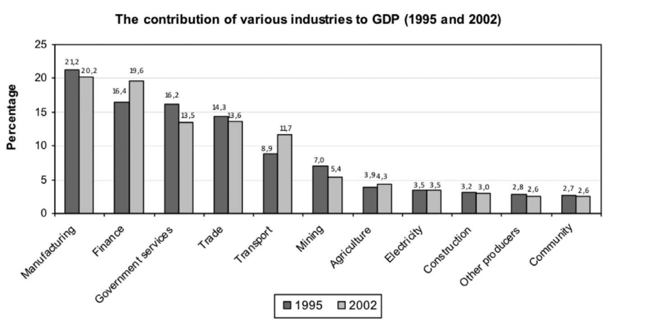
Worked Example: Applying the Six-Step Method
Step 1 - Heading analysis: The graph compares GDP contributions across different industries over two time periods
Step 2 - Axes examination: Vertical axis shows GDP percentage, horizontal axis lists industries, with time as a comparison factor
Step 3 - Units identification: GDP is measured as a percentage of total GDP, with years (1995 and 2002) for comparison
Step 4 - Trend analysis: Manufacturing shows the highest contribution but decreased over time, while finance and transport sectors increased significantly
Step 5 - Unusual patterns: Finance and transport show notably higher contributions in 2002 compared to other sectors
Step 6 - Question application: Use this analysis to answer specific questions about economic sector performance
Reading pie charts
Pie charts show how different parts contribute to a whole, typically displayed as percentages that total 100%. They're perfect for showing the relative size of different categories within a complete dataset.
Step-by-step approach to reading pie charts
Step-by-Step Pie Chart Analysis
Step 1: Examine the heading Understand what the complete "pie" represents and what the individual "slices" show.
Step 2: Identify the sectors Each slice represents a different category or factor contributing to the whole.
Step 3: Check units of measurement Pie chart sectors are usually shown as percentages, with all slices totalling 100%.
Step 4: Compare sector sizes Note the relative sizes of different sectors to understand their proportional contributions.
Step 5: Identify extremes Look for the largest and smallest sectors, as these often feature in exam questions.
Step 6: Apply to questions Use your analysis to answer specific questions about the data.
Practical example: Provincial GDP contributions
Consider a pie chart showing how South Africa's nine provinces contribute to the national GDP.
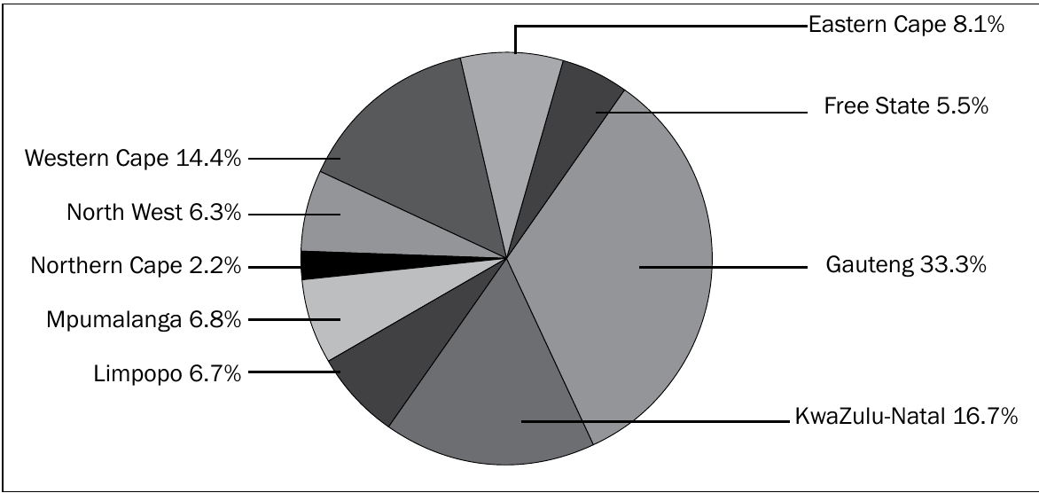
Key Observations from Provincial GDP Data
- Gauteng dominates with 33.3% (largest slice)
- KwaZulu-Natal and Western Cape are significant contributors
- Northern Cape has the smallest contribution at 2.2%
- The three largest provinces contribute over 64% of national GDP
Key economic geography terms
GDP (Gross Domestic Product): The total value of all goods and services produced within a country's borders in a specific period.
Primary economic activities: Industries that extract raw materials from the environment (mining, agriculture, fishing, forestry).
Secondary economic activities: Industries that process raw materials into finished goods (manufacturing, construction).
Tertiary economic activities: Service industries that don't produce physical goods (finance, transport, government services, communications).
Common exam mistakes to avoid
Critical Mistakes That Cost Marks
- Rushing through graph analysis: Always study the graph thoroughly before attempting questions
- Ignoring units of measurement: This leads to incorrect interpretations of scale and magnitude
- Missing unusual patterns: These exceptions often hold the key to higher-mark questions
- Confusing correlation with causation: Just because two factors move together doesn't mean one causes the other
- Not linking graph analysis to question requirements: Always ensure your graph reading directly addresses what the question asks
Exam tips for graph questions
The following strategies will help you maximise your performance when answering graph-based questions:
- Time management: Spend adequate time understanding the graph before rushing to answer questions
- Use the graph systematically: Follow the step-by-step approach every time
- Look for question clues: Question wording often hints at which parts of the graph are most important
- Support answers with data: Use specific figures from the graph to support your explanations
- Practice regularly: The more graphs you analyse, the faster and more accurate you become
Key Points to Remember:
- Always read the heading first to understand what the graph shows
- Check axes labels and units of measurement before interpreting data
- Look for trends, patterns, and unusual features in the data
- Pie charts show parts of a whole, while bar graphs compare different categories
- Use specific data from graphs to support your answers in exams