Misleading Data (Grade 12 NSC Matric Mathematical Literacy): Revision Notes
Misleading Data
Understanding how data can be presented in misleading ways is crucial for making informed decisions and avoiding manipulation. Graphs and charts in the media are often designed to support a particular viewpoint, and we need to develop skills to identify when data presentation gives a false impression.
In today's information-rich world, the ability to critically evaluate data presentations is an essential skill for students, professionals, and informed citizens. Media outlets, advertisers, and even academic sources may present data in ways that support their narrative.
What is misleading data?
Misleading data occurs when information is presented in a way that distorts the truth or leads viewers to incorrect conclusions. This doesn't necessarily mean the underlying data is wrong - rather, the way it's displayed creates a false impression.
Types of misleading data presentation
Biassed labelling
Biased labelling involves using loaded or emotionally charged words in graph titles, axis labels, or captions that influence how readers interpret the data. The choice of words can lead readers to draw incorrect conclusions before they even examine the actual numbers.
Misleading pie charts
Pie charts can be made misleading through several visual tricks:
- 3D effects: Adding depth to pie charts makes it difficult to accurately compare segment sizes
- Exploded slices: Pulling sections away from the main pie makes those segments appear disproportionately large
- Different sized charts: Comparing pie charts of different sizes makes accurate comparison impossible
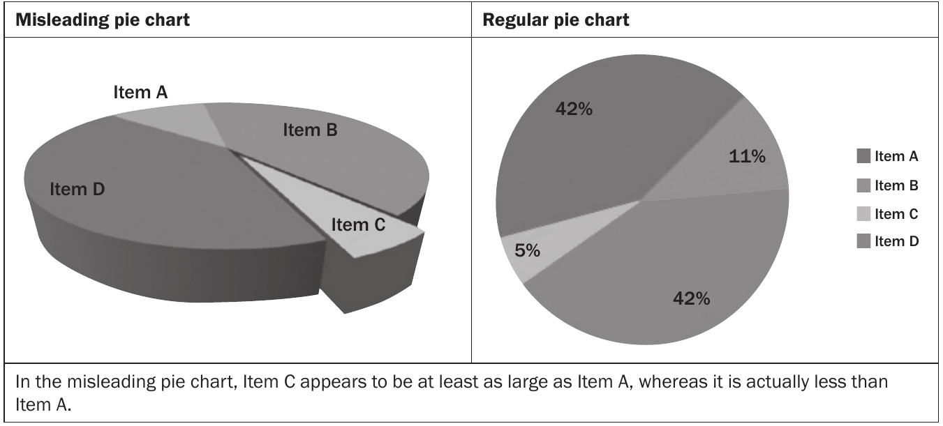
The image above shows how a 3D pie chart with an exploded slice makes Item C appear much larger than it actually is, even though it represents only 5% of the data compared to Item A's 42%.
Visual tricks in pie charts are among the most deceptive forms of data presentation. A 3D effect combined with an exploded slice can make a small 5% segment appear larger than a 42% segment to the casual observer.
Misleading bar graphs
Bar graphs can mislead through axis manipulation and scale issues:
Y-axis manipulation
One of the most common tricks is not starting the y-axis at zero. This makes small differences appear dramatically large.
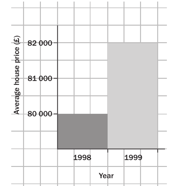
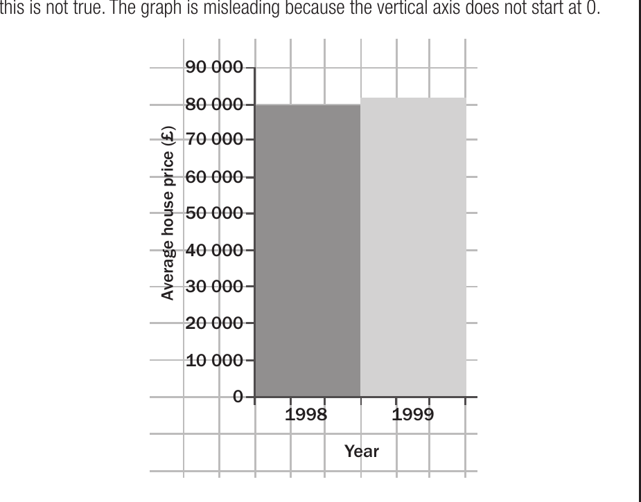
The first graph makes it appear that house prices nearly tripled from 1998 to 1999, but the corrected version starting from zero shows the actual modest increase of about £2,000.
Y-axis manipulation is the most common form of misleading data presentation. Always check whether the y-axis starts at zero. A change from £38,000 to £40,000 represents only a 5.3% increase, but when the axis starts at £37,000, it visually appears to be a massive jump.
Missing scales
Missing scale problems occur when graphs lack clear starting values or proper scale markings. This prevents readers from determining the true magnitude of differences between data points.
The 3D bar chart above makes it difficult to read exact values and compare the years accurately.
How to identify misleading graphs
Essential Questions for Graph Analysis:
When examining any graph or chart, ask these key questions:
- Does the y-axis start at zero? If not, are the differences being exaggerated?
- Are there any 3D effects or visual tricks? These often distort proportions
- Is the labelling neutral and factual? Watch for emotionally charged language
- Are the scales clearly marked and appropriate? Missing scales make accurate reading impossible
- Can you easily compare all data points? Visual tricks might make some appear larger than others
Worked example: Identifying misleading presentations
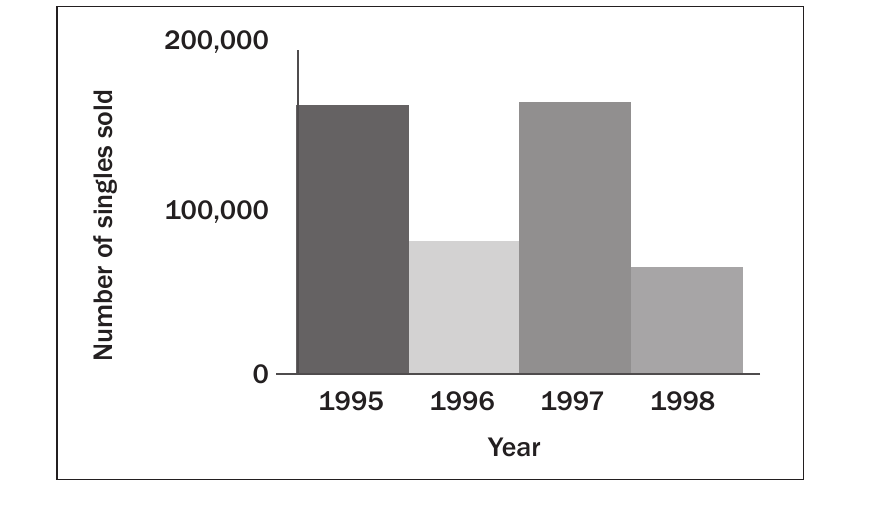
Worked Example: Analysing Music Sales Charts
Let's examine a music sales chart that appears to show declining sales:
Step 1: Identify the visual presentation issues The original 3D chart uses depth effects that make it difficult to read exact values.
Step 2: Compare with the actual data When we examine the numbers rather than the visual impression, we discover that sales in 1995 and 1997 were actually identical at around 175,000 units.
Step 3: Draw the correct conclusion The 3D presentation suggested a dramatic drop and recovery, but the actual trend shows more stability than the visual impression suggested.
Key lesson: Always look for the actual values and proper 2D presentation to understand the true trends.
Comparing different graph types
The same data can tell different stories depending on how it's presented:
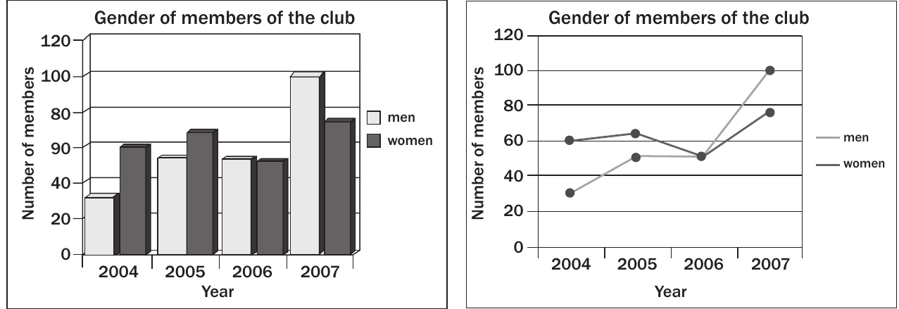
These graphs show identical data about club membership by gender from 2004-2007. The bar chart emphasises the absolute numbers each year, while the line graph highlights trends over time. Neither is misleading, but they emphasise different aspects of the same information.
Different graph types can legitimately emphasise different aspects of the same data. The key is that both presentations are honest and clear, allowing readers to understand what aspect is being highlighted.
Common exam traps
Watch Out for These Common Traps:
- Truncated y-axes: Always check if the axis starts at zero
- 3D pie charts: These are almost always harder to read accurately than 2D versions
- Missing context: Look for proper labels, scales, and units
- Comparative sizing: Ensure charts being compared are the same size
- Loaded language: Watch for biassed words in titles and labels
How to present data correctly
Guidelines for Honest Data Presentation:
To create honest, readable graphs:
- Start y-axes at zero unless there's a compelling reason not to
- Use 2D formats for pie charts with clear percentage labels
- Include complete, unbiased titles and axis labels
- Provide clear scales with appropriate intervals
- Choose appropriate graph types for the data being presented
Exam tips
Strategic Approach for Exam Success:
- Question every graph: Don't accept visual impressions at face value
- Read the numbers: Look for actual values, not just visual proportions
- Check the scale: This is the most common source of misleading impressions
- Compare like with like: Ensure graphs use consistent scales and formats
- Look for bias: Consider whether the presentation supports a particular viewpoint
Key Points to Remember:
- Always check if the y-axis starts at zero - this is the most common way to make small differences look dramatic
- Pie charts should be flat (2D) with clear percentage labels to allow accurate comparison
- Watch for loaded or biassed language in titles and labels that might influence your interpretation
- Missing or unclear scales prevent accurate reading of data relationships
- The same data can look completely different depending on how it's presented - focus on the actual numbers, not just the visual impression