Representing, Interpreting, and Analysing Data (Grade 12 NSC Matric Mathematical Literacy): Revision Notes
Representing, Interpreting, and Analysing Data
Understanding graphs and their purposes
Graphs are visual tools that help us explore, display, and report data effectively. They make it easier to identify patterns, relationships, shapes of distributions, and trends in information.
Purposes of graphs
Graphs serve several important functions:
- Exploring relationships - They help us see connections between different pieces of data
- Displaying information - They present data in a clear, visual format
- Reporting findings - They communicate results in an easy-to-understand way
- Identifying patterns - They reveal trends, shapes, and distributions in data
Understanding the purpose of each graph type helps you choose the most appropriate visualisation for your data and interpret results more effectively.
Essential features of effective graphs
Any well-constructed graph should clearly show:
- The significant features and key findings in a fair and readable manner
- The underlying structure of relationships between variables
- The dependent variable on the horizontal (x) axis and independent variable on the vertical (y) axis
Types of graphs
There are six main types of graphs used in data analysis:
- Line graphs - for showing change over time
- Bar graphs - for comparing categories
- Histograms - for displaying continuous data distributions
- Scatter plots - for examining relationships between variables
- Pie charts - for showing parts of a whole
- Box and whisker plots - for displaying data spread and quartiles
Line graphs
Line graphs display the relationship between two quantities by using straight lines to connect data points plotted on a grid. They are particularly effective for showing how information changes over time.
Key characteristics of line graphs
- Data points are marked and connected with straight line segments
- The horizontal axis typically represents time periods
- The vertical axis shows the measured quantity
- Trends and patterns become clearly visible through the line's slope
Worked Example: Television viewing patterns
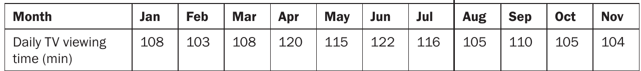
This table shows Jabu's average daily TV viewing time (in minutes) from January to November.
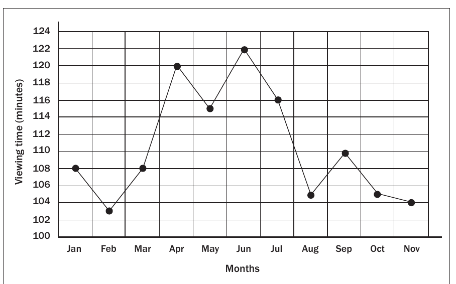
Analysis of the line graph: The graph reveals several interesting patterns in Jabu's viewing habits:
- Peak viewing occurs in April (120 minutes) and June (122 minutes)
- Lowest viewing happens in February (103 minutes) and November (104 minutes)
- Seasonal trends suggest increased viewing during school holidays and exam preparation periods
- The line's slope changes help identify increasing or decreasing periods
Advantages of line graphs:
- Trends become immediately visible through the line's direction
- Multiple time periods can be compared at a glance
- Seasonal patterns and cycles are easy to identify
Bar graphs
Bar graphs represent data organised into distinct categories, with each bar showing the quantity for that category. Spaces between bars clearly separate the different categories being compared.
Types of bar graphs
- Single graphs - display one set of data
- Double or multiple graphs - compare two or more data sets
- Compound or stacked graphs - show parts within categories
Bar graphs can be oriented horizontally or vertically. The key distinguishing feature is the spaces between bars, which separate distinct categories.
Worked Example 1: Tuckshop sales
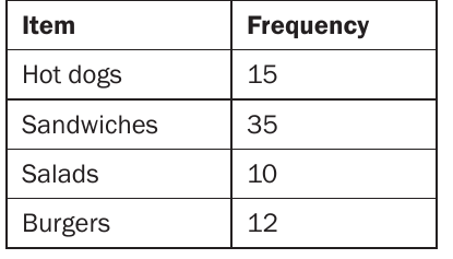
This frequency table shows the number of different food items sold at a school tuckshop during break time.
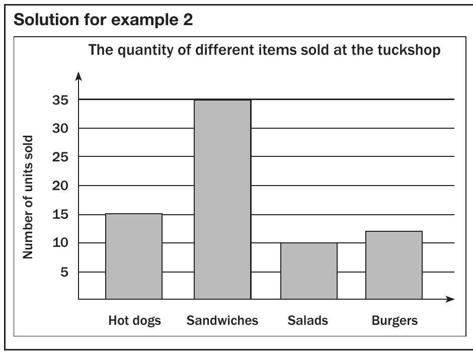
Analysis: Sandwiches are clearly the most popular item (35 units), followed by hot dogs (15 units), burgers (12 units), and salads (10 units).
Worked Example 2: Electronic appliances survey
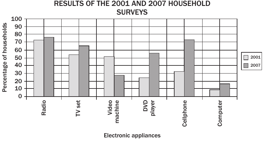
This comparative bar graph shows how household electronic appliance usage changed between 2001 and 2007.
Key findings:
- Radios remained the most commonly used appliance in both years
- DVD players showed dramatic growth from 24.4% to 56.5%
- Cellphones increased significantly from 32.3% to 72.9%
- Video machines declined from 51.2% to 27.6%
- Computers nearly doubled from 8.8% to 15.7%
Calculation example: To find the percentage increase in TV set usage: increase
Histograms
Histograms display continuous data that has been grouped into intervals or ranges. Unlike bar graphs, histograms have no spaces between the bars because the data is continuous.
Key differences from bar graphs
- Represent continuous data rather than separate categories
- Bars touch each other with no gaps
- Data is organised into class intervals or ranges
- Show the shape of data distribution
The most critical difference: Bar graphs have spaces between bars for distinct categories, while histograms have no spaces because they represent continuous data ranges.
Worked Example: Book length measurements
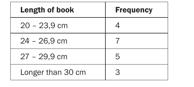
This frequency table shows the distribution of book lengths measured in centimetres.
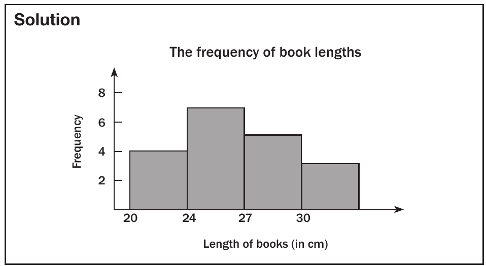
Analysis: The histogram shows that most books (7 books) fall in the 24-26.9 cm range, with fewer books at the extreme lengths.
Worked Example: Employee salary distribution
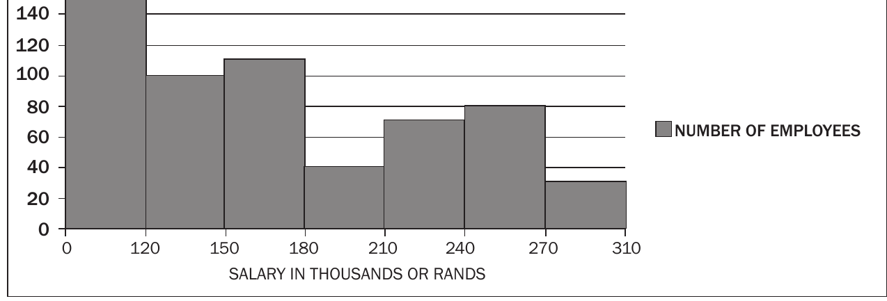
This histogram displays salary ranges for employees at a company, showing that most workers earn between R120,000-R150,000, with fewer employees at higher salary levels.
Pie charts
Pie charts are circular graphs divided into sectors that show the parts making up a whole. They effectively display proportional relationships where all parts must total 100%.
Key characteristics of pie charts
- Display relative proportions rather than actual quantities
- All percentages must add up to 100%
- Useful for showing parts of a whole
- Cannot show the shape or spread of data
Students are not expected to draw pie charts in exams, but you must be able to read and interpret them effectively.
Worked Example: Fruit juice preferences
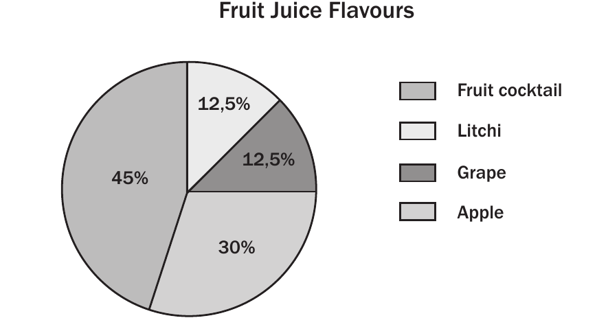
This pie chart shows the favourite fruit juice flavours among 120 high school learners.
Calculating actual numbers:
- Fruit cocktail: learners
- Apple: learners
- Grape: learners
- Litchi: learners
Worked Example: Household spending comparison
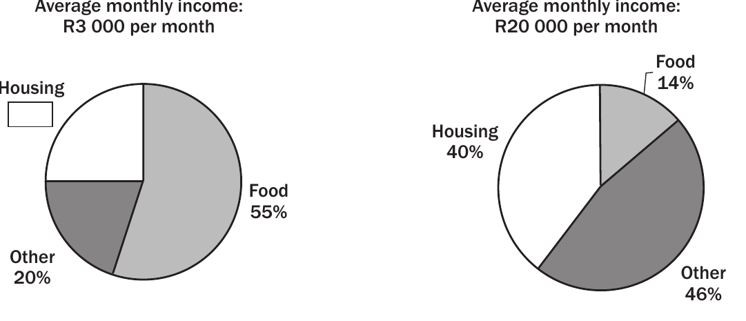
These pie charts compare spending patterns between low-income (R3,000/month) and higher-income (R20,000/month) households.
Key differences:
- Low-income group: Spends 55% on food, showing food as the largest expense
- Higher-income group: Spends only 14% on food, with housing (40%) and other expenses (46%) dominating
Calculation example: Housing spending for higher-income group:
Scatter plots
Scatter plots are the most useful graphs for studying relationships (correlations) between two variables. They show one variable on the horizontal axis and another on the vertical axis, with data points plotted accordingly.
Types of correlation
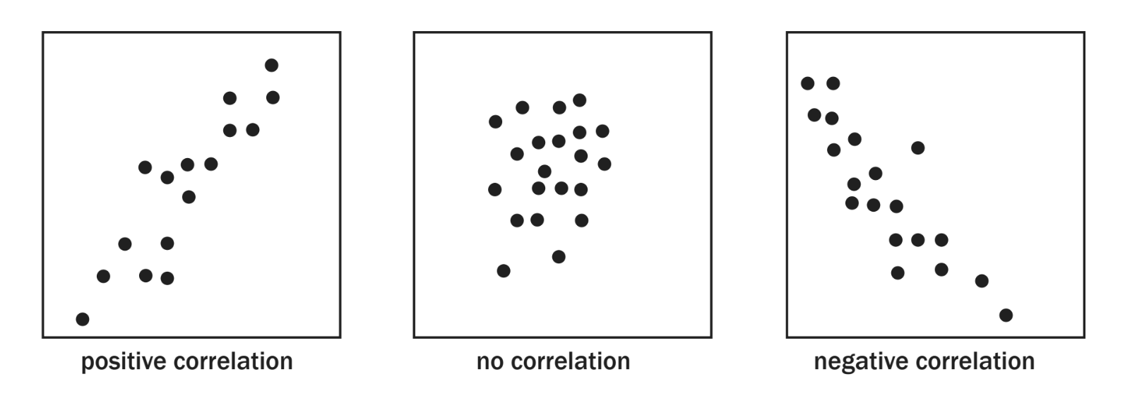
Scatter plots can reveal three types of relationships:
- Positive correlation: As one variable increases, the other also increases (upward trend)
- No correlation: No clear pattern exists between the variables (random scatter)
- Negative correlation: As one variable increases, the other decreases (downward trend)
Understanding correlation types helps you interpret relationships between variables and make predictions about data patterns.
Identifying correlation strength
- Tighter clustering of points indicates stronger correlation
- More scattered points suggest weaker correlation
- The slope direction determines if correlation is positive or negative
Students are not expected to draw lines of best fit in exams, but you must be able to identify and describe correlation types.
Box and whisker plots
Box and whisker plots provide a graphical representation of the five-number summary of a dataset, showing the spread and central tendency of the data.
The five-number summary
The five key values are:
-
Minimum value - the smallest data point
-
Lower quartile (Q₁) - 25% of data falls below this value
-
Median (Q₂) - the middle value (50% of data falls below this)
-
Third quartile (Q₃) - 75% of data falls below this value
-
Maximum value - the largest data point
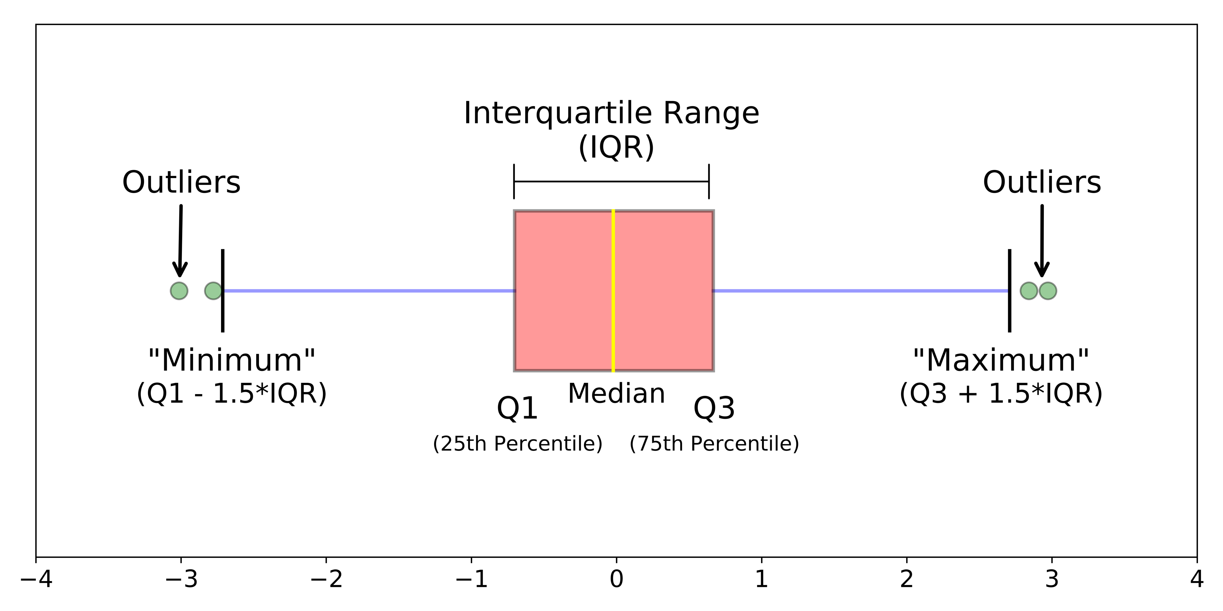
Students are not expected to draw box and whisker plots in exams, but you must understand how to read and interpret the five-number summary.
Exam tips and common traps
Key exam strategies
- Identify graph types quickly by looking for spaces between bars (bar graph) or no spaces (histogram)
- Read axes carefully - check units and scale
- Calculate percentages step by step, showing all working
- Describe trends using specific values from the graph
- Compare categories by referring to actual data values
Common mistakes to avoid
- Confusing histograms with bar graphs
- Forgetting to convert percentages to actual numbers when required
- Misreading scale intervals on axes
- Not showing calculation steps for percentage problems
- Describing trends without supporting evidence from the data
Formula reminders
- Percentage increase:
- Percentage of total:
- Actual number from percentage:
Key Points to Remember:
- Line graphs show trends over time and make patterns clearly visible
- Bar graphs compare categories with spaces between bars, while histograms show continuous data with no spaces
- Pie charts display parts of a whole where all percentages must total 100%
- Scatter plots reveal correlations between variables - positive, negative, or no correlation
- Box plots summarise data using five key values and help identify outliers and quartiles