The Demand Curve (HSC SSCE Economics): Revision Notes
The Demand Curve
Introduction to demand curves
The demand curve is a fundamental tool in economics that illustrates the relationship between the price of a good or service and the quantity that consumers are willing and able to purchase. When analyzing demand, economists use the ceteris paribus assumption - a Latin term meaning "all other things being equal". This assumption allows us to isolate the effect of one variable (such as price) while holding all other factors constant, making economic relationships clearer and easier to understand.
Understanding Ceteris Paribus
The ceteris paribus assumption is crucial in economic analysis. By assuming "all other things remain equal," economists can focus on the relationship between just two variables - in this case, price and quantity demanded. This makes it easier to understand cause and effect without the confusion of multiple changing factors.
The demand schedule
A demand schedule is a table that displays the quantity of a good consumers will demand across a range of different prices at a specific point in time. The market demand schedule represents the combined demand from all individual consumers in the market.
Consider the following example showing weekly market demand for shoes:
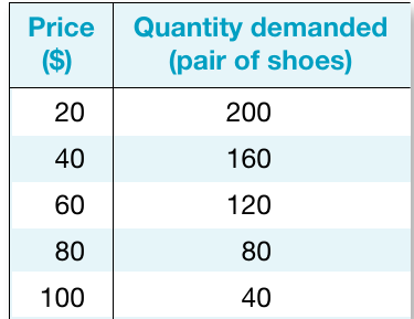
This schedule demonstrates a fundamental principle in economics called the law of demand, which states that as the price of a product increases, the quantity demanded by consumers decreases. The inverse relationship occurs because of two key effects:
Why Does Demand Fall as Price Rises?
Two key economic effects explain this relationship:
- Income effect: When prices fall, consumers can afford to buy larger quantities of the product with their existing income
- Substitution effect: Lower-priced goods become relatively cheaper compared to alternatives, making them more attractive to purchase
Therefore, more consumers are willing and able to purchase the good when its price is lower. For instance, in the shoe market example above, when the price is $20, consumers demand 200 pairs of shoes weekly. However, when the price rises to $100, demand falls to just 40 pairs.
Exceptions to the Law of Demand
Occasionally, some high-priced luxury goods may experience increased demand as prices rise, because they become more desirable as status symbols. Examples include dining at exclusive restaurants or purchasing designer fashion items. These are known as "Veblen goods" and represent rare exceptions to the typical demand pattern.
The demand curve
While the demand schedule presents data in tabular form, we can convert this information into a graphical representation called the demand curve. To construct this curve, we plot price on the vertical axis and quantity demanded on the horizontal axis, with each price-quantity combination from the schedule becoming a point on the graph.
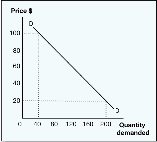
The demand curve typically slopes downward from left to right, visually representing the same inverse relationship described by the law of demand. This negative slope reflects the fact that as prices increase, quantity demanded falls (and vice versa), assuming all other factors remain constant.
Plotting the Demand Curve: Shoe Market
Using the shoe market example, we can observe that:
- At a price of $20, the market demands 200 pairs of shoes
- When the price increases to $100, demand contracts to only 40 pairs
The demand curve provides an immediate visual understanding of how consumers respond to price changes across the entire price range. Each point on the curve represents a specific price-quantity combination from the demand schedule.
Movements along the demand curve
When the price of a good changes (while all other factors remain constant), this creates a movement along the existing demand curve. These movements are classified as either expansions or contractions in demand.
Expansion of demand occurs when a price decrease leads to an increase in quantity demanded. As prices fall, the good becomes more affordable and attractive relative to alternatives, causing consumers to purchase larger quantities. This is represented by a downward movement along the demand curve.
Contraction of demand occurs when a price increase leads to a decrease in quantity demanded. Higher prices make the good less affordable and less attractive compared to substitutes, causing consumers to reduce their purchases. This is shown by an upward movement along the demand curve.
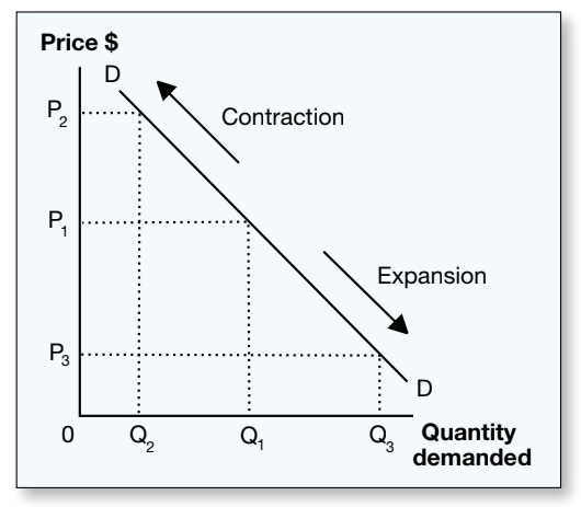
The diagram illustrates both types of movement:
- A price increase from to causes quantity demanded to fall from to (contraction)
- A price decrease from to causes quantity demanded to rise from to (expansion)
Critical Distinction: Movements vs. Shifts
Only changes in the price of the good itself cause movements along the demand curve.
Changes in other factors (such as consumer income, prices of related goods, or consumer preferences) would cause the entire demand curve to shift to a new position - this represents a different concept called an increase or decrease in demand.
Remember: Price changes = movements ALONG the curve. Other factors = SHIFTS of the curve.
Remember!
Key Points to Remember:
-
The demand schedule is a table showing quantity demanded at different prices, while the demand curve is the graphical representation of this data
-
The law of demand states that quantity demanded falls as price rises, creating the characteristic downward slope of the demand curve
-
Ceteris paribus means "all other things being equal" - economists use this assumption to isolate the effect of individual variables
-
Expansion of demand: price falls → quantity demanded rises → downward movement along the curve
-
Contraction of demand: price rises → quantity demanded falls → upward movement along the curve
-
Only price changes cause movements along the existing demand curve; changes in other factors cause shifts of the entire curve