Conducting Investigations & Analysing and Presenting Results (VCE SSCE Biology): Revision Notes
Conducting Investigations & Analysing and Presenting Results
Conducting investigations
During your scientific investigations, your main goal is to collect data that is unbiased, accurate, and precise. You also need to work cooperatively with your classmates, teachers, and lab technicians to achieve the most reliable results possible.
Generating and collecting data
When you collect your own experimental data through hands-on experiments, interviews, or surveys, this is called primary data. As you first write down your results in your logbook, this information is considered raw data because it hasn't been processed or organised yet. Once you start creating graphs or tables from this information, it becomes transformed data. If you're using results that someone else has already collected (such as data from previous classes, online databases, or published scientific papers), this is called secondary data.
Understanding the difference between these data types is crucial for scientific communication. Primary data gives you full control over the collection process, while secondary data can save time but requires careful evaluation of the original study's methods and validity.
Recording observations and potential errors
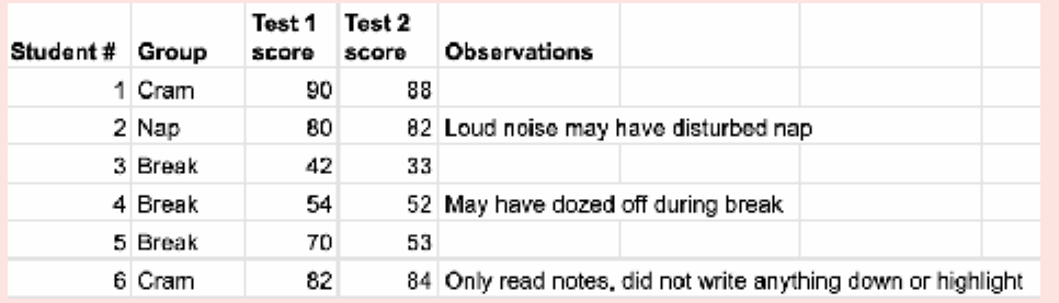
When collecting primary data, it's crucial that you carefully note down any observations from your experiment. This is particularly important for recording any potential errors that may have occurred during your investigation. Writing down these observations demonstrates scientific integrity and gives anyone reading your results the full picture of what happened during the experiment.
Important observations to record during experiments include:
- Potential moments of contamination
- Any personal errors you made, including spills or breakages
- General observations such as unusual scents or colour changes
- Any inconsistent treatment between your experiment and control groups
- Potential uncontrolled variables that may be affecting your results
By documenting potential errors and discussing them in your report, you're communicating your results with integrity. This gives readers full autonomy to draw their own conclusions with all the required knowledge available to them. Never hide mistakes or unexpected observations – they're an essential part of the scientific process.
Analysing and presenting results
Once you've finished conducting your experiment, you need to carefully interpret and present your results. This process typically involves transforming your raw data into visual formats like graphs or tables, identifying any potential sources of error, drawing conclusions from your data, and then communicating your findings to your intended audience.
There are four key steps to follow when presenting and communicating your results, which we'll explore in detail below.
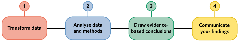
Step 1: Transform your data
A crucial part of being a scientist is communicating your results clearly and honestly. Raw data is often difficult to read, repetitive, or messy, so it's not usually presented directly in practical reports and posters. Instead, you need to manipulate your data so that the main result, pattern, or trend becomes obvious to your reader. While tables can be useful, graphs and charts are typically better at showing trends clearly.
Choosing the right type of graph
The type of graph you choose depends entirely on the type of data you have collected. Understanding the difference between numerical and categorical variables is essential for making the right choice.
| Type of variable | Explanation | Typically graphed using | |
|---|---|---|---|
| Numerical | Continuous | Data that can take any value between a set of real numbers. Continuous data can include decimals and fractions, such as height (178.87 cm), age (16 years 2 months 4 days), or mass (65.87 kg) | Line graph or scatter plot |
| Discrete | Data that can be counted and takes a particular whole number value. Discrete data cannot take a fraction of that value, such as count of individuals (1, 2, 3) | Bar graph | |
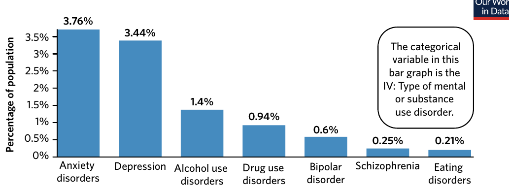
| Categorical | Ordinal | Data that can be logically ordered, such as size (small, medium, large), fin health score (1 = no fin damage, 2 = some fin damage, 3 = most of fin surface damaged), or attitudes (agree, neutral, disagree) | Bar graph or pie chart |
| Nominal | Data that cannot be organised in a logical sequence, such as gender (male, female, nonbinary, other), nationality (Australian, Chinese, South African, Egyptian), or hair colour (brown, black, blonde, red) | Bar graph or pie chart |
Examples of different graph types
Bar graphs are typically used to display categorical and discrete data. The independent variable (IV) is shown on the x-axis, and the dependent variable (DV) is shown on the y-axis.
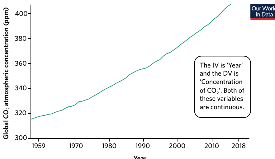
Line graphs are used to display continuous data over time or another continuous variable. They're particularly effective at showing trends and changes.
Scatter plots are especially useful when you want to visualise the relationship between two continuous variables. For example, you might use a scatter plot to explore the relationship between amount of rainfall and number of species in an ecosystem.
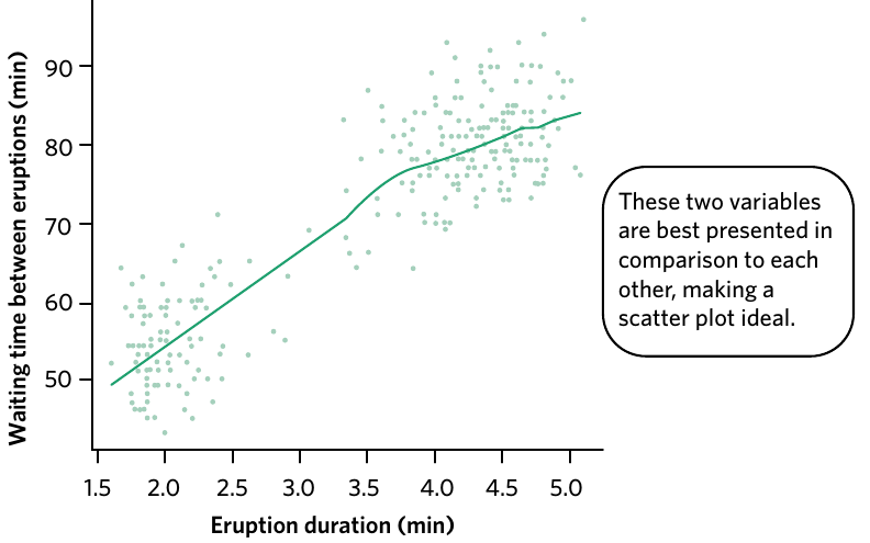
Drawing trendlines
During experiments, you may record continuous data that enables you to create a scatter plot. Because both variables are continuous, you can convert your scatter plot into a line graph by drawing a trendline, also known as a line of best fit. The trendline helps readers determine if the relationship between the two variables is positive, negative, or non-existent.
A line of best fit may pass through all the points, some of the points, or none of the points on your scatter plot. A good rule of thumb when drawing a line of best fit is to ensure the number of points above and below the line are roughly equal.
Common Mistake to Avoid
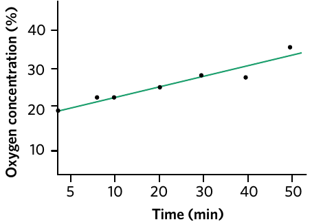
Never force your trendline through zero unless you actually collected data at that point. Forcing a trendline through zero when you haven't measured that data point will produce an inaccurate slope and misrepresent your actual measurements.
Formatting guidelines for graphs and tables
Once you've drawn up your graph on paper or computer, you need to format it properly to maximise clarity and ensure it fits scientific conventions. Follow these guidelines:
- Ensure the graphics are clear and easy to read
- The scale should be appropriate for the data and labelled clearly
- Avoid coloured backgrounds or grid lines unless they're required to present results clearly
- Format axis labels in sentence case (not in Title Case and NOT ALL CAPS). Only capitalise the first letter of the first word and any proper nouns
- Present any calculations in a clear, non-repetitive manner (by using one sample calculation)
- Each graph should have a figure number and caption underneath it
- Each table should have a table number and title above it
- Tables should have units written in the column or row headings only, not in the cells within the table
- The results section also includes text. The text should summarise the key findings for each graph in 1–2 sentences, including whether the result supports your hypothesis
Quick Formatting Checklist
Remember: Figures have captions below, tables have titles above. Always include units in column/row headings, never in individual cells. This keeps your data presentation clean and professional.
Step 2: Analyse your data and method
Once you visualise your results clearly, you can determine whether your hypothesis is supported or rejected, and reflect on your data and method to decide if your experiment is valid and reliable.
Describing data from graphs
During exams, you may be asked to describe data before you explain it. A good strategy for describing data is to divide the graph into different sections rather than trying to describe everything at once. When describing data, make sure to include specific numbers from the x and y-axes to contextualise the overall pattern.
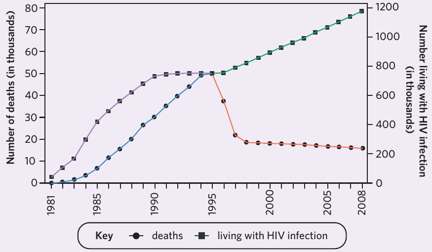
Worked Example: Describing HIV/AIDS Epidemic Trends
When describing the HIV/AIDS epidemic trends shown in the graph above, you might write:
"The number of deaths from HIV rose steadily from 1981, reaching a peak in 1995 at 50,000. This was followed by a sharp decline in deaths from 1995–1997, until plateauing around 20,000 for the next ten years. Meanwhile, the number of people living with HIV rose from close to zero to 800,000 between 1981 and 1990. This number stayed at approximately 800,000 for five years before increasing linearly to 1,200,000 by 2008."
Notice how specific numbers and years are included to support the description of the overall trends.
Evaluating your method and data quality
Once you know what your results mean for your hypothesis, you can dig deeper into the data and evaluate your method. Consider these important questions:
Method evaluation:
- Did anything happen during the experiment that might mean you can't trust a data point or multiple data points?
- Can you identify any personal, systematic, or random errors that may affect the accuracy and precision of your results?
Data evaluation:
- Precision – are the results within replicate treatments similar or different? If there is a wide spread of results, this could mean your instruments or processes were not valid and did not measure what you wanted to measure
- Accuracy – if you know what the true value should be, are the values you recorded similar or different? If they are different, this could mean an uncontrolled variable was affecting your results, your instruments were faulty, or that you were not collecting data carefully enough
- Outliers – are there any data points that stand out or do not follow the pattern? If so, did something happen when you collected that sample that could explain the anomaly? There may be a good reason to exclude outliers from your results, but make sure you report in your discussion that you did this and explain why
The answers to these questions should be brought up in the discussion section of your report, article, or poster. Honest evaluation of your method strengthens your scientific credibility rather than weakening it.
Step 3: Draw evidence-based conclusions
One of the important aspects of science is that things considered 'true' today can be disproven tomorrow. Scientists draw the most reasonable conclusions based on the evidence available at the time. If contradictory evidence arises, what is considered 'true' can also change. However, we cannot instantly accept new findings unless we can trust the results of an experiment.
The strongest evidence comes from controlled experiments that use random sampling methods and have been reviewed and reproduced by colleagues in the scientific community. To trust results, the experiment must be designed to be reproducible, repeatable, and valid. These characteristics ensure that any conclusions drawn are evidence-based, reliable, and meaningful.
Avoiding common mistakes: Correlation does not mean causation
Drawing conclusions from evidence isn't always straightforward. Two common mistakes that students make when drawing conclusions are: 1) assuming that correlation means causation, and 2) assuming the same pattern will exist beyond the data range you measured.
Not all experiments will reveal a correlation between two variables. In fact, you may find that the dependent variable (DV) and the independent variable (IV) are completely unrelated. Furthermore, even if your data indicate that your IV is related to your DV in a consistent and measurable manner (for example, if you increase the IV, the DV increases), this doesn't necessarily mean that the IV causes the change in DV.
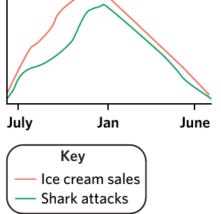
Worked Example: Ice Cream Sales and Shark Attacks
Consider this classic example: the number of ice cream sales and shark attacks are correlated (they both increase in summer), but one does not cause the other. It's more likely that an uncontrolled variable, such as hot weather, explains the relationship. When it's hot, people are both more likely to eat ice cream and go to the beach, with the latter likely increasing the number of shark attacks.
This demonstrates why correlation does not imply causation – always look for potential confounding variables that might explain the relationship.
Critical Thinking Required
Just because two variables change together doesn't mean one causes the other. Always ask yourself: "Could there be a third variable (confounding variable) that's actually responsible for both changes?" This is one of the most common errors in scientific reasoning.
Avoiding inappropriate extrapolation
You cannot assume that data will follow the same trend outside of the range you actually measured. For example, if scientists measured the height of a seedling for ten days and observed a positive growth trend, we cannot definitively state that "it will take the seedlings 20 more days to reach 9 cm". However, you could say that "if the rate of growth continues in the same manner, then it will take the seedlings 20 more days to reach 9 cm".
Similarly, if scientists did not collect data on day zero, it's important not to force your trendline through zero. Drawing a trendline that is forced through zero (shown in red) results in a different slope compared to the trendline that actually best fits the collected data (shown in green). This produces inaccurate results that don't properly represent your actual measurements.
Step 4: Communicate your findings
As we face global challenges like climate change, pandemics, and pollution, it's crucial that all citizens have basic scientific literacy. However, approximately forty percent of Australians report being uninterested in and disengaged from science. One of the major barriers to improving scientific literacy is that scientists often use complex, technical words and high levels of detail which can make science seem boring or difficult.
Professional science communicators emphasise that the best way to communicate your findings depends on your audience. For instance, to communicate your results to your teacher or supervisors, a formal laboratory report written according to standard scientific practice would be most appropriate. However, if you're trying to teach your siblings or parents about something you learnt at school, you should avoid jargon and perhaps use drawings and examples to support your communication.
Know Your Audience
The same scientific findings can be communicated in vastly different ways depending on who you're talking to. A formal lab report uses technical language and detailed methodology, while a presentation to the general public should use simple language, relatable examples, and visual aids. Both approaches are valid – they're just suited to different audiences.
Structure of a scientific practical report
To help you communicate your findings clearly, here is an outline of the typical conventions and formats for each section of a scientific practical report:
| Section | Section description | Suggested length | Suggested tense |
|---|---|---|---|
| Title | The title may be written as a question or statement that describes the main phenomenon you are trying to determine in your experiment. Examples include: "How does light intensity affect the rate of photosynthesis?" or "The impact of pH on the rate of enzyme-catalysed reactions". If you are investigating a particular species, you may wish to include the species name in the title. | One sentence | Present |
| Abstract | Abstracts are optional but recommended. The abstract is a short overview of the entire experiment. Answer each of these questions in one sentence: What is the significance of the experiment? What was the aim? What was your method? What were your results? Why are your results important? What should be researched next? | 100–300 words | Past |
| Introduction | The purpose of the introduction is to justify why you needed to perform your experiment. Include background information explaining why the system or model is important to study, the broader implications of answering your question, any prior research undertaken, any gaps in knowledge, the aim of the experiment, the variables being tested, and your hypothesis with justification. The final sentence is typically 'big picture', suggesting how your discovery could help the world or influence future research. | Variable – check with your teacher, but usually one to four paragraphs | Mostly present and future |
| Method | The purpose of a method is to outline all the materials and steps you took during an experiment. Like a cooking recipe, it must be very detailed so that someone else could read it and follow your steps exactly. Write the steps in order, name any equipment used, draw and label any complex experimental setups, and state what you measured and when. | Usually no longer than half a page | Past |
| Results | The purpose of the results section is to present the key findings of the study clearly and honestly. You do not usually present raw data, but manipulate it into transformed data (tables, line graphs, bar graphs) that best shows any trends, patterns, or relationships. Each figure is accompanied by a brief (2–3 sentences) description of the key findings. Do not interpret or explain your findings in this section. | Variable – depends on the number of figures and tables | Past |
| Discussion | The purpose of the discussion is to determine if the data obtained supports the hypothesis and to explore the implications of the findings. Restate each key result, state if it supports or refutes the hypothesis, discuss if your findings support or differ from prior research, weigh up strengths and weaknesses, identify reasons why results may be invalid or unreliable, identify limitations, suggest improvements to the method, and identify strengths that support validity, reliability, and scope of results. | At least one paragraph – usually three or four | Mostly present |
| Conclusions | The purpose of this section is to summarise your study. State whether the hypothesis was supported, provide justification, summarise limitations and improvements, and discuss the broader implications such as future research, impact on scientific knowledge, and impact on society/environment. | One paragraph | A mix, but mostly present |
| Acknowledgements | Individuals involved in the experiment should be recognised for specific contributions. | One to three sentences (not included in word count) | Present |
| References | A list of references in a standard style (such as Harvard or APA) should be included. | Typically anywhere from 2–20 references (not included in word count) | N/A |
Key Points to Remember
-
Collect and record carefully: Always record potential errors, observations, and uncontrolled variables during your investigation to maintain scientific integrity
-
Choose appropriate graphs: Use bar graphs for categorical and discrete data, line graphs and scatter plots for continuous data, and ensure the IV is on the x-axis and DV is on the y-axis
-
Draw trendlines correctly: Never force a trendline through zero unless you actually collected data at that point, as this produces an inaccurate slope
-
Correlation ≠ causation: Just because two variables are related doesn't mean one causes the other. Always consider potential confounding variables
-
Communicate for your audience: Adapt your communication style based on your audience, from formal scientific reports for teachers to simplified explanations for the general public