Visual Persuasive Texts (VCE SSCE English): Revision Notes
Visual Persuasive Texts
Introduction to visual persuasive texts
Visual persuasive texts are images that present a particular point of view and aim to influence how viewers think about an issue. These texts appear in many forms across media, including newspapers, magazines, social media, advertising, and billboards. Visual texts can stand alone or accompany written arguments, where they often reinforce or highlight key messages from the written content.
Visual persuasive texts are powerful communication tools because they can convey complex ideas quickly and emotionally. Unlike written arguments that require time to read and process, visual texts can create immediate impact and influence audiences at first glance.
This chapter explores three main types of visual persuasive texts commonly found in Australian media:
- Cartoons - using humour and satire to comment on issues
- Photographs - capturing real moments to present perspectives
- Infographics and graphics - transforming complex data into accessible visuals
Each type uses different visual techniques to persuade audiences and communicate arguments effectively.
Cartoons
What are cartoons?
Cartoons are visual texts that combine images and sometimes text to express a viewpoint on serious topics. They typically appear in the opinion sections of newspapers (both print and online) and use humour and satire as their primary persuasive tools.
Key characteristics of cartoons:
- Use illustrations to present people or situations
- May include text in the form of dialogue bubbles or captions
- Employ humour to engage audiences
- Often adopt a satirical tone to critique or comment on issues
How cartoons persuade
Caricature and exaggeration
Cartoons frequently use caricature to exaggerate the physical features or characteristics of key individuals involved in an issue. This technique makes figures instantly recognisable whilst also making a comment about their role or behaviour.
Understanding Satire and Humour in Cartoons
Whilst cartoons use humour to engage audiences, their purpose is serious. The humour serves as a vehicle to deliver critical messages about politics, social issues, or current events. Don't mistake a cartoon's light-hearted appearance for a lack of serious intent - the best cartoons use laughter to provoke thought and challenge perspectives.
Simplicity and complexity
Whilst cartoons may appear simple on the surface, closer examination often reveals more complex messages. The combination of visual elements, text, and symbolic representations creates layers of meaning that invite deeper analysis.
Analysing cartoon techniques
When studying cartoons, consider these visual and textual elements:
Colour and lighting
Colour choices can affect the tone and accessibility of a cartoon. Bright colours might make a serious issue more approachable for audiences, whilst darker tones could emphasise gravity or danger. The contrast between colours can highlight key elements or create mood.
Text and irony
Speech bubbles, captions, and labels within cartoons often use irony to make their point. The text may say one thing whilst the visual elements suggest something different, creating tension that reveals the cartoonist's message.
Size and placement
The size and positioning of elements within a cartoon draw attention to what the cartoonist considers most important. Larger elements dominate the visual field, whilst placement can suggest relationships or hierarchies between subjects.
Juxtaposition
Cartoons often place contrasting elements side by side to highlight differences or ironies. This visual technique makes comparisons obvious and can emphasise the gap between different perspectives or situations.
Metaphor
Visual metaphors transform abstract concepts into concrete images. For example, a cartoon might show a tank crushing a fuel hose to represent how international conflict affects domestic fuel prices. These metaphors make complex issues more accessible and memorable.
Remember the HITS acronym for cartoon features:
- Humour - engages audiences and makes serious topics approachable
- Illustration - visual representation of people and situations
- Text - dialogue, captions, or labels that add meaning
- Satire - critical commentary on issues through humour
Example: Ukraine fuel price cartoon
Worked Example: Analysing the Warren Brown Cartoon
The Warren Brown cartoon from the Herald Sun (2022) demonstrates these techniques effectively. The image shows a large military tank dominating the frame, with a small blue car and petrol pump in the background. The tank has driven over the fuel hose, creating a visual metaphor for how the Ukraine conflict impacted Australian fuel prices.

Analysis of visual elements:
Colour and tone:
- The bright colours make the serious topic more approachable
- The cartoon uses vibrant hues to engage readers rather than alienate them with heavy imagery
Text and irony:
- Speech bubbles use irony: "How are prices affecting the tank?" versus "It's how the tanks are affecting the prices"
- The wordplay reveals the disconnect between global conflict and local concerns
Size and emphasis:
- The tank's size and central placement emphasise the scale of the conflict's global impact
- The small car appears dwarfed, representing ordinary citizens' powerlessness
Juxtaposition:
- Large military tank versus small civilian car contrasts the seriousness of war with everyday concerns
- This visual contrast highlights the far-reaching effects of international conflict
Metaphor:
- The crushed fuel hose provides a metaphor for international conflict disrupting daily life
- The physical connection between tank and fuel system makes the abstract economic impact concrete
Photographs
What are photographs?
Photographs are visual texts that present perspectives on issues or news stories using only visual elements. Unlike cartoons, photographs capture real places and people, though they can be modified through editing software. They commonly accompany articles in news publications and magazines, and also appear in advertising, social media, and on billboards.
Key characteristics of photographs:
- Use visual language exclusively
- May include a caption explaining content and context
- Present real places and people
- Can be modified with editing software to enhance certain elements
Visual elements in photographs
Photographs persuade through careful attention to several key elements:
Subject matter
What appears in the photograph determines its content and message. The choice of subject reflects what the photographer or publication wants to highlight about an issue.
Lighting and colour
Lighting affects mood and emphasis within a photograph. Bright, natural lighting can create optimism or clarity, whilst dim or dramatic lighting might suggest seriousness or concern. Colour choices (or the decision to use black and white) similarly influence emotional response.
Positioning and framing
How subjects are positioned within the frame affects their importance and the relationships between elements. Framing determines what the audience sees and what remains outside the image, shaping the viewer's understanding of context.
Focal point and angles
The focal point draws the viewer's eye to specific elements, establishing priorities within the image. Camera angles affect how audiences perceive subjects: low angles might make subjects appear powerful or important, whilst high angles could diminish them.
Remember the SLAP acronym for photograph analysis:
- Subject matter - what is shown and why it matters
- Lighting - how light creates mood and emphasis
- Angles - camera perspective and its effect on perception
- Positioning - placement within the frame and framing choices
Analysing photographs
When examining persuasive photographs, consider:
- What is the main subject and what does its inclusion suggest?
- How do lighting and colour contribute to the mood or tone?
- What has been included in the frame and what has been excluded?
- Where is the focal point and how does this direct the viewer's attention?
- What angle is used and how does this affect perception of the subject?
- If present, how does the caption frame the image's meaning?
The Power of Framing and Exclusion
Remember that photographs show only what the photographer chooses to include in the frame. What is excluded from a photograph can be just as significant as what is shown. Always ask yourself: What might be happening outside the frame? What context might be missing? This critical awareness helps you recognise how photographs shape rather than simply record reality.
Example: Numbat release photograph
Worked Example: Analysing the Numbat Release Photograph
The photograph of wildlife ecologist Dr Laurence Berry, NSW Environment Minister Matt Kean, and NPWS manager Jo Gorman releasing a numbat demonstrates how photographs create positive messages.

Analysis of visual elements:
Subject matter and composition:
- The three figures kneel together in natural bushland, focused on the small endangered animal in their hands
- The composition suggests collaboration, care, and successful conservation efforts
Positioning and framing:
- All three subjects are positioned at the same level (kneeling), suggesting equality and shared purpose
- The numbat is the focal point, emphasised by the figures' attention and careful handling
Lighting and setting:
- Natural lighting and the outdoor setting reinforce themes of environmental protection and restoration
- The bright, clear lighting creates an optimistic tone
Overall message:
- The photograph conveys positive outcomes in conservation work
- The presence of a government minister alongside scientists suggests official support for environmental programs
Infographics and graphics
What are infographics and graphics?
Infographics and graphics are visual texts designed to present complex information clearly and accessibly. Infographics combine numerical data (such as statistics), written text, and visual elements like diagrams and illustrations. Graphics are primarily visual with minimal text. Both forms transform information that might be dense or confusing in paragraph form into clear, engaging visuals.
Key characteristics of infographics:
- Present information through illustrations, diagrams, words, and numbers
- Influence viewer response through visual elements like colour, font sizes, and layout
- Make complex data accessible and memorable
- Often combine facts with emotive elements to support a message
Purpose and persuasive impact
Whilst infographics appear to simply present facts, they actually make persuasive choices in several ways:
Selection of information
Infographics present a snapshot of an issue, showing what creators want audiences to focus on. Information that doesn't support the main message may be excluded, even if it's relevant to the broader topic.
Infographics Are Not Neutral
Even though infographics present statistics and facts, they are never truly objective. The creators make deliberate choices about which information to include, how to visualise it, and what emotional tone to convey. Always approach infographics critically, asking what information might be missing and how the visual presentation influences your interpretation of the data.
Visual choices
Colour palettes, fonts, borders, and icons all contribute to persuasive impact:
- Reassuring colours (greens and blues) might communicate positive messages or stability
- Urgent colours (reds and oranges) could signal warnings or need for change
- Font sizes establish hierarchies of information, showing what's most important
- Icons and illustrations make abstract data concrete and memorable
- Layout guides the viewer's eye through information in a particular order
Combining facts and emotion
Effective infographics blend factual information with emotional appeal. Statistics gain impact through visual representation, colour choices, and accompanying imagery that prompts emotional responses.
Remember the CLIP acronym for infographic elements:
- Colour - palette choices and emotional associations
- Layout - arrangement and flow of information
- Information - data selection and presentation
- Presentation - visual elements, fonts, and icons
Analysing infographics
When examining infographics, consider:
Content and message
- What is the main contention or argument?
- Is this stated explicitly or implied through the combination of elements?
- What information is included and what might be excluded?
- How are statistics used to support the message?
Visual elements
- What colour palette is used and what does this suggest about the tone?
- How does layout guide the viewer through information?
- What font sizes and styles emphasise key points?
- How do illustrations or icons reinforce the message?
- What contrasts are created through visual choices?
Persuasive techniques
- How do visual elements work together to create an emotional response?
- What assumptions does the infographic make about its audience?
- How might the visual presentation influence interpretation of the data?
Example: Rural health care infographic
Worked Example: Analysing the Rural Health Care Infographic
The National Rural Health Alliance infographic titled "The Case for Better Health Care" demonstrates effective use of persuasive techniques.
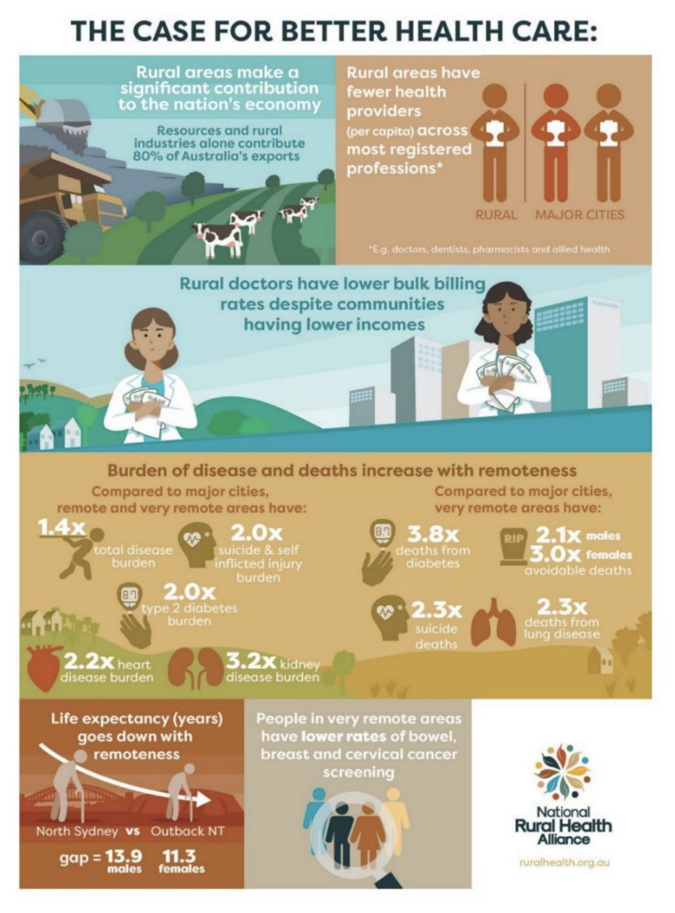
Analysis of visual elements:
Colour coding and contrast:
- Uses teal for rural areas and orange/brown for health disparities
- The contrasting colours visually separate the problem (poor health outcomes) from the setting (rural areas)
Layout and flow:
- The layout moves from top to bottom, building an argument about health inequality
- This vertical progression creates a logical narrative flow
Typography and emphasis:
- The title explicitly states the contention: "The Case for Better Health Care"
- Multipliers (2.0x, 2.3x, 3.2x) are emphasised through size and colour
Visual statistics:
- Multipliers emphasise the severity of disparities in a concrete, memorable way
- Simple illustrations accompany statistics, making abstract numbers more tangible
Overall persuasive strategy:
- The infographic combines clear data with visual elements that create emotional impact
- The contrasting imagery between urban and rural health outcomes builds urgency for change
Exam tips for analysing visual persuasive texts
Essential Strategies for Exam Success
Identify the text type first
Recognising whether you're analysing a cartoon, photograph, or infographic helps you focus on relevant techniques and conventions.
Consider context
Think about where the visual text appeared (newspaper, magazine, social media) and when it was published. This context affects interpretation and helps identify the intended audience.
Look beyond the obvious
Visual texts often contain layers of meaning. Move beyond describing what you see to analysing how visual choices create persuasive effects.
Connect visual elements to purpose
Every visual choice serves the text's persuasive purpose. Link your observations about colour, composition, or symbolism to the overall argument or message.
Use precise terminology
Demonstrate your understanding by using appropriate terms: caricature, juxtaposition, metaphor, focal point, framing, colour palette, typography, and layout.
Balance description and analysis
Whilst you need to describe visual elements, focus primarily on analysing their persuasive effects. Explain how and why visual choices influence audiences, not just what you see.
Remember!
Key Points to Remember:
-
Visual persuasive texts use images to present viewpoints and influence audiences through visual elements rather than primarily through words.
-
Cartoons employ humour, satire, and caricature to comment on serious issues. They may appear simple but often contain complex messages revealed through analysis of visual and textual elements.
-
Photographs capture real subjects and use visual elements like lighting, composition, and framing to present particular perspectives on events or issues.
-
Infographics and graphics make complex information accessible through visual presentation, but they also make persuasive choices about what information to include and how to present it emotionally.
-
Visual analysis requires attention to multiple elements working together: colour, size, placement, contrast, text, symbolism, and composition all contribute to persuasive impact.
-
Use the mnemonics to remember key analytical approaches:
- HITS for cartoons: Humour, Illustration, Text, Satire
- SLAP for photographs: Subject, Lighting, Angles, Positioning
- CLIP for infographics: Colour, Layout, Information, Presentation