Visual Persuasive Texts (VCE SSCE English): Revision Notes
Visual Persuasive Texts
Understanding visual persuasive texts
Visual persuasive texts are powerful communication tools that use images, either alone or combined with words, to comment on important issues and events. These texts can stand independently or work alongside written persuasive pieces to convey information and suggest particular viewpoints.
The key strength of visual texts lies in their immediate emotional impact. Unlike written text that requires time to read and process, images strike viewers instantly. They invite personal interpretation based on individual knowledge and experience, making them highly effective persuasive tools.
It is important to recognise that visual texts, whilst they may appear objective, are carefully constructed to present specific perspectives. Even photographs and graphs, which seem to represent factual reality, are created in ways that convey particular angles on their subject matter.
Key terms:
- Visual persuasive texts: Images or combinations of images and words designed to comment on issues and influence viewer opinion
- Positioning: The way a text guides viewers toward a particular interpretation or viewpoint
- Visual language: The elements and techniques used in images to create meaning and persuade
Cartoons
Cartoons represent a distinctive form of visual persuasion that addresses serious issues through humour. Typically found in newspapers, they offer commentary on current events and often feature recognisable public figures.
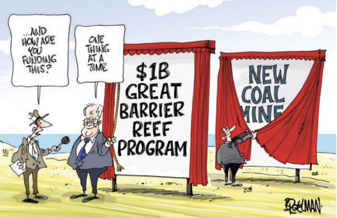
What makes cartoons effective
Cartoons achieve their impact through the combination of visual elements and minimal text. They present critical perspectives whilst maintaining a humorous tone, which can make controversial viewpoints more palatable to audiences.
The cartoon's apparent simplicity often masks complex messages and subtle commentary. This layered approach allows cartoonists to convey sophisticated critiques whilst maintaining accessibility and entertainment value.
Key terms:
- Caricature: A drawing style that exaggerates a person's distinctive features, making them instantly recognisable whilst emphasising certain characteristics
- Exaggeration: Deliberately overstating visual or textual elements to highlight particular aspects or create humour
- Irony: Expressing meaning through language or images that suggest the opposite of what is literally presented
- Sarcasm: A sharper form of irony used to mock or criticise
Features and conventions of cartoons
Cartoons employ several standard elements that enhance their persuasive power:
- Present critical yet humorous perspectives on serious issues
- Frequently use exaggeration to emphasise particular points
- May include speech balloons, thought bubbles, captions and other written text to clarify or enhance the visual message
- Often employ irony and sarcasm to challenge prevailing views or highlight contradictions
Analysing cartoons effectively
When examining cartoons for their persuasive techniques, consider these essential elements:
Textual elements:
- Speech balloons and thought bubbles reveal characters' words and inner thoughts
- Captions and other written text provide context or commentary
- Contrast between different text elements can create ironic effects
Visual techniques:
- Colour choices capture emotion or convey symbolic meanings (for example, green commonly represents nature or environmental concerns)
- Objects carrying symbolic meanings add layers of interpretation
- Stereotypes, caricatures and clichés quickly establish character types and viewpoints
- Shading in black-and-white cartoons creates mood and emphasis
- Facial expressions reveal emotional responses and attitudes
- Background details establish setting and context for the issue being discussed
Photographs
Photographs create immediate, visceral responses in viewers. They can tell stories, convey information and evoke emotional reactions without requiring any written accompaniment. Whilst photographs often appear in articles, they also function as standalone persuasive texts that suggest particular perspectives on events and issues.

The power of photographic persuasion
The persuasive strength of photographs lies in their apparent objectivity. Viewers often perceive photographs as unbiased records of reality, yet photographers make numerous choices that shape how subjects are presented and interpreted.
The Objectivity Illusion
Photographers make numerous decisions that significantly influence viewer responses and attitudes toward the depicted subject matter. These technical and compositional choices—including framing, lighting, angle, and focus—transform seemingly objective documentation into persuasive visual arguments.
Key terms:
- Composition: The deliberate arrangement of visual elements within the photographic frame
- Framing: The photographer's choice of what to include within the image boundaries and what to exclude
- Focus: The areas of sharpness and blur that direct viewer attention
- Digital manipulation: Electronic editing of photographs to alter, enhance or disguise elements
Features and conventions of photographs
Persuasive photographs share certain characteristics:
- Present subjects using various visual features including colour, focus, framing, lighting, angle and distance
- Often include captions that add information or reinforce particular perspectives
- May be digitally manipulated to enhance persuasive impact
- Frequently accompany written articles to support or extend arguments
Analysing photographs effectively
Successful photograph analysis requires attention to multiple technical and compositional elements:
Compositional choices:
- The overall composition determines how elements are arranged within the frame
- The apparent distance between camera and subject affects viewer connection and perspective
Camera angle and perspective:
- Looking up at subjects suggests their power, authority or status
- Looking down on subjects implies vulnerability or diminishment
- Eye-level shots suggest equality or neutral presentation
Understanding Camera Angles
The vertical angle from which a photograph is taken significantly influences how viewers perceive the subject. Low angles (looking up) create impressions of power and dominance, whilst high angles (looking down) can make subjects appear vulnerable or insignificant. These choices shape viewer attitudes before they consciously process the image's content.
Light and shadow:
- Areas of light and shadow direct viewer attention to particular elements
- Lighting creates mood and atmosphere that influences emotional response
Focus and depth:
- Selective focus draws attention to specific elements whilst blurring others
- Sharp focus throughout suggests all elements carry importance
- Blurred backgrounds isolate subjects and emphasise their significance
Framing decisions:
- What is included or excluded shapes the narrative
- Background elements provide context and meaning
- Amount of background shown affects interpretation
Colour and enhancement:
- Colour choices carry emotional and symbolic associations
- Natural colours suggest authenticity
- Enhanced or altered colours create particular effects or moods
Digital manipulation:
- Editing can disguise or emphasise features of people or environments
- Manipulation affects the perceived authenticity of the image
Captions:
- Written text accompanying photographs influences interpretation
- Captions can reinforce or challenge the apparent meaning of images
Graphs, infographics and tables
These multimodal texts combine visual elements with written language to present information, particularly numerical data and statistics. They make complex information accessible by enabling viewers to quickly recognise patterns and trends.
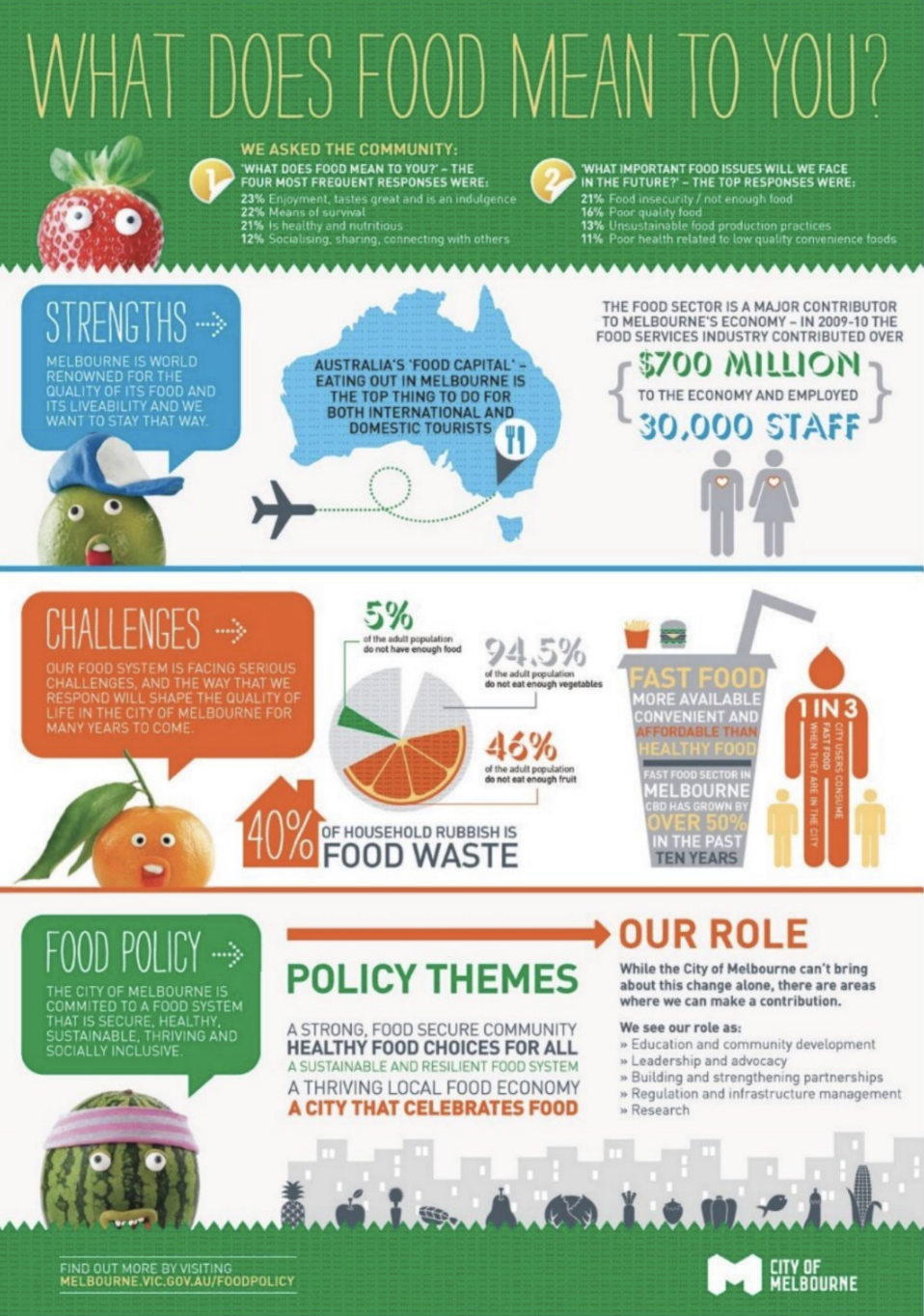
Understanding data visualisation
Graphs, infographics and tables are highly effective for presenting numerical information in digestible formats. They create visual representations of data that would be difficult to comprehend in written form alone. These texts typically accompany articles that discuss the data in greater detail, but they can also stand independently as persuasive documents.
Key terms:
- Multimodal: Combining multiple modes of communication, such as visual elements, written text and numerical data
- Infographic: A visual representation that combines illustrations or photographs with text and numbers to present information
- Data visualisation: The presentation of information through visual formats like graphs, charts and tables
The persuasive nature of data presentation
Whilst graphs, infographics and tables appear objective because they are based on data, they can present particular interpretations that support specific arguments.
Data Presentation is Never Neutral
Several techniques shape how viewers interpret information:
- Graph axes can be scaled to emphasise or minimise particular trends
- Colour choices add emotional dimensions to supposedly neutral data
- Categories for sorting data introduce subtle biases and interpretations
- Selection of which data to include or exclude shapes the overall message
All data in media texts is selected and organised to support particular viewpoints, even when presented in seemingly objective formats.
Features and conventions of graphs, infographics and tables
These visual data presentations share common characteristics:
- Present information, especially numerical data, in visual formats
- Create striking effects through design elements such as colours and fonts
- Combine visual language, words and numbers for comprehensive communication
- Present viewpoints on data, particularly when supplementing written texts
Understanding infographics specifically
Infographics represent particularly rich multimodal texts. They combine visual elements like illustrations or photographs with text and numbers, and may overlay graphs on images.
The Emotional Power of Infographics
This combination creates strong emotional impact through the associated imagery, which influences how viewers respond to the actual data and arguments being presented. The emotional resonance of infographic imagery can significantly affect how viewers interpret the statistical information, making these texts powerful persuasive tools that blend apparent objectivity with emotional appeal.
Analysing data visualisations effectively
When examining graphs, infographics and tables, consider:
Structure and organisation:
- How information is divided into sections
- The order in which information is presented
- Whether the structure supports a particular argument or conclusion
Visual elements:
- Colours and their emotional or symbolic associations
- Font choices and their effects on tone and readability
- Illustrations or photographs and their emotional impact
- Whether visual elements enhance or distract from the data
Data presentation:
- Scale and range of graph axes
- Categories used to sort information
- Which data points are emphasised or minimised
- What information is included or excluded
Overall message:
- What viewpoint the visualisation supports
- Whether the presentation appears neutral or clearly persuasive
- How written and visual elements work together to convey meaning
Key Points to Remember:
- Visual persuasive texts use images to comment on issues and create immediate emotional impact, positioning viewers toward particular viewpoints.
- Cartoons employ humour, exaggeration, irony and sarcasm to present critical perspectives on serious issues, often using caricatures and symbolic elements.
- Photographs appear objective but are carefully constructed through compositional choices, camera angles, lighting, focus, framing and potential digital manipulation.
- Graphs, infographics and tables combine visual and written language to present data persuasively, using design elements and structural choices to support particular interpretations.
- All visual persuasive texts are constructed to convey specific perspectives, even when they appear to present neutral or objective information.