Key Skills (VCE SSCE Health and Human Development): Revision Notes
Key Skills
Understanding health status indicators
Being able to accurately describe and explain health status indicators is a fundamental skill for studying Health and Human Development. When you define these indicators, you need to include all essential components to make your definition complete. Regular practice with these terms will help you understand their meanings and when to apply them correctly.
Complete definitions matter
Common Mistake: Incomplete Definitions
One common mistake is providing definitions that are too narrow or incomplete. A complete definition must include all essential components to demonstrate full understanding.
For example, when defining life expectancy, you need two key components to make it a complete definition:
Components of a Complete Life Expectancy Definition
A complete definition of life expectancy must include:
- The average number of years of life remaining
- The specific age being considered
- The assumption that current death rates remain unchanged
Describing and applying health indicators
Once you understand what each health indicator means, you need to demonstrate that you can interpret the information they provide. This allows you to accurately discuss and compare the health status of different populations.
Example of a strong response
When comparing health status between males and females, a well-constructed response should:
Identify relevant indicators: Name the specific health indicators you're using (e.g., life expectancy and health-adjusted life expectancy)
Make clear comparisons: State explicitly which group has higher or lower measurements
Demonstrate understanding: Explain what the indicators actually mean in practical terms
Example Response: Comparing Health Status by Gender
"Females experience higher life expectancy and health-adjusted life expectancy than males. This means that on average, females are expected to live longer than males if current death rates remain constant. It also means that females will typically live more years in full health without reduced functioning compared to males."
Why this response works:
- Identifies specific indicators (life expectancy and HALE)
- Makes clear comparison (females higher than males)
- Explains practical meaning of the indicators
Practice Questions to Test Your Understanding
- Explain what burden of disease measures
- Explain how life expectancy differs from health-adjusted life expectancy
- Using two health indicators, describe the health status of Australians
Using data to interpret health status
Throughout this course, you'll need to read and interpret health data presented in various formats. Data helps identify trends over time and enables comparisons between countries or population groups. Effective data interpretation is essential for improving health and wellbeing outcomes.
Six-step process for reading graphs and tables
To become proficient at interpreting health data, follow this systematic approach:
1. Read the title
The title indicates what type of information the graph presents. Look for it at the top of the graph or near the figure number.
2. Examine the axes and units
Check both the horizontal and vertical axes on graphs. Note what units are being used – they might be percentages, years, rates, proportions, or dollar amounts. Always use the correct unit when referring to data.
3. Study the key
If present, the key helps you identify different elements within the data, such as different groups being compared.
4. Read any additional notes
Look for explanatory notes, usually at the bottom of the graph. These may clarify elements that seem confusing at first.
5. Identify trends and patterns
Look for similarities, differences, increases, decreases, and other patterns in the data. This helps you understand what story the data is telling.
6. Use specific data, not general statements
Critical Rule: Always Use Specific Data
Avoid vague terms like "more" or "higher". Instead, quote actual figures from the graph with their correct units.
Example:
- Good: "around 75 deaths per 100,000 compared to around 150 deaths per 100,000"
- ❌ Poor: "more deaths occurred"
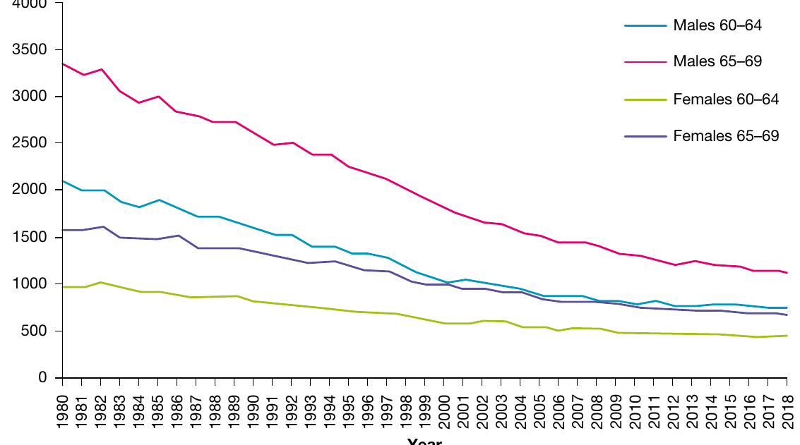
Worked example: Analysing mortality data
Let's apply these steps to real health data showing mortality rates for different age groups over time:
Worked Example: Interpreting Mortality Rate Trends
Describing trends over time:
The mortality gap between males and females has narrowed over time, but males in Australia have consistently experienced higher mortality rates than females every year shown.
For males aged 65–69, the mortality rate decreased from approximately 3,350 per 100,000 population in 1980 to around 1,100 per 100,000 in 2018.
For females in the same age group, rates decreased from roughly 1,600 per 100,000 in 1980 to about 700 per 100,000 in 2018.
Comparing age groups:
People aged 65–69 were significantly more likely to die than those aged 60–64 in 2018.
For example, the mortality rate for males aged 60–64 was approximately 750 per 100,000 compared to around 1,100 per 100,000 for males aged 65–69.
For females, the mortality rate was around 250 deaths per 100,000 higher in the 65–69 age group compared to the 60–64 age group.
Notice how this response:
- Makes general statements identifying trends and comparisons
- Supports statements with specific data from the graph
- Uses approximate language ("around", "approximately") when exact figures cannot be determined
- Includes correct units throughout
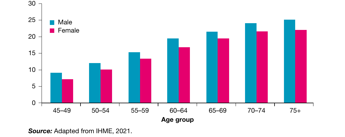
Practice your data interpretation skills
Study the following graph showing type 2 diabetes prevalence:
Practice Questions:
a. Outline one similarity and one difference in health status between males and females in Australia based on this data
b. Outline the relationship between age and the prevalence of type 2 diabetes in Australia
Key Points to Remember:
- Always provide complete definitions that include all essential components
- Use specific health indicators to make comparisons between populations
- Follow the six-step process when interpreting graphs and tables
- Support your statements with actual data from graphs, using correct units
- Look for trends, patterns, and differences when analysing health data
- Use approximate language ("around", "approximately") when exact figures aren't available from visual data