Representing and Analysing Data (VCE SSCE Physics): Revision Notes
Representing and Analysing Data
Introduction
One of the most crucial skills in modern physics is the ability to analyse and use data effectively. This enables scientists to predict weather patterns, assess health risks, and discover new particles. When conducting scientific investigations, we collect data and need to communicate our findings clearly and accurately. This involves creating graphs, drawing lines of best fit, and calculating gradients to understand the relationships between variables.
Key terms and definitions
Linearise - The process of transforming data so that when plotted on a graph, a straight line of best fit can be drawn through the points. This transformation helps us identify mathematical relationships between variables more easily.
Gradient - A measure representing the rate of change of one variable with respect to another on a graph. The gradient tells us how quickly the dependent variable changes as the independent variable increases.
Straight line of best fit - A straight line drawn through data points on a graph that best represents the relationship between the independent and dependent variables. This line helps us identify linear relationships and make predictions.
Curved line of best fit - A curved line drawn through data points when the relationship between variables is non-linear. Like a straight line of best fit, this shows the trend in the data but follows a curve rather than a straight path.
Trendline - Another term for either a straight line of best fit or curved line of best fit, depending on the pattern in the data.
Plotting data
Representing data visually
When conducting experiments, we collect data and record it in tables. Graphs provide a powerful visual representation of this data, making it easier to identify patterns and relationships. Consider an experiment investigating how long it takes for a block to slide down a one-metre ramp at different angles:
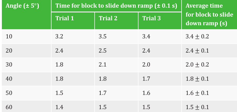
From this table, we can extract coordinate pairs to plot on a graph. The first value in each pair represents the independent variable (ramp angle), and the second represents the dependent variable (time).
Graph conventions
To ensure graphs communicate information clearly and accurately, we must follow specific conventions:
Axis labels and arrangement:
- The independent variable should always be plotted on the horizontal axis (x-axis)
- The dependent variable should always be plotted on the vertical axis (y-axis)
- Both axes must be clearly labelled with the variable name and units
- The graph should have a descriptive title, typically in the format "dependent variable vs. independent variable"
A common way to remember axis arrangement: the independent variable (what you control or choose) goes on the horizontal axis, while the dependent variable (what you measure as a result) goes on the vertical axis.
Scales:
- Each axis must have a consistent scale, meaning equal intervals on the axis represent equal changes in value
- Note that logarithmic graphs are an exception, where intervals represent constant ratios rather than constant differences
- The scale should be chosen so data points occupy more than 50% of the available space on each axis
- An axis may indicate a power of ten by which all values should be multiplied (e.g., )
In examinations, axes and grids are typically provided, but you may need to choose an appropriate scale. When practising, use graph paper to develop this skill.
Uncertainty bars
When measurements include uncertainties, we represent these on graphs using uncertainty bars - lines with end caps whose length indicates the magnitude of uncertainty:
- Horizontal uncertainty bars show the uncertainty in the independent variable
- Vertical uncertainty bars show the uncertainty in the dependent variable
- Together, these bars define a rectangular region where the true value likely lies
Here's a complete example showing all the conventions properly applied:
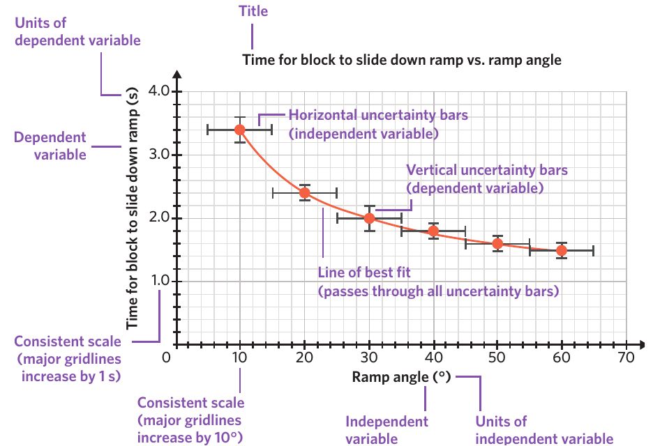
This annotated graph demonstrates every element required for correct data representation: proper axis labels with units, consistent scales, an appropriate title, uncertainty bars in both directions, and a line of best fit passing through all uncertainty bars.
Linearising data
Often, the relationship between variables is not linear. Linearising data involves transforming one or both variables so the graph shows a straight-line relationship. This makes it much easier to analyse the mathematical relationship between variables.
If the transformation is done correctly and the resulting straight line passes through the origin, this indicates a proportional relationship between the variables. We can represent this mathematically using as a constant for the gradient.
Linearised graphs don't always need to pass through the origin. However, if they do, this provides valuable information about the proportional relationship between variables.
Common transformations:
For a parabolic relationship where :
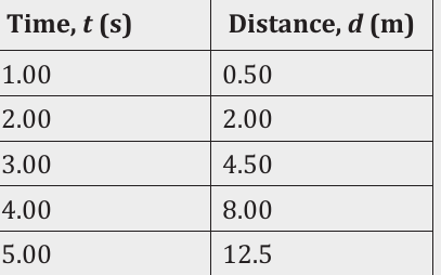
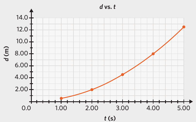
When we plot distance against time, we get a curved graph. To linearise this data, we can square the independent variable (time):
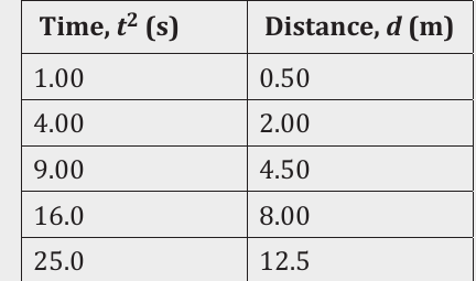
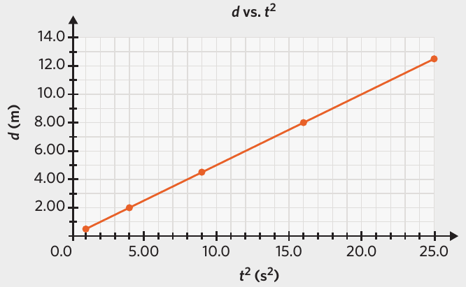
Now plotting distance against time squared produces a straight line, confirming that .
Different relationships require different transformations:
- Square root relationship (): Transform by squaring the values or taking the square root of the values
- Hyperbolic relationship (): Transform by taking the reciprocal of either variable
Similar transformations can be applied to the dependent variable. For example, to establish a relationship like , you would take the square root of all values before plotting.
Using proportional relationships:
When you've established that , you can use this for calculations. If when , and , then . The proportional relationship means both variables change by the same factor.
Drawing straight lines and curved lines of best fit
Lines of best fit (also called trendlines) are drawn through data points to show the overall relationship between variables. These lines help us visualise correlations and can be used to make predictions or solve physics equations.
Rules for drawing lines of best fit
Whether drawing a straight or curved line, the following rules must be followed:
Essential Rules for Lines of Best Fit:
-
Pass through uncertainty bars: The line must pass through the uncertainty bars (error bars) of all data points. It doesn't need to pass through the actual data point itself, just somewhere within the uncertainty region.
-
No forced direction changes: Don't force the line to change direction sharply just to pass through individual points. The line should be smooth and represent the overall trend.
-
Not forced through origin: The line should not be forced to pass through the origin unless there's a physical reason to expect this. Let the data determine where the line goes.
-
Not forced through any specific point: Treat all data points as equally important. Don't force the line through any particular point.
-
Stay within data region: Don't extend the line far beyond the region where you have data points.
These rules ensure that all data points are treated equally and that the line represents the best overall fit to the data.
If you expect your graph to pass through the origin based on physical principles, but your trendline doesn't, this indicates systematic error in your measurements.
Dealing with outliers: If certain points have experienced significant random error, they become outliers. These should be identified and may be disregarded when drawing trendlines.
Straight lines versus curved lines
Sometimes a straight line cannot be drawn that passes through all the uncertainty bars. In this case, the relationship is better represented by a curved line of best fit:
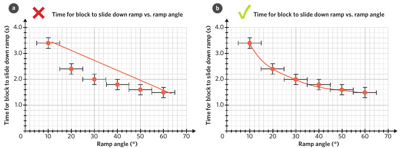
The left graph shows an incorrectly drawn straight line that doesn't pass through all uncertainty bars. The right graph shows the correct curved line of best fit that properly represents the data.
It's also possible that uncertainty is too large or the spread of data too small to definitively establish the true relationship between variables.
Calculating the gradient
The gradient (or slope) of a line on a graph represents the ratio of change in the vertical axis variable to the change in the horizontal axis variable. Understanding gradients is essential because they often have important physical meanings.
Understanding gradients
A gradient is fundamentally a rate of change:
- Positive gradient: The dependent variable increases as the independent variable increases
- Negative gradient: The dependent variable decreases as the independent variable increases
- Magnitude matters: The steeper the line (larger gradient magnitude), the more the dependent variable changes per unit increase in the independent variable
Calculating gradients
The formula for calculating the gradient of a straight line is:
where and are two points on the line of best fit.
Critical Guidelines for Accurate Gradient Calculation:
-
Use points on the line: Choose two coordinates that lie on the straight line of best fit, not necessarily the actual data points.
-
Choose points far apart: Select coordinates that are relatively far apart on the line. This reduces the effect of any errors when reading values from the graph.
-
Check scales: Always check the scale on each axis and apply any scale factors indicated (such as ).
-
Include units: The units of the gradient are determined by dividing the units on the vertical axis by the units on the horizontal axis.
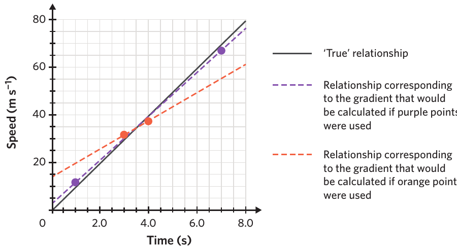
This diagram illustrates why point selection matters. The purple and orange points both have the same error compared to the true line, but the purple points (far apart) give a more accurate gradient than the orange points (close together).
Worked Example: Speed vs Time Graph
Consider this speed versus time graph showing an object in free fall:
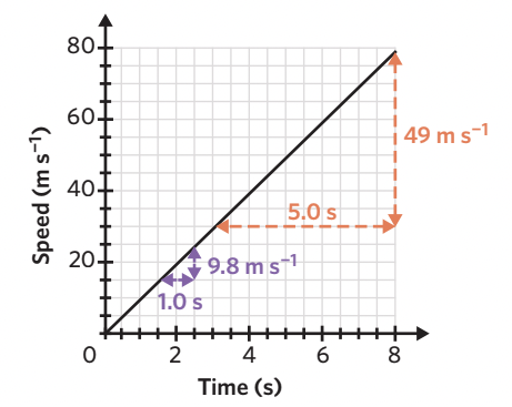
The object's speed increases by every second. Therefore, the gradient is:
When time increases by seconds, speed increases by .
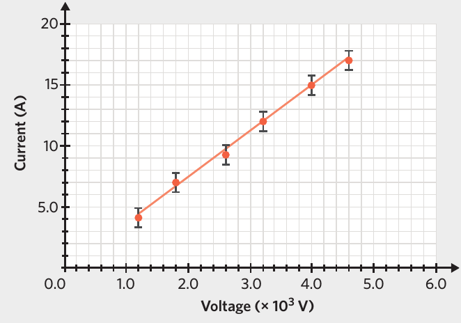
Worked Example: Current vs Voltage Graph
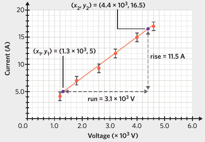
Step 1: Select two points on the line of best fit that are far apart:
Step 2: Apply the gradient formula:
Special case - line through origin:
If you know the line passes through the origin, the gradient formula simplifies to:
However, always verify that the line actually passes through the origin before using this simplified approach.
Physical interpretation of gradients
The gradient often represents an important physical quantity. We can determine what it represents by examining the equation relating the variables and considering the physical context.
For straight line relationships following the form (where is the gradient and is a constant):
Example 1 - Acceleration:
From the speed versus time graph shown earlier:
- Gradient =
- This is the definition of acceleration magnitude:
- Therefore, the gradient represents the magnitude of acceleration
Example 2 - Specific Heat Capacity:
Consider an experiment where temperature change () is measured as heat () is absorbed by an object of mass :
where is the specific heat capacity.
Rearranging:
If we plot versus , the gradient equals .
If the gradient is measured as °C J and the mass is kg:
Exam tip: Exam questions often ask you to use the gradient from experimental data to determine a known constant. Always use the gradient of the line of best fit from the experimental data, not the theoretical value of the constant.
Remember!
Key Points to Remember:
- Graph axes: Independent variable on the horizontal axis, dependent variable on the vertical axis, both with clear labels and units
- Scales: Must be consistent, with data occupying more than 50% of each axis
- Uncertainty bars: Horizontal bars show uncertainty in the independent variable, vertical bars show uncertainty in the dependent variable
- Lines of best fit: Must pass through uncertainty bars of all points but don't need to pass through specific data points or the origin
- Gradient calculation: Use the formula with two points far apart on the line of best fit
- Physical meaning: The gradient often represents an important physical quantity - determine this by analysing the relationship between your variables