Generating, Collating, and Recording Data (VCE SSCE Psychology): Revision Notes
Generating, Collating, and Recording Data
Understanding correlation and causation
Before working with data, it's important to understand a common misconception. When two variables show correlation (they change together in a pattern), this does not necessarily mean one causes the other to change.
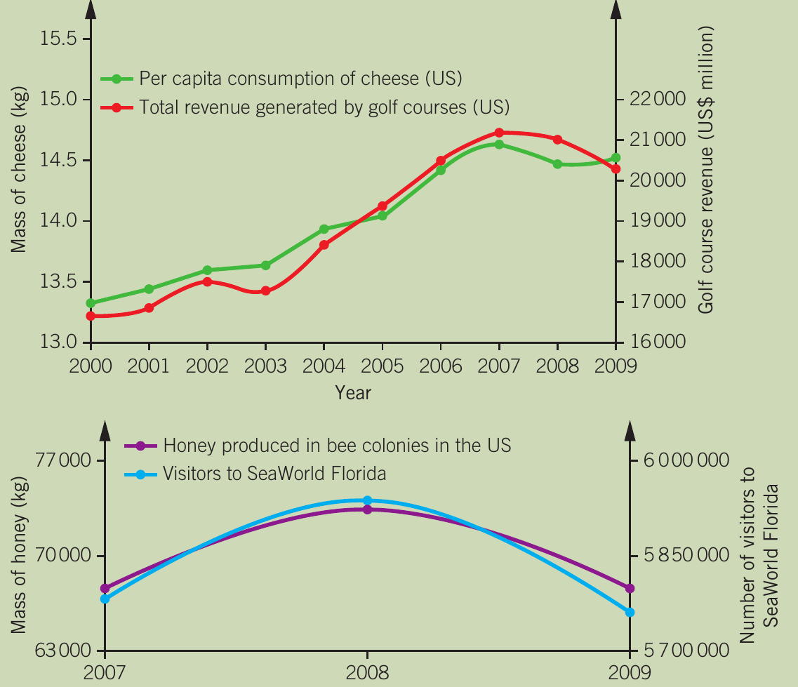
Correlation Does Not Equal Causation
The graphs above show examples of spurious correlations. Although cheese consumption in the US correlates almost perfectly with golf course revenue (r = 0.99), and honey production correlates with SeaWorld Florida visitors, these relationships are coincidental. There is no causal link between these variables.
This is a critical distinction in data analysis - just because two variables change together doesn't mean one is causing the other to change.
Working with data
Data collection is essential to research. The type of data collected depends on the investigation method used. Once collected, data must be organised and presented clearly to enable analysis and meaningful conclusions.
Types of data
Primary and secondary data
Primary data is collected through first-hand research for an intended purpose. For example, a researcher conducting their own questionnaire study collects primary data.
Advantages of primary data:
- Can be tailored to specific investigation needs
- Direct control over collection methods
Disadvantages of primary data:
- Time-consuming to collect
- Can be expensive
- Requires participants and equipment
Secondary data is obtained second-hand through research conducted by another person for a different purpose. For example, using Australian Census data to track crime rates over time.
Advantages of secondary data:
- Cost-effective and time-efficient
- Large datasets available without needing participants
- Can provide baseline comparisons for current data
Disadvantages of secondary data:
- Original study validity may be unknown
- Not specifically designed for your research question

Qualitative and quantitative data
Qualitative data describes characteristics and qualities without using numbers. This includes words, photographs, videos, audio recordings, and other non-numerical records.
Example: Qualitative Data in Play Research
In a study on children's imaginative play, an observer might write descriptions of behaviours or record videos of children explaining their games. These rich, detailed observations capture the nuances of how children interact and create imaginary scenarios.
Advantages of qualitative data:
- Rich in detail
- Captures nuances and context
- Can explain quantitative findings
Disadvantages of qualitative data:
- Difficult to summarise
- Challenging to compare across participants
- Subjective interpretation required
Quantitative data involves measurable values and quantities compared on a numerical scale. This includes measurements (length, weight, time) or frequencies and tallies.
Example: Quantitative Data in Play Research
In the same play study, an observer could count how many times a behaviour occurs or measure how many minutes it lasted. These numerical measurements allow for precise comparisons and statistical analysis.
Advantages of quantitative data:
- Easy to summarise using statistics
- Straightforward comparisons between groups
- Objective measurements

Let's illustrate both types of data using the above cat as an example:
- Qualitative: brown spotted fur, white whiskers, small, large ears, yellow-green eyes
- Quantitative: 5 years old, weighs 4.5 kg, has 4 legs, 40 cm long, has 18 claws
Processing quantitative data
Raw data alone doesn't reveal much about study findings. After collection, data must be summarised and organised to identify patterns, relationships, and enable comparisons. Various statistical methods make raw data meaningful.
Using percentages
A percentage is a part of a whole, expressed as a proportion out of 100. For example, 5% means 5 per 100 or .
Percentages are useful for:
- Comparing values from different sample sizes
- Making comparisons when totals differ
- Standardising data for easy interpretation
| Number of females working as technicians or trade workers | Total number of females (>15 years old) in the region | Percentage of all females in the region working as technicians or trade workers (%) |
|---|---|---|
| Greater Melbourne: 42,858 | 998,542 | 4.3 |
| Rest of Victoria: 15,255 | 296,681 | 5.1 |
The table above shows that while Greater Melbourne has more female technicians in absolute numbers, the percentages reveal similar proportions in both regions when accounting for population differences. This demonstrates why percentages are essential for fair comparisons.
Percentage change calculates the degree of change in a value over time, comparing an old value with a new value.
- Positive percentage change = percentage increase
- Negative percentage change = percentage decrease
Worked Example: Calculating Percentage Change
If a store had 15 customers on one day and 20 the next, the percentage change is calculated as:
This represents a 33% increase in customers.
Measures of central tendency
Measures of central tendency are statistics that describe the central value of a dataset. The three main measures are mean, median, and mode.
Mean
The mean is the average value of a dataset. It represents a typical, central value and summarises large amounts of data into a single figure.
The mean is useful because:
- It summarises entire datasets
- It allows comparison between groups
- It provides a typical value
Example: Using Mean to Compare Groups
In a study testing two running shoe designs with 20 participants each, calculating the mean marathon time for each group reveals which design performed better on average.
- Design A mean time: 3 hours 45 minutes
- Design B mean time: 3 hours 52 minutes
This shows that Design A resulted in faster average completion times.
Limitations of the mean:
- Vulnerable to extreme values (outliers) that can skew the average
- Can be misleading if data is not normally distributed
- May not represent typical values in skewed distributions
For example, if most students score 60-70% on a test but one student scores 5%, the mean will be pulled down and won't represent the typical performance.
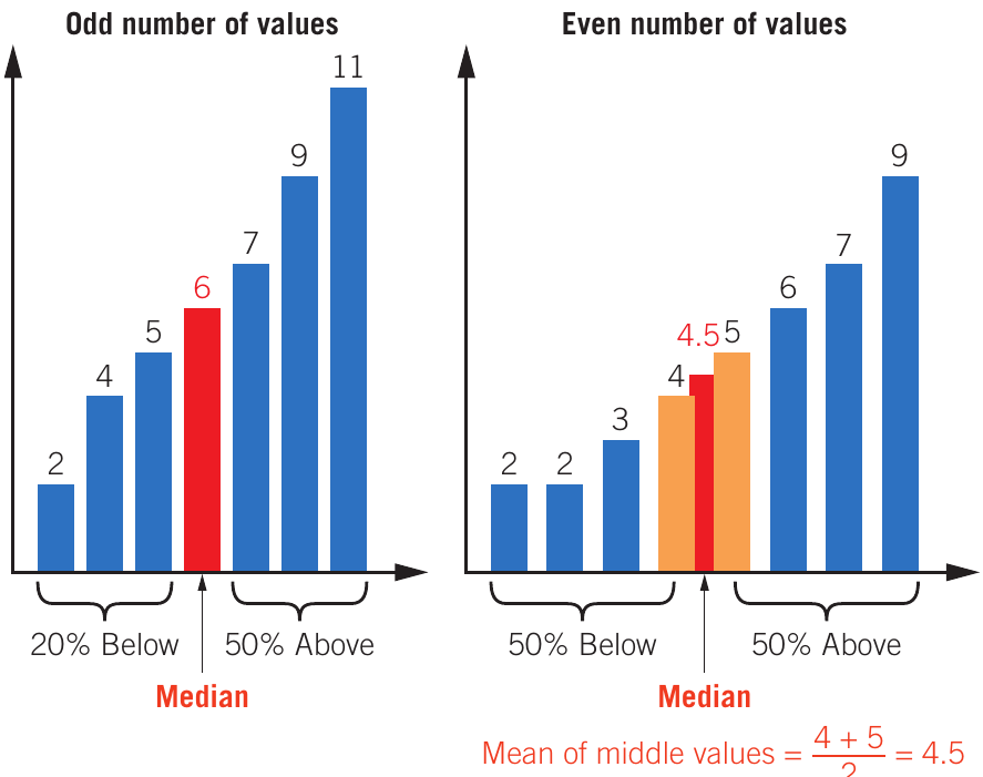
Median
The median is the middle value in an ordered dataset. It splits the data in half, with equal numbers of values above and below.
To find the median:
- Arrange values in increasing or decreasing order
- If odd number of values: select the middle value
- If even number of values: calculate the mean of the two middle values
When to use the median:
- Data contains outliers
- Distribution is skewed
- You want a value that truly represents the centre
The median is not affected by extreme values, making it more robust than the mean in certain situations.
Mode
The mode is the value that occurs most frequently in a dataset. It represents the most common value.
Key points about mode:
- A dataset can have more than one mode (if multiple values share the highest frequency)
- A dataset may have no mode (if no value repeats)
- Particularly useful for categorical data
Choosing the appropriate measure
Different measures suit different data types:
| Type of data | Mean | Median | Mode |
|---|---|---|---|
| Qualitative data, including categorical data | ✔ | ||
| Quantitative data that is continuous with a symmetrical distribution | ✔ | ✔ | ✔ |
| Quantitative data that is continuous with a skewed distribution | ✔ | ||
| Data with outliers or small data sets | ✔ | ✔ |
Choosing the correct measure of central tendency is crucial for accurate data interpretation. Using the wrong measure can lead to misleading conclusions about your data.
Standard deviation as a measure of variability
Measures of variability are statistics that describe how data is distributed. The standard deviation is one such measure, showing the spread of data around the mean.
The standard deviation indicates:
- How close data values lie to the average
- How spread out the values are
- How much values vary from one another
The standard deviation uses the same unit of measurement as the original data. For example, if recording time in minutes, standard deviation is also in minutes.
Interpreting standard deviation
When comparing datasets:
- Smaller standard deviation = values are close together, small spread
- Larger standard deviation = values are further apart, large spread
| Sample A | Sample B | Sample C |
|---|---|---|
| Mean weight: 25 kg | Mean weight: 25 kg | Mean weight: 25 kg |
| Standard deviation: 0 kg | Standard deviation: 4.1 kg | Standard deviation: 12.1 kg |
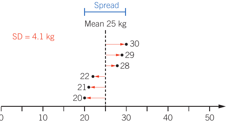
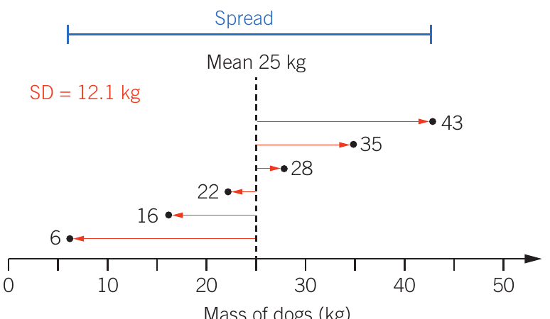
Worked Example: Interpreting Standard Deviation
Sample A: All dogs weigh exactly 25 kg, so no variation exists (SD = 0 kg)
Sample B: Dogs weigh 20, 21, 22, 28, 29, 30 kg. Values are close to the mean, creating a small spread (SD = 4.1 kg)
Sample C: Dogs weigh 6, 16, 22, 28, 35, 43 kg. Values are far from the mean, creating a large spread (SD = 12.1 kg)
Even though all three samples have the same mean weight, the standard deviation reveals how consistent the weights are within each sample.
Interpreting results tables
When analysing tables in examinations, follow these steps systematically:
Steps for Table Analysis:
- Read column and row labels carefully, including units
- Identify the independent variable (IV) and dependent variable (DV)
- Read each row separately to see trends as the IV changes
- Read each column separately to see how each IV level affects the DV
- Determine overall findings and patterns
Worked Example: Analysing a Results Table
| Hours of sleep | 7 | 6 | 5 | 4 | 3 | 2 |
|---|---|---|---|---|---|---|
| Mean time taken (min) | 6 | 6 | 6.2 | 6.5 | 7 | 8.2 |
| Percentage of errors | 11 | 13 | 18 | 26 | 36 | 50 |
Analysis:
- Independent variable: Hours of sleep
- Dependent variables: Time taken and error percentage
- Trend: As sleep hours decrease from 7 to 2, both task completion time and error percentage increase
- Key finding: 2 hours of sleep resulted in the poorest performance (8.2 minutes and 50% errors)
- Conclusion: Sleep deprivation negatively affects both speed and accuracy
Organising and presenting data
Large amounts of data are too complex to explain as text. Summary statistics are therefore presented in tables, graphs, and charts for easy visual interpretation.
Tables
Tables organise data and summary statistics to clearly compare results between groups. They are used when showing precise values is more important than displaying trends.
When to use tables:
- Data cannot be presented in one or two sentences
- Precise values need to be highlighted
- Quick comparison is needed
When NOT to use tables:
- The same data is also presented in a graph (avoid duplication)
- Text description would be clearer
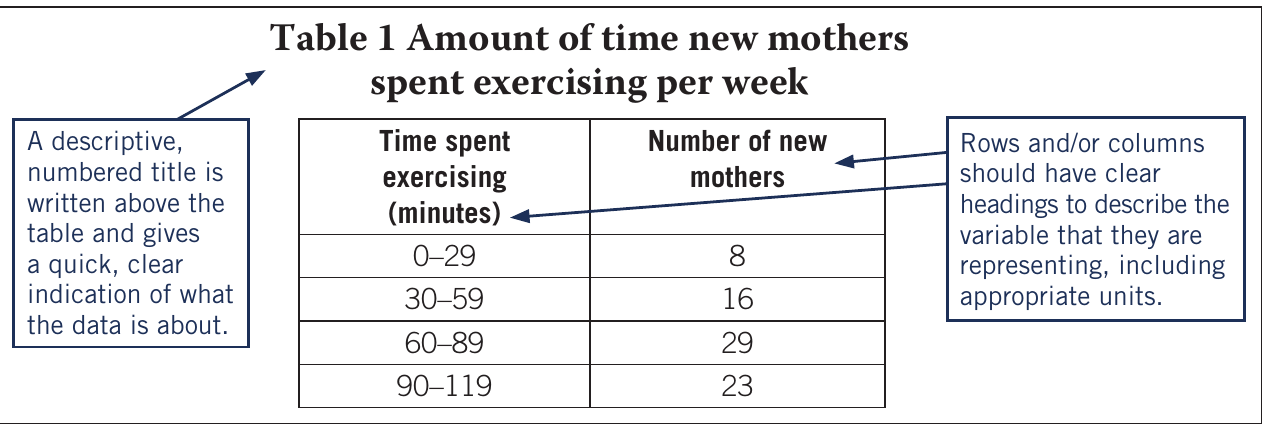
Features of effective tables
An effective table should include:
- Descriptive, numbered title above the table indicating what the data represents
- Clear headings for rows and columns describing each variable
- Appropriate units included in headings
- Organised structure that facilitates easy comparison
Charts and graphs
Charts and graphs organise and present data to show trends, patterns, relationships, and overall pictures rather than exact values. They should not duplicate information from tables.
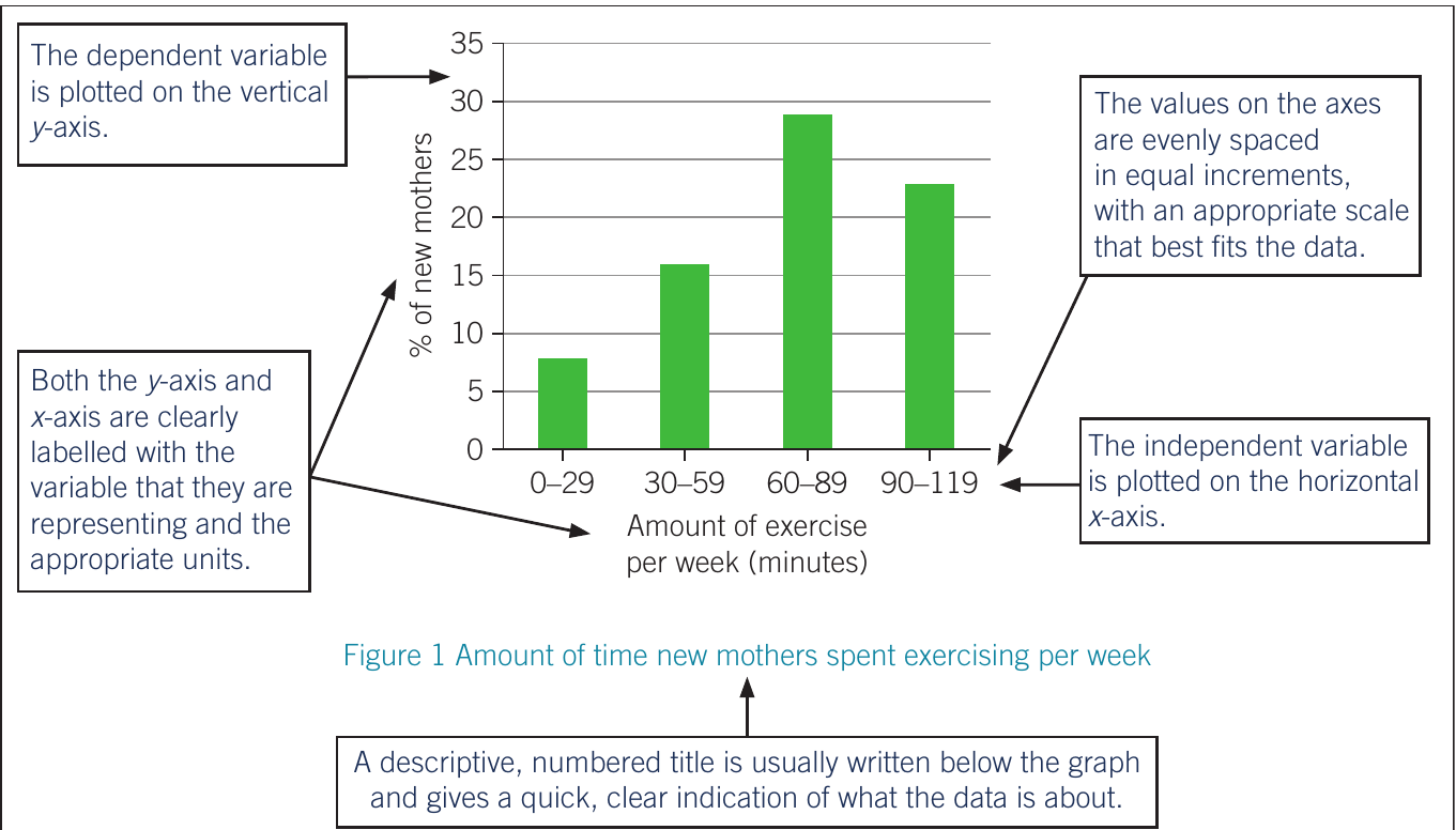
Features of effective graphs
An effective graph should include:
- Descriptive, numbered title (usually below the graph)
- Clearly labelled axes with variables and appropriate units
- Evenly spaced scale with equal increments that fit the data
- Dependent variable on the vertical y-axis
- Independent variable on the horizontal x-axis
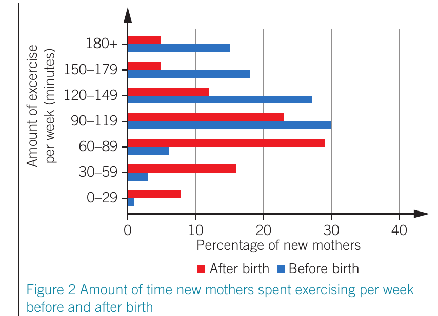
- Legend or key when displaying multiple data sets
Critical Graph Elements
Always ensure your graphs have:
- The dependent variable on the y-axis (vertical)
- The independent variable on the x-axis (horizontal)
Reversing these is a common mistake that makes the graph difficult to interpret correctly.
Bar charts
Bar charts display data with discrete categories. Bar height represents the measured value for each category.
Characteristics of bar charts:
- Bars can be vertical or horizontal
- Bars should not touch (representing separate categories)
- Can include grouped or stacked data for subcategories
- Best for data with larger differences between categories
When to use bar charts:
- Comparing discrete categories
- Showing data with distinct groups
- Highlighting differences between categories
Bar charts are ideal when your data represents separate, distinct categories rather than continuous values.
Line graphs
Line graphs display numerical, continuous data. The line shows how one data point continues to the next, estimating values between measured points.
Characteristics of line graphs:
- Show continuous data
- Track changes over time
- Visualise overall trends and patterns
- Can display multiple datasets using different lines
When to use line graphs:
- Data is continuous
- Tracking changes over time
- Comparing trends between groups
- Small changes need to be visible
Line graphs are particularly useful for time-series data where you want to show how a variable changes continuously.
Interpreting graphs
When interpreting graphs, follow these systematic steps:
Graph Interpretation Process:
- Examine labels on both axes, including any legend or key
- Check the scale – different scales can make the same data appear very different
- Identify patterns for individual variables or categories
- Compare across groups by focusing on specific data series
- Consider context – what do the patterns mean?
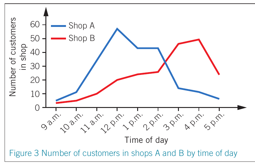
Analysing Complex Graphs
For complex graphs with multiple variables, analyse systematically:
- Look at one colour/category at a time to identify trends
- Compare all categories within a single group
- Note the overall patterns and relationships
Breaking down complex graphs into smaller parts makes interpretation more manageable and reduces errors.
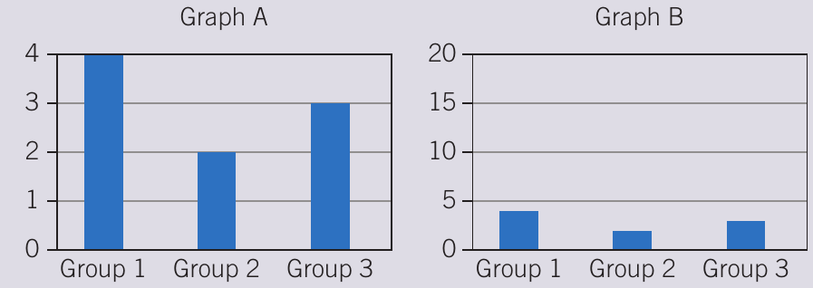
The Scale Matters!
The graphs above show identical data, but Graph A (with y-axis 0-4) makes differences appear much larger than Graph B (with y-axis 0-20).
Always check the scale when interpreting graphs – misleading scales can dramatically change how data appears, even though the actual values haven't changed.
Key Points to Remember:
- Correlation does not equal causation – variables can be related without one causing the other
- Primary data is collected first-hand; secondary data comes from other sources
- Qualitative data describes characteristics; quantitative data uses measurable values
- Percentages allow fair comparison between different sample sizes
- The three measures of central tendency are:
- Mean (average)
- Median (middle value)
- Mode (most frequent value)
- Standard deviation shows data spread – smaller SD means values are closer together
- Tables show precise values; graphs show trends and patterns
- Bar charts display discrete categories; line graphs display continuous data
- Always check graph scales and labels carefully when interpreting data