Maths Skills 2 (OCR A-Level Biology A): Revision Notes
Maths Skills 2
Introduction
This chapter covers advanced mathematical skills required for A-Level Biology, focusing on two main areas:
- Using logarithms and log graphs to display and analyse data
- Applying statistical methods to analyse experimental results
These skills build upon the mathematical foundation established in Chapter 18 of OCR A Level Biology 1 Student's Book.
Variables in biological investigations
In all biological investigations, different types of variables are identified, measured or controlled. Understanding these categories is essential for experimental design and data analysis.
Independent variable – This is the variable you deliberately manipulate during your investigation. You select its range and the specific values to test. For example, when investigating photosynthesis, you might choose different light intensities or carbon dioxide concentrations as your independent variable. The independent variable is always plotted on the x-axis of a graph. Some investigations may have more than one independent variable.
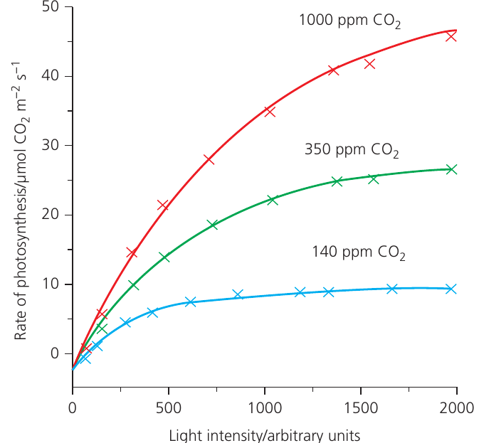
Dependent variable – This is the variable you count or measure in response to changes in the independent variable. It represents the outcome or result of your investigation. For instance, you might measure the rate of photosynthesis or the biomass of organisms. Multiple dependent variables can be recorded in a single investigation.
When graphing results with two dependent variables, use a primary y-axis on the left and a secondary y-axis on the right, ensuring you label each axis clearly and match data points to the correct axis.
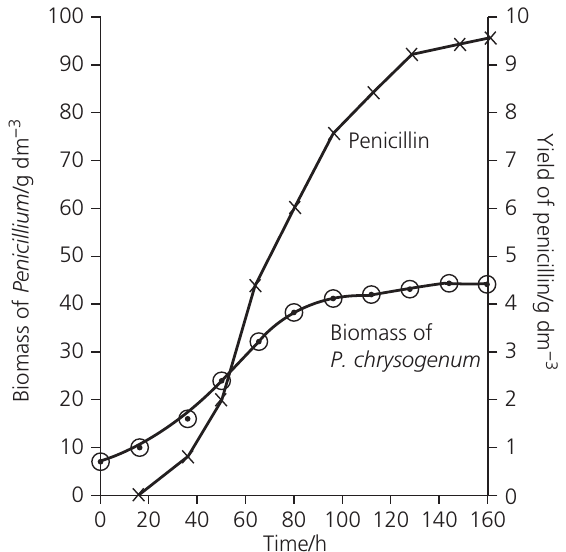
Derived variable – This is a variable calculated from your collected results rather than directly measured. For example, rates of respiration or photosynthesis are often derived variables. You might collect data on bubble movement or gas volume over time, then calculate the rate from these measurements. Derived variables frequently appear as the final output in investigations.
Controlled variable – Any variable kept constant throughout an investigation to ensure a fair test. For example, temperature might be controlled when investigating the effect of light intensity on photosynthesis. Controlled variables prevent confounding factors from affecting your results.
Common Mistake to Avoid:
Students often confuse dependent and independent variables. Remember:
- Independent variable = what YOU change (x-axis)
- Dependent variable = what YOU measure (y-axis)
- Controlled variables = what you KEEP THE SAME
Logarithms and log graphs
When to use logarithmic scales
Logarithmic scales become necessary when your independent or dependent variable covers an extremely wide range, making it difficult to plot data on standard linear graph paper. A logarithmic scale uses intervals that increase by an order of magnitude (), allowing you to display data spanning several powers of ten.
Common situations requiring logarithmic scales include:
- Plant hormone concentrations ranging from to
- Microorganism population growth, which increases exponentially
- Serial dilution experiments
When the values are exact orders of magnitude (e.g., , , , , ), these are plotted equidistant on the axis. Intermediate values are accommodated between these major divisions.
Understanding log graph paper
Log graph paper consists of cycles, where each cycle represents one order of magnitude. For example:
- to = one cycle
- to = one cycle
- to = one cycle
A key feature of logarithmic scales is that the physical distance between 10 and 100 equals the distance between 1 and 10, even though the numerical difference is much larger in the former case.
Plotting data on log graphs
You have two options for creating log graphs:
- Direct plotting – Plot your raw data directly onto log graph paper
- Calculate logarithms first – Convert your data to logarithms (base 10), then plot on standard linear graph paper
The second method is demonstrated in the following example using bacterial growth data.
Converting between logs and actual numbers
To convert from a logarithm back to the actual number:
- Use the button on your calculator, where is the logarithm value
- In Excel, enter
=Power(10,A1)where A1 contains the logarithm
This conversion is essential when extrapolating from log graphs to predict future values, such as pest populations in crop protection.
Example: Straightening the curve
When bacterial populations grow under ideal conditions (adequate nutrients, optimal temperature, no limiting factors), they exhibit exponential growth, with the population doubling at regular intervals.
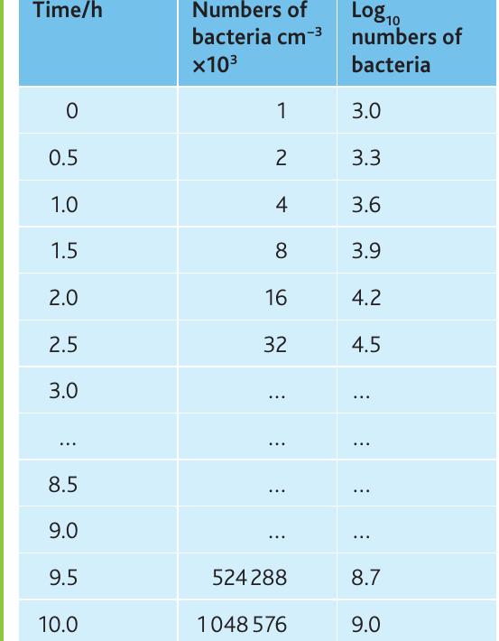
The table shows bacterial growth over ten hours, with the population doubling every 30 minutes. When plotted on standard linear graph paper, exponential growth produces a characteristic J-shaped curve that makes early changes difficult to see and extrapolation challenging.
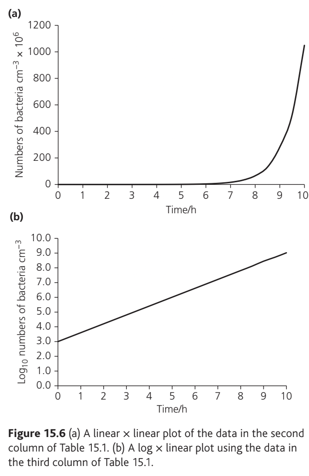
Worked Example: Straightening the Exponential Curve
Converting the data to logarithms (base 10) and replotting produces a straight line, which:
- Makes the exponential nature of growth visible across the entire time period
- Allows easier and more accurate extrapolation
- Reveals any deviations from exponential growth
This transformation from a curve to a straight line is called "straightening the curve" and is a powerful analytical technique.
Types of data
Understanding data types is crucial for selecting appropriate display methods and statistical tests. Data can be classified as either qualitative or quantitative.
Qualitative data
Qualitative data describe characteristics that cannot be measured numerically. They fall into two categories:
Categoric (nominal) data – These place observations into distinct categories with no inherent order. Examples include:
- Different phenotypes in genetic studies (e.g., tall vs dwarf plants)
- Presence or absence of roots on cuttings
- Different species or taxa
Display methods: Bar charts, pie charts
Ordered (ordinal) data – These have a ranking or order but lack precise numerical intervals. Examples include:
- Abundance scales in fieldwork (ACFOR, DAFOR scales)
- Arbitrary scales from to
- Ratings or grades
Display methods: Bar charts
Quantitative data
Quantitative data consist of numerical measurements and can be further divided:
Continuous data – These can take any value within a range and are measured using instruments. Examples include:
- Rates of respiration, photosynthesis, or enzyme-catalysed reactions (e.g., , , )
- Length, height, mass, temperature
- Concentrations
Display methods: Line graphs, histograms, or bar charts depending on the independent variable
Discrete data – These consist of whole numbers (integers) only and are obtained by counting. Examples include:
- Number of heartbeats per minute
- Number of plants in a quadrat
- Number of offspring with particular phenotypes
Display methods: Bar charts, histograms, or line graphs depending on the investigation
The table below summarises these data types:
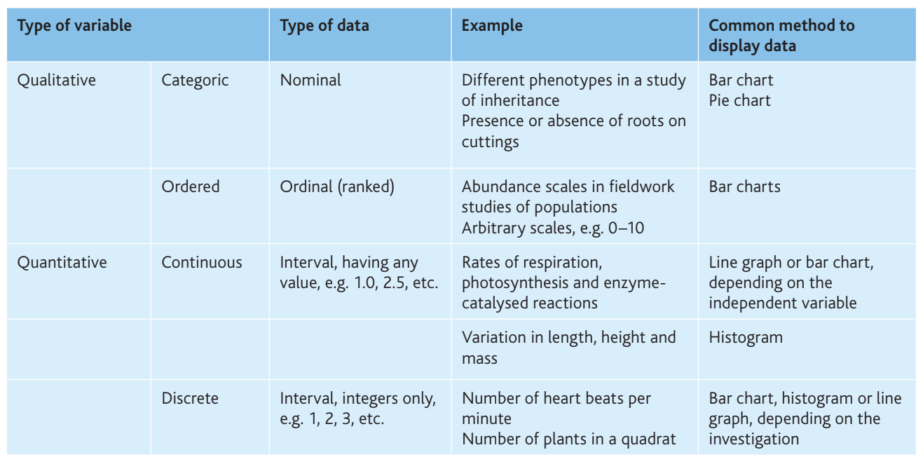
Key Points to Remember:
- Qualitative data = descriptive, non-numerical (categoric or ordered)
- Quantitative data = numerical measurements (continuous or discrete)
- Continuous data = any value within a range (measured)
- Discrete data = whole numbers only (counted)
- Data type determines which graphs and statistical tests are appropriate
Descriptive statistics
Descriptive statistics summarise and simplify data to make it more interpretable. They include measures of central tendency (mean, mode, median) and measures of dispersion (range, standard deviation).
Measures of central tendency
- Mean () – The arithmetic average, calculated by summing all values and dividing by the number of observations
- Mode – The most frequently occurring value
- Median – The middle value when data are arranged in order
For biological data, the mean is most commonly used and reported.
Standard deviation
Standard deviation (SD) quantifies the spread or dispersion of data around the mean. A small standard deviation indicates that data points cluster tightly around the mean, while a large standard deviation shows greater variability.
Key properties of standard deviation:
- Approximately 64% of values lie within SD of the mean
- Approximately 95% of values lie within SD of the mean
- Approximately 99.7% of values lie within SD of the mean
Standard deviation can be used to plot error bars on graphs. Draw error bars as a ⊥ symbol above and below the mean, with each bar extending one SD from the mean.
Standard error of the mean
Standard error of the mean (SEM) provides information about the precision of the sample mean as an estimate of the population mean. Unlike standard deviation, which describes the variability within your sample, SEM indicates how confident you can be that your sample mean reflects the true population mean.
The formula for calculating SEM is:
where SD is the standard deviation and is the number of observations.
A smaller SEM indicates greater confidence in the relationship between the sample mean and population mean.
95% confidence intervals
The 95% confidence limits (95% CL) define a range within which we can be 95% certain that the true population mean lies. They are calculated using:
The confidence interval is the difference between the upper and lower confidence limits. These confidence limits provide the best measure of uncertainty for error bars on graphs and are superior to standard deviation for comparing different data sets.
Worked example: Photosynthesis rates
An investigation measured the rate of photosynthesis in Canadian pondweed (Elodea canadensis) under blue and green light. The investigation was replicated ten times.
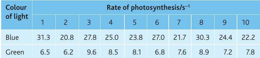
Worked Example: Calculating Confidence Intervals
Blue light:
- Mean =
- Standard deviation = (to 1 dp)
- SEM =
- 95% CL =
Green light:
- Mean =
- Standard deviation = (to 1 dp)
- SEM =
- 95% CL =
These confidence limits are added to and subtracted from the means to give upper and lower limits, which can be plotted as error bars.
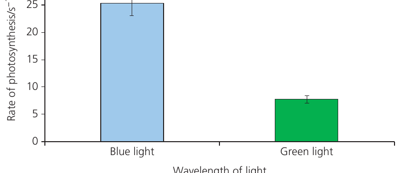
Interpreting error bars
When comparing two sets of data using 95% confidence limit error bars:
- If error bars do not overlap – The difference between means is likely statistically significant
- If error bars overlap – The difference between means is definitely not statistically significant
Critical Point:
When error bars do not overlap, you cannot be certain of significance without performing a statistical test. Non-overlapping error bars suggest significance but don't prove it.
Statistical tests
Biological data are inherently variable due to genetic differences, environmental factors, and measurement uncertainty. Statistical tests allow us to determine whether observed differences or relationships are likely due to real biological effects or simply chance variation.
Types of investigations requiring statistical tests
Biological investigations at A-Level typically fall into four categories:
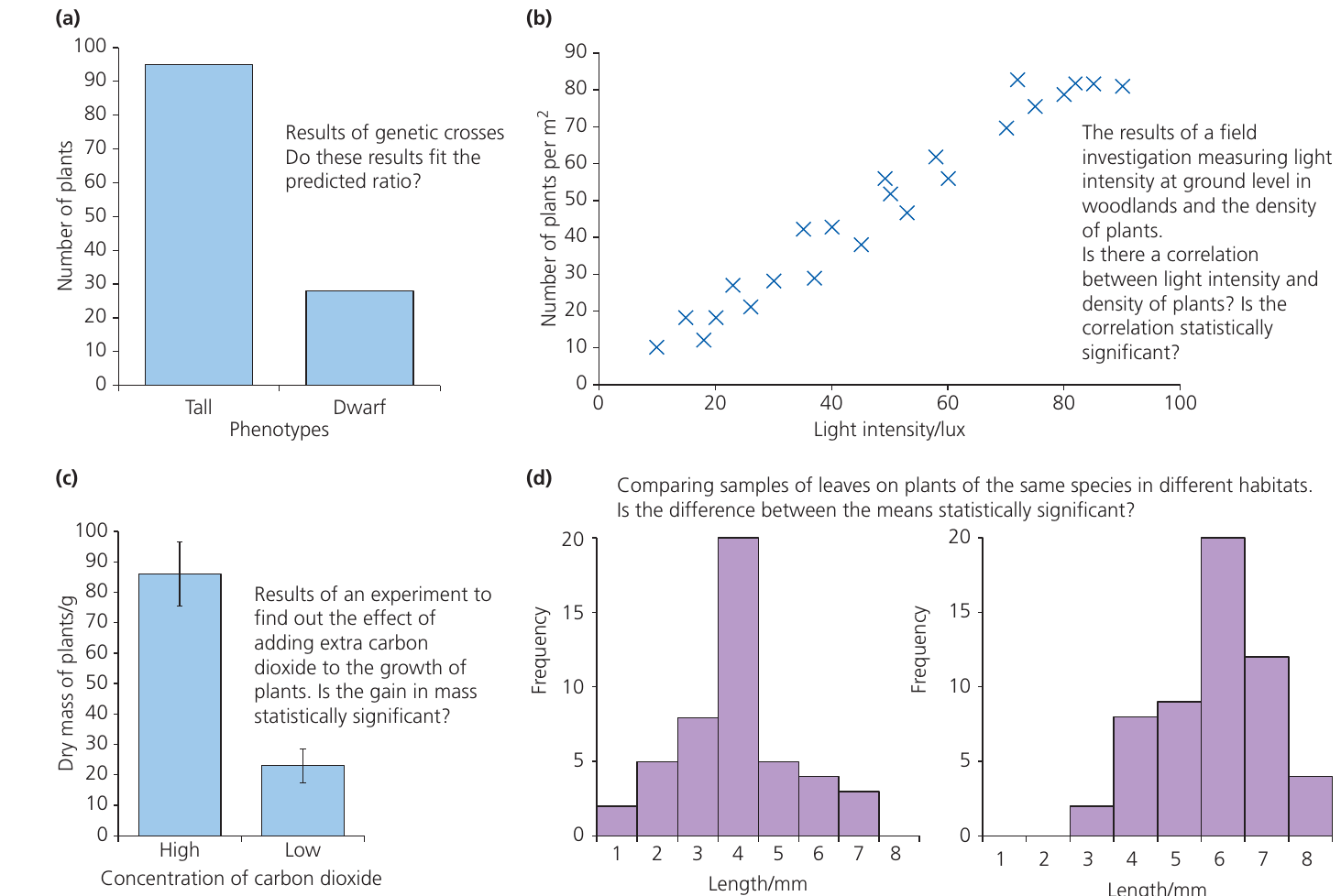
- Comparing observed vs expected results (e.g., genetic ratios) – Use chi-squared test
- Testing for correlation between two variables (e.g., light intensity and plant density) – Use Spearman's rank correlation test
- Comparing means of two samples (e.g., plant growth under different conditions) – Use Student's t-test
- Comparing distributions (e.g., leaf lengths in different habitats) – Use Student's t-test
The chi-squared () test
The chi-squared test is a "goodness-of-fit" test that determines whether observed results differ significantly from expected results. It is exclusively used with categoric data.

When to use the chi-squared test:
- Data are categoric (nominal or ordinal)
- You can predict expected outcomes from theory (e.g., Mendelian ratios) or by assuming random distribution
- All expected values are 5 or greater
- Working with actual counts, not percentages
Do not use if:
- Data are not categoric
- Any expected value is less than 5
- Data have been converted to percentages
Formula:
where means sum of, is the observed value, and is the expected value.
Steps for performing a chi-squared test:
- Identify the inheritance pattern – Determine if it's monohybrid, dihybrid, sex-linked, etc.
- Determine the expected ratio – Use genetic theory to predict the expected ratio (e.g., 3:1, 9:3:3:1, 1:1:1:1)
- Write a null hypothesis – For example: "There is no significant difference between the observed and expected results"
- Create a chi-squared table with six columns:
- Category
- Observed (O)
- Expected (E)
- Complete the table:
- Calculate expected values using the predicted ratio
- Calculate the difference () for each category
- Square each difference to remove negative signs
- Divide each squared difference by the expected value
- Sum the final column to obtain
- Calculate degrees of freedom: df = number of categories
- Find the critical value at for your degrees of freedom using Table 15.4
- Compare your calculated with the critical value:
- If : Reject null hypothesis (significant difference)
- If : Accept null hypothesis (no significant difference)
- Write a conclusion stating:
- The calculated value
- The critical value
- Whether you accept or reject the null hypothesis
- What this means for the biological principle being tested
Interpreting probability values:
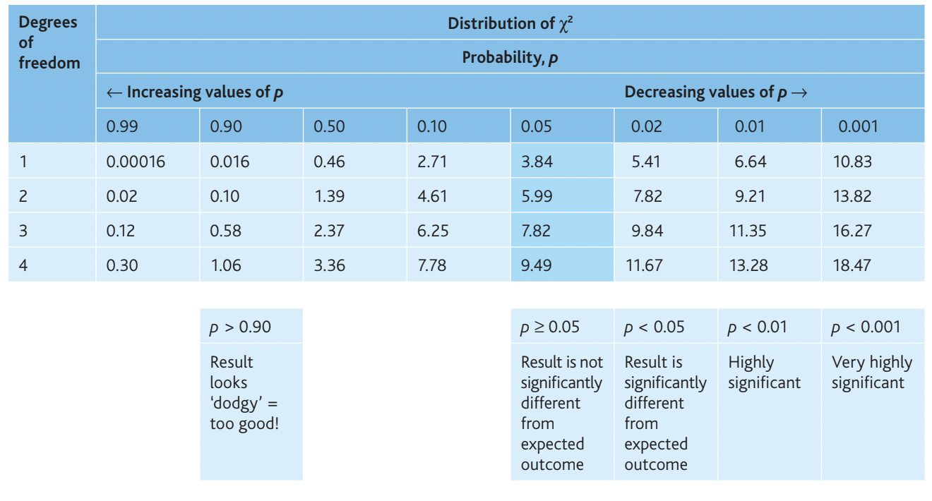
- – Result looks suspicious (too good to be true)
- – No significant difference from expected
- – Significantly different from expected
- – Highly significant difference
- – Very highly significant difference
Example: Fruit fly wing length

Pure-breeding fruit flies with long wings were crossed with pure-breeding flies with vestigial (very small) wings. All F₁ offspring had long wings. The F₁ flies were then interbred.
F₂ results:
- Long wings: 390
- Vestigial wings: 114
- Total: 504
Expected ratio: 3:1 (from monohybrid inheritance)
Null hypothesis: There is no significant difference between observed and expected numbers.
Expected values:
- Long wings:
- Vestigial wings:
Worked Example: Chi-Squared Calculation
Calculation:
Degrees of freedom:
Critical value (at , df = 1):
Conclusion: The calculated value () is less than the critical value (), so we accept the null hypothesis. The results are not significantly different from the 3:1 ratio predicted by Mendelian inheritance. The probability is between and ( but ), meaning this result could easily occur by chance through random fertilisation.
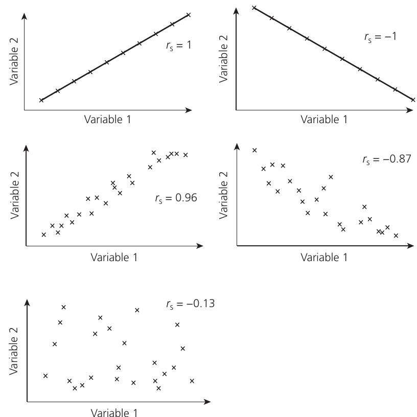
Spearman's rank correlation test
The Spearman's rank correlation coefficient () measures the strength and direction of association between two variables. It can be used with both ordinal and interval data, and the relationship does not need to be linear.
When to use Spearman's rank correlation test:
- Data points within samples are independent of each other
- Data are paired (e.g., soil moisture and plant abundance at the same sampling stations)
- You have ordinal or interval data
- A scattergraph suggests a possible increasing or decreasing relationship (but not one that increases then decreases)
- Between 5 and 30 paired observations (though more is acceptable)
- Individuals selected randomly from a population
Formula:
where is the sum of squared differences between ranks and is the number of pairs of observations.
Steps for performing Spearman's rank correlation test:
- Plot a scattergraph to visually assess whether a correlation may exist. The relationship could be positive, negative, or absent.
- Write a null hypothesis – Usually: "There is no significant correlation between [variable 1] and [variable 2]"
- Rank each data set – Assign rank 1 to the largest value in each set. If you prefer, rank from smallest to largest, but remain consistent across both data sets. For tied values, assign the average of the ranks they would have occupied.
- Calculate the difference () between ranks for each pair by subtraction
- Square each difference to give , removing negative signs
- Sum all values to calculate
- Calculate by substituting and into the formula
- Interpret the value of :
- indicates perfect positive correlation
- indicates perfect negative correlation
- indicates no correlation
- Intermediate values show the strength of correlation
- The sign (+ or −) indicates direction; ignore the sign when comparing to critical values
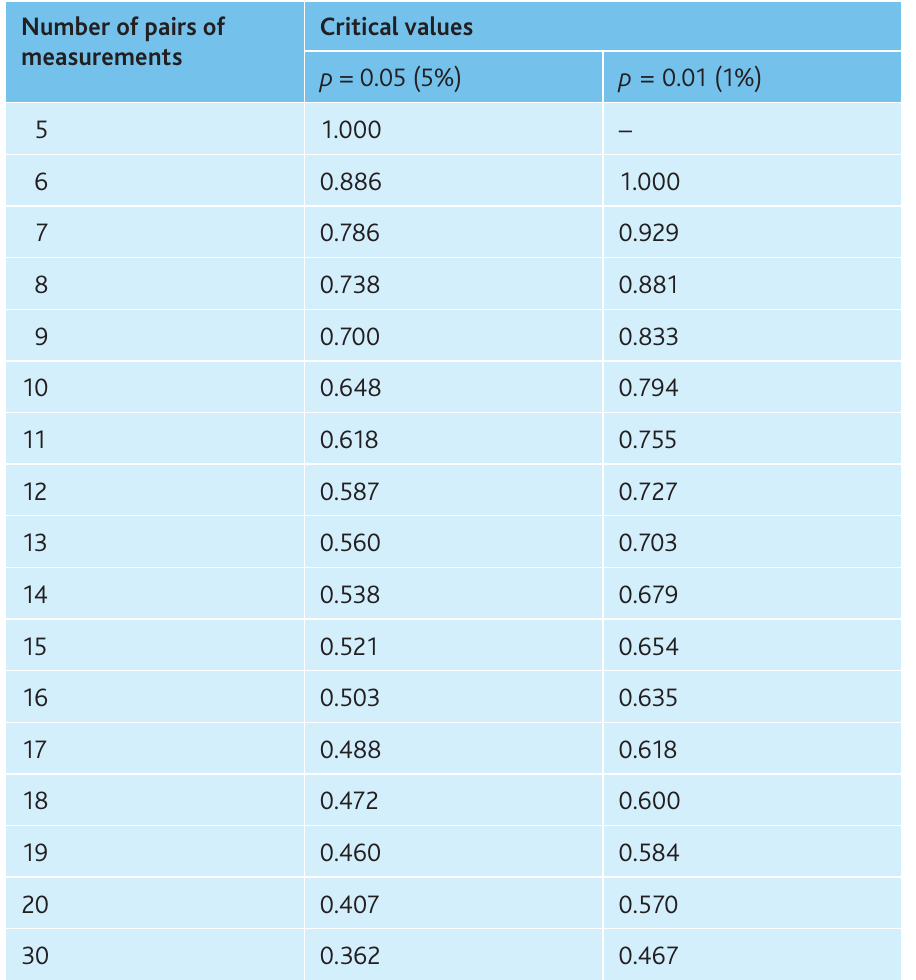
- Find the critical value at for your number of paired measurements:
- Compare with the critical value (ignore the sign):
- If critical value: Reject null hypothesis (significant correlation)
- If critical value: Accept null hypothesis (no significant correlation)
- Write a conclusion including:
- Type of correlation (positive or negative)
- Strength of correlation (the value)
- Statistical significance level
- Remember: correlation does not prove causation
Example: Dissolved solids and macroinvertebrate diversity
Researchers investigated whether total dissolved solids (TDS) correlate with macroinvertebrate diversity in the River Wye by sampling 13 stations.
Null hypothesis: There is no significant correlation between total dissolved solids and the number of macroinvertebrate taxa.
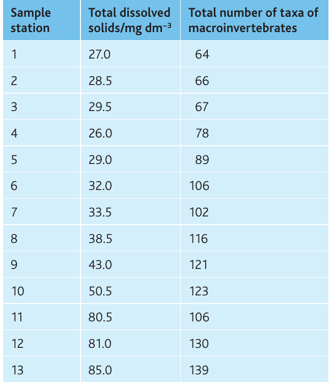
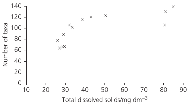
The scattergraph shows a clear positive relationship, suggesting correlation is likely.
Ranking and calculations:
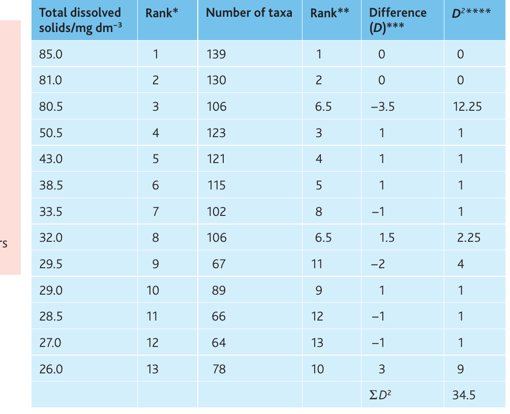
Worked Example: Spearman's Rank Correlation
Calculation:
Critical value (13 pairs, ):
Critical value ():
Conclusion: The calculated value () exceeds both the 5% and 1% critical values. We reject the null hypothesis and conclude there is a statistically significant positive correlation (strength = ) at between total dissolved solids and macroinvertebrate diversity.
Important: This test demonstrates correlation but does not prove that dissolved solids cause increased diversity. Other factors associated with TDS might be responsible.
Student's t-test for unpaired data
The t-test for unpaired data determines whether the means of two independent samples differ significantly. It assumes both samples show normal (bell-shaped) distribution.
When to use Student's t-test for unpaired data:
- Interval data collected from two separate populations
- Both data sets show approximately normal distribution
- Sample sizes are relatively small (typically < 30 in each sample)
- Sample sizes may differ between the two groups
- You want to determine if a difference exists between population means
Formula:
where and are the sample means, and are the standard deviations, and and are the sample sizes.
Degrees of freedom:
Steps for performing Student's t-test for unpaired data:
- Write a null hypothesis – Usually: "There is no significant difference between the mean of [sample X] and the mean of [sample Y]"
- Calculate the mean of each data set
- Calculate the standard deviation for each data set
- Square the standard deviations to get
- Apply the formula:
- Find the absolute difference between means (ignore the sign)
- Square each SD and divide by the corresponding sample size
- Add these two results and take the square root
- Divide the difference in means by this result to obtain
- Calculate degrees of freedom using the formula above
- Find the critical value at for your degrees of freedom using Table 15.10
- Compare calculated with critical value:
- If : Reject null hypothesis (significant difference)
- If : Accept null hypothesis (no significant difference)
- Write a conclusion stating:
- The calculated value
- Whether you accept or reject the null hypothesis
- The probability level
- What this means biologically
Example: Limpet shell shape variation

Students investigated variation in the common limpet (Patella vulgata) on exposed and sheltered shores. They randomly sampled 10 limpets from each location and calculated length:height ratios.
Null hypothesis: There is no significant difference between length:height ratios on sheltered and exposed shores.
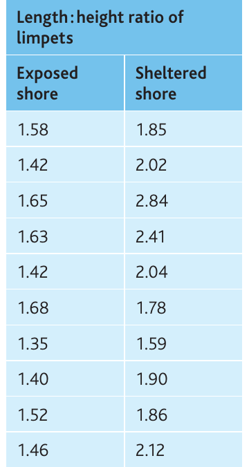
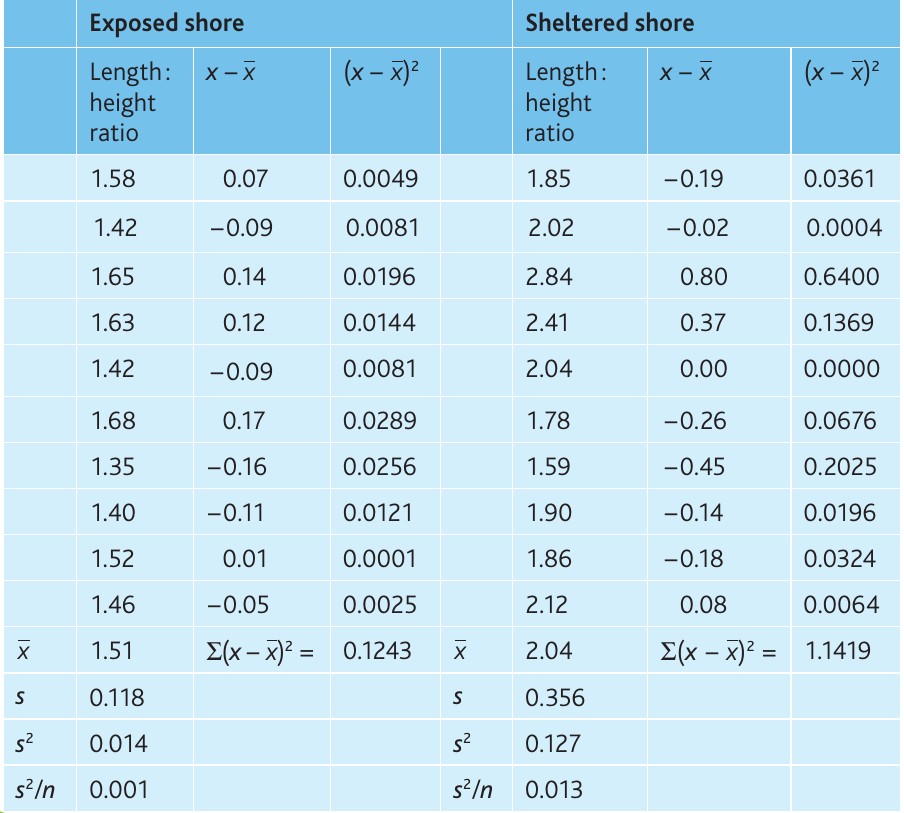
Worked Example: Unpaired t-test Calculation
Calculations:
From the table:
Degrees of freedom:
Critical value (18 df, ):
Conclusion: The calculated value () exceeds the critical value (), so we reject the null hypothesis. There is a statistically significant difference () between the length
ratios of limpets on exposed and sheltered shores. We are more than 95% confident this difference is real and not due to chance.Student's t-test for paired data
The t-test for paired data is used when two measurements are taken from the same individuals, such as before-and-after studies. This test accounts for individual variation between subjects.
When to use Student's t-test for paired data:
- Two sets of interval data collected from the same individuals
- Before-and-after comparisons (e.g., effect of exercise on heart rate)
- Matched pairs or repeated measures designs
Formula:
where is the mean of the differences, is the standard deviation of differences, and is the number of individuals.
Degrees of freedom:
Steps for performing Student's t-test for paired data:
- Write a null hypothesis – For example: "There is no significant difference between [measurement before] and [measurement after]"
- Calculate the difference between paired measurements for each individual
- Calculate the mean difference ()
- Calculate the standard deviation of the differences ()
- Apply the formula to calculate
- Calculate degrees of freedom ()
- Find the critical value at for your degrees of freedom
- Compare calculated with critical value and draw conclusions as before
Example: Effect of exercise on heart rate
A student investigated how skipping affects heart rate. Ten volunteers of similar age, sex, BMI and fitness wore heart rate monitors, and their pulse was recorded before and after 30 seconds of skipping.
Null hypothesis: There is no significant difference between heart rates before and after exercise.
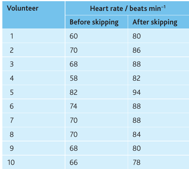
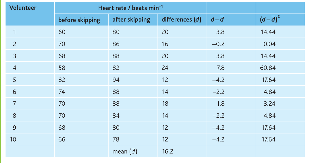
Worked Example: Paired t-test Calculation
Calculations:
- Mean difference () = beats per minute
- Standard deviation () =
Degrees of freedom:
Critical value (9 df, ):
Conclusion: The calculated value () far exceeds the critical value (), so we reject the null hypothesis. There is a highly significant difference () between heart rates before and after skipping exercise.
Choosing the appropriate statistical test
Selecting the correct statistical test depends on your data type and research question. Use this decision framework:
Decision criteria
1. For categoric data:
- Use chi-squared test only
- Compares observed data with predicted or expected values
- Common in genetics experiments testing Mendelian ratios
2. For comparing means of two samples:
- Use Student's t-test if both datasets show normal distribution
- Choose unpaired t-test when data come from two different populations
- Choose paired t-test when two measurements come from the same individuals
3. For investigating correlation:
- Use Spearman's rank correlation test
- Works with ordinal or interval data
- Determines if two variables are associated
Summary table
| Research Question | Data Type | Statistical Test |
|---|---|---|
| Do observed results match predicted ratios? | Categoric | Chi-squared test |
| Are two population means different? | Interval (normal distribution) | t-test for unpaired data |
| Do before/after measurements differ? | Interval (same individuals) | t-test for paired data |
| Are two variables correlated? | Ordinal or interval | Spearman's rank correlation |
General Advice:
If you encounter data requiring statistical analysis but are unsure which test to use, state: "These data should be analysed using an appropriate statistical test to determine if the results are statistically significant."
Always calculate and report descriptive statistics (mean, standard deviation, standard error of the mean, 95% confidence limits) before applying inferential tests.
Remember!
Key Points to Remember:
-
Variables: Distinguish between independent (manipulated), dependent (measured), derived (calculated), and controlled (kept constant) variables in all investigations
-
Logarithmic scales are essential when data span multiple orders of magnitude; they transform exponential curves into straight lines for easier analysis and extrapolation
-
Data types determine which statistical tests and display methods are appropriate – categoric data require different approaches than interval data
-
Descriptive statistics (mean, SD, SEM, 95% CL) summarise data and quantify uncertainty; 95% confidence limits provide the best error bars for graphs
-
Chi-squared test determines if observed categoric data match expected values; compare calculated to critical values at
-
Spearman's rank correlation measures the strength ( to ) and statistical significance of associations between two variables; correlation does not prove causation
-
Student's t-test compares means of two samples; use the unpaired version for different populations and the paired version for before/after measurements on the same individuals