Quality assurance and control charts (AQA GCSE Statistics): Revision Notes
Sample medians and sample ranges
Quality control charts are powerful tools that help manufacturers monitor their production processes. While we often think about using means to track quality, we can also use sample medians and sample ranges to keep an eye on how well our production is performing.
Understanding control charts with sample medians
When monitoring production quality, the sample median can be just as useful as the sample mean. A control chart for medians works in exactly the same way as one designed for means, but focuses on the middle value of each sample rather than the average.
How median control charts work: For each test period, we calculate the median value of all the items in our sample. This median value is then plotted on our control chart so we can track how it changes over time.
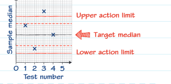
The chart includes several important reference lines that help us make decisions:
Target median: This is our ideal value - where we want our production to be centred. It's shown as a dashed line running through the middle of the chart.
Warning limits: These are set at (plus or minus 2 standard deviations) from the target median. If a sample median falls beyond these limits, it suggests something might be starting to go wrong, but we don't need to stop production yet.
Action limits: These are positioned at (plus or minus 3 standard deviations) from the target median. If any sample median falls outside these limits, we need to take immediate action to investigate and correct the problem.
Control charts for sample ranges
While tracking the median tells us about the centre of our production, we also need to monitor how much our products vary from each other. This is where sample ranges become incredibly valuable.
The range is the difference between the highest and lowest values in each sample. It's much quicker and easier to calculate than the standard deviation, making it practical for regular quality monitoring on busy production lines.
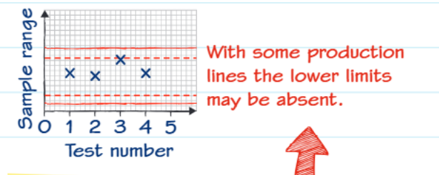
Sample range charts follow the same basic principles as median charts, but there's an important difference: sometimes the lower limit may be completely absent from the chart. This happens because with some production processes, having very little variation (a very small range) isn't actually a problem - it might even indicate that our testing equipment isn't working properly if there's absolutely no variation at all.
Why monitor variability?
Consider a biscuit factory where the average weight might be perfect, but individual biscuits vary dramatically in weight. Some might be much too heavy while others are far too light. Customers wouldn't be happy with this inconsistency, even if the average weight is correct.
Important note: There isn't a simple mathematical relationship between the sample range and the normal distribution like there is with means and medians. This means that the warning and action limits for range charts need to be determined through practical testing rather than theoretical calculations.
Worked example: interpreting range control charts
Worked Example: Interpreting Range Control Charts
Let's look at a practical example from a biscuit factory to understand how these concepts work in real life.
The factory uses a control chart to monitor sample ranges. Looking at the data collected:
Sample weights (in grammes): 15.2, 14.9, 15.3, 15.0, 15.1, 14.9, 15.1
Step 1: Calculate the range for sample 4 To find the range, we subtract the smallest value from the largest value: Range = 15.3 - 14.9 = 0.4 grammes
Step 2: Plot this value on the control chart The calculated range of 0.4 grammes should be plotted at test number 4 on the horizontal axis.
Step 3: Make a decision Looking at the control chart, we can see that all the plotted ranges fall within the warning limits. This means no action is needed - the production process is running within acceptable parameters.
Key insight: Even though it might seem obvious what the answer should be, always show your calculation clearly in exams. This demonstrates your understanding of the process and ensures you get full marks even if you make a small arithmetic error.
Making decisions from control charts
When interpreting control charts for both medians and ranges, follow this decision-making process:
- Within warning limits: Continue normal production - everything is running smoothly
- Between warning and action limits: Monitor more closely and investigate possible causes, but don't stop production yet
- Beyond action limits: Stop production immediately and investigate the cause before continuing
Remember that the purpose of these charts is prevention rather than cure. By catching problems early, we can avoid producing large quantities of defective products.
Key Points to Remember:
-
Sample medians work just like sample means in control charts, helping us monitor the central tendency of our production process
-
Warning limits are set at from the target, while action limits are at from the target
-
Sample ranges monitor variability and are quicker to calculate than standard deviations, making them practical for busy production environments
-
Lower limits may be absent on range charts because minimal variation isn't necessarily a problem in some production processes
-
Always show your calculations clearly in exams, even for seemingly simple range calculations like finding the difference between highest and lowest values