Bar charts and vertical line graphs (AQA GCSE Statistics): Revision Notes
Bar charts and vertical line graphs
Bar charts and vertical line graphs are powerful tools for displaying discrete data in a clear, visual format. They help us understand patterns and make comparisons quickly by transforming numbers from frequency tables into easy-to-read visual displays.
What are bar charts used for?
Bar charts work brilliantly when you need to represent discrete data that comes from tally charts or frequency tables. They're particularly useful for showing qualitative data - information about categories rather than measurements. For example, you might use a bar chart to show different types of trees in a woodland survey or people's favourite shopping destinations.
Qualitative vs Quantitative Data
Qualitative data deals with categories and descriptions (like types of trees, favourite colours, or shopping preferences), while quantitative data deals with numerical measurements (like height, weight, or temperature). Bar charts are specifically designed for qualitative data where each category is distinct and separate.
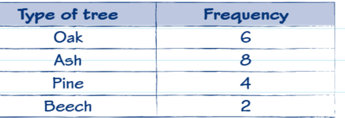
The frequency table above shows the count of different tree types. This discrete data is perfect for creating a bar chart because each tree type is a separate category.
Key rules for constructing bar charts
Essential Rules for Bar Chart Construction
When creating a bar chart, you must follow these critical rules:
Starting your scale: Always begin your vertical axis at zero and increase by equal amounts for each division. This prevents your chart from being misleading.
Bar spacing and width: All bars must be exactly the same width and have equal spacing between them. This maintains visual consistency and makes comparisons fair.
Labelling: Both your horizontal and vertical axes need clear labels. The vertical axis often shows 'Frequency' or 'Number of...', whilst the horizontal axis shows your categories.
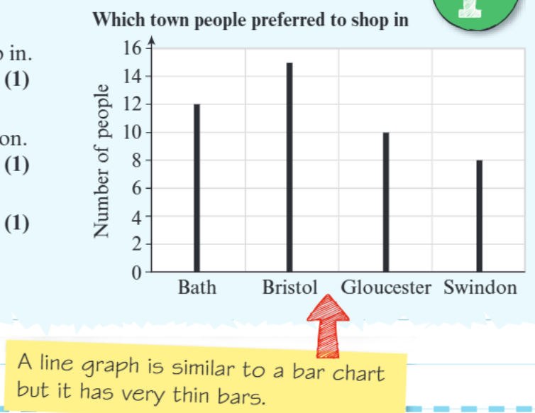
This bar chart demonstrates proper construction with equal bar widths, consistent spacing, and clear axis labels.
Understanding vertical line graphs
A vertical line graph looks very similar to a bar chart, but there's one key difference: the bars are extremely thin, appearing almost like vertical lines. This is why they're sometimes called "stick graphs". Despite looking different, they follow the same construction rules as bar charts.
The image shows how line graphs use very thin bars instead of the wider bars you see in traditional bar charts. Both represent the same type of data in equally valid ways.
Step-by-step worked example
Worked Example: Shopping Preference Analysis
Let's work through a complete example using shopping preference data:
Question: This vertical line graph shows information about which towns people preferred for shopping.
(a) How many people said Bath? Looking at the Bath bar, it reaches up to 12 on the vertical axis. Answer: 12 people
(b) More people preferred Bristol than Swindon. How many more? Bristol shows 15 people, Swindon shows 8 people. Calculation: Answer: 7 more people
(c) How many people were asked altogether? Add all the values: Bath (12) + Bristol (15) + Gloucester (10) + Swindon (8) Calculation: Answer: 45 people
Reading and interpreting data
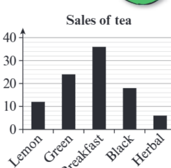
When reading bar charts, always check the scale carefully. In the tea sales example, you can see that breakfast tea has the highest sales at approximately 37 units, whilst herbal tea has the lowest at about 6 units.
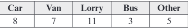
For the vehicle data shown, you would create bars with heights of 8 for cars, 7 for vans, 11 for lorries, 3 for buses, and 5 for others. Remember to start your scale at 0 and use equal intervals.
Common exam tips and traps
Watch Out for These Common Exam Traps
Scale traps: Always check that your scale starts at zero and increases by equal amounts. Exam questions sometimes try to catch you with scales that don't start at zero.
Reading between lines: When a value falls between two grid lines, you need to estimate. For example, if a bar goes up to between 14 and 16, and you need a whole number, choose 15.
Adding all values: When asked for totals, make sure you add up all the individual frequencies - this is a common question type.
Units and labels: Always include proper labels and units where given in the question.
Key Points to Remember:
- Bar charts and vertical line graphs are perfect for displaying discrete, qualitative data from frequency tables
- Always start your vertical scale at zero and use equal intervals throughout
- All bars must have the same width and equal spacing between them
- Both axes need clear, appropriate labels
- Line graphs are just bar charts with very thin bars - they follow the same rules
- When reading values, estimate carefully if the bar falls between grid lines