Multiple and composite bar charts (AQA GCSE Statistics): Revision Notes
Multiple and composite bar charts
What are multiple bar charts?
Multiple bar charts are a powerful way to display data when you need to compare different categories across various groups or time periods. These charts contain more than one bar for each class or category, allowing you to see patterns and trends at a glance.
The key feature of multiple bar charts is that they show several bars side by side for each category. This makes it easy to compare values between different groups within the same time period or category.
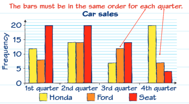
Looking at this car sales example, you can see how three different car manufacturers (Honda, Ford, and Seat) performed across four quarters. Each quarter has three bars representing the different brands, and crucially, the bars must always be in the same order for each category to make comparison meaningful.
Multiple bar charts are particularly useful because they allow you to:
- Compare different groups directly
- Spot trends over time for each group
- Identify which category performs best in each time period
What are composite bar charts?
Composite bar charts (also called compound bar charts) work differently from multiple bar charts. Instead of showing bars side by side, they group several different categories into a single stacked bar. These charts are excellent for showing how different parts make up a whole, and they often display data as percentages.
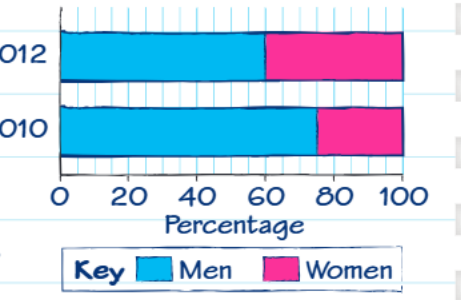
This horizontal composite bar chart shows the gender distribution across two different years. Each bar represents 100% of the population, with different coloured sections showing the proportion of men and women.
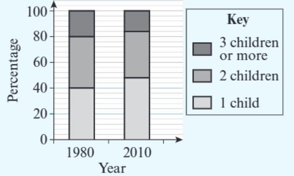
Similarly, this vertical composite bar chart displays family size data, with each bar representing all families and the different sections showing the proportions with 1 child, 2 children, or 3 or more children.
The main advantage of composite bar charts is that they clearly show:
- How parts relate to the whole
- Changes in proportions over time
- The relative size of different categories within each group
However, composite bar charts can be more challenging to read than multiple bar charts, especially when you need to find exact values for categories that don't start at zero.
Worked example: Reading composite bar charts step-by-step
Let's work through a practical example of reading a composite bar chart to find specific information.
Worked Example: Finding Percentage Changes in Composite Bar Charts
Question: The composite bar chart shows the percentages of families with 1, 2, and 3 children in 1980 and 2010. Did the percentage of families with 2 children increase or decrease between 1980 and 2010?
Step 1: Identify what you're looking for We need to find the percentage of families with 2 children in both years, then compare them.
Step 2: Read the values carefully When reading composite bar charts, you need to be very careful about where each section starts and ends. The middle section (2 children) doesn't start at 0, so you need to use subtraction.
For 1980: The "2 children" section runs from 40% to 80% Percentage with 2 children =
For 2010: The "2 children" section runs from 48% to 84%
Percentage with 2 children =
Step 3: Compare and conclude Since , the percentage of families with 2 children decreased between 1980 and 2010.
This example shows why you must read composite bar charts carefully - you can't simply read values directly from the scale unless the section starts at zero.
Key differences between multiple and composite bar charts
Understanding when to use each type of chart is important:
Multiple bar charts are best when:
- You want to compare specific values between different groups
- Each bar represents an independent measurement
- You need to see exact values easily
- You're comparing trends over time for different categories
Composite bar charts are best when:
- You want to show how parts make up a whole
- You're interested in proportions rather than absolute values
- You want to display percentage data
- Space is limited and you need to show multiple categories compactly
Exam tips and common mistakes
When working with these charts in exams, remember these important points:
For multiple bar charts:
- Always check that bars are in the same order across all categories
- Use the key to identify which bar represents which group
- Read values directly from the scale
For composite bar charts:
- Always use the key to identify which section represents what
- Remember to subtract when finding values that don't start at zero
- Be extra careful when sections are in the middle of the bar
- Check whether you're looking at percentages or actual numbers
Common exam trap: Students often read composite bar chart values incorrectly by reading the top of a section rather than calculating the difference. Always remember that for middle sections, you need to subtract the bottom value from the top value.
Key Points to Remember:
- Multiple bar charts show different categories side by side for easy comparison
- Composite bar charts stack categories within single bars to show proportions
- Multiple bar charts are easier to read for exact values
- Composite bar charts require subtraction to find middle section values
- Both types need clear keys to identify what each bar or section represents