Comparative pie charts (AQA GCSE Statistics): Revision Notes
Comparative pie charts
When we need to compare data from groups of different sizes, we use comparative pie charts. These special charts help us make fair comparisons by adjusting the size of each pie chart to reflect the size of the group it represents.
What are comparative pie charts?
Comparative pie charts are a way to display and compare data between populations that have different total numbers. The key principle is that the size of each pie chart is proportional to the size of the group it represents. This means that if one group has more people than another, its pie chart will be physically larger.
For example, if we surveyed 100 men and 200 women about their news preferences, the pie chart showing women's responses would be larger than the one showing men's responses, because the women's group contains twice as many people.
The mathematical relationship
The relationship between the sizes of comparative pie charts follows a specific mathematical formula. When comparing two pie charts:
Main Formula for Comparative Pie Charts:
Where:
- R = radius of the larger pie chart
- r = radius of the smaller pie chart
- N = total number in the larger sample
- n = total number in the smaller sample
This formula works because the area of a circle is , so when we compare the areas of two pie charts:
Since the areas should be proportional to the sample sizes, this ratio equals .
Converting angles to actual numbers
To find the actual number of people represented by each section of a pie chart, we use:
This formula works because a complete circle has 360°, so any section's angle as a fraction of 360° tells us what fraction of the total group that section represents.
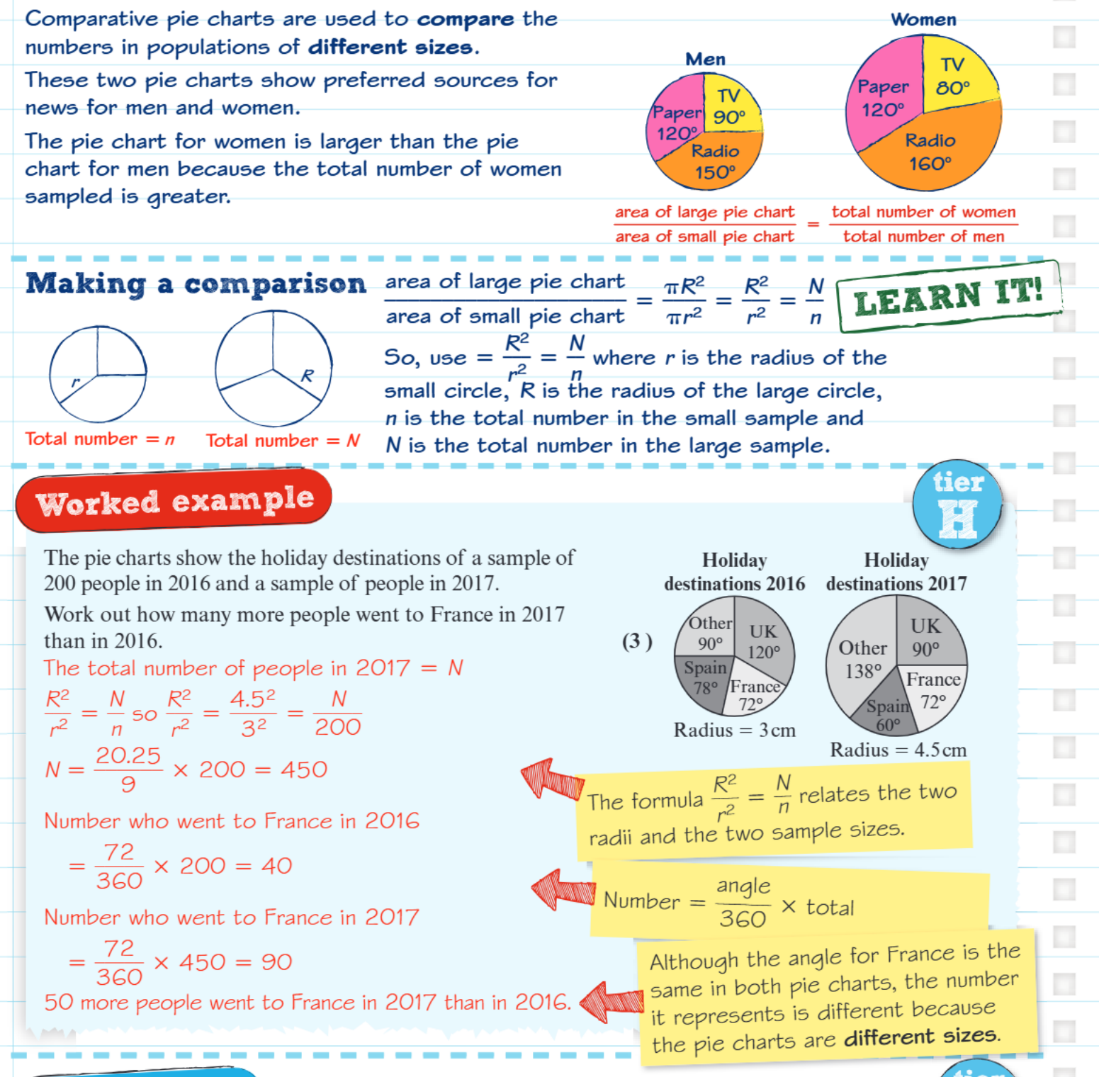
Worked example: holiday destinations
Worked Example: Comparing Holiday Destinations (2016 vs 2017)
Given information:
- 2016 sample: 200 people (pie chart radius = 3cm)
- 2017 sample: unknown size (pie chart radius = 4.5cm)
- France section: 72° in both charts
Step 1: Find the 2017 sample size Using :
Step 2: Calculate people who went to France in 2016
Step 3: Calculate people who went to France in 2017
Step 4: Find the difference
Important exam points
Key Insight: Even though France has the same angle (72°) in both pie charts, it represents different numbers of people because the total sample sizes are different. This is why we need comparative pie charts - the angles stay proportional, but the actual numbers change with sample size.
Common Mistake: Don't assume that equal angles mean equal numbers of people across different pie charts. Always check the sample sizes first.
Exam Strategy: When asked to compare data from comparative pie charts, always follow this systematic approach:
- Find the sample sizes using the radius relationship
- Convert angles to actual numbers using the angle formula
- Make your comparison using these actual numbers, not just the angles
Key Points to Remember:
- Comparative pie charts are used when comparing groups of different sizes
- The size of each pie chart is proportional to its sample size
- Use to find unknown sample sizes or radii
- Convert angles to numbers using:
- Equal angles don't mean equal numbers when sample sizes differ
- Always work with actual numbers, not just angles, when making comparisons