Cumulative frequency diagrams 2 (AQA GCSE Statistics): Revision Notes
Cumulative frequency diagrams 2
Understanding cumulative frequency diagrams
Cumulative frequency diagrams are powerful tools that help us interpret data and estimate values from large datasets. These graphs show the running total of frequencies up to each point, making it easy to see patterns and find specific information about the data.
The key purpose of these diagrams is to allow you to estimate values quickly and accurately. Unlike regular frequency charts that show individual counts, cumulative frequency shows how many items fall below (or up to) any given value.
The main advantage of cumulative frequency diagrams is their ability to help you answer questions about data distribution and make comparisons between different parts of your dataset.
Reading values from cumulative frequency graphs
The most important skill with cumulative frequency diagrams is knowing how to read values accurately. This involves a systematic approach using vertical and horizontal lines to extract information from the graph.
Understanding the methodology behind reading these graphs will help you tackle any cumulative frequency problem with confidence.
Finding how many items are above a certain value
When you need to find how many items exceed a particular value, there's a systematic three-step approach:
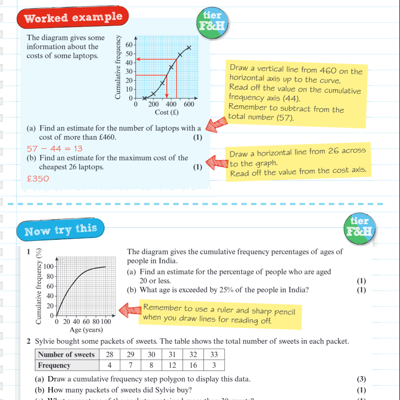
Worked Example: Finding Laptops Above £460
Step 1: Draw a vertical line from your target value on the horizontal axis up to where it meets the cumulative frequency curve
Step 2: Read across horizontally to find the cumulative frequency value on the vertical axis
Step 3: Subtract this value from the total number of items to find how many are above your target value
For laptops costing more than £460: Draw vertical line from £460 → Read across to get cumulative frequency (44) → Subtract from total (57) to get 13 laptops above £460.
This subtraction method is essential because cumulative frequency tells you how many items are up to a value, not above it.
Finding values for a given cumulative frequency
When you need to find what value corresponds to a specific cumulative frequency, the process works in reverse using the "horizontal then vertical" technique:
- Draw a horizontal line from the cumulative frequency value across to the curve
- Draw a vertical line down from where the horizontal line meets the curve
- Read the value from the horizontal axis
This technique helps you find values like "the maximum cost of the cheapest 26 items" by drawing horizontally from 26 on the cumulative frequency axis.
Key techniques for exam success
Using rulers and sharp pencils
Always use a ruler when drawing your lines on cumulative frequency graphs. Sharp pencils help ensure accuracy when reading values. Even small inaccuracies can lead to incorrect answers, so take time to be precise.
Understanding what the axes represent
The horizontal axis typically shows the data values (like cost, age, or measurements), while the vertical axis shows the cumulative frequency. Sometimes this might be shown as a percentage rather than actual numbers.
Working with percentages
When cumulative frequency is given as a percentage, remember that 100% represents all the data. To find what percentage of people are above a certain age, you subtract the cumulative percentage from 100%.
Creating step polygons
Step polygons are another way to display cumulative frequency data. These use straight lines connecting points, creating a stepped appearance rather than a smooth curve. The method for reading values remains the same.
Common exam approaches
Cumulative frequency questions often ask you to:
- Find how many items are above or below a certain value
- Determine the value that a certain number or percentage of items don't exceed
- Calculate what percentage of items fall within a specific range
- Create cumulative frequency tables or diagrams from given data
The key to success is methodically drawing your lines and reading values carefully. Accuracy is more important than speed - don't rush through the process.
Remember!
Key Points to Remember:
- Always draw lines with a ruler - vertical from values, horizontal from cumulative frequencies
- Subtract from the total to find how many items are above a certain value
- Read the axes carefully - check whether you're working with actual numbers or percentages
- Use the "draw then read" method systematically for accurate results
- Step polygons use the same reading techniques as smooth cumulative frequency curves