Interpreting pie charts (AQA GCSE Statistics): Revision Notes
Interpreting pie charts
What are pie charts?
Pie charts are visual representations commonly used to display qualitative data. They show how different categories make up parts of a whole dataset. The fundamental principle you need to understand is that the angle of each sector in a pie chart is directly proportional to the quantity it represents.
Think of a pie chart like slicing a pizza - the bigger the slice, the larger the angle and the more data it represents!
The key relationship
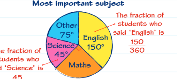
In any pie chart, there's a crucial relationship between angles and the data they represent. Since a complete circle contains 360°, each sector's angle tells you what fraction of the total that category represents. For example, if a sector has an angle of 90°, it represents of the total data.
Remember that all sectors in a pie chart must add up to exactly 360° - this is your key check for accuracy!
Essential formula for calculations
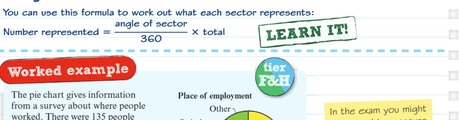
When working with pie charts, you'll frequently need to convert between angles and actual numbers. The formula that makes this possible is:
This formula works because you're finding what fraction the sector's angle is of the complete 360° circle, then multiplying by the total to get the actual quantity.
Worked example walkthrough
Let's work through a comprehensive example to see how pie chart interpretation works in practice. Consider a survey of 135 people about where they work.
Worked Example: Finding numbers from angles
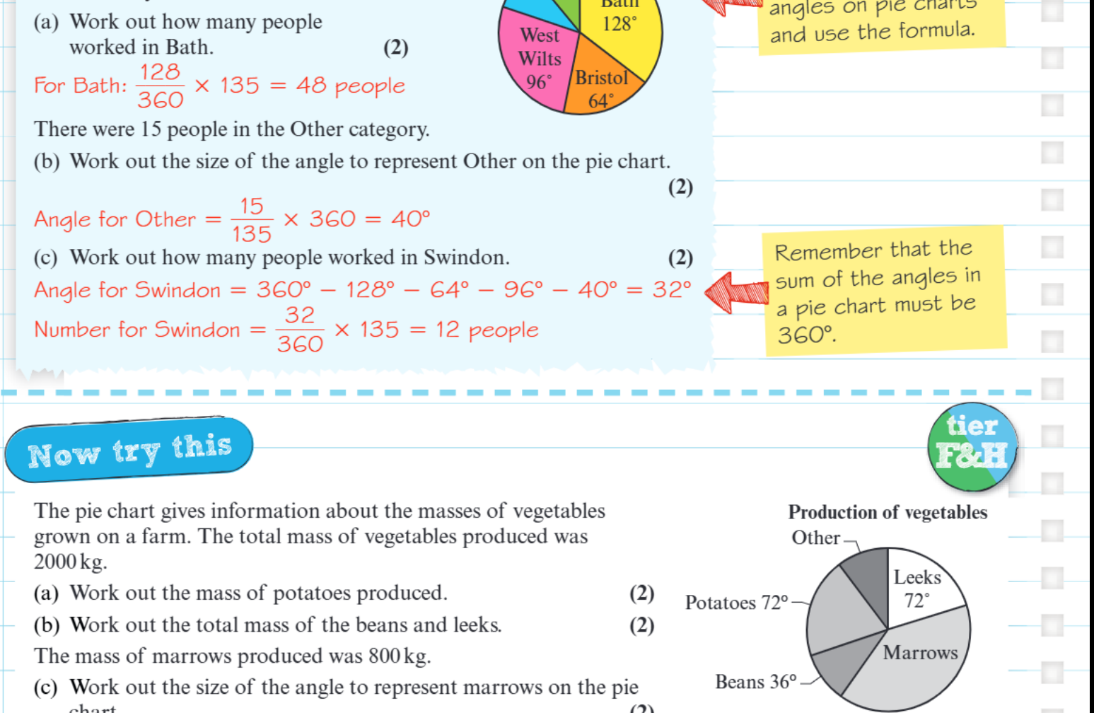
Question: How many people worked in Bath if the Bath sector has an angle of 128°?
Solution:
- Use the formula: Number =
- Number for Bath =
- Number for Bath = 48 people
Worked Example: Finding angles from numbers
Question: If 15 people work in the "Other" category, what angle should this sector have?
Solution:
- Rearrange the formula: Angle =
- Angle for Other =
- Angle for Other = 40°
Worked Example: Using angle relationships
Question: How many people worked in Swindon if all other angles are known?
Solution:
- First find Swindon's angle: 360° - 128° - 64° - 96° - 40° = 32°
- Then use the formula: Number =
- Number for Swindon = 12 people
Important exam techniques
When interpreting pie charts in your GCSE exam, you might need to measure angles directly from the chart using a protractor. This skill is just as important as the calculations themselves. Always remember to measure from the centre of the circle to get accurate readings.
Protractor Tips:
- Always place the protractor's centre point at the exact centre of the pie chart
- Align one edge of the sector with the 0° line before reading the angle
- Read carefully - protractors have two scales!
The most crucial check you can perform is ensuring all angles add up to 360°. If they don't, you've made an error somewhere in your measurements or calculations. This is a reliable way to verify your work before moving on to the next part of a question.
Common calculation patterns
You'll encounter two main types of calculations when working with pie charts:
Type 1: Angle to Number When you know the angle and total, find the actual quantity using the standard formula:
Type 2: Number to Angle When you know a quantity and the total, find what angle it should have by rearranging:
Both types use the same underlying principle - that angles are proportional to the values they represent.
Key Points to Remember:
- Pie charts display qualitative data where angles are proportional to the quantities they represent
- The key formula is:
- All angles in a pie chart must add up to exactly 360°
- You can work backwards from numbers to find angles by rearranging the formula
- Always double-check your work by ensuring angles sum to 360°
- Use a protractor carefully when measuring angles from charts