Line graphs and time series (AQA GCSE Statistics): Revision Notes
Line graphs and time series
What are time series graphs?
A time series graph is a special type of line graph that displays how data changes over a period of time. These graphs are particularly useful for spotting trends, patterns, and seasonal variations in data.
The key features of time series graphs are:
- Time is always plotted on the horizontal axis (x-axis)
- The measured quantity is plotted on the vertical axis (y-axis)
- Data points show values at specific time intervals
Time series graphs commonly display data over quarters of a year. Each quarter represents a three-month period:
- Q1: January, February, March
- Q2: April, May, June
- Q3: July, August, September
- Q4: October, November, December
How to construct a time series graph
When drawing a time series graph, follow these essential steps:
- Mark data points with crosses (×) - This is the standard way to plot points on time series graphs
- Connect the crosses with dotted lines - This helps show the trend and makes patterns easier to spot
- Label your axes clearly - Time goes on the horizontal axis, your measured quantity on the vertical axis
- Mark time periods appropriately - Show individual quarters or halves of years as needed
Critical Construction Points:
- Always use crosses (×) for data points, not dots or other symbols
- Connect points with dotted lines, not solid lines
- Ensure your scale accommodates all data points before you start plotting
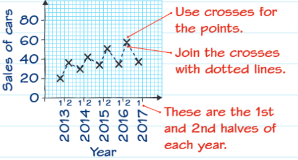
The graph above demonstrates proper construction technique for car sales data, showing how to use crosses for data points and connect them with dotted lines.
Interpreting patterns in time series data
Time series graphs often reveal important patterns that help us understand the data better:
Seasonal patterns: Many datasets show regular variations throughout the year. For example, biological data often peaks in summer months (Q3) and drops in winter months (Q1 and Q4).
Trends: Look for overall increases or decreases over longer time periods, beyond just seasonal variations.
Irregular variations: Some changes don't follow predictable patterns and may be due to external factors or random events.
Pattern Recognition Tips: When analysing time series data, always look at the bigger picture. Don't focus on individual data points - instead, look for repeating patterns across multiple time periods to identify genuine seasonal trends.
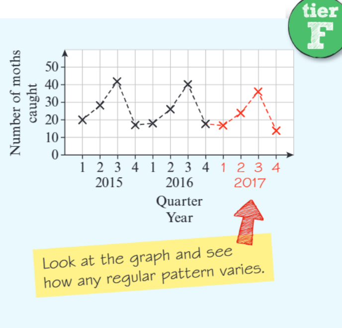
Worked example: Moths caught over time
Let's work through a complete example to see how to analyse time series data.
Worked Example: Analysing Moth Population Data
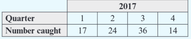
The problem: A researcher collected data about moths caught each quarter from 2015-2016, and additional data for 2017 is provided in a table.
Step-by-step solution:
(a) Adding 2017 data to the graph (2 marks)
- Plot the 2017 data points using crosses: Q1(17), Q2(24), Q3(36), Q4(14)
- Connect these points with dotted lines
- Make sure the scale on both axes accommodates all data points
(b) When was the greatest number of moths caught? (1 mark) The answer is Quarter 3 of 2015, where approximately 45 moths were caught (the highest point on the graph).
(c) Give a possible reason why fewer moths were caught in Q1 and Q4 each year (1 mark) Sample answer: These quarters contain the coldest months of the year and some months when moths hibernate during winter. Moths are more active in warmer weather, so fewer are caught during colder periods.
Key exam technique: Always answer in context! Don't just say "it's cold" - explain specifically how the cold weather affects moth behaviour and activity levels.
Identifying and describing patterns
When analysing time series graphs in exams, look for:
- Seasonal patterns: Does the data repeat similar values each year at the same times?
- Overall trends: Is the data generally increasing, decreasing, or staying roughly the same over the whole time period?
- Unusual values: Are there any points that break the usual pattern?
Common Exam Trap: Don't just describe what you see - explain WHY the pattern might occur. Link your explanation to real-world factors that could cause the variation. This is often where students lose marks!
Practice problem structure
Typical Question Format: Time series questions often follow this pattern:
A typical question might ask you to:
- Plot the data on a time series graph (usually worth 2 marks)
- Identify specific values like the highest or lowest point (1 mark)
- Comment on patterns or give reasons for variations (2 marks)
Top tip: When plotting data, take your time to place points accurately and use a ruler for neat dotted lines. Examiners look for precision in graph construction.
Key Points to Remember:
- Time series graphs show how data changes over time, with time always on the horizontal axis
- Use crosses (×) for data points and connect them with dotted lines
- Look for seasonal patterns - many datasets peak in summer (Q3) and drop in winter (Q1, Q4)
- Always explain patterns in context - don't just describe what you see, but why it might happen
- Take care with graph construction - accurate plotting and neat presentation earn valuable marks