Trend lines (AQA GCSE Statistics): Revision Notes
Trend lines
What are trend lines?
A trend line is a straight line drawn through the moving averages on a time series graph. This line helps us identify the overall direction or pattern in the data over time, smoothing out seasonal fluctuations to reveal the underlying trend.
The key purpose of a trend line is to show whether data is generally increasing, decreasing, or staying constant over the time period being studied.
Plotting moving averages correctly
Before drawing a trend line, you need to plot your moving averages in the correct positions on your time series graph. Getting the positioning right is crucial for accurate trend analysis.
Position of moving averages
The position where you plot each moving average depends on how many data points it covers:
For 3-point moving averages: Plot each moving average against the middle time period. For example, if your moving average covers 2012, 2013, and 2014, plot it at 2013.
For 4-point moving averages: Plot each moving average halfway between the 2nd and 3rd time periods. If your moving average covers quarters 1, 2, 3, and 4, plot it at position 2.5 (halfway between quarters 2 and 3).
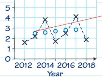
This graph demonstrates the correct positioning - notice how the moving averages (blue circles) are plotted at the appropriate midpoints.
Drawing the trend line
Once you've plotted your moving averages correctly, follow these steps to draw your trend line:
- Identify the moving average points - these are usually marked with circles or dots on your graph
- Draw a line of best fit through these moving average points by eye
- Ensure equal distribution - try to have roughly equal numbers of moving average points above and below your trend line
- Ignore the original data points - don't let the original seasonal data (usually marked with crosses) influence your trend line
The trend line should represent the overall pattern shown by the moving averages, not the individual seasonal fluctuations in the original data.
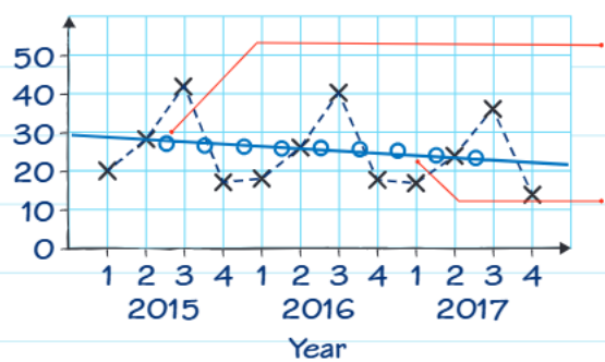
This example shows a declining trend line drawn through the moving averages, clearly showing the overall downward pattern despite seasonal variations.
Worked example: smoothie sales
Worked Example: Smoothie Sales Analysis
Let's work through a complete example showing sales data from a café.
Step 1: Calculate moving averages
Given the raw data for smoothie sales: 31, 30, 29, 28.5, 26.5, 26, 24
The 2-point moving averages would be:
- And so on...
Step 2: Plot the moving averages
Plot these moving averages at the midpoint between each pair of original data points. For 2-point moving averages, this means plotting halfway between consecutive time periods.
Step 3: Draw the trend line
Draw a straight line through the moving average points that best represents the overall pattern. In this example, the trend line slopes downward.
Step 4: Describe the trend
From the trend line, we can describe the pattern: "The trend line shows that the sales are decreasing" over the time period from 2014 to 2017.
Practical application
When working with real data like rainfall measurements, understanding the systematic approach is essential for accurate analysis.
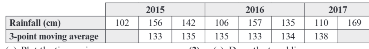
You follow the same process with any time series data:
- Calculate your moving averages (3-point moving averages in this case)
- Plot these averages at the correct positions (middle time period for 3-point averages)
- Draw your trend line through the moving average points
- Describe what the trend shows about the data pattern
The beauty of this method is its consistency - whether you're analysing sales data, rainfall measurements, or any other time series, the fundamental approach remains the same.
Common exam tips
Critical Points for Exam Success:
Remember the positioning: Always plot moving averages at the correct midpoint - this is a frequent source of marks in exams.
Focus on moving averages only: When drawing your trend line, only consider the moving average points, not the original seasonal data.
Describe trends clearly: Use precise language like "increasing," "decreasing," or "remaining constant" rather than vague descriptions.
Equal distribution: Your trend line should have roughly equal numbers of moving average points above and below it.
Key Points to Remember:
- Moving averages are always plotted at the midpoint of the time periods they cover
- Trend lines are drawn through moving average points only, not the original data
- 3-point moving averages go at the middle time period, 4-point averages go halfway between the 2nd and 3rd periods
- The trend line should have roughly equal numbers of moving average points above and below it
- Always describe trends using clear, specific language about the direction of change