Trend lines (AQA GCSE Statistics): Revision Notes
Trend lines
Time series graphs are powerful tools that help us understand how data changes over time. When we look at these graphs, we often see data points that go up and down, but there's usually an overall pattern or direction that the data follows. This overall pattern is called a trend.
Understanding Trend Lines
A trend line is a straight line drawn on a time series graph that shows the general direction or pattern of the data over time. Think of it as the "average path" that your data is following, even though individual data points might be scattered above and below this line.
Trend lines help us to:
- Identify the overall pattern in data that might otherwise look messy or confusing
- Make predictions about future values
- Compare different time periods
- Understand long-term changes rather than short-term fluctuations
Types of trends
There are three main types of trends you need to know about for your GCSE exam:
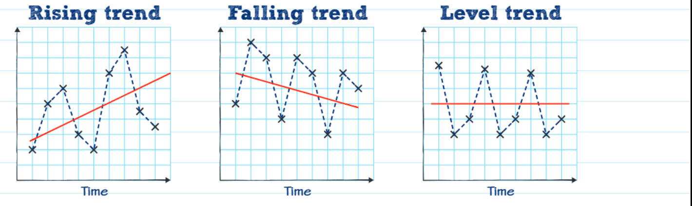
Rising trend (upward/increasing trend)
This occurs when the general direction of the data is upwards over time. Even though individual data points might go down occasionally, the overall pattern shows an increase. Examples might include:
- Population growth over decades
- House prices in a growing area
- Sales of a popular product
Falling trend (downward/decreasing trend)
This happens when the general direction of the data is downwards over time. Despite some individual increases, the overall pattern shows a decrease. Examples might include:
- The price of technology products over time
- Birth rates in developed countries
- Sales of a product going out of fashion
Level trend (no increase or decrease)
This occurs when the data remains roughly constant over time. The values might fluctuate up and down, but there's no clear overall increase or decrease. Examples might include:
- Temperature readings in a climate-controlled room
- Exam pass rates that remain stable
- Population in an area with balanced migration
How to draw a trend line
Drawing a trend line is actually quite straightforward, and you'll often be asked to do this by eye in your exam. The key technique involves placing the line strategically to best represent the data pattern.
Step-by-Step Method: Drawing a Trend Line
Step 1: Look at your time series graph and identify all the data points.
Step 2: Imagine a straight line that best represents the general direction of all the points.
Step 3: Draw this line so that it passes roughly halfway between the highest and lowest points for each time period.
Step 4: Make sure you have roughly equal numbers of data points above and below your trend line.
Key tip: Don't try to make your trend line pass through every single data point. Remember, individual points will naturally fluctuate above and below the trend line - that's completely normal!
Interpreting trend lines in context
One of the most important skills for your GCSE exam is being able to interpret what a trend line means in the context of the specific question you're answering.
Worked Example: Car Sales Analysis
Let's look at a practical example. Suppose we have data showing car sales from 2013 to 2017, and we can see that the trend line is rising (going upwards from left to right).
The mathematical observation: The trend line is upward/rising/increasing.
The interpretation in context: The number of car sales is increasing over time.
Important exam tip: Always relate your answer back to what the data actually represents. Don't just say "the trend is rising" - explain what is rising! In this case, it's the number of car sales that's rising.
Common exam techniques and tips
Drawing trend lines accurately
- Use a ruler to ensure your line is straight
- Make sure your line extends across the full time period shown
- Don't worry about making it pass through specific points - it's about the overall pattern
Describing trends in exams
- Always state the direction clearly (rising, falling, or level)
- Always relate it back to what the data represents
- Use appropriate mathematical language: increasing, decreasing, constant, upward, downward
Common Exam Traps to Avoid
Trap 1: Focusing only on individual data points rather than the overall trend
Trap 2: Describing the trend without relating it to the context (e.g., just saying "upward trend" instead of "sales are increasing")
Trap 3: Drawing trend lines that are too steep or too shallow - remember to place them roughly in the middle of the data spread
Problem-solving approach
When faced with a trend line question in your exam, follow this systematic approach:
Step-by-Step Problem Solving Method
Step 1: Read the question carefully and identify what the data represents
Step 2: Look at the overall pattern of the data points
Step 3: If asked to draw a trend line, use the halfway between highest and lowest method
Step 4: If asked to describe the trend, identify whether it's rising, falling, or level
Step 5: Always interpret your findings in the context of what the data actually represents
Step 6: Check your answer makes sense in the real-world context of the question
Key Points to Remember
- A trend line shows the general pattern of data over time, not individual fluctuations
- There are three types of trends: rising (increasing), falling (decreasing), and level (constant)
- Draw trend lines by placing them roughly halfway between the highest and lowest points
- Always interpret your findings in the context of what the data represents
- Don't focus on individual data points - look for the overall pattern across the entire time period