Use of Data in PE (Edexcel GCSE Physical Education): Revision Notes
📚 Revision Notes
Presenting & Interpreting Data In Pe
Graphs and Charts
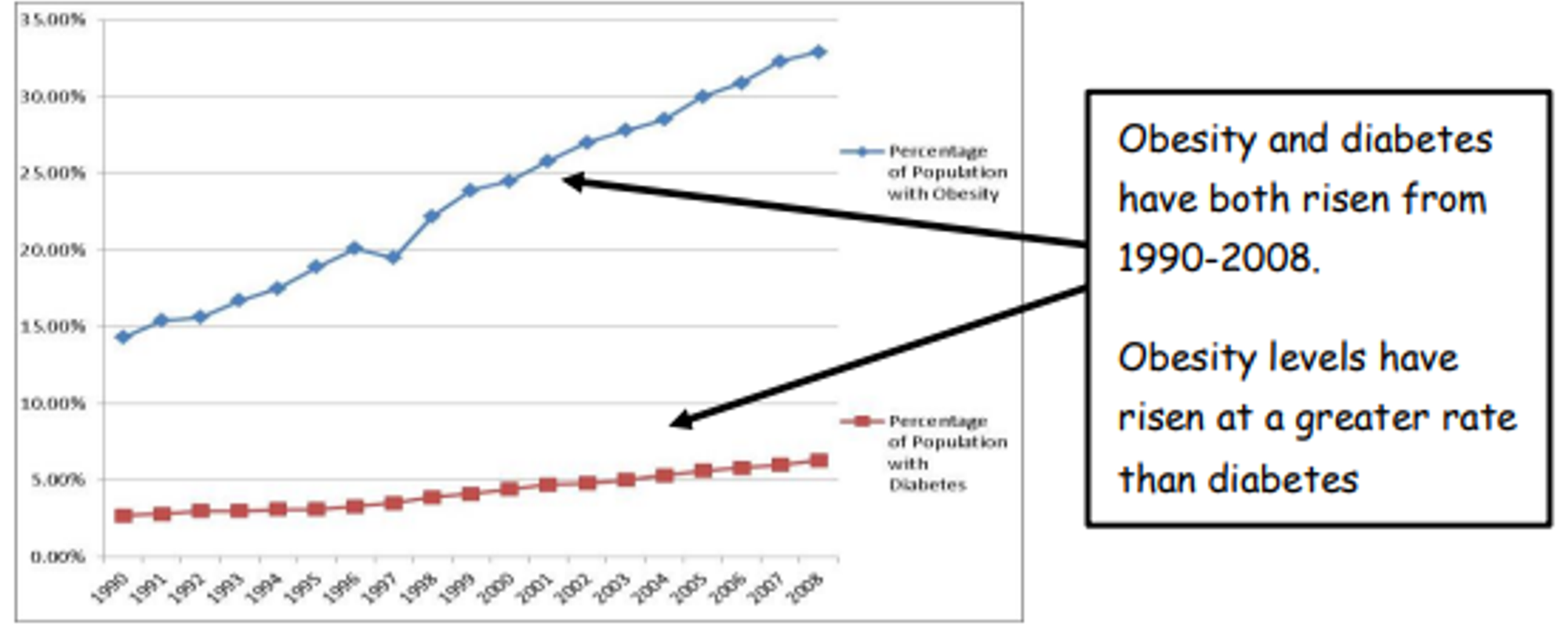
infoNote
Some information that happens over time will be represented as a line graph, such as the correlation between obesity and diabetes over time. See below …
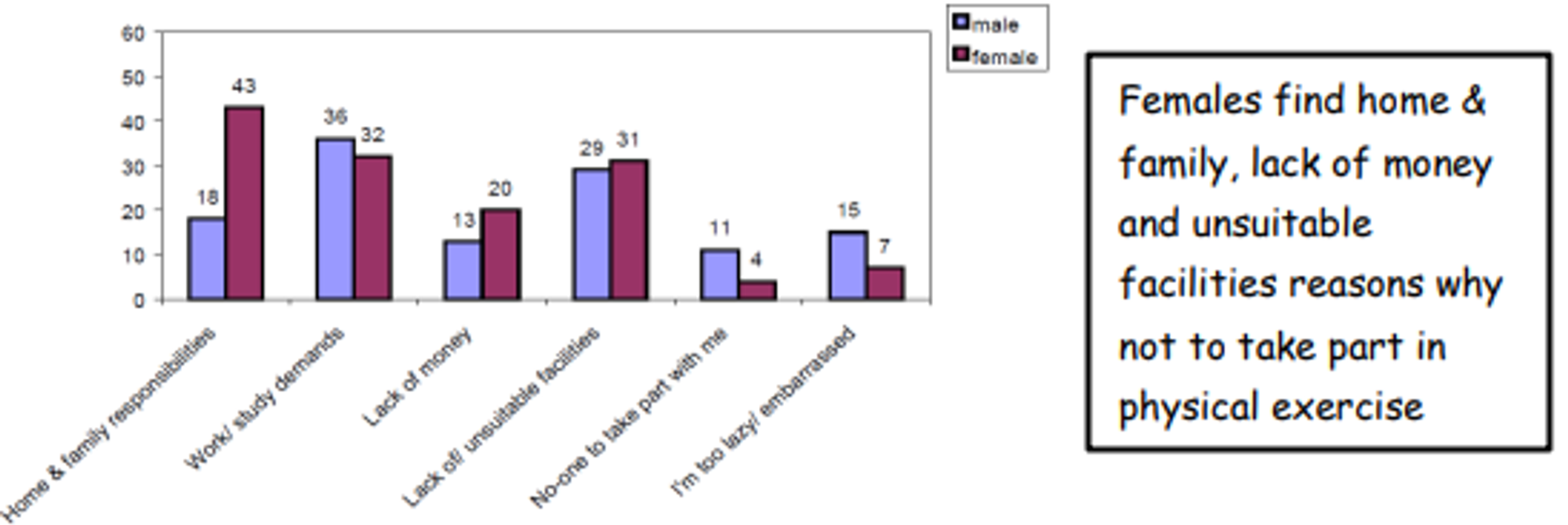
infoNote
Information that compares different categories of data may be represented in a bar graph, such as the reason why males and females don't take part in physical activity. See below …
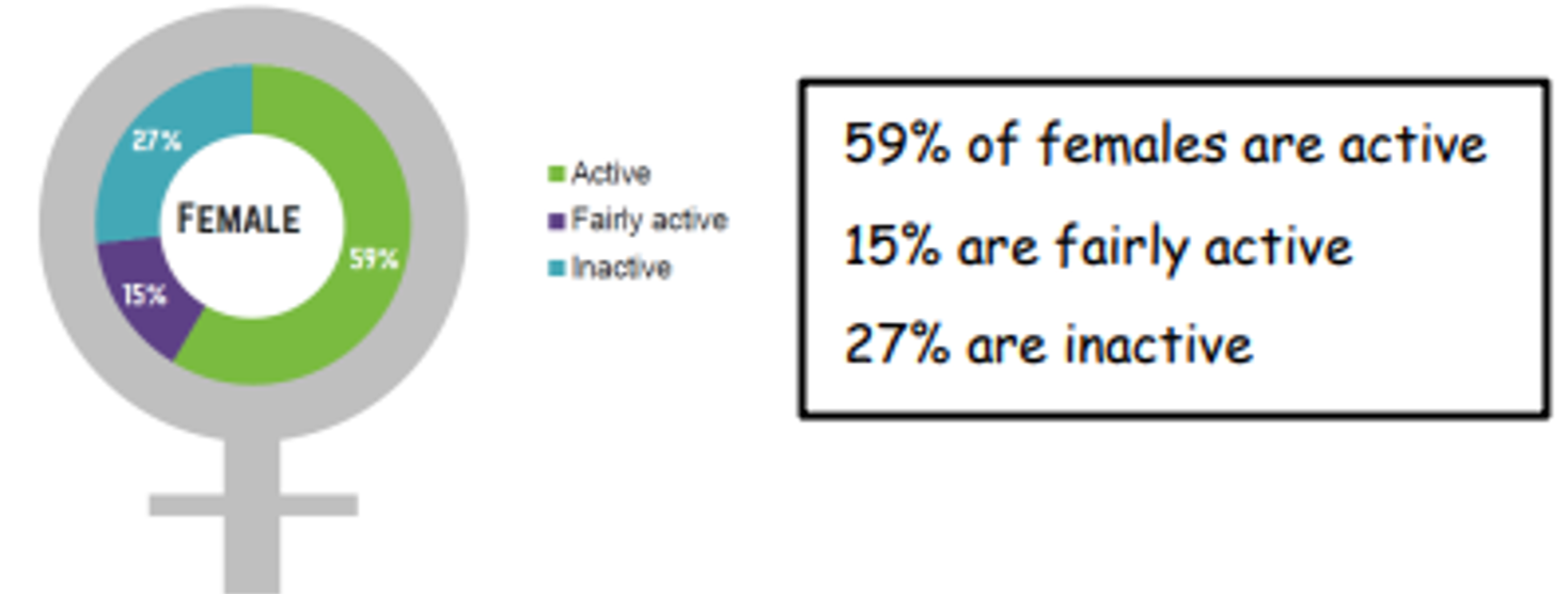
infoNote
If you are trying to compare parts of a whole you may use a pie chart such as a pie chart to show the percentage of women who are active, fairly active, and inactive. See below …