Travel graphs and story graphs (OCR GCSE Maths): Revision Notes
Travel graphs and story graphs
Understanding Travel Graphs and Story Graphs
Travel graphs and story graphs are commonly used in GCSE Maths to represent real-life scenarios. These graphs typically involve two variables, which are plotted on the -axis (usually time) and -axis (usually distance or another relevant measure). Understanding these graphs is crucial for interpreting and solving problems in exams.
Key Points to Remember:
- Examine Both Axes:
- -axis: Usually represents time or another continuous variable.
- -axis: Usually represents distance, speed, or another measurable quantity.
- Always check what each axis represents before interpreting the graph.
- Pay Attention to the Scale:
- Carefully note the scale on both axes. This will help you accurately read and interpret the values on the graph.
- Understand the Gradient (Slope):
- Horizontal Line: Indicates no change in the variable; for a distance-time graph, this means the object is stationary.
- Positive Slope: Indicates an increase in the variable over time; in a distance-time graph, this means the object is moving away from the starting point.
- Negative Slope: Indicates a decrease in the variable over time; in a distance-time graph, this means the object is moving towards the starting point.
- Carefully Read the Question:
- Before solving the problem, make sure to understand what is being asked. Look for key words and check your answers after solving.
Travel Graphs
Travel graphs are used to represent the journey of an object, such as a car, person, or family, over time. They show the relationship between distance and time, allowing you to interpret various aspects of the journey, such as speed, time spent stationary, and changes in direction.
Interpreting Travel Graphs
Before you begin answering questions related to travel graphs, it's crucial to break down what the graph is showing. Here's how to approach it:
- Examine the Axes:
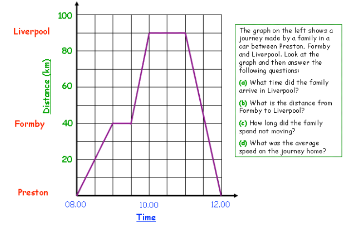
- axis (Time): This usually represents time. In the graph provided, the axis shows time in hours from 08:00 to 12:00.
- axis (Distance): This typically represents distance. In the graph provided, the axis shows distance in kilometres.
- Understand the Scale:
- axis: Each square represents 30 minutes (0.5 hours).
- axis: Each square represents 10 kilometres.
- Analyse the Gradient (Slope):
- Horizontal Line: Indicates the object was stationary because time passed but distance didn't change.
- Positive Slope: Indicates the object was moving away from the starting point. The steeper the slope, the faster the object was moving.
- Negative Slope: Indicates the object was moving back towards the starting point.
- Key Observations:
- The family travels from Preston to Formby and then to Liverpool.
- They stop at Formby, indicated by the horizontal line from 09:00 to 09:30, showing no change in distance during this time.
- The slope from Formby to Liverpool is steeper than the slope from Preston to Formby, indicating the family was travelling faster between Formby and Liverpool.
Worked Example: Answering Questions Based on a Travel Graph
Let's use a specific example to understand how to answer questions related to a travel graph.
Example Travel Graph Summary:
- Journey: The family travels from Preston to Formby and then to Liverpool.
- Graph Details:
- Time axis: 08:00 to 12:00
- Distance axis: 0 to 100 km
Questions and Solutions:
- (a) What time did the family arrive in Liverpool?
- Solution: According to the graph, the family arrives in Liverpool at 10:00. This is when the distance line reaches the 100 km mark on the axis.
- (b) What is the distance from Formby to Liverpool?
- Solution: Formby is 40 km from Preston, and Liverpool is 90 km from Preston. Therefore, the distance from Formby to Liverpool is 90 km−40 km=50 km.
- (c) How long did the family spend not moving?
- Solution: The family was stationary at two points on the graph:
- From 09:00 to 09:30 in Formby (30 minutes).
- From 10:00 to 11:00 in Liverpool (60 minutes).
- Total time spent not moving is 30 minutes+60 minutes=90 minutes (1.5 hours).
- (d) What was the average speed on the journey home?
- Solution: To calculate the average speed, use the formula:
- The distance from Liverpool to Preston is 90 km.
- The time taken was 1 hour.
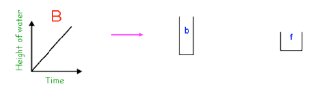
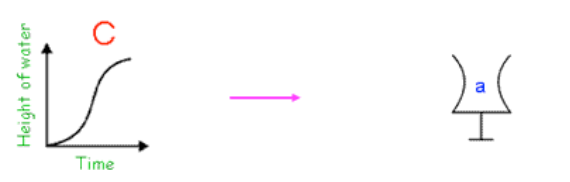
Worked Example: Matching Glass Shapes to Graphs
Example Story Graph Summary:
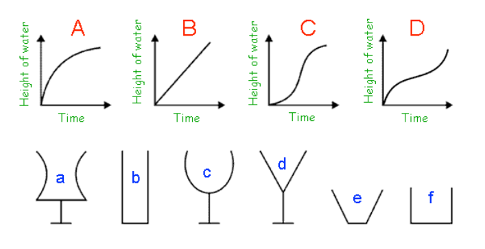
- Scenario: Water is being poured at a constant rate into different glasses. The graphs () represent how the height of water changes over time in each glass.
Key Steps to Interpreting Story Graphs
- Examine the Axes:
- -axis (Time): This axis represents the time that passes as the experiment continues.
- -axis (Height of Water): This axis shows the height of water in the glass at any given time.
- Understand the Graphs:
- Straight Line: Indicates that the water height increases at a consistent rate, typically occurring in glasses with straight, vertical sides.
- Curved Line: Suggests that the rate at which the water height increases is not constant, which could occur in glasses that are wider at the top or have a non-uniform shape.
- Matching Glass Shapes to Graphs:
- Straight Sides: A straight line graph (like Graph ) corresponds to glasses with straight vertical sides (like glass "").
- Wider Top: A graph that starts steep and becomes less steep (like Graph ) matches glasses that are narrow at the bottom and wide at the top (like glass "").
- Narrower Top: A graph that starts less steep and becomes steeper (like Graph ) matches glasses that are wide at the bottom and narrow at the top (like glass "").
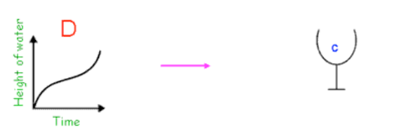
- Complex Shapes: Graphs with unusual curves (like Graph ) are likely to correspond to glasses with complex shapes, like "."
Worked Example: Matching Glass Shapes to Graphs
Answering the Question:
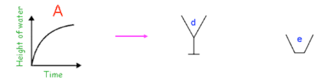
- Graph :
- Explanation: The curve indicates a decreasing rate of water height increase.
- Matching Glass: Glass "d" or "e," which start narrow and widen towards the top.
- Graph :
- Explanation: The straight line indicates a constant increase in water height.
- Matching Glass: Glass "b" or "f," which have straight vertical sides.
- Graph :
- Explanation: The curve indicates an increasing rate of water height change.
- Matching Glass: Glass "a," which is wider at the bottom and narrower at the top.
- Graph :
- Explanation: The graph shows an unusual curve, suggesting a glass with a unique shape.
- Matching Glass: Glass "c," which has an inward curve and then widens.