Bar Charts (Leaving Cert Mathematics): Revision Notes
📚 Revision Notes
Bar Charts
Overview
A bar chart is a graphical representation of data where rectangular bars are used to show the frequencies or values of different categories. It is a simple and effective way to compare discrete data or categorical variables.
Key Features of a Bar Chart
Bars:
- Each bar represents a category.
- The height (or length) of the bar corresponds to the value or frequency of that category.
Axes:
- Horizontal axis (x-axis): Represents the categories or groups.
- Vertical axis (y-axis): Represents the frequency or value.
Spacing:
- Bars are separated by spaces to indicate that the data categories are distinct (unlike histograms, where bars touch).
Orientation:
- Bar charts can be vertical or horizontal, depending on how the categories and values are organised.
When to Use Bar Charts
- To compare data across different categories.
- To display discrete or categorical data (e.g., favourite subjects, types of transport).
Examples
infoNote
Example 1: Favourite Colours
Problem:
A survey asks 50 students about their favourite colour. The results are as follows:
- Red: 15 votes
- Blue: 20 votes
- Green: 10 votes
- Yellow: 5 votes Create a bar chart to represent this data.
Solution:
- Identify the categories: Colours (Red, Blue, Green, Yellow).
- Determine the frequencies: Votes for each colour.
- Set up the axes:
- Horizontal axis: Colours.
- Vertical axis: Number of votes (0 to 25).
- Draw bars:
- Red: Height of 15.
- Blue: Height of 20.
- Green: Height of 10.
- Yellow: Height of 5.
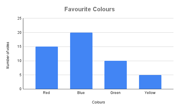
The bar chart shows that Blue is the most popular colour, while Yellow is the least popular.
infoNote
Example 2: Weekly Sales
Problem:
A shop records the number of items sold each day for one week:
- Monday: 30
- Tuesday: 45
- Wednesday: 40
- Thursday: 25
- Friday: 50 Create a bar chart to represent this data.
Solution:
- Identify the categories: Days of the week (Monday to Friday).
- Determine the values: Number of items sold each day.
- Set up the axes:
- Horizontal axis: Days of the week.
- Vertical axis: Number of items sold (0 to 60).
- Draw bars:
- Monday: Height of 30.
- Tuesday: Height of 45.
- Wednesday: Height of 40.
- Thursday: Height of 25.
- Friday: Height of 50.
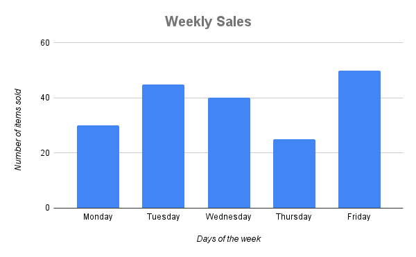
The bar chart shows that Friday had the highest sales, while Thursday had the lowest.
Summary
- Bar charts represent data using rectangular bars, where the height (or length) corresponds to the value or frequency.
- Bars are separated to indicate distinct categories.
- Useful for comparing discrete or categorical data.
- Steps to create a bar chart: 9. Identify the categories and values. 10. Set up axes with appropriate labels and scales. 11. Draw bars for each category based on its value.
- Bar charts can be vertical or horizontal, depending on the data.