Histograms (Leaving Cert Mathematics): Revision Notes
Histograms
Drawing a Histogram
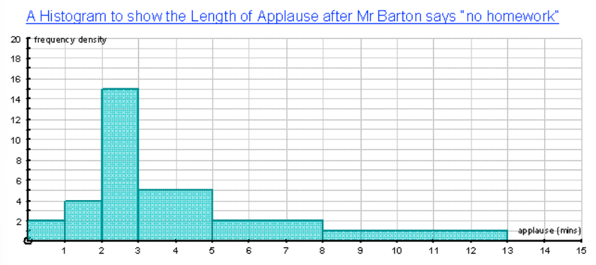
Histograms are used for continuous data and show the distribution of data across intervals.
- Label the axes:
- : Length of applause (continuous data intervals like , etc.).
- : Frequency density (calculated using the formula below).
- Calculate Frequency Density using:
The group width is the difference between the upper and lower limits of each interval. For example, the group width for is .
- Draw the bars: The height of each bar represents the frequency density, and the bars should be touching to show that the data is continuous.
Worked Example of Histogram Calculations
Example
Let's apply the formula to our example data.
| Length of Applause (minutes) | Frequency | Group Width | Frequency Density |
|---|---|---|---|
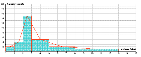
What is the Point of Histograms?
Histograms are useful because they show how the data is distributed across different intervals. While bar charts are helpful for comparing categories, histograms show the shape of the data (whether it is spread out, concentrated in one range, or follows a particular pattern).
Interpreting Histograms
Histograms allow us to interpret continuous data and see the distribution of that data across different intervals.
Example:
Let's consider the following histogram showing the time taken by Year students to complete a set of times tables.
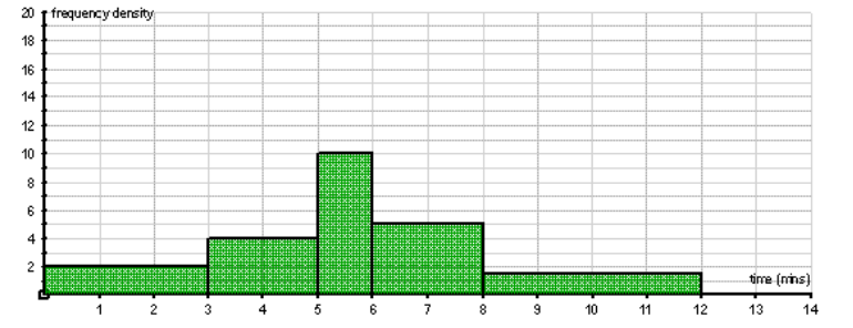
| Time (minutes) | Frequency Density | Group Width | Working | Frequency |
|---|---|---|---|---|
Rearranging the Formula:
We can rearrange the formula to calculate frequency from frequency density and group width: