Line Plots (Leaving Cert Mathematics): Revision Notes
📚 Revision Notes
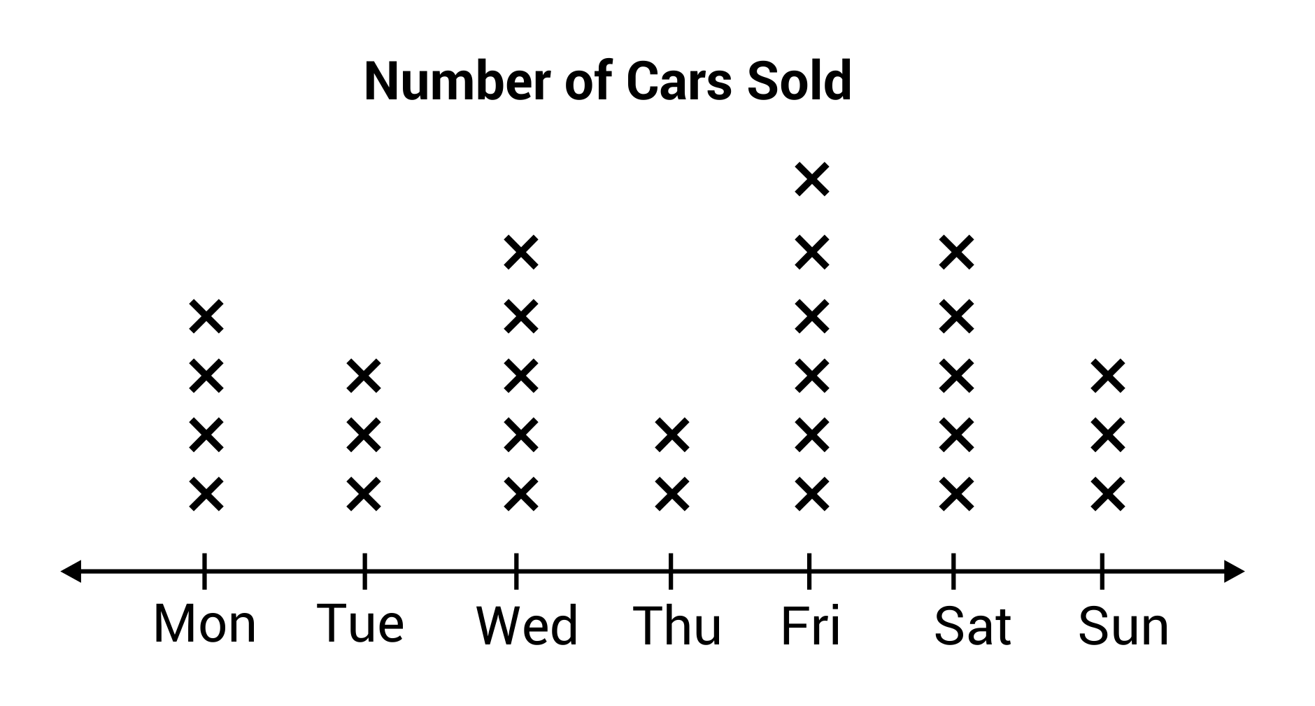
Line Plots
Overview
A line plot is a simple way to organise and visualise data along a number line. It is especially useful for small data sets and provides an immediate visual representation of the frequency of values.
Key Features of a Line Plot
Number Line:
- A horizontal line representing the data values.
Data Points:
- Each data value is represented by a mark (e.g., a cross or dot) above the corresponding value on the number line.
Frequency:
- The number of marks above a value indicates its frequency in the data set.
When to Use Line Plots
- To display and analyse small data sets.
- To observe the frequency distribution of data points.
- To identify patterns, gaps, or outliers in the data.
Worked Examples
infoNote
Example 1: Test Scores
Problem:
A class of 10 students scored the following marks on a test: 4, 5, 5, 6, 6, 6, 7, 7, 8, 9.
Represent this data using a line plot.
Solution:
Step 1: Draw a number line:
Mark values from 4 to 9 (the range of the data set).
Step 2: Plot the data points:
Place a mark above each value for its frequency.
- One mark above 4.
- Two marks above 5.
- Three marks above 6.
- Two marks above 7.
- One mark each above 8 and 9.
infoNote
Example 2: Daily Temperatures
Problem:
The daily high temperatures (in °C) for one week are: 18, 20, 20, 22, 22, 22, 24.
Create a line plot for this data.
Solution:
Step 1: Draw a number line:
Label values from 18 to 24.
Step 2: Plot the data points:
Place marks for each frequency:
- One mark above 18.
- Two marks above 20.
- Three marks above 22.
- One mark above 24.
Summary
- Line plots are effective for representing small data sets along a number line.
- Each mark on a line plot corresponds to the frequency of a data point.
- Steps to create a line plot:
- Draw a number line with the range of data values.
- Place marks above the number line for each data point.
- Analyse the plot for patterns, clusters, or outliers.
- Line plots are particularly useful for observing distributions and frequencies at a glance.