Trend Graphs (Leaving Cert Mathematics): Revision Notes
Trend Graphs
Overview
A trend chart (or line graph) is a graphical representation used to display data points in a sequential order, typically over time. It helps illustrate patterns or trends in the data, making it an essential tool for analysing how a variable changes.
Key Features of Trend Charts
Axes:
- Horizontal axis Represents the independent variable, usually time.
- Vertical axis Represents the dependent variable or the data being measured.
Data Points:
- Each point represents a specific measurement or observation.
- Points are connected by lines to visualise trends over the given range.
Trends:
- Increasing trend: The line rises, indicating growth or increase.
- Decreasing trend: The line falls, indicating a decline.
- Steady trend: The line is flat, indicating no change.
Multiple Data Sets:
- Trend charts can compare multiple data sets by plotting different lines on the same graph.
Examples
Example 1: Temperature Over a Week
Problem:
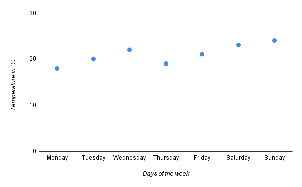
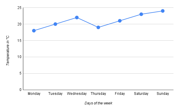
A city records daily temperatures for a week as follows:
- Monday: 18°C
- Tuesday: 20°C
- Wednesday: 22°C
- Thursday: 19°C
- Friday: 21°C
- Saturday: 23°C
- Sunday: 24°C Create a trend chart to display this data.
Solution:
Step 1: Identify axes:
- Days of the week.
- Temperature (in °C)
Step 2: Plot data points:
Monday: (1, 18), Tuesday: (2, 20), ..., Sunday: (7, 24)
Step 3: Connect points:
Draw lines connecting consecutive points to show the trend.
Example 2: Monthly Sales Data
Problem:
A company tracks its monthly sales (in thousands) as follows:
- January: £50k
- February: £55k
- March: £60k
- April: £65k
- May: £70k Create a trend chart to represent this data.
Solution:
Step 1: Identify axes:
- Months (January to May).
- Sales (in £k).
Step 2: Plot data points:
January: (1, 50), February: (2, 55), ..., May: (5, 70).
Step 3: Connect points:
Draw lines to connect consecutive points.
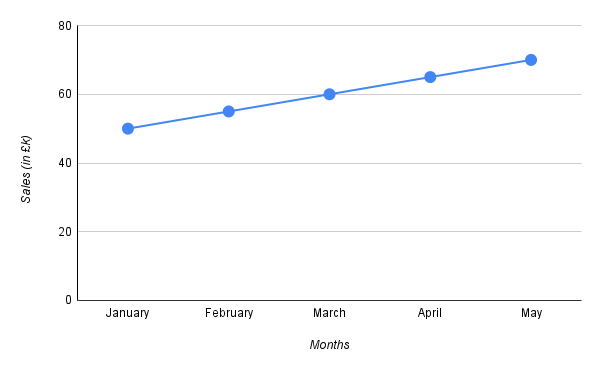
The trend shows consistent growth in sales from January to May.
Summary
- A trend chart uses lines to connect data points, making it ideal for showing patterns over time.
- Key components include axes ( for independent variable, for dependent variable), data points, and lines.
- Trends can indicate growth, decline, or stability.
- Trend charts can compare multiple data sets on the same graph.
- Steps to create a trend chart:
- Identify the variables and axes.
- Plot data points.
- Connect the points with lines.
- Interpret the trends to draw conclusions.