Bar Charts and Pie Charts (Leaving Cert Mathematics): Revision Notes
Bar Charts and Pie Charts
What are bar charts?
A bar chart is a straightforward and effective method for displaying numerical data visually. This type of chart uses rectangular bars to represent different categories or groups of data.
Key features of bar charts
Understanding these key characteristics will help you both create and interpret bar charts effectively:
- Same width bars: All bars in the chart have identical width for consistency
- Height represents frequency: The height (or length for horizontal bars) of each bar shows how often that category occurs
- Clear spacing: Bars are separated by narrow, equal gaps to distinguish between categories
- Axes: One axis shows the categories being measured, while the other shows the frequency scale
Bar charts can be drawn either vertically (with bars going up) or horizontally (with bars going across).
Reading bar charts
Worked Example: Text Message Data
Let's examine how students' text message data can be displayed using a bar chart.
The frequency table shows the number of text messages received by students on a particular Sunday. Looking at this data:
- 0 students received 0 messages
- 1 student received 1 message
- 2 students received 2 messages
- The highest frequency is 14 students receiving 7 messages
The bar chart clearly shows this distribution. Notice how:
- The x-axis shows the number of text messages (0 to 9)
- The y-axis shows the frequency (0 to 16)
- The tallest bar is at 7 messages, matching our table data
- The pattern creates a roughly bell-shaped distribution
What are pie charts?
A pie chart is an excellent way to display data when you want to show how something is divided up or shared among different categories. This type of chart is particularly effective for displaying categorical data.
Key features of pie charts
Pie charts are uniquely suited for showing proportional relationships within data:
- Circular shape: The entire circle represents the complete dataset
- Sectors: The circle is divided into segments called sectors
- Proportional angles: Each sector's angle is proportional to the frequency of that category
- Total angles: All sectors together equal 360° (a complete circle)
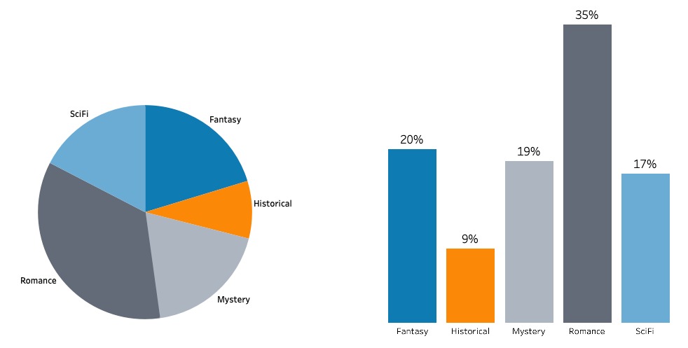
The pie chart showing how Shane spent his 24-hour day demonstrates these features perfectly. You can see that School and Sleep take up the largest portions, while the whole circle represents the complete 24 hours with each activity shown as a differently coloured sector.
Creating pie charts - angle calculations
To create an accurate pie chart, you need to calculate the angle for each sector. Here's the essential formula:
Angle for each sector =
Worked Example: Transportation Survey
Let's work through creating a pie chart for transportation data with 120 total respondents:
| Type of transport | Frequency | Calculation | Angle |
|---|---|---|---|
| Train | 24 | ||
| Coach | 12 | ||
| Car | 59 | ||
| Ship | 11 | ||
| Plane | 14 | ||
| Total | 120 | 360° |
Step-by-step process:
- Add up all frequencies to find the total (120 people)
- For each category, divide its frequency by the total
- Multiply this fraction by 360° to get the angle
- Check that all angles add up to 360°
- Use a protractor to draw each sector accurately
The completed pie chart shows each transportation method with its calculated angle, making it easy to see that cars were by far the most popular choice.
Reading and interpreting pie charts
When reading pie charts, you can work backwards from angles to find actual quantities using the reverse of our creation formula.
Worked Example: Athletics Medals
If we know:
- Total medals won = 24
- Gold sector angle = 75°
- Silver sector angle = 150°
- Bronze sector angle = 135°
We can calculate:
Gold medals: medals
Silver medals: medals
Bronze medals: medals
Check: medals total ✓
Comparing pie charts
When comparing pie charts of different sizes, remember that the size of sectors depends on both the percentage AND the total number. Two charts might have similar-looking sectors, but if one represents 320 people and another represents 800 people, the actual numbers will be very different.
Common exam tips
Essential Tips for Success:
- Always check your angles add to 360° when creating pie charts
- Show your working clearly when calculating angles
- Use a protractor accurately for precise angle measurement
- Label all sectors clearly with both category names and angles
- Read questions carefully - sometimes you need to work backwards from angles to find frequencies
Key Points to Remember:
-
Bar charts use bars of equal width where height represents frequency - perfect for comparing different categories
-
Pie charts show how data is divided into parts using a circle with sectors - ideal for showing proportions of a whole
-
Angle calculation for pie charts: - always check angles sum to 360°
-
Bar charts are best for comparing quantities between categories, while pie charts are best for showing parts of a whole
-
Both chart types make data easier to understand visually than tables of numbers alone