Scatter Graphs (Leaving Cert Mathematics): Revision Notes
Scatter Graphs
What is a scatter graph?
A scatter graph (also called a scatter diagram) is a visual way to investigate whether a relationship exists between two sets of data. These graphs help us determine if changes in one variable are connected to changes in another variable.
Scatter graphs are powerful tools used across many fields - from science and medicine to business and economics - because they make it easy to spot patterns and relationships that might not be obvious in raw data tables.
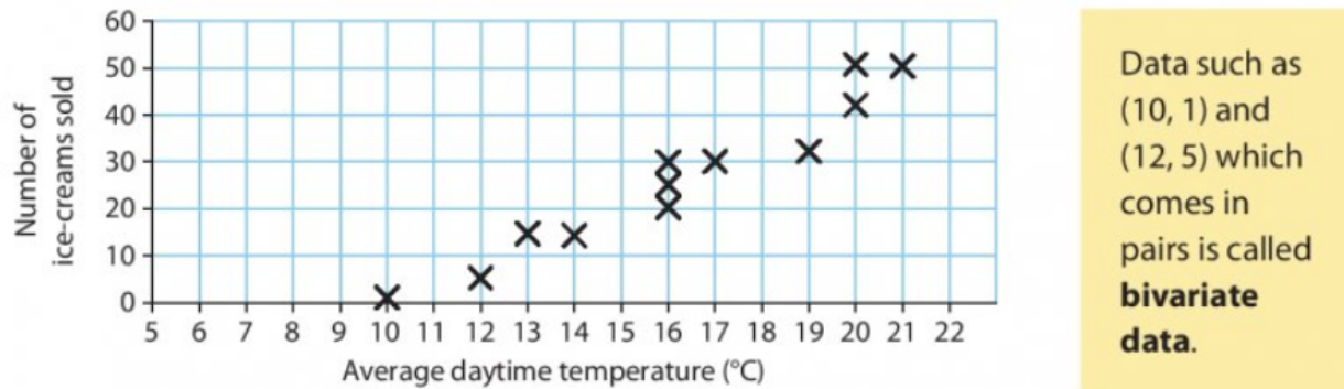
For example, you might want to find out if there's a relationship between:
- Temperature and ice cream sales
- Height and weight of people
- Hours of study and exam marks
Scientists, researchers, and businesses use scatter graphs to identify patterns and make informed decisions based on data relationships.
Bivariate data
When we collect data that comes in pairs, we call this bivariate data.
Each pair represents measurements of two different variables for the same subject or time period. For example:
- (10°C, 1 ice cream) - temperature and sales on one day
- (12°C, 5 ice creams) - temperature and sales on another day
The key point is that both measurements belong together - they're paired because they were recorded at the same time or for the same individual. This pairing is what makes the data "bivariate" (meaning "two variables").
Creating scatter graphs
Step-by-step process
- Draw two axes at right angles - horizontal (x-axis) and vertical (y-axis)
- Label your axes with the variable names and units
- Choose appropriate scales that fit all your data points
- Plot each pair of values as a single point marked with an X or dot
- Don't join the points - scatter graphs show individual data points, not a continuous line
Never join the points with lines in a scatter graph! This is one of the most common mistakes students make. Scatter graphs show individual data points to reveal patterns, not continuous relationships.
Worked Example: Journey Progress

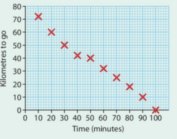
This example shows how remaining distance decreases as journey time increases. Notice how the points form a clear downward pattern, indicating a strong negative correlation between the two variables.
Types of correlation
Correlation describes the strength and direction of the relationship between two sets of data. There are three main types:
Positive correlation
- Definition: As one variable increases, the other variable also increases
- Pattern: Points slope upwards from left to right
- Example: Height and weight - taller people tend to weigh more
Negative correlation
- Definition: As one variable increases, the other variable decreases
- Pattern: Points slope downwards from left to right
- Example: Journey time and distance remaining - more time means less distance left
No correlation
- Definition: There's no clear relationship between the variables
- Pattern: Points appear randomly scattered with no obvious direction
- Example: Temperature and rainfall on different days
Worked Example: Temperature and Rainfall Data
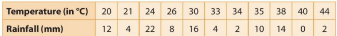
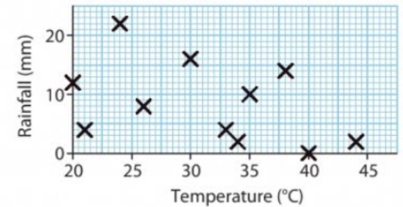
This temperature and rainfall data shows no correlation - the points are randomly distributed with no clear pattern, indicating that temperature does not predict rainfall amounts.
Strong vs weak correlation
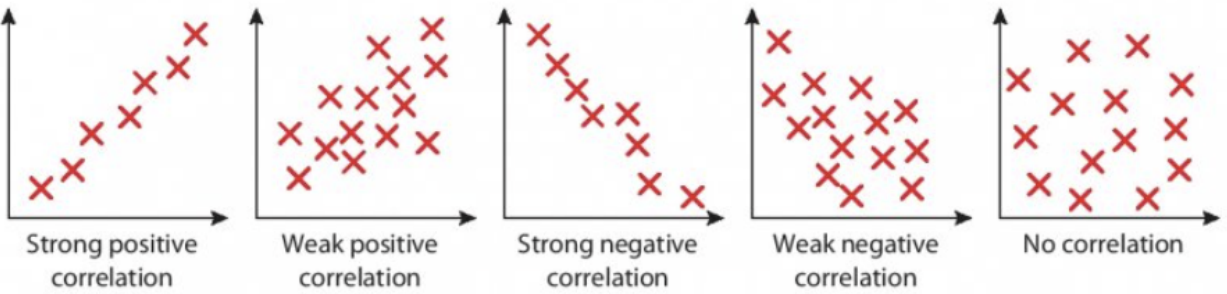
- Strong correlation: Points lie close to an imaginary straight line
- Weak correlation: Points are more spread out but still show a general trend
- The closer the points are to a straight line, the stronger the relationship
When points lie approximately on a straight line, we say there's a linear relationship between the variables. This is different from correlation strength - you can have strong linear relationships that are positive or negative.
Worked example: Height and weight relationship
Worked Example: Analysing Height and Weight Data

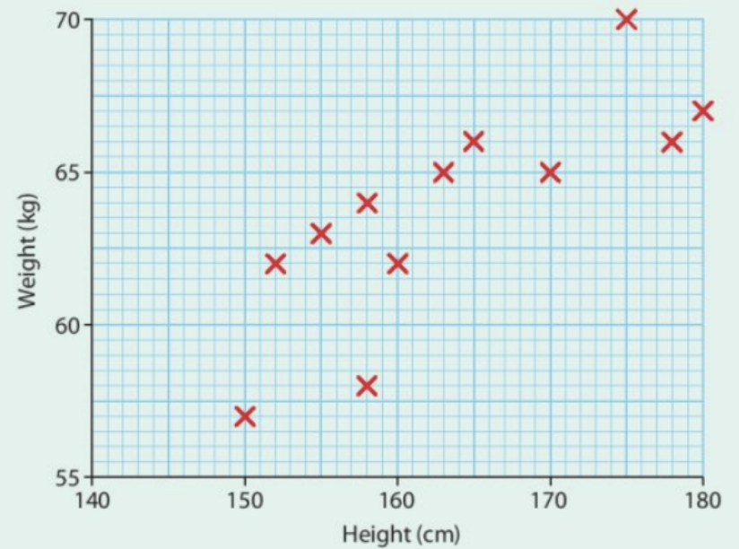
Steps to create this scatter graph:
- Set up axes: Height (cm) on horizontal axis from 140-180cm, Weight (kg) on vertical axis from 55-70kg
- Plot points: Each person's measurements become one point, e.g., (150cm, 57kg)
- Analyse the pattern: The points show a general upward trend but are quite spread out
Interpretation: This shows a weak positive correlation because:
- The correlation is positive (weight generally increases as height increases)
- The correlation is weak (points don't lie close to a straight line - they're quite scattered)
Key exam tips
Essential Tips for Success:
- Always label your axes with variables and units
- Use appropriate scales that show all data points clearly
- Look for the overall pattern, not individual points that don't fit
- Describe correlation using two words: strength (strong/weak) and direction (positive/negative/none)
- Remember: Correlation doesn't prove causation - just because two variables are related doesn't mean one causes the other
Key Points to Remember:
-
Scatter graphs help identify relationships between two sets of paired data (bivariate data)
-
Positive correlation means both variables increase together, negative correlation means one increases while the other decreases
-
Strong correlation has points close to a straight line, weak correlation has points more spread out
-
No correlation shows randomly scattered points with no clear pattern
-
Always describe correlation using both strength (strong/weak) and direction (positive/negative/none)