Representing and Analysing Data (Grade 10 NSC Matric Mathematical Literacy): Revision Notes
Representing and Analysing Data
Introduction to representing data
After collecting and organising data, the next crucial step is to represent the information visually using graphs and charts. This makes it much easier to understand patterns, compare values, and identify trends in your data.
Visual representation of data is one of the most powerful tools in statistics - it can reveal patterns that are difficult to spot in raw numbers alone.
There are several types of graphical representations you can use:
- Pie charts - for showing parts of a whole
- Bar graphs - for comparing different categories
- Histograms - for showing frequency distributions of continuous data
- Line graphs - for displaying relationships between two variables, especially over time
The key is choosing the right type of graph for your specific data and purpose. Each graph type has specific strengths and is designed for particular types of data analysis.
Pie charts
Definition: A pie chart is a circular graph divided into sectors that represent different parts of a whole dataset, usually shown as percentages.
When to use pie charts
Pie charts work best when you want to:
- Compare parts of a whole
- Show data as proportions or percentages
- Display how different categories contribute to a total
Limitation of pie charts: Pie charts do not show changes over time well, making it difficult to identify trends or patterns in the data. If you need to show changes over time, consider using a line graph instead.
Worked example: Analysing a pie chart
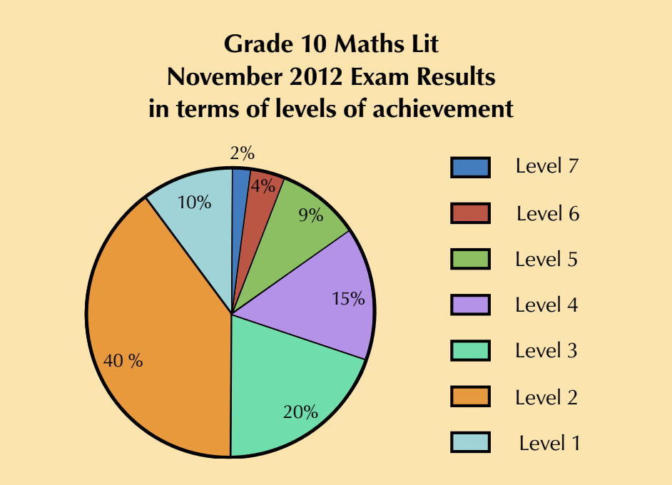
Worked Example: Grade 10 Mathematical Literacy Results
Question: The pie chart shows Grade 10 Mathematical Literacy exam results in terms of achievement levels.
- Which level did most learners obtain?
- What percentage of learners obtained this level?
- Few learners achieved Level 7. What percentage achieved this level?
- If 120 learners wrote the exam, how many achieved Level 4?
- Write the ratio of Level 3 to Level 2 learners in simplest form.
Solution:
- Level 2 had the most learners (largest orange sector)
- 40% of learners obtained Level 2
- 2% of learners achieved Level 7 (smallest dark blue sector)
- Level 4 = 15% of 120 = learners
- Level 3 2 = 20:40 = 1:2 (in simplest form)
Bar graphs
Definition: A bar graph uses rectangular bars to display and compare data across different categories. The bars are separated by spaces and can be vertical or horizontal.
When to use bar graphs
Bar graphs are ideal for:
- Comparing quantities across different categories
- Showing discrete (separate) data
- Making it easy to compare values at a glance
The spaces between bars in a bar graph are important - they show that the categories are separate and distinct from each other, unlike continuous data.
The example shows customer numbers for a store over five months, making it easy to compare which months were busiest.
Histograms
Definition: A histogram is similar to a bar graph but specifically shows the frequency distribution of continuous data. The key difference is that bars touch each other (no gaps) because the data is continuous.
When to use histograms
Histograms are perfect for:
- Displaying continuous data (like heights, weights, or lengths)
- Showing frequency distributions
- Identifying the shape of data distribution
Key difference: In histograms, bars touch each other because there are no gaps in continuous data. In bar graphs, bars are separated because categories are distinct.
Example: Foot length data
| Foot length | Frequency |
|---|---|
| 22-23.9 cm | 3 |
| 24-25.9 cm | 10 |
| 26-27.9 cm | 8 |
| 28 cm and longer | 4 |
Notice how the bars touch each other because foot length is continuous data - there are no gaps between the possible values.
Worked example: Drawing graphs
Worked Example: Choosing Graph Types
Question 1: A school tuckshop tracks food sales with this data:
| Item | Frequency |
|---|---|
| Hot dogs | 15 |
| Sandwiches | 35 |
| Salads | 10 |
| Burgers | 12 |
Draw a bar graph to represent this data.
Question 2: Book length measurements:
| Length of Book | Frequency |
|---|---|
| 20-23.9 cm | 4 |
| 24-26.9 cm | 7 |
| 27-29.9 cm | 5 |
| Longer than 30 cm | 3 |
Draw a histogram to represent this data.
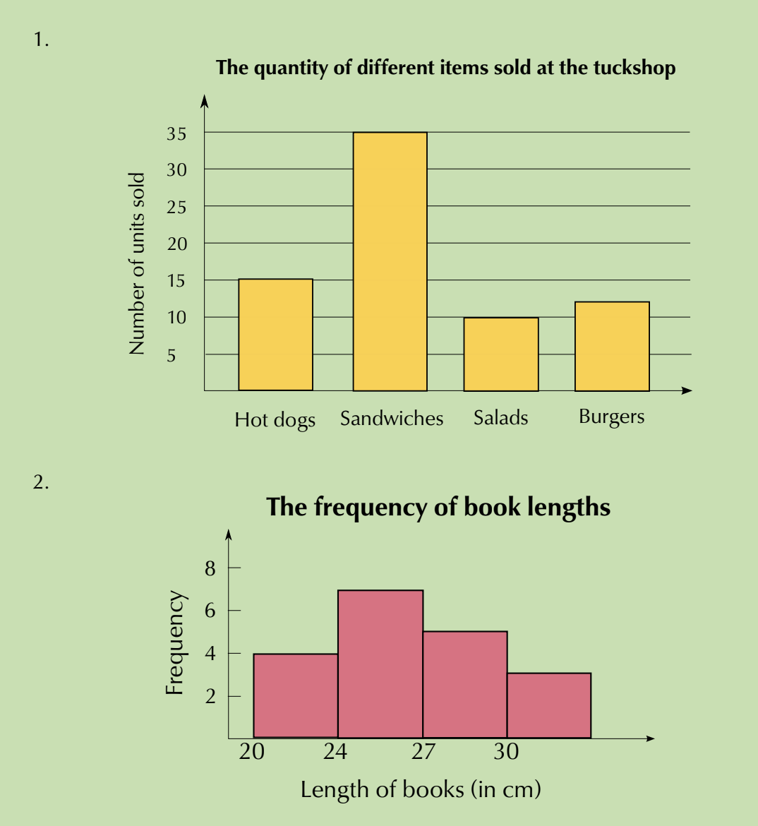
Key insight: Question 1 uses a bar graph because food items are separate categories. Question 2 uses a histogram because book lengths represent continuous measurement data.
Graph drawing tip: When drawing graphs, always use appropriate intervals for your vertical axis. Don't use intervals that are too large (making small differences invisible) or too small (making the graph difficult to read).
Line graphs
Definition: A line graph uses points connected by straight lines to show the relationship between two quantities. The horizontal axis typically represents time.
When to use line graphs
Line graphs are excellent for:
- Showing changes over time
- Displaying trends and patterns
- Comparing how two variables relate to each other
- Making it easy to spot increasing or decreasing patterns
Worked example: TV viewing patterns
Worked Example: Analyzing TV Viewing Trends
Question: The table shows Jabu's average daily TV viewing time throughout the year:
| Month | Jan | Feb | Mar | Apr | May | Jun | Jul | Aug | Sep | Oct | Nov |
|---|---|---|---|---|---|---|---|---|---|---|---|
| Daily TV viewing (min) | 108 | 103 | 108 | 119 | 115 | 122 | 116 | 105 | 110 | 105 | 104 |
- Plot this data on a line graph
- Describe any trends you observe
- Could this data be shown on a bar graph?
- What advantage does a line graph have?
Solution:
- Plot each point and connect with straight lines
- Trends observed:
- Viewing time increases in April and peaks in June (122 minutes)
- Decreases occur in February, May, August, October and November
- This could indicate exam/school preparation periods reducing viewing time
- Yes, this data could be shown as a bar graph with one bar per month
- Line graph advantage: Makes it easier to see trends because you can quickly identify the increasing or decreasing slope of each line segment
Exam tip: When analysing line graphs, look for:
- Peaks (highest points) and valleys (lowest points)
- Increasing trends (upward slopes)
- Decreasing trends (downward slopes)
- Seasonal patterns or cycles
Analysing data
Definition: Data analysis is the process of examining information carefully to identify patterns, trends, and relationships that help you make informed decisions.
The analysis process involves:
- Looking at your graphical representations
- Identifying trends and patterns
- Drawing conclusions about what the data shows
- Considering possible explanations for the patterns observed
Key analysis questions to ask:
- What are the highest and lowest values?
- Are there any clear trends (increasing/decreasing)?
- Are there any unusual patterns or outliers?
- What might explain these patterns?
- What conclusions can be drawn from this data?
Key Points to Remember:
- Pie charts show parts of a whole as percentages - use when comparing proportions
- Bar graphs compare categories with gaps between bars - use for discrete data
- Histograms show continuous data with bars touching - use for frequency distributions
- Line graphs show relationships over time with connected points - best for identifying trends
- Choose your graph type based on your data type and what you want to show
- Always use appropriate scales and label your axes clearly
- Look for patterns, trends, and unusual features when analysing data