Histograms (Grade 11 NSC Matric Mathematics): Revision Notes
Histograms
What are histograms?
A histogram is a type of bar chart that shows how often different outcomes occur in a dataset. It displays the frequency (how many times) of mutually exclusive events or categories. Histograms are particularly useful for visualising the distribution of numerical data.
Key Features of Histograms:
- The x-axis shows the events or categories being measured
- The y-axis shows the count or frequency
- Each bar represents one category, and its height shows the frequency
- Adjacent bars touch each other (unlike regular bar charts)
Reading histograms
When interpreting a histogram, follow these systematic steps to extract meaningful information from the data:
Step 1: Identify the events
Look at the x-axis to determine what categories or events are being measured.
Step 2: Read the frequency for each event
The height of each rectangular bar indicates how many times that event occurred. Read these values from the y-axis.
Step 3: Calculate relative frequencies
Relative frequency is a crucial concept that shows the proportion of each event:
The relative frequency shows what fraction or percentage each event represents of the total dataset.
Step 4: Summarise the information
Organise your findings in a clear table showing events, counts, and relative frequencies.
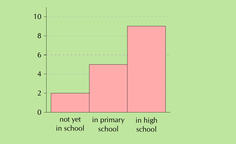
Worked Example: School Enrollment
From the histogram above showing education levels:
Step 1: Identify events
- "not yet in school", "in primary school", "in high school"
Step 2: Read frequencies from bar heights
- not yet in school: 2
- in primary school: 5
- in high school: 9
Step 3: Calculate total and relative frequencies
- Total observations:
- Relative frequencies:
- not yet in school:
- in primary school:
- in high school:
Drawing histograms with numerical data
When your data consists of numbers (like heights, weights, or test scores), you need to group them into intervals before creating the histogram. This process is essential for making sense of continuous numerical data.
Step 1: Determine appropriate intervals
Divide your data range into equal-length intervals. The number of intervals should be reasonable (typically 5-10) to show patterns clearly.
Step 2: Count data in each interval
Count how many data points fall within each interval range.
Step 3: Draw the histogram
Create bars where:
- The width represents the interval range
- The height represents the frequency count
- Bars are adjacent to each other
Critical Point: When working with numerical data, always ensure your intervals are equal in width. Unequal intervals will distort the visual representation and lead to incorrect interpretations.

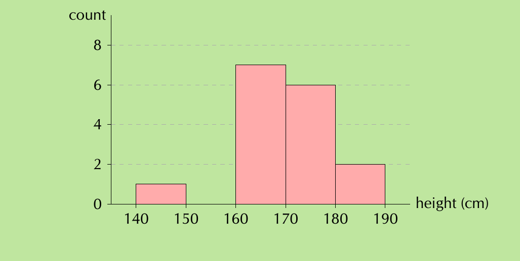
Worked Example: Adult Heights
Given height data for 16 adults, we can group them into 5 intervals between 140-190 cm:
Intervals and their frequencies:
- (140;150]: 1 person
- (150;160]: 0 people
- (160;170]: 7 people
- (170;180]: 6 people
- (180;190]: 2 people
Analysis: The resulting histogram shows most adults have heights between 160-180 cm, with the peak frequency in the 160-170 cm range.
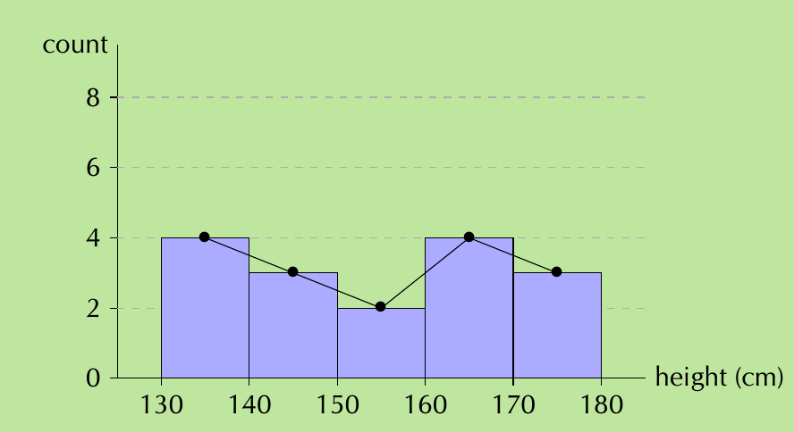
Frequency polygons
A frequency polygon is a line graph that displays the same information as a histogram but uses connected line segments instead of bars. This alternative representation offers unique advantages for data analysis.
Creating frequency polygons
Step 1: Start with your histogram
Step 2: Mark the midpoint of the top of each bar
Step 3: Connect these midpoints with straight lines
Step 4: Remove the histogram bars, leaving only the line graph
Why Use Frequency Polygons?
Frequency polygons are particularly valuable when you need to:
- Compare two or more datasets on the same graph
- Avoid confusion from overlapping bars of multiple histograms
- Emphasise the overall shape and trend of the distribution
- Show smooth transitions between data points
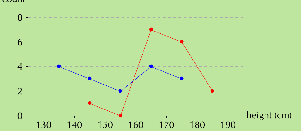
Comparison Example: Heights Analysis
When comparing adult heights (red line) with Grade 11 learner heights (blue line), the frequency polygon clearly reveals:
- Grade 11 learners are generally shorter than adults
- Learner heights are more evenly distributed across the range
- Adult heights cluster more around 160-180 cm
This comparison would be much harder to interpret with overlapping histogram bars.
Common Exam Mistakes to Avoid:
- Always read axis labels carefully to understand what the histogram represents
- Check whether you need to calculate frequencies, relative frequencies, or percentages
- When drawing histograms, ensure your intervals are equal in width
- Remember that bar heights represent frequencies, not the actual values
- For frequency polygons, connect the midpoints of interval tops, not the interval boundaries
Key Points to Remember:
- Histograms show frequency distributions using adjacent rectangular bars
- Reading histograms involves identifying events, reading frequencies, and calculating relative frequencies if needed
- Drawing histograms requires grouping numerical data into equal intervals and counting frequencies
- Frequency polygons connect the midpoints of histogram bars and are excellent for comparing multiple datasets
- Relative frequency =