Continuous and Discrete Graphs (Grade 12 NSC Matric Mathematical Literacy): Revision Notes
Continuous and Discrete Graphs
Understanding discrete and continuous data
When working with graphs, it's essential to understand the difference between discrete and continuous data, as this determines how we should draw and interpret graphs.
Discrete data consists of values that can only be whole numbers. You cannot have fractions or decimal parts of these values. Examples include:
- Number of people on a bus
- Number of cars in a car park
- Number of necklaces sold
Continuous data consists of values that can include fractions and decimals. These measurements can take any value within a range. Examples include:
- Distance travelled
- Time elapsed
- Temperature
- Height or weight measurements
The key distinction is whether fractional values make logical sense for your data. You can't have 2.5 people, but you can travel 2.5 kilometres.
How to represent discrete data
When drawing graphs for discrete data, you must use dotted lines connecting individual points. This shows that only the specific whole number values are possible - there are no valid values between the points.
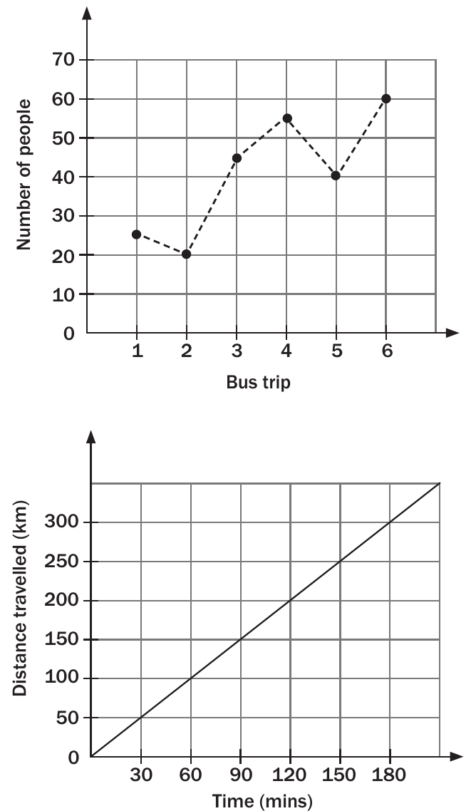
In the top graph above, we can see the number of bus passengers across different trips. Notice how the line is dotted because you cannot have 2.5 people on a bus - only whole numbers make sense.
How to represent continuous data
For continuous data, use solid lines to connect the points. This shows that all values between the measured points are also possible and meaningful.
Looking at the bottom graph in the image above, the distance-time relationship uses a solid line because the bus travels through every possible distance value (including decimals) during its journey.
Key differences summary
| Discrete Data | Continuous Data |
|---|---|
| Whole numbers only | Can include decimals/fractions |
| Use dotted lines | Use solid lines |
| Points represent exact values | Lines show all possible values |
| Gaps between valid values | No gaps - all values possible |
Worked example: interpreting discrete graphs
Worked Example: Analysing Necklace Sales Data
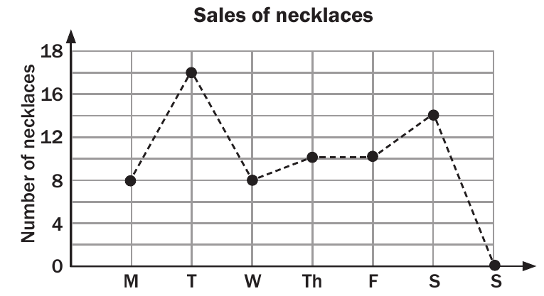
This necklaces sales graph shows a perfect example of discrete data representation:
Why dotted lines are used:
- You can only sell whole necklaces (not 2.5 necklaces)
- Each point represents an exact count
- The dotted line emphasises that values between the points don't exist
Key observations from this graph:
- Tuesday had the highest sales (17 necklaces)
- Sunday had the lowest sales (approximately 0 necklaces)
- The data fluctuates throughout the week
- Weekend sales are generally lower than weekday sales
Exam tips
Common mistakes to avoid:
- Don't use solid lines for discrete data (like number of people)
- Don't use dotted lines for continuous data (like distance or time)
- Remember that discrete data points represent exact values only
Quick decision method: Ask yourself: "Can this value have decimal places that make sense?"
- If NO → Use dotted lines (discrete)
- If YES → Use solid lines (continuous)
Memory aid:
- Discrete = Dotted lines
- Continuous = Complete solid lines
Identifying misleading graphs
Watch out for misleading representations: Be careful when interpreting graphs. Sometimes graphs can be misleading if:
- The axes don't start at zero
- The scale is inconsistent
- The wrong line type is used for the data type
- Points are positioned incorrectly on the grid
Always check whether the graph type matches the data type being represented.
Summary
Key Points to Remember:
- Discrete data uses dotted lines because only whole number values are possible
- Continuous data uses solid lines to show that all values between points exist
- The line type you choose depends on the nature of your data, not your preference
- Always ask yourself if fractional values make sense for your data
- Common discrete examples: people, cars, items sold
- Common continuous examples: distance, time, temperature, money amounts