Grouped Data and Histograms (HSC SSCE Mathematics Advanced): Revision Notes
Grouped Data and Histograms
Introduction
When working with large datasets, organising data into tables and graphs helps us see the overall patterns. However, when a table has too many rows or a graph has too much detail, it becomes difficult to get a clear overview. The solution is to group the data, which reduces complexity while still showing important patterns.
Grouping data is particularly useful when:
- A frequency table would have too many rows
- Individual data points would create a cluttered graph
- We want to see the "big picture" of the data distribution
Grouping data
What is grouped data?
Grouped data organises individual values into intervals (also called bins). Each interval has equal width and is represented by its class centre, which is the midpoint of the interval.
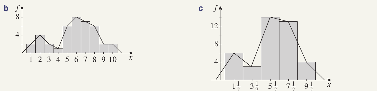
Creating a grouped frequency table
Consider this example of heights (in centimetres) of people from the !Kung people of the Kalahari desert:
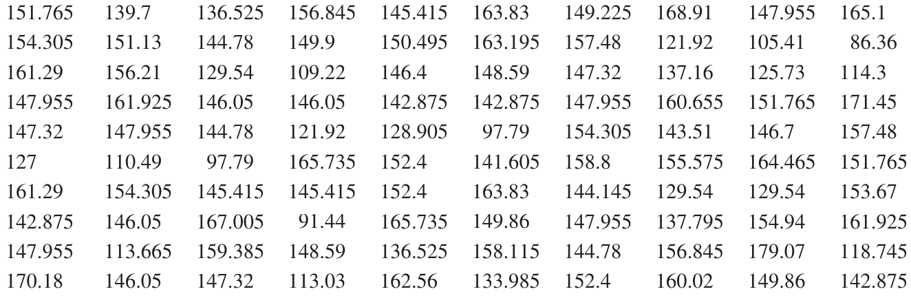
To group this data, we organise it into intervals of cm:
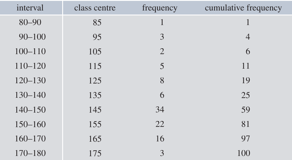
Key features of this table:
- Interval: The range of values (e.g., means )
- Class centre: The midpoint of each interval (e.g., for the interval)
- Frequency: How many data points fall in each interval
- Cumulative frequency: The running total of frequencies
Why use class centres?
When data is grouped, we lose information about the exact values within each interval. We use the class centre as a representative value for all data in that interval. This simplification allows calculations while keeping the data manageable.
Effects of grouping
Grouping is a form of rounding that helps us see patterns, but it involves ignoring some information:
Advantages:
- Clearer overview of data distribution
- Easier to create meaningful graphs
- Reduces clutter in large datasets
Disadvantages:
- Loss of precision in calculations
- Summary statistics (mean, median, range) will be approximations
Never discard the original data. Keep it for more accurate calculations if needed.
Example: Impact of Grouping on Accuracy
For the height data above:
- Median from grouped data: cm
- Median from raw data: cm
- Range from grouped data: cm
- Range from raw data: cm
The grouped data provides useful approximations while being easier to work with.
Handling boundary values
When the underlying variable is continuous, some data points may fall exactly on the boundary between intervals. You should:
- Choose one consistent approach (either place in lower or upper interval)
- Make a note of your decision
- Be consistent throughout your analysis
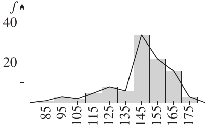
Frequency histograms and frequency polygons
Frequency histograms
A frequency histogram is a bar graph where:
- Each rectangle represents a class interval
- The height shows the frequency
- Rectangles join with no gaps between them
Guidelines for drawing frequency histograms
For ungrouped data:
- Each rectangle is centred on the value
- Rectangles join up with no gaps
For grouped data:
- Each rectangle is centred on the class centre
- All rectangles have equal width
- Rectangles join up with no gaps
- The horizontal axis intervals are called bins
Practical tip: If you have too many columns making the histogram difficult to interpret, use coarser grouping (wider intervals).
Frequency polygons
A frequency polygon is a line graph that can be drawn alongside or instead of a histogram.
Guidelines for drawing frequency polygons
Key steps for frequency polygons:
- Plot points at the centre of the top of each histogram rectangle
- Join these points with straight line segments
- On the left: Start the polygon on the horizontal axis at the previous value or class centre
- On the right: End the polygon on the horizontal axis at the next value or class centre
Histograms with discrete data
Histograms are designed for continuous variables, but can be used for discrete data. Remember:
- Rectangles still have width
- Rectangles still join up
- They are centred on values (or class centres for grouped data)
- This may involve numbers like half-integers that aren't possible values of the variable
Worked Example: Spelling Test Marks
Consider these Year spelling test marks:
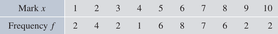
Grouping the data:
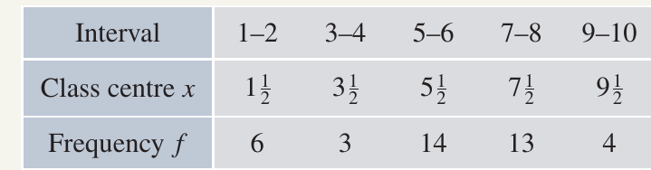
Histograms and polygons:
Analysis: The grouped data histogram makes it clearer that a significant group of students have difficulties with spelling or tests, shown by the higher frequency in the middle-to-upper mark ranges.
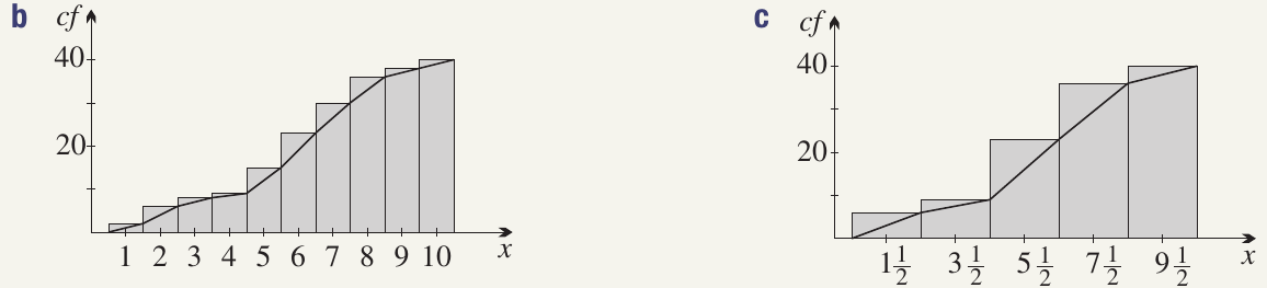
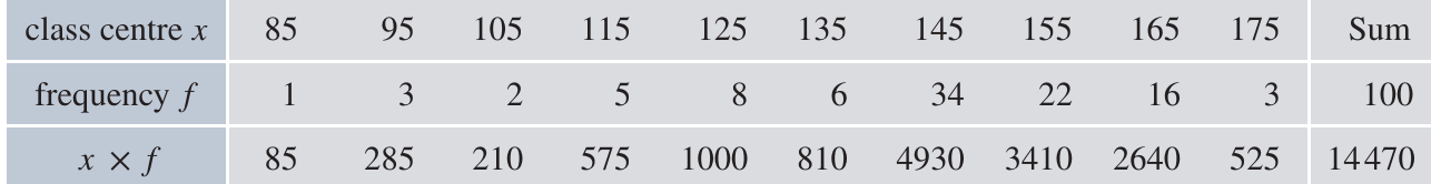
Cumulative frequency histograms and polygons (ogives)
Cumulative frequency histograms
A cumulative frequency histogram shows the accumulation of frequencies:
- Rectangles are "piled on top of each other"
- The height of the last rectangle equals the total sample size
Cumulative frequency polygons (ogives)
An ogive (pronounced "oh-jive") is the cumulative frequency version of the frequency polygon.
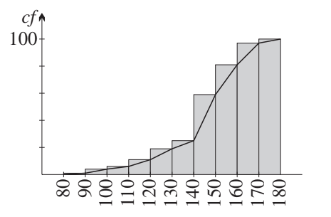
Guidelines for drawing cumulative frequency histograms
Key steps:
- Stack the frequency histogram rectangles on top of each other
- The final rectangle height equals the total number of observations ()
Guidelines for drawing ogives
Key steps for drawing ogives:
- Start at zero at the bottom left corner of the first rectangle (no scores yet accumulated)
- Pass through the top right-hand corner of each rectangle
- This plots scores less than or equal to the upper bound of each interval
- Finish at the top right corner of the last rectangle
- Final height equals the total sample size
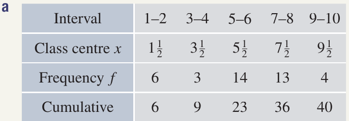
Worked Example: Cumulative Frequencies for Spelling Test
Grouped cumulative frequency table:
Cumulative histograms and ogives:
Finding the median:
- Original data: The th and st scores are both , so median
- Grouped data: The class centres of the th and st scores are both , so median
Such discrepancies are normal when using grouped data.
Calculating the mean for grouped data
Formula for the mean
For data organised in a frequency table:
where:
- is the mean
- is the score (or class centre for grouped data)
- is the frequency
- is the total number of observations
- means "sum all the products of "
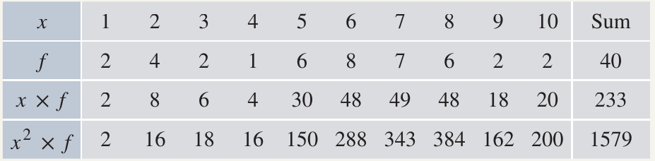
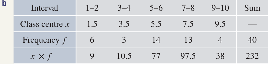
Worked Example: Heights Data
Calculation:
Note: The mean calculated from the raw (ungrouped) data was cm. Grouping reduced the mean by about mm.
Understanding the formula
The formula is equivalent to the weighted mean formula:
where is the relative frequency.
Each score is weighted by how often it occurs in the dataset.
Calculating variance and standard deviation
What are variance and standard deviation?
Variance () and standard deviation () measure how spread out the data are from the mean:
- Larger values indicate data are more spread out
- Smaller values indicate data are clustered near the mean
- Standard deviation is the square root of variance
- Standard deviation has the same units as the original data
Formulas for variance
Recommended formula for calculation:
Alternative formula (shows meaning more clearly):
The alternative formula shows that variance is the average of the squared deviations from the mean.
Formula for standard deviation
Important notation
For samples (data):
- Mean:
- Standard deviation:
- Variance:
For populations (theoretical):
- Mean: or
- Standard deviation:
- Variance: or
Worked Example: Heights Data
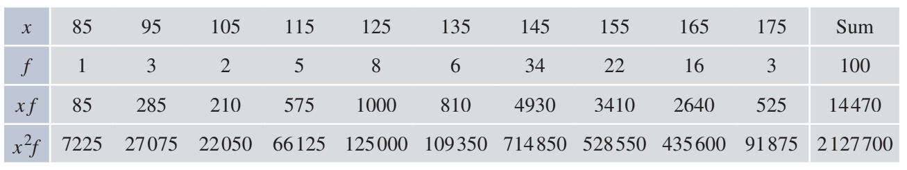
Calculating the mean:
Calculating the variance:
Calculating the standard deviation:
Comparison with raw data:
- Raw data: , cm
- Grouped data produced slightly different results
Worked Example: Spelling Test Marks
For the original (ungrouped) data:
For the grouped data:
The differences arise from the loss of information when grouping.
Key formulas summary
Essential Formulas for Grouped Data:
Mean:
Variance:
Standard deviation:
For grouped data: Use class centres in place of values.
Exam tips
When grouping data:
- Choose an appropriate number of intervals (typically )
- Use equal interval widths
- Record class centres clearly
- Note how you handle boundary values
When drawing histograms:
- Centre rectangles on values or class centres
- Ensure no gaps between rectangles
- Label axes clearly with units
- Include a frequency scale
When drawing frequency polygons:
- Join points with straight lines
- Extend to the horizontal axis at both ends
- At the appropriate previous/next value or class centre
When drawing ogives:
- Start at zero (bottom left)
- Pass through top right corners
- End at total sample size
When calculating statistics:
- Use the recommended formula as it's usually easier
- Show your working in a clear table format
- For grouped data, use class centres
- Remember that grouped data gives approximations
Remember!
Key Points to Remember:
-
Grouping data helps us see the big picture but involves some loss of precision. The trade-off is worth it for clarity when dealing with large datasets.
-
Class centres represent all values in an interval. They are used for calculations with grouped data.
-
Histogram rectangles join up with no gaps, whether for ungrouped or grouped data. They are centred on values or class centres.
-
Frequency polygons pass through the centres of rectangle tops and extend to the horizontal axis at both ends.
-
Ogives start at zero (bottom left corner) and pass through the top right corners of cumulative histogram rectangles, ending at the sample size.
-
Mean and variance formulas use class centres for grouped data: and .