Pareto Charts (HSC SSCE Mathematics Standard): Revision Notes
Pareto Charts
What is a Pareto chart?
A Pareto chart is a powerful visual tool that brings together two types of graphs into one display. Named after Vilfredo Pareto, this chart combines a frequency histogram with a cumulative frequency line graph.
The structure of a Pareto chart has specific features:
- The histogram bars are arranged from highest to lowest frequency, moving from left to right
- The vertical scale on the left side measures the frequency of each category
- A cumulative frequency line graph is overlaid on top of the histogram
- The vertical scale on the right side measures the cumulative percentage
- Categories are displayed along the horizontal axis
This dual-axis design allows you to see both individual frequencies and cumulative totals at the same time, making it easier to identify which categories contribute most to the overall total.
The Pareto principle
Pareto charts are designed to highlight the Pareto principle, also known as the 80/20 rule. This principle states that approximately 20% of the causes are responsible for about 80% of the effects or results.
Key concept: In most situations, a small number of factors account for the majority of the outcomes.
The Pareto principle has widespread applications across many fields:
- Manufacturing - identifying the main sources of defects
- Management - focusing on the most impactful problems
- Human resources - recognising top performers
- Time management - concentrating effort on the most important tasks rather than spreading time evenly
Let's look at an example using sales data from different regions:
| Region | Sales | Cumulative frequency | Cumulative percentage |
|---|---|---|---|
| USA | 57 | 57 | 28 |
| Europe | 52 | 109 | 54 |
| Africa | 41 | 150 | 74 |
| Canada | 24 | 174 | 86 |
| Pacific | 16 | 190 | 94 |
| Asia | 8 | 198 | 98 |
| India | 5 | 203 | 100 |
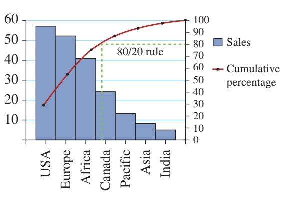
In this chart, notice how the first three regions (USA, Europe, and Africa) account for approximately 74% of total sales, even though they represent less than half of all regions. This demonstrates the 80/20 principle in action. The green dashed lines on the chart show where the 80% threshold occurs, helping to identify which categories are most significant.
Creating a Pareto chart
To construct a Pareto chart, follow this systematic five-step process:
Step 1: Arrange categories by frequency
Draw the horizontal axis and position each category along it. The category with the highest frequency must be placed on the left-hand side, with frequencies decreasing as you move right.
Step 2: Draw the histogram
Create a frequency histogram with bars representing each category. Include an appropriate vertical scale on the left-hand side of the chart to show the frequency values.
Step 3: Calculate cumulative values
Determine the cumulative frequency and cumulative percentage for each category. The cumulative frequency is the running total as you add each category's frequency. The cumulative percentage shows what proportion of the total each cumulative frequency represents.
Step 4: Add the cumulative percentage line
Draw a cumulative percentage line graph that connects the cumulative percentages. This line should have its own vertical scale on the right-hand side of the chart, typically ranging from 0 to 100%.
Step 5: Include a legend
Create a clear legend that identifies both the histogram bars and the cumulative percentage line, so readers can easily understand what each element represents.
Exam tip: Always check that your categories are in descending order before you start plotting. This is essential for a Pareto chart and is a common mistake to avoid.
Worked example: Applying the Pareto principle
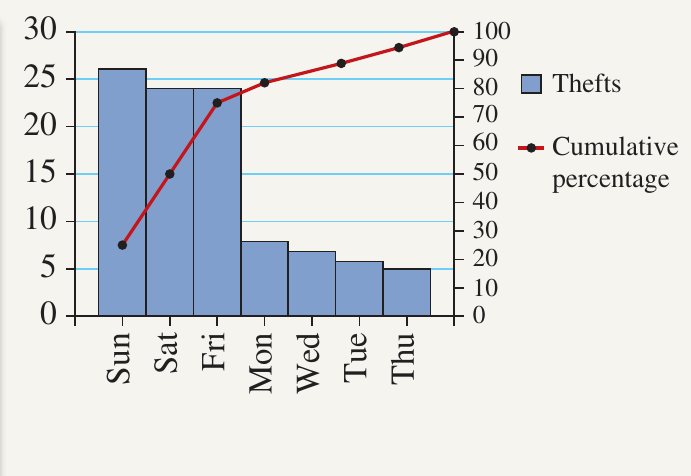
Let's examine how to interpret a Pareto chart and apply the 80/20 rule using motor vehicle theft data recorded across different days of the week.
| Day | Thefts | Cumulative frequency | Cumulative percentage |
|---|---|---|---|
| Sun | 26 | 26 | 26 |
| Sat | 24 | 50 | 50 |
| Fri | 24 | 74 | 74 |
| Mon | 8 | 82 | 82 |
| Wed | 7 | 89 | 89 |
| Tue | 6 | 95 | 95 |
| Thu | 5 | 100 | 100 |
Worked Example: Motor Vehicle Theft Analysis
Question a: On which day was there the least number of motor vehicle thefts?
Solution:
- Look at the right-hand side of the chart where the smallest bars appear
- The category with the lowest frequency is positioned on the far right
- Answer: Thursday, with 5 thefts
Question b: What is the cumulative percentage for Saturday and Sunday?
Solution:
- Saturday is the second category in the chart
- Find Saturday's row in the table and read the cumulative percentage value
- Answer: The cumulative percentage is 50%
This means that Sunday and Saturday together account for 50% of all motor vehicle thefts during the week.
Question c: What is the cumulative percentage for Friday, Saturday, Sunday and Monday?
Solution:
- Monday is the fourth category in the chart
- Locate Monday's row in the table
- Answer: The cumulative percentage is 82%
This shows that these four days (Sun, Sat, Fri, Mon) represent 82% of total thefts.
Question d: Apply the 80/20 rule to determine the days on which motor thefts are a major concern.
Solution:
To apply the 80/20 rule, we need to identify which categories fall within the first 80% of cumulative percentage:
- Draw a horizontal line from the 80% mark on the cumulative percentage axis
- Follow this line until it intersects with the red cumulative percentage line
- Draw a vertical line down from this intersection point
- All categories to the left of this vertical line represent the critical 20% of inputs causing 80% of outcomes
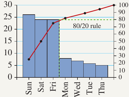
Answer: Sunday, Saturday and Friday are the days when motor thefts are a major concern.
Interpretation: Even though these three days represent less than half the week (about 43% of days), they account for approximately 74% of motor vehicle thefts. This insight allows law enforcement to allocate resources more effectively by focusing patrol efforts on these high-risk days.
Key Points to Remember:
- A Pareto chart combines a frequency histogram (bars) with a cumulative frequency line graph, with two different vertical scales
- Categories must be arranged in descending order from left to right, with the highest frequency on the left
- The Pareto principle (80/20 rule) suggests that roughly 20% of causes lead to 80% of effects
- To apply the 80/20 rule, draw a horizontal line at the 80% cumulative percentage mark and identify which categories fall to the left of where it intersects the line
- Pareto charts are valuable tools for prioritising problems, allocating resources, and making informed decisions by highlighting the most significant factors