Exploring and Describing Data (HSC SSCE Mathematics Standard): Revision Notes
Parallel Box-and-Whisker Plots
What is a box-and-whisker plot?
A box-and-whisker plot (also called a box plot) is a graphical way to display data that shows five key statistics at once. This visual representation helps you quickly understand the distribution and spread of a dataset.
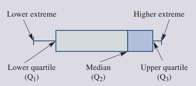
The five important statistics used in a box-and-whisker plot are collectively called the five-number summary:
The five-number summary consists of:
- Lower extreme: The minimum (smallest) value in the dataset
- Lower quartile (): Also called the first quartile, this marks the point where 25% of the data falls below
- Median (): The middle value that divides the dataset into two equal halves
- Upper quartile (): Also called the third quartile, this marks the point where 75% of the data falls below
- Higher extreme: The maximum (largest) value in the dataset
The plot is constructed on a number line. The box represents the middle 50% of the data, spanning from to , with a vertical line inside marking the median (). The whiskers are lines extending from each end of the box to the extreme values (minimum and maximum).
What are parallel box-and-whisker plots?
Parallel box-and-whisker plots display two (or more) box plots aligned on the same scale. This arrangement makes it easy to compare different datasets side by side. When comparing data, you can quickly see differences in:
- Central tendency (median values)
- Spread (range and interquartile range)
- Consistency of data
- Extreme values
Parallel plots are particularly useful when comparing data collected on the same variable from different groups, such as test scores from two different classes or measurements taken at different times.
Critical requirement: Both plots must be drawn on the same scale to ensure accurate comparison.
Constructing a parallel box-and-whisker plot
Creating a parallel box-and-whisker plot involves calculating the five-number summary for each dataset and then carefully drawing the plots on the same scale. The process requires careful attention to detail and accurate calculations. Let's work through a complete example to demonstrate the construction process step by step.
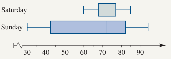
Worked Example: Temperature Comparison
Suppose you want to compare the hourly temperatures recorded on two days:
| Day | Temperatures (°C) |
|---|---|
| Saturday | 60, 62, 65, 69, 70, 72, 75, 75, 77, 78, 80, 85 |
| Sunday | 30, 35, 40, 45, 54, 66, 75, 77, 80, 85, 94, 94 |
Step 1: Calculate the five-number summary for each day
For Saturday ( values, already ordered):
- Minimum =
- (median of lower half: )
- Median = (average of 6th and 7th values: )
- (median of upper half: )
- Maximum =
For Sunday ( values, already ordered):
- Minimum =
- (median of lower half: )
- Median = (average of 6th and 7th values: )
- (median of upper half: )
- Maximum =
Step 2: Draw a labelled number line
Create a horizontal number line that covers the full range of values for both datasets. In this case, the scale should run from at least to .
Step 3: Draw the box for Saturday
Draw a rectangular box starting at and ending at .
Step 4: Mark the median
Draw a vertical line inside the box at the median value of .
Step 5: Draw the whiskers
Draw straight lines (whiskers) from the middle of each end of the box:
- Left whisker extends from to the minimum value ()
- Right whisker extends from to the maximum value ()
Step 6: Repeat for Sunday
Follow the same process to construct the box-and-whisker plot for Sunday using its five-number summary.
Step 7: Label each plot
Clearly label which box plot represents which day.
Key Tips for Construction:
- Always order your data from smallest to largest before finding the five-number summary
- Ensure both plots use the same scale on the number line for accurate comparison
- Double-check quartile calculations, especially when you have an even number of data values
- Label each plot clearly to avoid confusion when comparing
Using parallel box-and-whisker plots to compare data
Once you've constructed parallel box-and-whisker plots, you can use them to make meaningful comparisons between datasets. The visual display makes it easy to identify similarities and differences in the data distributions, allowing you to draw evidence-based conclusions about the datasets being compared.
Reading values from parallel plots
To extract information from a parallel box-and-whisker plot, you need to understand what each feature represents:
- The end of the left whisker shows the minimum value
- The left edge of the box shows the lower quartile ()
- The line inside the box shows the median
- The right edge of the box shows the upper quartile ()
- The end of the right whisker shows the maximum value
The width of the box indicates the interquartile range (IQR), which shows where the middle 50% of the data lies. A wider box indicates greater variability in the central data, while a narrower box suggests more consistent values in the middle of the dataset.
Worked example: Hospital births comparison

A city hospital recorded the number of births each day over two weeks. The data is shown below:
| Week | Number of births per day |
|---|---|
| Week A | 13, 13, 15, 15, 17, 18, 18, 19 |
| Week B | 8, 9, 10, 12, 12, 15, 18, 20 |
The parallel box-and-whisker plot below summarises this data:
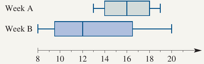
Worked Example: Interpreting Hospital Birth Data
Let's interpret this plot by answering several questions:
a) What is the lower extreme for Week A?
Looking at the left whisker of Week A, the lower extreme is 13.
b) What is the upper quartile for Week B?
The right edge of the box for Week B shows the upper quartile is 16.5.
c) What is the median for Week A?
The vertical line inside the box for Week A indicates the median is 16.
d) What is the lower quartile for Week B?
The left edge of the box for Week B shows the lower quartile is 9.5.
e) Compare and contrast the two sets of data
When comparing Week A and Week B:
Similarities:
- Both weeks had some days with similar numbers of births (both reached - births)
Differences:
- Spread: Week B shows greater variability with a much wider range ( to , range = ) compared to Week A ( to , range = ). The box for Week B is also wider, indicating a larger interquartile range.
- Consistency: Week A had more consistent daily birth numbers, with all values falling in a narrow range. Week B had both the highest () and lowest () number of births.
- Central tendency: Week A had a higher median () compared to Week B (), suggesting more births occurred on average during Week A.
Overall interpretation: The number of births was more stable and predictably higher in Week A. Week B experienced greater fluctuation, including both the busiest and quietest days recorded.
When Comparing Parallel Plots:
- Always compare medians first to understand central tendency
- Look at the box widths to assess the spread of the middle 50% of data
- Compare whisker lengths to understand the full range of data
- Consider outliers or extreme values that might affect interpretation
- Draw conclusions based on multiple features, not just one aspect
Key Points to Remember:
-
A box-and-whisker plot displays the five-number summary of a dataset: minimum, lower quartile (), median (), upper quartile (), and maximum.
-
Parallel box-and-whisker plots place two or more box plots on the same scale, making it easy to compare datasets visually.
-
The box contains the middle 50% of the data (between and ), while the whiskers extend to the extreme values.
-
When comparing parallel plots, look at the median values, the spread of data (box widths and whisker lengths), and the extreme values to draw meaningful conclusions.
-
A wider box or longer whiskers indicate greater variability in the data, while a narrower display suggests more consistent values.