Data Analysis and Presentation (VCE SSCE Chemistry): Revision Notes
Data Analysis and Presentation
Processing data
When you carry out a scientific investigation, you collect raw data that needs to be processed and analysed. Processing data involves performing calculations on your raw measurements to extract meaningful information. Always record the formula you used and show a sample calculation, even if you don't include all of this in your final report.
Calculating changes in measurements
In many experiments, you need to calculate the change in a measured quantity. For example, in an electrolysis experiment investigating Faraday's first law, you might measure the initial and final masses of a cathode:
Calculating means
The mean (average) helps you identify the typical value from repeated measurements. To calculate a mean, add all the values together and divide by the number of measurements:
Presenting data in tables
When you summarise processed data in a table, follow these conventions:
- Place the independent variable (the one you control) in the left-hand column
- Place the dependent variable(s) (the one(s) you measure) in the column(s) that follow
- Put calculated or processed values in the final column
Here's an example from an electrolysis experiment:
| Current (A) | Trial number | Change in mass (g) | Mean change in mass (g) |
|---|---|---|---|
| 0.20 | 1 | 0.125 | 0.128 |
| 2 | 0.122 | ||
| 3 | 0.138 | ||
| 0.40 | 1 | 0.220 | 0.224 |
| 2 | 0.230 | ||
| 3 | 0.223 | ||
| 0.60 | 1 | 0.384 | 0.380 |
| 2 | 0.380 | ||
| 3 | 0.375 | ||
| 0.80 | 1 | 0.512 | 0.520 |
| 2 | 0.520 | ||
| 3 | 0.528 |
In this table, the final two columns contain processed data (the change in mass and the mean change in mass).
Scientific notation
Scientists use scientific notation (also called standard form or power of ten notation) to express very large and very small numbers more conveniently. For example, instead of writing , scientists write .
A number in scientific notation is written as , where:
- is a number equal to or greater than 1 and less than 10 (that is, )
- is the index (plural: indices), which is an integer (positive or negative whole number) representing the power to which 10 is raised
Converting to scientific notation
To convert a number to scientific notation:
- Place the decimal point after the first non-zero digit, creating a number between 1 and 10
- Count how many places you moved the decimal point and note the direction
- Multiply by the appropriate power of 10:
- If you moved the decimal point to the left, the index is positive
- If you moved the decimal point to the right, the index is negative
Worked Example: Converting to Scientific Notation
Example 1: Convert to scientific notation
- Place decimal after first non-zero digit:
- Count: decimal moved 3 places to the left
- Result:
Example 2: Convert to scientific notation
- Place decimal after first non-zero digit:
- Count: decimal moved 4 places to the right
- Result:
Remember: Large numbers have positive indices; very small numbers have negative indices.
Managing significant figures in calculations
The number of significant figures in your answer depends on the type of calculation you're performing:
- For multiplication or division: Use the smallest number of significant figures from the initial values
- For addition or subtraction: Use the smallest number of decimal places from the initial values
For example: (rounded to 1 decimal place, matching the least precise value)
Important considerations
When using a calculator, don't report every decimal place just because it's displayed. If your least accurate data has 3 significant figures, report your final answer to 3 significant figures as well.
However, during multi-step calculations, keep extra decimal places in your calculator between steps. Only round your final answer to the appropriate number of significant figures.
Using scientific notation for significant figures
Scientific notation helps you express answers with the correct number of significant figures. The number could be written as:
- (2 significant figures)
- (3 significant figures)
- (4 significant figures)
Special note about molar masses
Molar mass values should not limit the significant figures in your answer. Molar mass is not experimental data, and in VCE Chemistry, relative atomic masses are quoted to one decimal place. This means most molar masses have at least 3 significant figures.
Worked example: Enthalpy of combustion calculation
Worked Example: Calculating Enthalpy of Combustion
Question: Calculate the enthalpy of combustion for ethanol, given that the temperature of of water increased from to when the mass of the spirit burner decreased from to . (Specific heat capacity of water = )
Step 1: Record all data and note significant figures
- mass (water) = (5 sig figs)
- temperature change (water) = (to 1 decimal place and 3 sig figs)
- specific heat capacity (water) = (3 sig figs)
- mass change (ethanol) = (3 sig figs)
Step 2: Calculate energy transferred using
(Keep all figures in calculator for next step)
Step 3: Calculate amount of ethanol burned using
(Keep all figures in calculator for next step)
Step 4: Calculate enthalpy of combustion using
Step 5: Round to 3 significant figures (limited by temperature) and add correct sign
Data analysis
After collecting and processing your data, you need to analyse and interpret your findings. Consider these factors:
- Was there a pattern, trend or relationship between the independent and dependent variables?
- What kind of pattern was observed and under what conditions?
- Were there data points that didn't match the trend (outliers)?
- How did the monitored values change during the experiment?
- How do your results compare to theoretical or literature values?
Graphs
It's easier to observe trends and patterns in graphical form than in tables. Graphs provide a visual representation of relationships between variables.
General rules for line graphs
When creating line graphs, follow these essential rules:
- Use a descriptive title
- Place the independent variable on the horizontal (x) axis
- Place the dependent variable on the vertical (y) axis
- Label the axes clearly with both the variable name and the unit
- Choose an appropriate scale that is consistent and easy to read
- Mark scales in multiples of 2 or 5 rather than 3 or 4 for easier reading
- If there's a data point at , the line of best fit can go through the origin
- Otherwise, draw the line of best fit through the data points on the graph
Types of graphs
Scatter graphs and line graphs
A scatter graph displays individual data points when one variable depends on another. The independent variable goes on the horizontal axis, and the dependent variable on the vertical axis. When you add a line of best fit to a scatter graph, it becomes a line graph.
Column graphs (bar graphs)
Column graphs clearly illustrate relationships between variables and are most appropriate for discrete (separate, distinct) data rather than continuous data.
Pie charts
Pie charts effectively illustrate percentages and proportions.

Trend lines in graphs
Line graphs show the relationship or trend between two variables. Different types of relationships produce different trend lines:
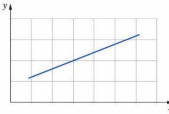
Linear relationships
When variables change in direct proportion to each other, they produce a straight trend line. This is called a linear trend or linear relationship.
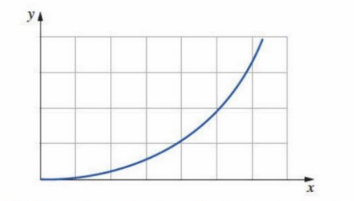
Exponential relationships
When variables change non-linearly in proportion to each other, they may produce a curved trend line. This is an exponential relationship: as increases, increases non-linearly. This corresponds to equations like , where is a positive number other than 1.
Inverse relationships
In an inverse relationship, one variable increases as the other variable decreases. The relationship may be direct (linear) or exponential (curved).
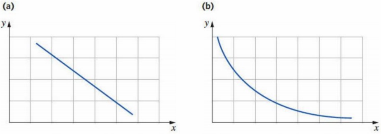
No relationship
When there's no relationship between two variables, one variable doesn't change even if the other changes.

Scatter graphs and lines of best fit
Scatter graphs can display raw or processed data. They show the relationship between two variables when one depends on the other.
- The independent variable (set by the experimenter) goes on the horizontal axis
- The dependent variable (measured in the experiment) goes on the vertical axis
- Data is plotted as individual points
- A trend line (straight or curved) is fitted to show the overall pattern
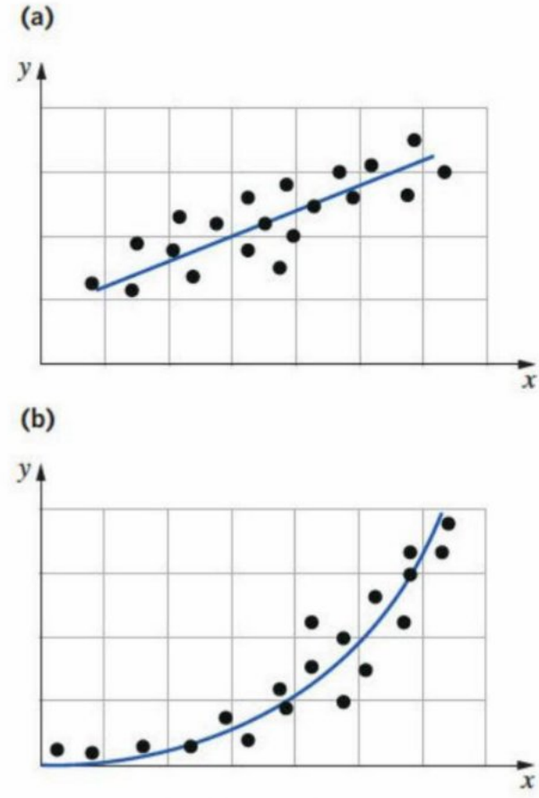
A line of best fit doesn't necessarily pass through every data point. You can estimate its position by eye (ensuring equal numbers of points above and below the line) or use mathematical graphing programs for accurate determination.
Outliers
An outlier is a data point that differs significantly from other observations and doesn't fit the trend. Outliers are often caused by mistakes in measurement or recording.
Critical Point About Outliers
You must analyse and explain outliers rather than automatically dismissing them. Repeating trials can help determine whether an outlier resulted from a mistake.
Example: Titration and concordant titres
In titrations using a burette with resolution, you should aim for three concordant titres. These are titres with a range of no more than (the difference between largest and smallest is ≤ ). Any titre beyond this range is an outlier and isn't used in calculating the mean titre.
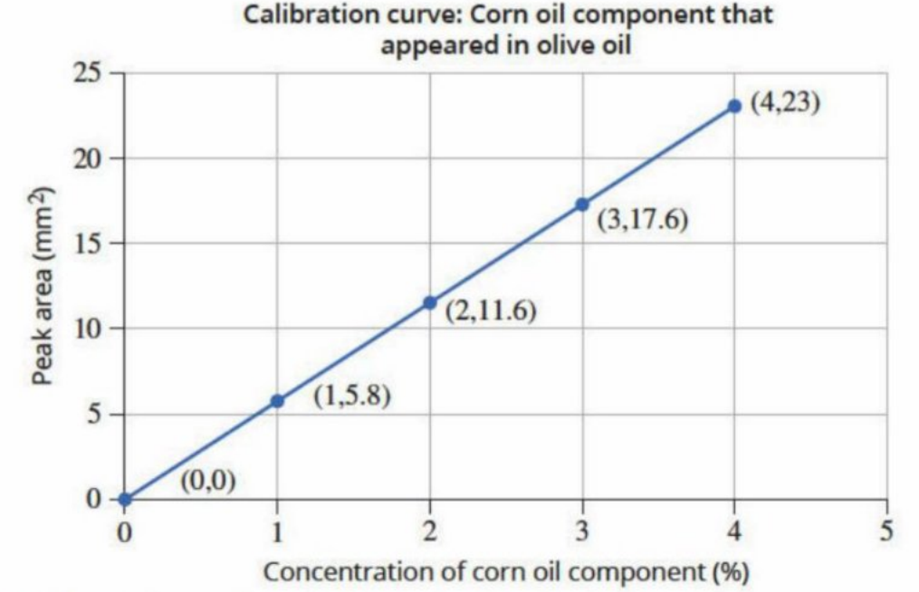
Outliers in calibration curves
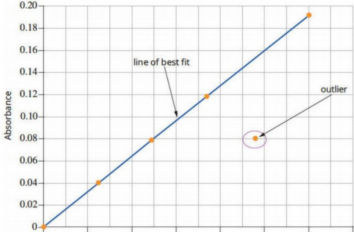
In this calibration curve for determining phosphate concentration, one data point doesn't fit the trend. This outlier (possibly caused by incorrect preparation of that standard solution) is shown on the graph but not included in the line of best fit.
Comparing your data to other values
To claim your results are accurate, you must compare them to literature values or accepted values:
- Literature values are found in published scientific reports, journals, or reliable websites
- Accepted values include published values and those calculated using correctly balanced equations and stoichiometry
Two useful calculations for comparing data are:
- Percentage difference: Compares experimental to theoretical values
- Percentage change: Shows how values changed during an experiment
Percentage difference
Percentage difference shows how accurate your experimental result is by comparing it to a theoretical value:
Worked Example: Calculating Percentage Difference
Question: A student electrolysed copper(II) sulfate solution using for minutes. The cathode mass changed from to . The theoretical mass gain (from Faraday's laws) was . Calculate the percentage difference.
Step 1: Calculate experimental mass gain
Mass gain = final mass - initial mass =
Step 2: Identify which value is larger
Theoretical mass gain () > experimental mass gain ()
Step 3: Substitute into formula
Step 4: Apply significant figures rules
Answer should have 2 significant figures (due to subtraction in step 3)
Result:
Step 5: Interpret the result
The experimental value is less than the theoretical mass gain of the cathode.
Percentage change
Percentage change measures the difference between initial and final values:
Worked Example: Calculating Percentage Change
Question: A student monitored mass loss during the reaction:
Initial mass was ; final mass after 120 seconds was . Calculate the percentage change in mass.
Step 1: Identify whether mass increased or decreased
Initial mass () > final mass (), so mass decreased
Step 2: Substitute into formula
Step 3: Apply significant figures rules
Answer should have 3 significant figures (due to subtraction in step 2)
Result:
Step 4: Interpret the result
There has been a decrease in mass.
Key Points to Remember:
- Always show the formula and a sample calculation when processing data, and record everything in your logbook
- In tables, place the independent variable in the left column and dependent variable(s) in the following column(s), with processed data in the final column
- For scientific notation: moving the decimal point left gives a positive index; moving right gives a negative index
- When multiplying or dividing, use the smallest number of significant figures from initial values; when adding or subtracting, use the smallest number of decimal places
- Graphs make trends and patterns easier to observe than tables—always plot the independent variable on the x-axis and dependent variable on the y-axis
- Outliers must be analysed and explained, not automatically dismissed; repeating trials can help determine if an outlier resulted from a mistake
- Use percentage difference to compare experimental results to theoretical values and assess accuracy; use percentage change to show how values changed from initial to final measurements