Time Series Data (VCE SSCE General Mathematics): Revision Notes
Time Series Data
What is time series data?
When we collect, observe, or record data about a variable at regular intervals over time, we call this time series data. This type of data is special because the explanatory variable is always time, which distinguishes it from other types of numerical data.
Time series data appears in many real-world contexts. For example, we might track annual road accident fatalities, daily temperatures, monthly electricity bills, or quarterly business sales. The key feature is that measurements are taken at successive time intervals.
Time series data is fundamentally different from other numerical data because time is always the explanatory variable. This temporal ordering creates unique patterns and analytical opportunities.
A classic example is the annual road accident fatalities for Australia from to . This data set shows how road deaths have changed over a -year period:
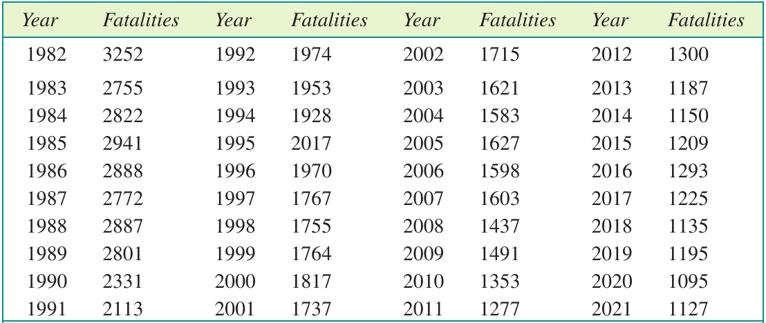
When we plot this data, we can visualise the pattern more clearly:
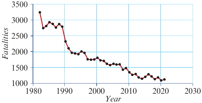
This plot immediately reveals a clear downward trend in road fatalities over time, suggesting that road safety initiatives in Australia have been effective.
Constructing time series plots
A time series plot is essentially a special type of scatterplot where time is always placed on the horizontal axis. The key difference from a regular scatterplot is that consecutive data points are joined by line segments in time order, making it easier to see patterns and trends.
Steps for creating a time series plot
Let's work through an example. Suppose maximum temperature was recorded each day for a week in a certain town:
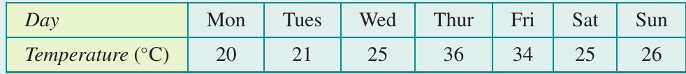
Worked Example: Creating a Time Series Plot
Step 1: Identify the variables
In any time series plot, time is the explanatory variable (EV) and goes on the horizontal axis. The variable we're measuring (temperature in this case) is the response variable (RV) and goes on the vertical axis.
Step 2: Determine appropriate scales
For the horizontal axis, we need a scale from to to cover all seven days, with intervals of for each day.
For the vertical axis, temperature ranges from to . A scale from to with intervals of would be suitable.
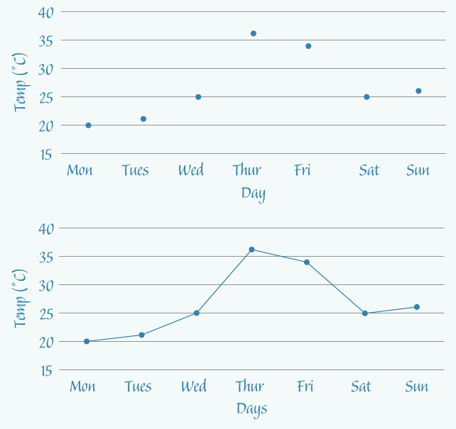
Step 3: Plot the data points
Set up your axes with appropriate labels, then plot each data point as you would for a scatterplot.
Step 4: Join consecutive points
Connect the data points with straight line segments in time order.
Important considerations for time variables
When working with time series data, we often need to convert time periods into numerical values. For example:
- Months can be numbered for January, February, March, etc.
- If we have monthly data for a two-year period, we'd use values
- Days of the week can be numbered to
- Quarters can be numbered
Both approaches are acceptable: you can use the actual time labels (Monday, Tuesday, Wednesday) or their numerical equivalents () on your plot. Choose whichever makes your graph clearer and easier to read.
Using technology
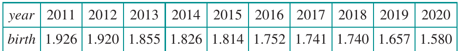
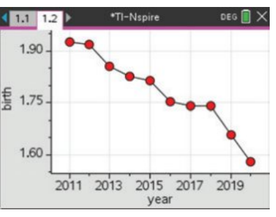
For larger data sets, technology tools like spreadsheets or CAS calculators are invaluable. Consider the Australian birth rate data from to :
This data can be plotted using a calculator to produce a time series plot showing the declining birth rate over the decade:
Looking for patterns in time series plots
When analysing time series data, we look for six main features:
- Trend: long-term increase or decrease
- Cycles: recurring patterns lasting more than one year
- Seasonality: recurring patterns within one year or less
- Structural change: sudden shifts in the pattern
- Outliers: unusual individual values
- Irregular fluctuations: random, unexplained variations
Every real-world time series will show irregular fluctuations, and it's common to see one or more of the other features as well. Learning to identify these patterns is essential for understanding and interpreting time series data.
Trend
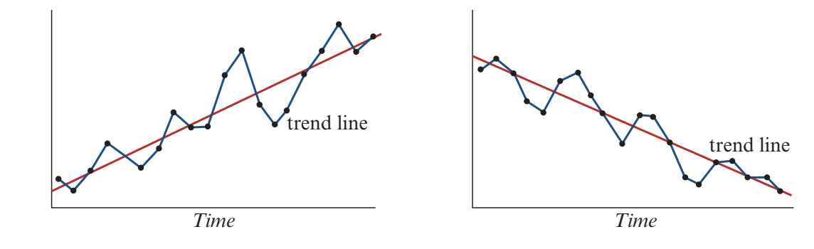
When examining a time series plot, we often notice a general upward or downward movement over time. This long-term change is called a trend. A trend represents the overall direction in which the data is moving, ignoring short-term fluctuations.
To identify trends, we can draw trend lines on the graph. These lines smooth out the fluctuations and show the overall increasing or decreasing nature of the data. An upward-sloping trend line indicates an increasing trend, while a downward-sloping trend line shows a decreasing trend.
Multiple trends in one time series
Sometimes a time series displays different trends during different time periods. This is particularly common when external events or changing circumstances affect the data.
Consider the Australian birth rate from to :
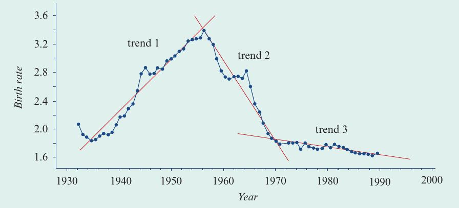
This plot shows three distinct trends:
Worked Example: Identifying Multiple Trends
Trend 1 (1940-1961): The birth rate grew dramatically during this period. After the Second World War ended, servicemen returned home and the economy expanded rapidly. This period of rapid increase in birth rate is known as the Baby Boom.
Trend 2 (1962-1980): The birth rate declined very rapidly. More effective birth control methods became available, and women increasingly focused on careers. This period is sometimes called the Baby Bust.
Trend 3 (1980s onwards): The birth rate continued to decline, but more slowly, due to a complex range of social and economic factors.
This example shows how trend analysis can reveal important social and economic changes over time.
Cycles
Cycles are recurring movements in a time series that generally last longer than one year. Unlike the regular patterns of seasonality, cycles may vary in height and may not repeat at exactly regular intervals.
The variations in cycles can be caused by various factors, such as economic conditions, natural phenomena, or long-term patterns in human behaviour.
Example: Sunspot cycles
A classic example of cycles appears in sunspot activity. Sunspots are darker, cooler areas on the sun's surface. The following plot shows sunspot activity from to :
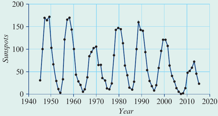
The recurring pattern is clearly visible in the time series plot. The years of lowest sunspot activity occur at approximately , , , , , and . This shows a cycle that repeats roughly every years.
Many business indicators also vary in cycles. For example, interest rates and unemployment figures often show cyclical patterns, although their periods are usually less regular than natural phenomena like sunspots.
Seasonality
When cycles have calendar-related periods of one year or less, we call them seasonality. Seasonal patterns are periodic movements related to specific time periods such as years, months, weeks, or even days.
Seasonal movements tend to be more predictable than other time series features. They occur because of:
- Variations in weather (e.g., ice-cream sales increase in summer)
- Institutional factors (e.g., unemployment increases at the end of the school year)
- Cultural patterns (e.g., retail sales peak before Christmas)
Example: Hotel occupancy rates
Consider the quarterly hotel room occupancy rates in Australia from to :
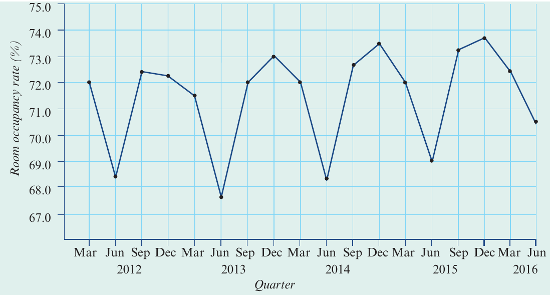
The regular peaks and troughs occurring at the same time each year clearly indicate seasonality. In this case:
- Demand for accommodation is lowest in the June quarter (winter)
- Demand is highest in the December quarter (summer/holiday season)
Notice that this time series plot reveals both seasonality (the regular fluctuations) and an upward trend (the general increase over time). The upward-sloping trend line shows that despite month-to-month fluctuations, overall demand for hotel accommodation has increased during this period.
Many real-world time series display multiple patterns simultaneously - don't assume you'll only see one feature at a time!
Structural change
A structural change occurs when there is a sudden shift in the established pattern of a time series. This is different from gradual trends or regular cycles because it represents an abrupt change at a specific point in time.
Structural changes often result from significant external events or changes in circumstances, such as:
- New legislation or regulations
- Major technological innovations
- Economic crises
- Changes in management or ownership
- Natural disasters
Example: Household electricity use
Consider the monthly electricity use (in kilowatt-hours, kWh) for a rental house over months:
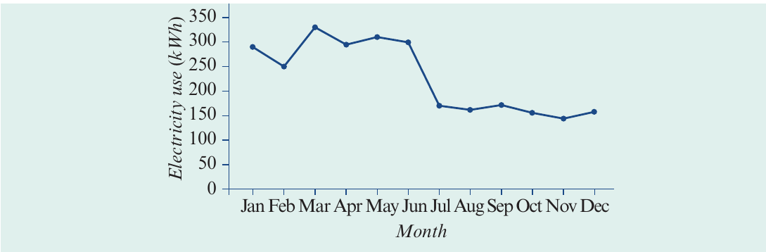
This plot shows an abrupt change in power usage between June and July. During the first half of the year (January to June), monthly power use averaged around kWh. From July onwards, it suddenly decreased to approximately kWh per month.
This structural change likely reflects a change in circumstances, such as a family with children moving out and being replaced by a single person living alone.
The birth rate time series we examined earlier also displayed structural change, with three quite distinct trends during -. These reflected significant external events (like World War II) and changes in social and economic circumstances.
Outliers
Outliers are individual data values that stand out from the general pattern of the data. They represent unusual observations that don't fit the established pattern of the time series.
Outliers can occur for various reasons:
- Measurement errors
- Recording mistakes
- Unusual one-off events
- Equipment malfunctions
- Extraordinary circumstances
Example: Daily electricity use
The following plot shows daily electricity use for a household over a fortnight (14 days):
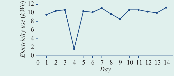
For this household, daily electricity use follows a regular pattern, fluctuating around an average of about kWh per day. However, day is a clear outlier, with less than kWh of electricity used.
Worked Example: Investigating an Outlier
A follow-up investigation revealed that on this day, the house was without power for hours due to a storm. This explains why much less power was used than normal.
Without this context, the outlier might have seemed mysterious, but knowing the cause helps us understand it's a genuine unusual event rather than a data error.
When you identify an outlier in your data, always investigate the cause. Outliers can indicate:
- Data recording errors that need to be corrected
- Genuine unusual events that are part of the story your data is telling
- Special circumstances that provide valuable insights
Never simply ignore or delete outliers without understanding why they occurred!
Irregular (random) fluctuations
Irregular fluctuations represent all the variations in a time series that we cannot reasonably attribute to systematic patterns like trend, cycles, seasonality, structural change, or outliers. These are the random, unpredictable movements that exist in all real-world data.
Key characteristics of irregular fluctuations:
- They are always present in any real-world time series
- They are unpredictable and cannot be forecast
- They have many sources, mostly unknown
- They can obscure underlying patterns
One of the main goals of time series analysis is to develop techniques to identify regular patterns that are often hidden by irregular fluctuations. In the next section of this topic, you'll learn about smoothing, a technique designed to reduce the impact of irregular fluctuations and make underlying patterns more visible.
Summary of time series patterns
When analysing any time series, systematically look for these six features:
Key Features of Time Series Data:
Trend: Present when there is a long-term upward or downward movement in the time series. Trend lines can be drawn to show the overall direction, ignoring short-term fluctuations.
Cycles: Present when there is a periodic movement with a period greater than one year. The period is the time taken for one complete up-and-down movement.
Seasonality: Present when there is a periodic movement with a calendar-related period of one year or less (such as yearly, monthly, or weekly patterns).
Structural change: Present when there is a sudden change in the established pattern at a specific point in time.
Outliers: Present when individual values stand out noticeably from the general body of data.
Irregular (random) fluctuations: Always present in real-world time series data. They include all the unexplained variations that cannot be attributed to the other five features.
Understanding these patterns helps us make sense of time series data and can support better decision-making in business, economics, science, and many other fields.
Remember!
Key Points to Remember:
- Time series data involves measurements taken at regular intervals over time, with time always as the explanatory variable
- Time series plots join consecutive data points with line segments to show patterns clearly
- Look for six key features: trend, cycles, seasonality, structural change, outliers, and irregular fluctuations
- Trend shows long-term direction; cycles repeat over periods greater than one year; seasonality repeats within one year
- Structural changes represent sudden shifts in pattern, while outliers are unusual individual values
- Every real-world time series contains irregular fluctuations - these are the random variations we cannot explain