Specific Skills (AQA A-Level Geography): Revision Notes
Graphical Skills
Graphical skills are essential tools for geographers to present data clearly and effectively. Different types of graphs and charts serve different purposes, and choosing the right one depends on the type of data you have and what patterns you want to show.
Line graphs
Line graphs are powerful tools for displaying how data changes over time or in relation to another continuous variable. They make it easy to spot trends and patterns at a glance.
Simple and compound line graphs
There are two main types of line graphs you need to understand:
Simple line graphs plot a single variable against another. The line itself represents the actual measurements taken. For example, you might plot temperature against time, with the line showing the exact temperature recorded at different points.
Compound line graphs display multiple datasets on the same chart. The key difference is that the spaces between lines are filled with colour or shading to show cumulative totals. Each coloured band represents a different component, and together they show how the total is made up.
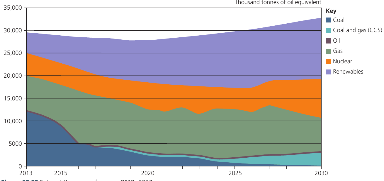
The chart above shows how the UK's energy mix is projected to change between 2013 and 2030. You can see both individual components (like coal declining sharply) and the overall total energy production remaining stable. This demonstrates the power of compound line graphs to show multiple data layers simultaneously.
Guidelines for constructing line graphs
When creating line graphs, follow these important rules:
-
Plot the independent variable on the horizontal axis (x-axis) and the dependent variable on the vertical axis (y-axis). For time-series data, time always goes on the horizontal axis.
-
Choose appropriate scales that allow you to plot the full range of your data without wasting space or making the graph difficult to read.
-
Label axes clearly with the variable name and units of measurement.
-
Use different symbols (dots, squares, triangles) if you're plotting more than one line on the same graph, and include a clear key.
Understanding Independent vs Dependent Variables
The independent variable is the one you control or that changes naturally (like time), while the dependent variable is what you're measuring or observing. Getting these on the correct axes is crucial for accurate data representation.
Displaying two datasets on one graph
It's possible to show two related sets of data on a single graph by using dual axes. The left vertical axis displays the scale for one variable, whilst the right vertical axis shows the scale for a different variable. This technique allows you to explore visual connections between two datasets, though you must be careful not to imply causation where there might only be coincidental correlation.
Correlation Does Not Equal Causation
Just because two variables appear related when plotted on dual axes doesn't mean one causes the other. Always consider whether the relationship is causal or merely coincidental before drawing conclusions.
Bar graphs
Bar graphs use vertical columns to represent data values. They are versatile and can display information in several different ways.
Understanding bar graph types
Simple bar graphs show individual values as separate columns rising from a baseline. The height of each column corresponds to the magnitude of the value it represents.
Comparative bar graphs place bars for different categories side by side, making it straightforward to compare values across groups.
Compound bar graphs (also called stacked bar graphs) divide each column into segments. Each segment represents a component of the total, allowing you to see both the overall total and the contribution of each part.
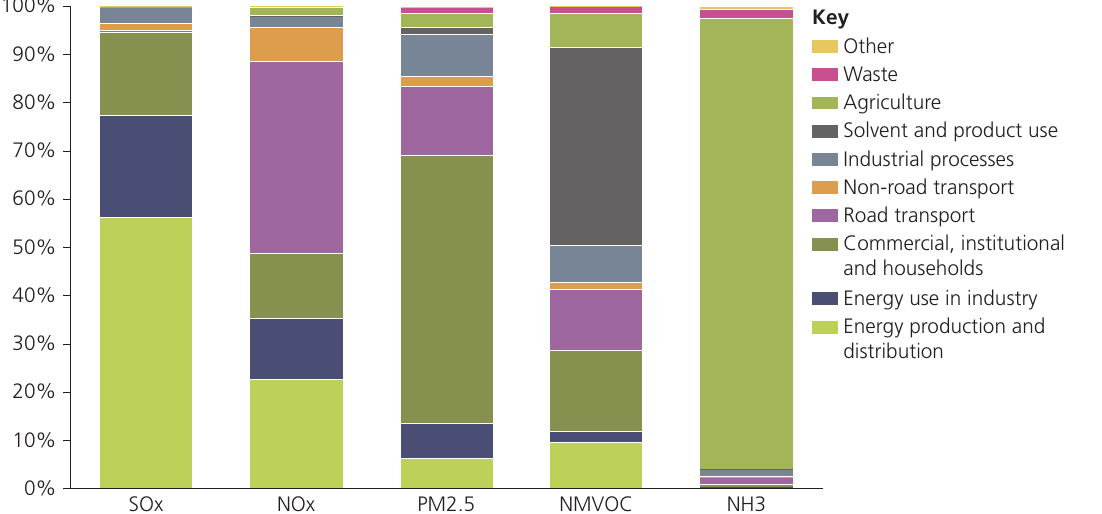
The graph above shows air pollutant emissions across different sectors in European countries. Each bar represents 100% of emissions for a particular pollutant, with the coloured segments showing which sectors contribute most to that specific pollutant.
Why Bar Graphs Are So Effective
Bar graphs are particularly useful because:
- Values can be read directly from the vertical scale
- They show relative magnitudes clearly
- Different categories can be compared easily
- They work well with both absolute values and percentages
Their simplicity makes them one of the most widely used graphical tools in geography.
Divergent bar charts
Divergent bar charts are useful when your data includes both positive and negative values. These charts use a central baseline (zero line) with bars extending upwards for positive values and downwards for negative values.
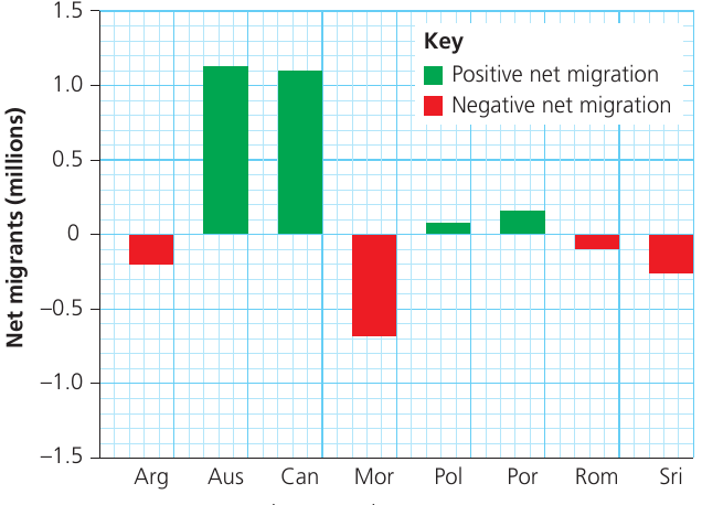
This type of chart is particularly helpful for showing data such as:
- Profit and loss
- Net migration (immigration vs emigration)
- Population growth and decline
- Changes above or below average
The clear visual separation between positive and negative values makes patterns immediately obvious.
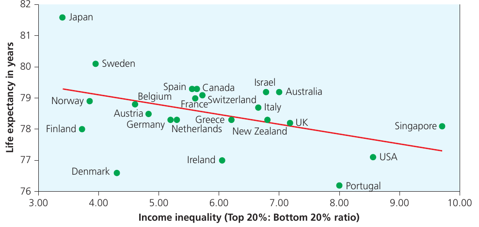
Scattergraphs and best-fit lines
Scattergraphs (also called scatter plots or scatter diagrams) are used to investigate potential relationships between two variables. Each point on the graph represents one observation, with its position determined by its values for both variables.
Using scattergraphs to identify relationships
Scattergraphs are particularly valuable for identifying patterns and trends that might warrant further investigation. Unlike line graphs, scattergraphs don't assume a direct connection between consecutive points – they simply display the data to see if any relationship exists.
Important features of scattergraphs include:
- The independent variable goes on the horizontal axis and the dependent variable on the vertical axis
- Correlations can emerge even when the relationship is only coincidental – just because two variables appear related on a scattergraph doesn't mean one causes the other
- They can be plotted on different types of graph paper including arithmetic, logarithmic, or semi-logarithmic paper, depending on the nature of your data
Understanding best-fit lines
A best-fit line can be added to a scattergraph to show the general trend in the data. This line should pass through the data in a way that minimises the distances between the line and all the points.
The direction of the best-fit line tells you about the relationship:
- If the line slopes upward (bottom left to top right), there's a positive relationship – as one variable increases, so does the other
- If the line slopes downward (top left to bottom right), there's a negative relationship – as one variable increases, the other decreases
The strength of the relationship is indicated by how closely the points cluster around the best-fit line. Points tightly grouped around the line suggest a strong relationship, while widely scattered points indicate a weak relationship.
Identifying residuals
Residuals are points that lie some distance away from the best-fit line. These are sometimes called anomalies. Residuals can be either positive (above the line) or negative (below the line).
Identifying residuals is useful because they may indicate:
- Measurement errors
- Unusual cases worth investigating further
- Other factors influencing the relationship between your two variables
Worked Example: Interpreting a Scattergraph
Imagine you've plotted population density (people per km²) against distance from city centre (km) for 20 locations. You observe:
Step 1: The scattergraph shows points generally moving from top left to bottom right.
Step 2: This indicates a negative relationship – as distance from the city centre increases, population density decreases.
Step 3: You notice two points lying well above the best-fit line (positive residuals). These might represent:
- Satellite towns with high density despite being far from the centre
- Areas with high-rise housing developments
- Locations worth investigating in more detail
Pie charts and proportional divided circles
Pie charts divide a circle into segments, with each segment representing a proportion of the total. They are visually effective for showing how a whole is divided into parts.
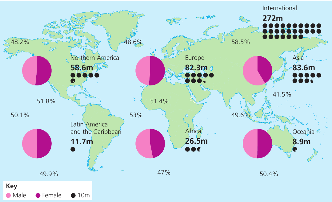
When to use pie charts
Pie charts work well when you want to:
- Show the relative contribution of each component to the whole
- Make it easy to see which categories are largest and smallest
- Display percentage or proportional data
Limitations of Pie Charts
However, pie charts have significant limitations:
- It's difficult to assess precise percentages or compare values between different pie charts
- Small segments are hard to label and interpret
- Too many segments make the chart cluttered and confusing
As a general rule, avoid using more than 6-8 segments in a single pie chart. If you have more categories, consider using a bar graph instead.
Constructing proportional divided circles
When you want to compare totals between different groups, you can draw multiple pie charts where the size of each circle is proportional to the total value it represents. This allows you to see both the internal composition and the relative magnitude of different groups.
Formula for Proportional Circles
To calculate the radius of a proportional circle, use the formula:
where is the total value you want the circle to represent, is the radius of the circle, and (pi) is taken as 3.142.
When stating the scale of your proportional circles, express it as: "x units of data = 1 square unit on the graph paper"
Worked Example: Calculating Proportional Circle Radius
You want to represent three cities' populations using proportional circles:
- City A: 400,000 people
- City B: 900,000 people
- City C: 1,600,000 people
Step 1: Decide on a scale. Let's use 100,000 people = 1 unit
Step 2: Convert populations to units:
- City A: units
- City B: units
- City C: units
Step 3: Calculate radii using :
- City A: cm
- City B: cm
- City C: cm
Triangular graphs
Triangular graphs (also called ternary diagrams) are specialist tools for displaying data that can be divided into three components, where those components must add up to 100%.
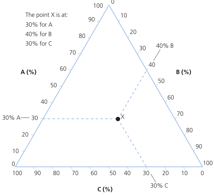
Understanding triangular graphs
Triangular graphs are plotted on special paper in the form of an equilateral triangle. Each side of the triangle represents one of the three components, with a percentage scale running from 0 to 100%.
The main advantage of this graph type is that you can see:
- The varying proportions of all three components simultaneously
- The relative importance of each component
- Which component is dominant
- Clusters of similar data points
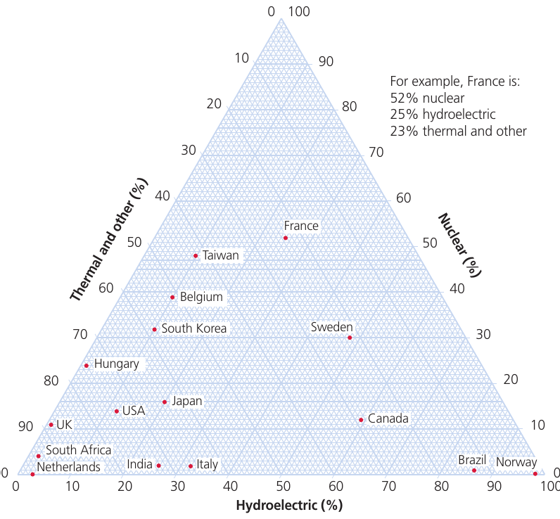
Reading Triangular Graphs
Although triangular graphs appear complex at first, they follow clear rules:
- Each corner of the triangle represents 100% of one component and 0% of the other two
- As you move away from a corner, the percentage of that component decreases
- The sum of all three percentages at any point always equals 100%
- Lines parallel to each side represent constant percentages for one component
The key to reading these graphs is to follow the lines parallel to each side of the triangle. Each set of parallel lines represents one of the three components.
Limitations of triangular graphs
Triangular graphs can only be used for data that fits specific criteria:
- The data must have exactly three components
- These components must be expressed as percentages
- The percentages must total 100%
This means you cannot use triangular graphs for absolute values or for data that has more or fewer than three components. If your data doesn't meet these requirements, consider using a different graph type such as a compound bar graph or stacked area chart.
Graphs with logarithmic scales
Logarithmic graphs are constructed similarly to arithmetic line graphs, but the scale is divided into cycles, with each cycle representing a tenfold increase in value.
When to use logarithmic scales
Logarithmic scales are particularly useful when:
- Your data ranges from very small to very large values (for example, from 0.0001 to 1 million)
- You want to display rates of change more clearly
- You're plotting exponential growth patterns
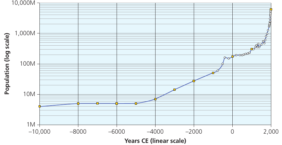
The graph above shows world population growth over thousands of years. Using a logarithmic scale on the vertical axis allows us to see patterns across the entire time period, even though recent population has grown enormously. On a standard arithmetic scale, the early data points would be invisible due to the massive scale difference.
Understanding semi-logarithmic graphs
Graph paper can be either fully logarithmic or semi-logarithmic. On semi-logarithmic paper, one axis uses a logarithmic scale whilst the other uses a standard linear (arithmetic) scale.
Semi-logarithmic graphs are especially useful for plotting rates of change over time, where time appears on the linear axis. If a variable is increasing at a constant proportional rate (such as doubling every decade), it will appear as a straight line on a semi-logarithmic graph.
You can begin your logarithmic scale at any power of 10, depending on your data range. For example:
- If your first cycle ranges from 1 to 10, the second will extend from 10 to 100, the third from 100 to 1,000, and so on
- Alternatively, you might start from 0.0001 to 0.001, then 0.001 to 0.01, continuing upward
Critical Limitations of Logarithmic Scales
You cannot plot positive and negative values on the same logarithmic graph, and the baseline can never be zero (as logarithms of zero don't exist). This means logarithmic scales are only suitable for data that is entirely positive.
If you need to display data that includes zero or negative values, you must use an arithmetic scale instead.
Dispersion diagrams
Dispersion diagrams display the distribution and spread of data values. They show each individual data point plotted against a vertical scale, allowing you to compare patterns between different groups.
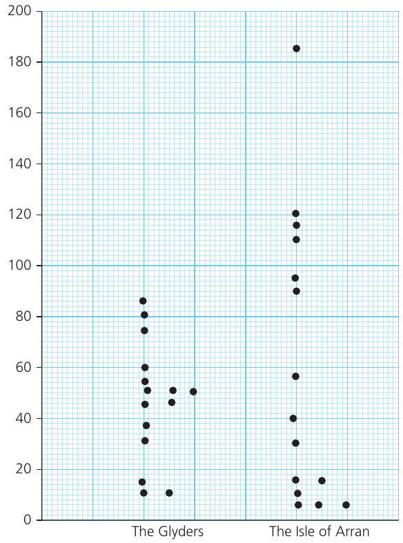
Understanding dispersion diagrams
The key features that dispersion diagrams reveal include:
- The range of the data (the difference between highest and lowest values)
- How the data values are distributed within that range
- Whether data points are clustered together or spread out
- The presence of any outliers (unusually high or low values)
- Comparisons of variation between two or more groups
Dispersion diagrams are particularly valuable when you want to compare the degree of variation (or "bunching") in different datasets. For example, one location might have data tightly clustered around certain values, whilst another shows much wider variation.
This visual comparison of spread is something that single summary statistics (like the mean) cannot adequately capture on their own.
Statistical skills
Statistical measures help us summarise and describe datasets numerically. They complement graphical techniques by providing precise values.
Measures of central tendency
Central tendency refers to the middle or typical value in a dataset. There are three main measures: arithmetic mean, mode, and median. Here we focus on the arithmetic mean.
Arithmetic mean
The Arithmetic Mean
The mean is calculated by adding all values in a dataset together, then dividing by the number of values.
Formula:
where is the mean, is the sum of all values, and is the number of values.
The arithmetic mean is the most commonly used measure of central tendency. However, it should not be used alone – it's important to also consider the spread (dispersion) of the data, as measured by the standard deviation.
When the Mean Can Be Misleading
The mean can give misleading impressions if:
- There are extreme outliers that skew the average
- The data is not normally distributed
- You're working with very small sample sizes
For example, calculating the mean orientation of corries (glacial landforms) in different mountain areas allows you to identify the typical aspect they face. However, looking at the full dispersion of the data reveals whether corries consistently face one direction or show more variable orientations.
Always present measures of central tendency alongside measures of dispersion for a complete picture of your data.
Key Points to Remember:
-
Line graphs are ideal for showing changes over time. Use compound line graphs when you want to show how different components contribute to a total.
-
Bar graphs are versatile and easy to read. Choose compound bars to show composition, and divergent bars when displaying positive and negative values.
-
Scattergraphs help identify relationships between variables. Add a best-fit line to show the trend, and look for residuals that might indicate interesting exceptions.
-
Pie charts effectively show proportions of a whole, but avoid using too many segments. Use proportional divided circles when you need to compare totals between different groups.
-
Triangular graphs are specialist tools for three-component data that must total 100%. Remember that each point shows all three percentages simultaneously.
-
Logarithmic scales are essential when dealing with data that spans several orders of magnitude or when showing rates of change over time. Never forget that you cannot include zero or negative values on logarithmic scales.
-
Dispersion diagrams reveal the spread and distribution of data, showing patterns that summary statistics alone cannot capture.
-
Always consider both central tendency (like the mean) and dispersion (spread) when analyzing your data for a complete understanding.