Box Plots (AQA GCSE Maths): Revision Notes
Box plots
Introduction to box plots
A box plot might appear quite simple at first glance, but it provides an incredibly useful summary of an entire data set. These diagrams are designed to show you the spread and distribution of your data in a clear, visual way.
Box plots are particularly valuable because they display what statisticians call the five-number summary - the five most important values that describe how your data is distributed. This makes them excellent tools for quickly understanding and comparing different sets of data.
Box plots are especially useful when you need to compare multiple data sets quickly or when you want to identify potential outliers in your data without getting overwhelmed by individual data points.
What box plots show you
Box plots reveal the spread of a data set by showing you several key pieces of information at once. They display the minimum and maximum values in your data, along with the values of the quartiles, which divide your data into four equal parts.
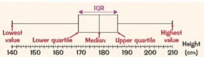 The diagram above shows a typical box plot with all its components clearly labelled. You can see how the different parts work together to give you a complete picture of the data distribution.
Understanding quartiles
Quartiles are values that divide your ordered data set into four equal parts, each containing 25% of the data. There are three quartiles that you need to know about:
- Lower quartile (Q₁): This is the value that 25% of your data falls below
- Median (Q₂): This is the middle value where 50% of your data falls below
- Upper quartile (Q₃): This is the value that 75% of your data falls below
To find the position of each quartile in an ordered data set with n values, you can use these formulas:
- Q₁ position:
- Q₂ position:
- Q₃ position:
These position formulas tell you where to look in your ordered data set to find each quartile value. Remember that your data must be arranged in ascending order first before applying these formulas.
The interquartile range (IQR)
The interquartile range is the difference between the upper quartile and the lower quartile. You calculate it using the formula:
This measurement is particularly important because it shows you the spread of the middle 50% of your data values. The IQR is often more reliable than the range because it isn't affected by extreme values (outliers) in your data set.
Why IQR is more reliable than range: The IQR focuses only on the middle 50% of your data, making it resistant to outliers. This means a few extremely high or low values won't distort your understanding of how spread out most of your data actually is.
Components of a box plot
A complete box plot consists of several distinct parts:
- The box: This rectangle spans from Q₁ to Q₃ and contains the middle 50% of your data
- The median line: A vertical line inside the box showing the position of Q₂
- The whiskers: Horizontal lines extending from the box to show the minimum and maximum values
- The scale: The horizontal axis showing the measurement units
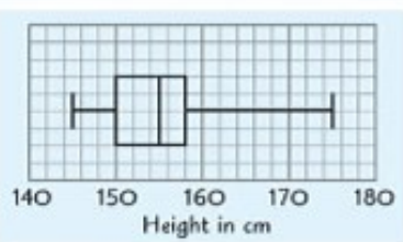 This example shows how these components work together in a real box plot displaying height data.
Think of the box as literally containing the middle half of your data - this visual representation makes it easy to see where most of your values are concentrated.
Constructing a box plot
Step-by-Step Construction Process:
To create a box plot, you need to follow these systematic steps:
- Mark the quartiles: Plot Q₁, Q₂ (median), and Q₃ on your scale
- Draw the box: Create a rectangle from Q₁ to Q₃
- Add the median line: Draw a vertical line at Q₂ inside the box
- Mark the extremes: Plot the minimum and maximum values
- Draw the whiskers: Connect the box to the extreme values with horizontal lines
Remember that you'll need to calculate your five-number summary first before you can start drawing the box plot.
Comparing measures of spread
Box plots show you two different measures of spread, and it's important to understand when each one is most useful:
Range (highest - lowest):
- Based on all data values
- Can be heavily influenced by outliers
- May not represent the typical spread of your data
Interquartile range (Q₃ - Q₁):
- Based only on the middle 50% of data values
- Not affected by outliers
- Generally provides a more reliable measure of spread
When to use each measure:
- Use range when you need to know the total spread of all your data
- Use IQR when you want to understand the typical spread without being influenced by extreme values
Advantages and limitations
Box plots are excellent for:
- Quickly comparing multiple data sets
- Identifying the general shape of data distribution
- Spotting potential outliers
- Showing the spread of the middle portion of your data
However, box plots don't show you:
- Individual data values
- The exact number of data points
- The precise shape of the distribution
- Specific frequencies or exact positions of all values
Understanding these limitations helps you know when box plots are the right tool for your analysis and when you might need additional information like histograms or dot plots.
Key Points to Remember:
- Box plots display the five-number summary: minimum, Q₁, median, Q₃, and maximum
- Quartiles divide your data into four equal parts of 25% each
- The IQR (Q₃ - Q₁) measures the spread of the middle 50% of your data
- IQR is more reliable than range because it's not affected by outliers
- Box plots are great for comparing data sets but don't show individual values