Comparing Data Sets (AQA GCSE Maths): Revision Notes
Comparing data sets
When studying statistics, you'll often need to compare different groups of data to understand patterns and draw conclusions. This involves looking at the shape, average values, and spread of different data sets using various statistical tools.
What does comparing data sets involve?
Comparing data sets means examining how different groups of data are similar or different. You might compare the distributions shown in graphs and charts, or look at specific measures like averages (mean, median, mode) and measures of spread (range, interquartile range). The key is to always consider what your findings mean in the real-world context of the data.
Statistical comparison is not just about calculating numbers - it's about understanding what those numbers tell you about the real situation being studied.
Comparing data sets using box plots
Box plots are particularly useful for comparing data sets because they clearly show the median, quartiles, and spread of each group. When you have two or more box plots side by side, you can quickly spot differences in the typical values and how spread out the data is.
Reading and comparing box plots
From a box plot, you can easily identify the median (the line in the middle of the box) and calculate the range and interquartile range (IQR). When comparing groups, look at both the position of the median and the size of the box and whiskers.
A larger spread in the data means the values are less consistent, showing more variation. You can compare spreads by looking at both the range (total spread from minimum to maximum) and the IQR (the spread of the middle 50% of data).
When comparing box plots, always examine both the central tendency (median position) and the variability (size of boxes and whiskers) to get a complete picture of how the groups differ.
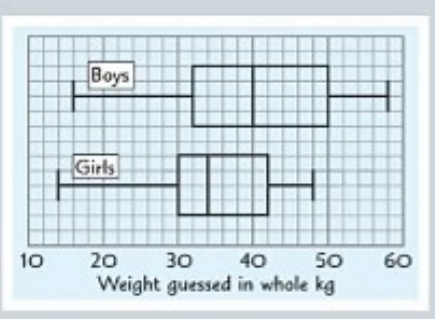
Practical example of box plot comparison
Worked Example: Comparing Weight Guesses
When comparing weight guesses between boys and girls, you might find that:
- Boys generally guess higher weights (shown by a higher median)
- Girls show less variation in their guesses (shown by a smaller IQR and range)
This tells you not just about the typical guess for each group, but also about how consistent each group is in their estimations.
Important limitations of box plots
Key Limitations to Remember:
Box plots don't show you everything. They don't tell you how many data values are in each group, so you can't determine if one group is larger than another just by looking at the plots. They also don't show the exact shape of the distribution within each quartile.
Using scatter plots for comparison
Scatter plots help you compare two variables for the same group of people or items. They show relationships between different measurements and can reveal patterns that other graphs might miss.
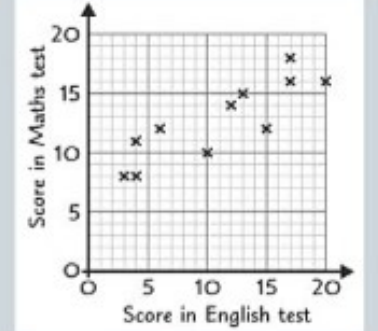
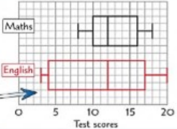
Adding box plots to scatter plots
You can create box plots from scatter plot data to compare the distributions of each variable. This involves finding the quartiles for each set of scores and drawing the corresponding box plots.
- Minimum score:
- Maximum score:
There are values in the data set, so:
- Lower quartile (): position value
- Median (): position value
- Upper quartile (): position value
These five key values — minimum, , median (), , and maximum — form the basis of your box plot.
Use them to compare:
- Range:
- Interquartile range (IQR):
- Median values: for comparison of central tendency
- Skewness or distribution shape: check if the box plot is symmetrical or skewed
Worked Example: Test Score Comparison
If you have test scores in both English and Maths, you can create separate box plots for each subject to compare how students performed overall in each area. This allows you to see not just individual performance, but overall patterns across subjects.
Comparing data sets using histograms
Histograms are excellent for comparing the shape and frequency of distributions, especially when dealing with grouped data. They show you not just the typical values, but also how the data is distributed across different ranges.
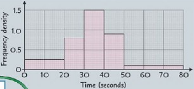
A histogram shows the time (in seconds) taken by a group of children to solve a puzzle
Step 1: Complete a Table
Fill in the missing information using the formula: Frequency = Frequency Density × Class Width
| Time interval | Frequency Density | Frequency () | Midpoint () | |
|---|---|---|---|---|
- Total frequency:
- Total of column: $50 + 200 + 525 + 405 + 195 = 1375
Step 2: Estimate the Mean
Use the formula: seconds (to 1 decimal place
Step 3: Identify the Modal Class
The modal class is the class with the highest frequency density, not the highest frequency.
In this case: Modal class = (since frequency density =
Step 4: Estimate the Range
The range is calculated using the class boundaries: seconds
Understanding histograms for comparison
When working with histograms, you need to understand frequency density rather than just frequency. This is because the bars might represent different sized groups (class widths). The frequency for each bar equals the frequency density multiplied by the class width.
Calculating key statistics from histograms
From a histogram, you can estimate the mean by using the mid-point of each class interval and the frequency of each class. You can also identify the modal class, which is the class interval with the highest frequency density (not necessarily the highest frequency).
Comparing distributions with histograms
When comparing two histograms, look at the shape of each distribution, where the peaks occur, and how spread out the data is. You can also compare calculated statistics like the mean and modal class between different groups.
Making valid comparisons
Ensuring Fair Comparisons:
Always consider whether your comparison is fair and meaningful. If you're comparing samples from different sized populations, make sure your sample sizes are appropriate for drawing conclusions about the whole population.
Interpreting comparisons in context
The most important skill in comparing data sets is explaining what your findings mean in the real world. Statistical measures only become useful when you can explain what they tell you about the actual situation being studied.
When you find differences between groups, consider whether these differences are meaningful and what might cause them. Also think about what factors might affect your results and whether your data is representative of the populations you're trying to understand.
Key Points to Remember:
- Box plots are great for comparing medians and spreads between groups, but they don't show sample sizes or detailed distribution shapes
- When comparing spreads, smaller ranges and IQRs indicate more consistent data with less variation
- Histograms show the shape of distributions and allow you to calculate means and identify modal classes
- Always interpret your statistical findings in the context of what the data actually represents
- Consider limitations of your data, such as sample size and whether it represents the whole population you're interested in