Line of best fit (AQA GCSE Statistics): Revision Notes
Line of best fit
What is a line of best fit?
A line of best fit is a straight line drawn through the points on a scatter diagram to show the general trend or pattern in the data. This line helps us understand the relationship between two variables and allows us to make predictions about values that aren't directly shown in our data.
The line of best fit serves two main purposes:
- It summarises the overall relationship between the two variables
- It can be used to estimate or predict unknown values
Drawing a line of best fit
When drawing a line of best fit, there are several important rules to follow to ensure accuracy and reliability in your analysis.
Key drawing rules
Essential Rules for Drawing Lines of Best Fit:
-
Draw the line by eye - You need to position the line so it passes as close as possible to all the data points, with roughly equal numbers of points above and below the line.
-
Pass through the mean point - The line should pass through the mean point (x̄, ȳ) when this information is available.
-
Extend the line - The line should extend beyond the first and last data points so it covers the full range of the data.
-
The line doesn't need to pass through the origin - Unlike other types of graphs, the line of best fit doesn't have to go through the point (0, 0).
The mean point
When you're given a table of data values, you can calculate the coordinates of the mean point using these formulas:
Mean x-coordinate:
Mean y-coordinate:
Understanding the Formula Components:
Where:
- means "sum of all the x-values multiplied by their frequencies"
- means "sum of all the y-values multiplied by their frequencies"
- means "sum of all the frequencies"
The mean point is a special point that your line of best fit should pass through when you're working with frequency data.
Using the line of best fit for predictions
Once you've drawn your line of best fit, you can use it to make predictions for values within and sometimes beyond your data range.
Making predictions
- Find the known value on the appropriate axis
- Draw a vertical or horizontal line from this value to meet your line of best fit
- Read off the corresponding value on the other axis
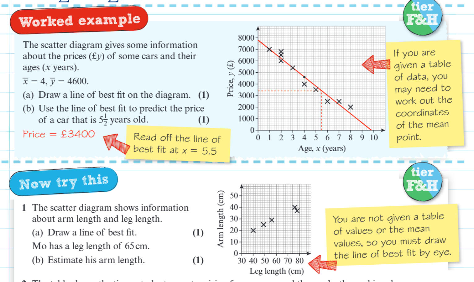
Worked Example: Predicting Car Prices
Let's look at a car price example:
- We have data showing car ages (x-axis) and their prices (y-axis)
- The mean values are given as years and
- To predict the price of a 5.5-year-old car:
Step 1: Find 5.5 years on the x-axis Step 2: Draw a vertical line up to meet the line of best fit Step 3: Draw a horizontal line across to the y-axis Step 4: Read off the price: approximately £3400
Key tips for exams
Understanding common pitfalls and following a systematic approach will help you achieve better results in examinations.
Common exam traps to avoid
Critical Mistakes to Avoid:
- Don't force the line through (0,0) - This is only necessary for direct proportion, not correlation
- Make sure your line extends beyond the data points - Examiners look for this
- Draw the line through the mean point when given - This is often worth marks
- Use a ruler - Your line should be straight and clear
Problem-solving method
Systematic Approach for Success:
- Plot all the data points carefully if drawing a scatter diagram
- Calculate and plot the mean point if working with a data table
- Draw your line of best fit by eye, ensuring it passes through the mean point
- Extend the line beyond your data range
- Use the line for predictions by reading values carefully from both axes
Types of correlation
When drawing lines of best fit, you'll encounter different types of relationships:
- Positive correlation - as one variable increases, the other increases (line slopes upward)
- Negative correlation - as one variable increases, the other decreases (line slopes downward)
- No correlation - no clear linear relationship (scattered points with no clear pattern)
Key Points to Remember:
- A line of best fit shows the general trend in scatter diagram data and can be used to make predictions
- Always draw the line through the mean point when this information is provided
- The line should extend beyond your data points and doesn't need to pass through the origin
- Use the line to predict values by finding the known value on one axis and reading off the corresponding value on the other axis
- Draw your line carefully with a ruler and make sure roughly equal numbers of points lie above and below it