Scatter diagrams (AQA GCSE Statistics): Revision Notes
Scatter diagrams
What are scatter diagrams?
Scatter diagrams are powerful visual tools that help us understand whether two different sets of data have a connection or relationship. Think of them as a way to see patterns between two things that might be related to each other.
When we plot data points on a scatter diagram, we can quickly spot if there's an association between the two variables. If the points seem to follow a pattern (like forming a rough line), then there's likely a strong relationship. If the points are scattered randomly with no clear pattern, then there's probably little or no relationship.
The beauty of scatter diagrams lies in their ability to reveal hidden relationships in data that might not be obvious when looking at numbers alone. They provide an immediate visual representation that can guide further statistical analysis.
Types of variables
Understanding the two types of variables is crucial for creating accurate scatter diagrams. Each variable has a specific role and position on the graph.
Explanatory variable (Independent variable):
- This is the variable that you control or change in an experiment
- It's plotted on the horizontal axis (x-axis)
- Think of it as the "cause" in a cause-and-effect relationship
- Remember: "X-planatory" goes on the x-axis!
Response variable (Dependent variable):
- This is the variable that responds to or depends on the explanatory variable
- It's plotted on the vertical axis (y-axis)
- Think of it as the "effect" in a cause-and-effect relationship
- Remember: "Y-responds" goes on the y-axis!
Memory Aid:
- X-planatory = Explanatory variable goes on the X-axis
- Y-responds = Response variable goes on the Y-axis
These memory aids are particularly helpful during exams when you need to quickly determine axis placement.
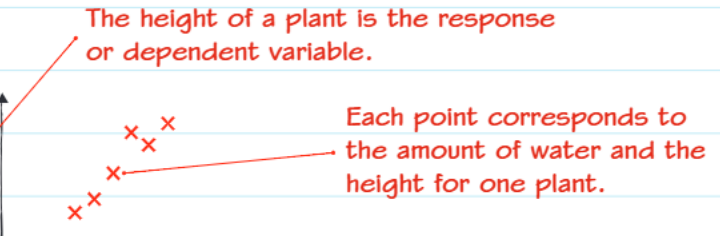
In this plant experiment example, the amount of water given is the explanatory variable (what we control), and the plant height is the response variable (what changes as a result).
How to create scatter diagrams
Creating an accurate scatter diagram requires following a systematic approach. Here's the step-by-step process:
-
Identify your variables: Decide which variable is explanatory and which is the response variable
-
Set up your axes:
- Put the explanatory variable on the x-axis (horizontal)
- Put the response variable on the y-axis (vertical)
- Choose appropriate scales that fit all your data
-
Plot your data points: For each pair of data values, find the correct position on the graph and mark it with a cross (×) or dot
-
Label everything clearly: Include axis labels with units, and give your graph a descriptive title
Common Mistake to Avoid: Many students rush the axis setup and place variables on the wrong axes. Always take a moment to identify which variable is the explanatory variable (cause) and which is the response variable (effect) before you start plotting.
Worked example: Study time and exam marks
Let's examine how to apply these concepts with real data. Katie collected data about students' study habits and their academic performance.
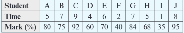
Katie collected data about 10 students' revision hours and their exam marks. This data provides an excellent opportunity to see the relationship between effort and results.
Worked Example: Plotting Study Time vs Exam Marks
Step 1: Identify the variables
- Hours spent revising = explanatory variable (goes on x-axis)
- Exam marks = response variable (goes on y-axis)
Step 2: Plot the data points
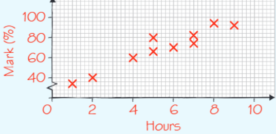
Step 3: Look for patterns In this scatter diagram, we can see that generally, students who spent more hours revising achieved higher marks. The points roughly follow an upward trend, showing a positive association between study time and exam performance.
Reading scatter diagrams and spotting associations
When examining a scatter diagram, you need to look for patterns in how the points are distributed. The arrangement of points tells us about the relationship between the variables.
Strong positive association:
- Points form a clear upward trend
- As one variable increases, the other increases too
- Points lie close to an imaginary straight line
Strong negative association:
- Points form a clear downward trend
- As one variable increases, the other decreases
- Points lie close to an imaginary straight line sloping downwards
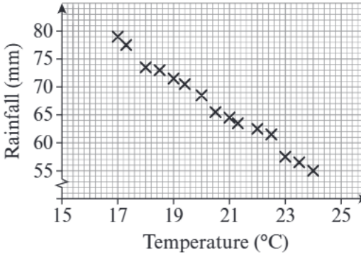
This temperature and rainfall example shows a negative association - as temperature increases, rainfall tends to decrease.
Weak or no association:
- Points are scattered randomly with no clear pattern
- Knowing one variable doesn't help predict the other
Identifying Association Strength: The closer the points lie to forming a straight line pattern, the stronger the association. If points are widely scattered around the trend, the association is weaker, even if the general direction is clear.
Key exam tips
Understanding how to approach scatter diagram questions in exams is essential for success. Here are the most important points to remember:
Common Exam Trap: Students often mix up which variable goes on which axis. Remember the memory aid: explanatory goes on the x-axis, response on the y-axis.
Exam Technique: When describing associations, always mention:
- The direction (positive or negative)
- The strength (strong, moderate, or weak)
- Any outliers (points that don't fit the general pattern)
Typical exam questions ask you to:
- Identify which variable should go on each axis
- Plot data points accurately
- Describe the type and strength of association shown
- Identify outliers or unusual data points
Summary
Key Points to Remember:
- Scatter diagrams show relationships between two sets of data by plotting points on a graph
- Explanatory (independent) variables go on the x-axis - remember "X-planatory"
- Response (dependent) variables go on the y-axis - remember "Y-responds"
- Strong associations show clear patterns with points close to a straight line
- Always describe both the direction (positive/negative) and strength (strong/weak) of any association you spot