Development Changes Lives (OCR GCSE Geography B (Geography for Enquiring Minds)): Revision Notes
Development Changes Lives
What is development?
Development refers to the progress a country makes in improving the quality of life for its population. This includes economic growth, better health outcomes, and improved access to education. However, development is uneven across the globe, meaning some countries are much more developed than others.
The concept of development goes beyond just wealth – it encompasses improvements in health, education, and overall living standards that enhance people's quality of life.
Countries are classified into different development categories:
- Advanced Countries (ACs) – wealthy, highly developed nations
- Emerging and Developing Countries (EDCs) – countries experiencing rapid economic growth
- Least Developed Countries (LDCs) – the world's poorest nations with limited development
Global patterns of development
Development varies significantly between different regions of the world, creating clear geographic patterns:
- Most ACs are located in Europe, North America, and Oceania
- Most EDCs are found in Asia and South America
- Most LDCs are concentrated in Africa
This uneven distribution shows that development is not randomly spread but follows distinct regional patterns influenced by historical, economic, and political factors.
Memory Aid: Remember AC and EDC locations
- "ENA" for AC locations: Europe, North America, OceaniA
- "ASA" for EDC locations: Asia, South America
Measuring development
Geographers use several indicators to measure and compare development levels between countries. The three main indicators are:
- GNI per capita at PPP (Purchasing Power Parity) – measures average wealth per person in US dollars, adjusted for what money can buy in each country
- Life expectancy – the average number of years a person is expected to live
- Adult literacy rate – the percentage of adults who can read and write
Memory Aid: "GLE" for Development Indicators
Remember the three key development indicators with "GLE":
- GNI per capita at PPP
- Life expectancy
- Education (adult literacy)
These three measures work together to give a complete picture of a country's development level.
Development indicators for selected countries
The table below shows how these three indicators vary across ten countries, ranked from 1 (highest/best) to 10 (lowest/worst):
| Country | GNI/capita at PPP ($) | Rank | Life expectancy (years) | Rank | Adult literacy (%) | Rank |
|---|---|---|---|---|---|---|
| Afghanistan | 2,000 | 1 | 48 | 1 | 38 | 1 |
| Brazil | 14,750 | 6 | 73 | 5 | 91 | 5 |
| China | 11,850 | 5 | 74 | 6 | 95 | 6 |
| India | 5,350 | 3 | 65 | 4 | 74 | 3 |
| Nigeria | 5,360 | 4 | 54 | 3 | 61 | 2 |
| Norway | 66,520 | 9 | 81 | 9 | 100 | 10 |
| Qatar | 123,860 | 10 | 78 | 7 | 96 | 7 |
| UK | 35,760 | 7 | 81 | 9 | 99 | 8 |
| USA | 53,960 | 8 | 79 | 8 | 99 | 8 |
| Zambia | 3,076 | 2 | 52 | 2 | 80 | 4 |
This data reveals important patterns about how development indicators relate to each other across different countries. Notice that countries like Norway, UK, and USA rank highly across all three indicators, while countries like Afghanistan and Zambia rank low in all categories.
The relationship between development indicators
The different measures of development are connected – they tend to move together. When examining countries globally, a clear pattern emerges: wealthier nations generally have better health and education outcomes.
Why does this relationship exist?
Countries with higher GNI have more money to invest in:
- Healthcare systems (hospitals, doctors, medicines)
- Education infrastructure (schools, teachers, resources)
- Public health programmes (clean water, sanitation, disease prevention)
This increased investment leads to improved life expectancy and higher literacy rates. The relationship can be clearly seen when comparing countries in the table above – Norway, UK, and USA (wealthy countries) all have high life expectancy and literacy rates, while Afghanistan and Zambia (poorer countries) have much lower indicators.
"MORE MONEY = MORE HEALTH"
Remember the positive correlation between wealth and life expectancy with this simple phrase. When a country has higher GNI, it can afford to invest more in healthcare, leading to longer life expectancy.
The same principle applies to education – wealthier nations can invest more in education systems, leading to higher literacy rates.
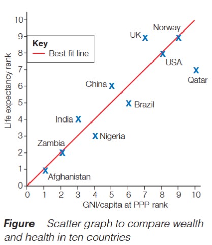
The scatter graph above illustrates this positive correlation. Countries positioned towards the right (higher GNI rank) tend to be positioned higher up (better life expectancy rank). The best fit line shows this general trend, though there are some notable exceptions.
Case study: Qatar's development paradox
Qatar's Development Paradox: When Wealth Doesn't Equal Health
Qatar provides an interesting example of how development can be uneven within a single country. Despite being the world's richest country by GNI per capita ($123,860), Qatar has a lower life expectancy (78 years) than some countries with considerably less wealth.
Why is Qatar so wealthy?
Qatar is a small Middle Eastern country that has become extremely wealthy through its abundant natural resources:
- Large reserves of oil
- Extensive natural gas deposits
Why doesn't Qatar have the highest life expectancy?
The explanation lies in Qatar's workforce composition. Qatar has a relatively small native population and therefore relies heavily on migrant workers from other countries, particularly India, to support its economy. Many of these migrant workers:
- Live in overcrowded conditions
- Receive low wages despite the country's wealth
- Face poor living standards
- Have limited access to quality healthcare
This situation brings down the overall average life expectancy for the country, even though native Qataris may have much higher life expectancy. This demonstrates that national averages can sometimes hide important inequalities within countries.
Qatar's Paradox: Key Lesson
Qatar shows that high GNI doesn't automatically guarantee high life expectancy. When large populations live in poor conditions (like migrant workers), they bring down the national average, even in wealthy countries.
This is why it's important to look at multiple development indicators and consider what might be happening within a country, not just at the national statistics.
Understanding development through data analysis
Scatter graphs are valuable tools for identifying relationships between development indicators. When analyzing development data:
- A positive correlation means both indicators increase together (e.g., as wealth increases, so does life expectancy)
- The best fit line shows the general trend across all data points
- Outliers (countries that don't follow the pattern) often have interesting explanations, like Qatar's case
Key Points to Remember:
Development Patterns:
- Development is uneven globally – ACs are mainly in Europe, North America, and Oceania; EDCs in Asia and South America; LDCs predominantly in Africa
- The three main development indicators are GNI per capita at PPP, life expectancy, and adult literacy rate
Relationships Between Indicators:
- There is a positive relationship between wealth and health/education indicators – wealthier countries can invest more in healthcare and education
- Development indicators are connected because economic wealth enables investment in social services that improve quality of life
Key Lessons:
- Qatar demonstrates that high GNI doesn't automatically guarantee high life expectancy, especially where there are large populations of migrant workers in poor conditions
- When analyzing development data, always look for outliers and think about what might explain them
Key Terms:
- Uneven development – the global variation in development levels between countries
- GNI per capita at PPP – average income per person adjusted for purchasing power
- Life expectancy – average number of years a person is expected to live
- Adult literacy – percentage of adults who can read and write
- Positive correlation – when two indicators increase together
Exam Tip: When describing relationships between development indicators, always explain WHY they are connected (e.g., wealthier countries can afford better healthcare, which increases life expectancy). The command word "explain" requires you to give reasons, not just describe the pattern.