Bar charts and histograms (OCR GCSE Maths): Revision Notes
Bar charts and histograms
Why Do We Use Statistical Diagrams?
We use statistical diagrams like bar charts and histograms because:
Raw data is hard to interpret.
Statistical diagrams simplify the data, making it easier to see patterns and compare results.
They present data in a clear, concise, and visually appealing way, helping us understand and summarise data sets.
Bar Charts vs. Histograms
| Bar Charts | Histograms |
|---|---|
| Used for categorical data (e.g., types of pets). | Used for continuous data (e.g., time intervals). |
| Bars are separated by gaps. | Bars are touching to show continuity. |
| Bars represent categories. | Bars represent data ranges (intervals). |
| The height of the bar represents frequency. | The height of the bar represents frequency density. |
Worked Example: Length of Applause
Example
Let's look at the following example data:
| Length of Applause (minutes) | Frequency |
|---|---|
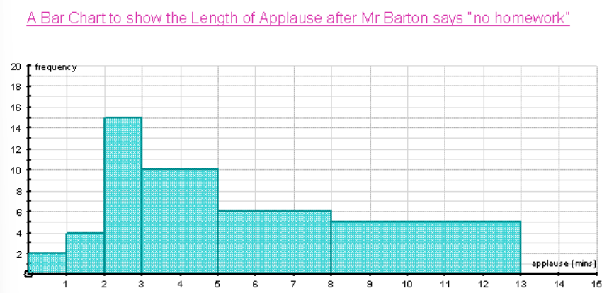
1: Drawing a Bar Chart
To draw a bar chart:
- Label the axes:
- : Length of applause (categories like , etc.).
- : Frequency (the number of people).
- Draw the bars: Each bar corresponds to a category, and the height of the bar is proportional to the frequency. For example, the bar for will have a height of , as the frequency is .
- Leave gaps between bars since the data is categorical.
Visual Representation:
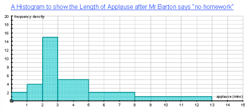
2: Drawing a Histogram
Histograms are used for continuous data and show the distribution of data across intervals.
- Label the axes:
- : Length of applause (continuous data intervals like , etc.).
- : Frequency density (calculated using the formula below).
- Calculate Frequency Density using:
The group width is the difference between the upper and lower limits of each interval. For example, the group width for is .
- Draw the bars: The height of each bar represents the frequency density, and the bars should be touching to show that the data is continuous.
Worked Example of Histogram Calculations
Example
Let's apply the formula to our example data.
| Length of Applause (minutes) | Frequency | Group Width | Frequency Density |
|---|---|---|---|
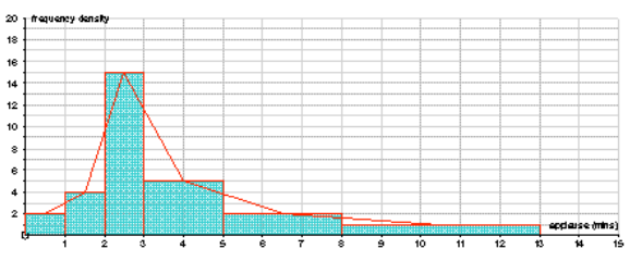
3. What is the Point of Histograms?
Histograms are useful because they show how the data is distributed across different intervals. While bar charts are helpful for comparing categories, histograms show the shape of the data (whether it is spread out, concentrated in one range, or follows a particular pattern).
Key Differences to Note:
- Bar charts can be deceptive: Sometimes a bar chart can make it look like one category has more data simply because the bar is wider. However, this doesn't always mean more data—it could just be a bigger range.
- Histograms solve this issue: The area of each bar in a histogram is proportional to the frequency, not just the height. This gives us a more accurate picture of the data distribution.
4. Interpreting Histograms
Histograms allow us to interpret continuous data and see the distribution of that data across different intervals.
Example:
Let's consider the following histogram showing the time taken by Year students to complete a set of times tables.
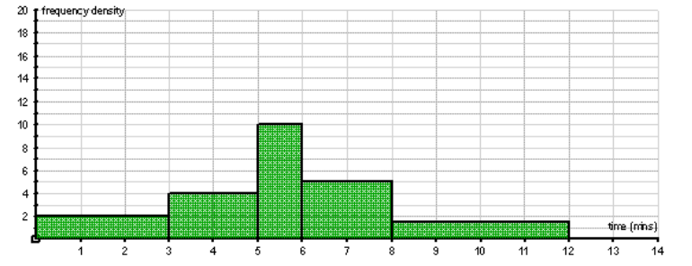
| Time (minutes) | Frequency Density | Group Width | Working | Frequency |
|---|---|---|---|---|
Rearranging the Formula:
We can rearrange the formula to calculate frequency from frequency density and group width: