Cumulative frequency/box plots (OCR GCSE Maths): Revision Notes
Cumulative frequency/box plots
1. What is Cumulative Frequency?
Cumulative Frequency is a way of calculating a running total of frequencies as you move through the data. The word "cumulative" means "adding up," and "frequency" refers to how often something happens. So, cumulative frequency tells us how many data points are below a certain value.
Example:
Let's say we have the following table showing how many hours a group of Year students spend playing video games in a week:
| Hours spent playing | Frequency |
|---|---|
2. Adding a Cumulative Frequency Column
To create a cumulative frequency column, we add up the frequencies as we move through the table. The cumulative frequency is the running total of the frequencies.
Example:
| Hours spent playing | Frequency | Cumulative Frequency |
|---|---|---|
The last entry in the cumulative frequency column should equal the total frequency. In this case, the total is 40, meaning there were 40 students in the survey.
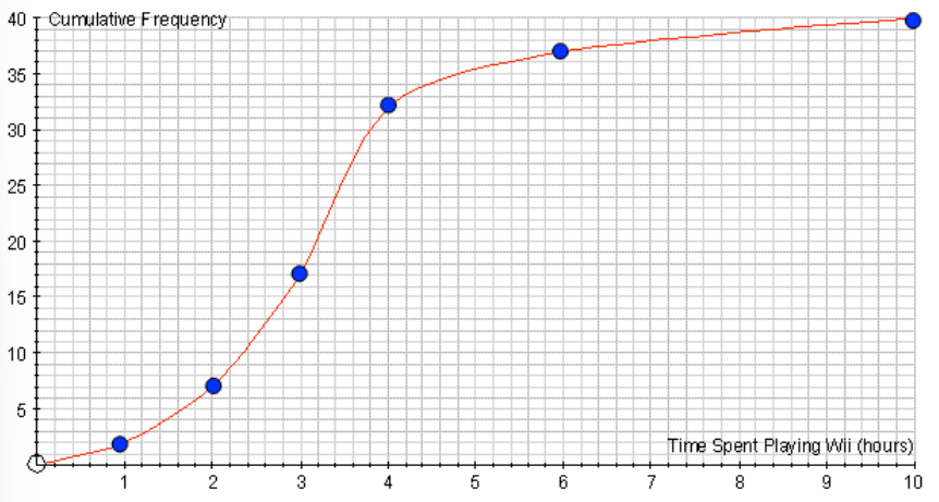
3. Drawing the Cumulative Frequency Curve
The cumulative frequency curve (also known as an ogive) is a graph that shows the running total of frequencies, helping us visualise how data accumulates over time or intervals.
Steps for Drawing a Cumulative Frequency Curve:
- Create a cumulative frequency column in your table (add up the frequencies as you go).
- Plot the cumulative frequency () against the upper boundary of each group (.
- Once all points are plotted, join them up with a smooth curve.
- Make sure your graph starts at (), as no data occurs below .
- Label the axes correctly—the is the range of data (e.g., time spent playing), and the is cumulative frequency.
Example:
Using the table below, we will draw the cumulative frequency curve:
| Hours spent playing | Frequency | Cumulative Frequency |
|---|---|---|
- For , the cumulative frequency is , so plot the point ().
- For , the cumulative frequency is , so plot the point ().
- For , the cumulative frequency is , so plot the point ().
- Continue for all intervals, plotting each point using the upper boundary of the interval on the and the cumulative frequency on the . Finally, join the points with a smooth curve to complete the cumulative frequency graph.
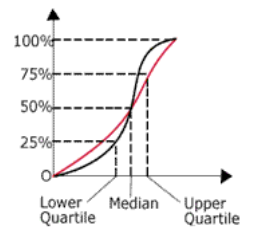
4. Interpreting the Cumulative Frequency Curve
Once the cumulative frequency curve is drawn, it allows us to estimate key statistics such as the median, lower quartile (), upper quartile (), and the interquartile range ().
Estimating Quartiles:
- Median: This is the 50th percentile, or halfway point. To find it, go to half the total frequency on the and read off the corresponding value on the .
- In this example, the total frequency is , so the median is at the 20th data point.
- Lower Quartile (): This is the 25th percentile. Find 25% of the total frequency, and read off the corresponding value on the .
- For a total frequency of , find at the 10th data point.
- Upper Quartile (): This is the 75th percentile. Find 75% of the total frequency and read off the corresponding value on the .
- For a total frequency of , is at the 30th data point.
- Interquartile Range (): This measures the spread of the middle 50% of the data and is calculated as:
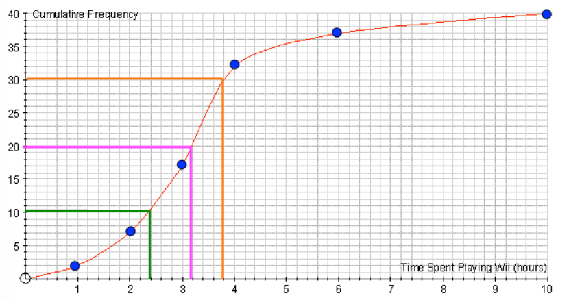
5. Estimating the Median and Quartiles from a Cumulative Frequency Curve
(a) Finding the Median
The median is the value that splits the data into two equal halves. For grouped data, the median can be estimated from the cumulative frequency curve.
Steps to Find the Median:
- Identify 50% of the total frequency (this is half of the data points).
- In this example, the total frequency is , so 50% is 20.
- Draw a horizontal line from the 20th cumulative frequency point on the y-axis until it intersects the cumulative frequency curve.
- From the point where the horizontal line meets the curve, draw a vertical line down to the .
- The point where the line touches the x-axis is the estimated median.
Example:
- In the cumulative frequency graph, the median is located at the 20th data point.
- The estimated median is 3.2 hours.
(b) Finding the Quartiles
The lower quartile () is the value below which 25% of the data lies, and the upper quartile () is the value below which 75% of the data lies. The interquartile range () is the difference between and , showing the spread of the middle 50% of the data.
Steps to Find the Quartiles:
- Lower Quartile ():
- Find 25% of the total frequency (for a total of is at the 10th data point).
- Draw a horizontal line from the 10th cumulative frequency point to the curve and then draw a vertical line down to the .
- The value on the is the lower quartile.
- Upper Quartile ():
- Find 75% of the total frequency (for a total of , is at the 30th data point).
- Draw a horizontal line from the 30th cumulative frequency point to the curve and then draw a vertical line down to the .
- The value on the is the upper quartile.
Example:
- Lower quartile (): Estimated to be 2.4 hours.
- Upper quartile (): Estimated to be 3.8 hours.
- Interquartile Range ():
6. Interquartile Range ()
The interquartile range () is the difference between the upper and lower quartiles:
The tells us how spread out the middle 50% of the data is, and it is a useful measure because it is not affected by outliers.
Example Calculation: From the example above:
- The is:
7. Drawing Box Plots from a Cumulative Frequency Curve
A box plot (or box-and-whisker plot) visually summarises data by showing the median, quartiles, and range. Box plots provide a clear representation of the spread of the data.
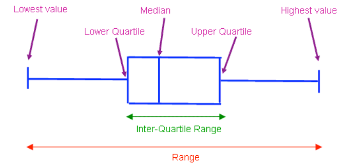
Steps for Drawing a Box Plot:
- Identify the five-number summary
- Draw a number line
- Draw the box
- Draw the whiskers
- Identify the five-number summary:
- Minimum value: The smallest value in the data set.
- Lower Quartile (): The value below which 25% of the data lies.
- Median: The middle value (50% of the data lies below this).
- Upper Quartile (): The value below which 75% of the data lies.
- Maximum value: The largest value in the data set.
- Draw a number line: Mark the minimum value, , median, , and maximum value on the number line.
- Draw the box: The box extends from to with a line inside the box at the median.
- Draw the whiskers: These lines extend from the box to the minimum and maximum values.
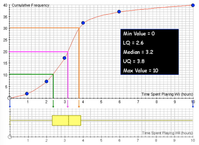
Example: Box Plot from Cumulative Frequency Data
Let's say we are working with data about the number of hours spent playing video games per week, represented by a cumulative frequency curve. From the cumulative frequency curve, we estimate the following values:
- Minimum value: 0
- Lower Quartile (): 2.6
- Median: 3.2
- Upper Quartile (): 3.8
- Maximum value: 10
Step-by-Step Breakdown:
- Minimum Value:
- The minimum value is 0 hours, which represents the lowest amount of time spent playing video games.
- Lower Quartile ():
- Q1 is estimated to be 2.6 hours. This means that 25% of the students played video games for 2.6 hours or less.
- Median:
- The median is the middle value, where 50% of the data lies below. The median is estimated to be 3.2 hours, meaning half of the students played video games for 3.2 hours or less.
- Upper Quartile ():
- Q3 is the value below which 75% of the data lies. It is estimated to be 3.8 hours, meaning 75% of the students played video games for 3.8 hours or less.
- Maximum Value:
- The maximum value is 10 hours, representing the longest time spent playing video games in this data set.
Interpreting the Box Plot
The box plot clearly summarises the data by showing:
- The spread of the middle 50% of the data (between and ) through the interquartile range ().
- The overall range of the data (from the minimum to the maximum values).
- The median, showing the central value.
Key Points to Note:
- Range:
- The range is the difference between the maximum and minimum values:
- Interquartile Range ():
- The is the spread of the middle 50% of the data:
- The tells us how spread out the central data values are. In this case, the middle 50% of the students played video games for a period of 1.2 .