Pie charts (OCR GCSE Maths): Revision Notes
Pie Charts
Introduction:
Pie charts are a great way to visually represent data, particularly when you want to show proportions or percentages of a whole. In a pie chart, the whole circle represents 100% of the data, and each segment (or "slice") represents a portion of the total.
1. How to Construct a Pie Chart
To construct a pie chart, you need to work out how big each slice of the circle should be. This is done by calculating the angle for each segment, based on the frequency of each category in the data.
Steps to Draw a Pie Chart:
- Add up the total number of items in the data set. This gives you the total number of people, responses, or occurrences that the pie chart will represent.
- Divide 360 degrees by the total number of items to determine how many degrees each item is worth.
-
Multiply the frequency of each category by the degrees per person/item to calculate the angle for each slice.
-
Draw the pie chart using the calculated angles, and make sure the angles add up to 360 degrees.
Worked Example: TV Show Preferences
Example
Let's say a group of 72 teachers were asked to choose their favourite TV show, and their responses were recorded as follows:
| TV Show | Number of Votes |
|---|---|
| Lost | 12 |
| Heroes | 10 |
| Desperate Housewives | 4 |
| Countdown | 15 |
| Teachers TV | 13 |
| The Beauty of Maths | 18 |
Step-by-Step Solution:
- Calculate the degrees per person:
- Work out the angle for each category:
- Lost:
- Heroes:
- Desperate Housewives:
- Countdown:
- Teachers TV:
- The Beauty of Maths:
- Check that the total of the angles adds up to 360 degrees:
Table of Results:
| TV Show | Total Votes | Working Out | Angle of Segment |
|---|---|---|---|
| Lost | 12 | 60° | |
| Heroes | 10 | 50° | |
| Desperate Housewives | 4 | 20° | |
| Countdown | 15 | 75° | |
| Teachers TV | 13 | 65° | |
| The Beauty of Maths | 18 | 90° |
2. Drawing the Pie Chart
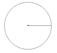
1. Drawing the Circle
- Start with a compass: Draw a circle using a compass, and mark the centre of the circle.
- Draw a straight line: From the centre, draw a straight line going to the right to use as your starting point. This line will represent the first 0° angle.
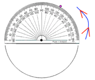
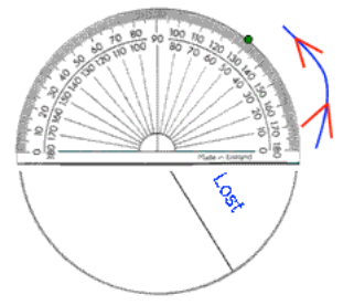
2. Measuring the First Segment (Example: "Lost")
- Use a protractor: Place your protractor on the line you drew, making sure the centre of the protractor is exactly at the centre of the circle.
- Measure the angle: For example, if the segment for "Lost" is 60°, rotate your protractor from 0° to 60°.
- Mark the point: Place a small dot at the 60° mark.
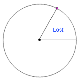
3. Drawing the First Segment
- Draw the segment: Connect the dot back to the centre of the circle using a straight line. This creates the first slice.
- Label the segment: In this case, label the segment "Lost".
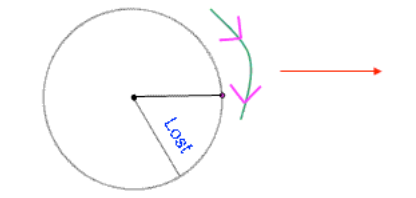
4. Rotating the Chart for the Next Segment
- Rotate the pie chart: Turn your paper so the first line (the one representing 60°) is now horizontal. This is important so you can correctly place the next segment.
- Repeat the steps: Use the protractor again to measure the next angle from the new horizontal line, and continue marking, drawing, and labelling each segment until all segments are complete.
5. Complete All the Segments
- Continue measuring and drawing: Keep repeating the steps of measuring angles and drawing lines from the centre until you've drawn all the segments.
- Check your last segment: To check if your angles are correct, the line you draw for the final segment should meet exactly with the first line you drew at the start. This will confirm that the total of all angles is 360 degrees.
6. Adding Labels and Colouring
- Label each segment: It's important to clearly label each segment with the category it represents. In this example, categories such as Lost, Heroes, and The Beauty of Maths are used.
- Add a key or legend: If you decide to colour the segments, include a key or legend alongside the pie chart. Each colour should correspond to a category.
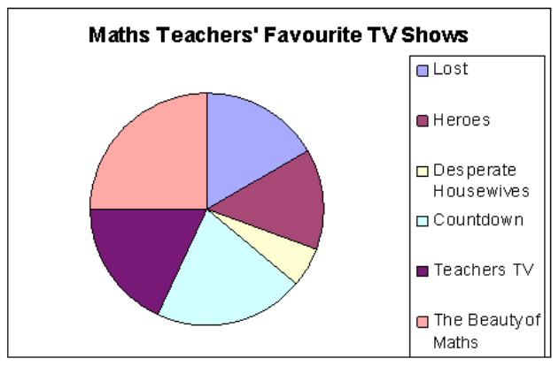
Final Pie Chart
The final pie chart visually represents the TV show preferences of 72 maths teachers. The chart is divided into slices, with each slice proportionate to the number of votes each show received. The labels and key ensure that the viewer can easily interpret the data.
3. What CAN We Tell from Pie Charts?
- Comparing categories: Pie charts clearly show which category is the most popular or least popular.
- In our example, we can see that The Beauty of Maths was the most popular choice amongst the surveyed teachers, while Desperate Housewives was the least popular.
- Making comparisons: We can use the size of segments to make comparisons between categories.
- For example, you could say, "roughly three times as many teachers preferred Lost to Desperate Housewives," based on the size of the segments.
4. What CAN'T We Tell from Pie Charts?
- Exact numbers without original data: If you're only given the pie chart without the raw data, it's impossible to tell the exact number of people who selected each category.
- For example, without knowing how many teachers were surveyed, you can't answer questions like, "How many teachers chose Countdown as their favourite show?"
- Total number surveyed: Pie charts alone do not tell you how many people were surveyed. To calculate the number of responses, you need the total frequency or data set.
5. How to Interpret a Pie Chart
To interpret a pie chart and work out how many people or items each segment represents, you must reverse the process of creating the chart. The main goal is to figure out how much of the total population or total number of items each angle represents.
Formula:
You can rearrange this formula to solve for the number of people in the segment:
Worked Example: Favourite Drink
Example
In this example, 240 maths teachers were asked, "What is your favourite drink?" A pie chart was created based on their responses.
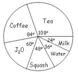
We are given the following angles for the drinks in the pie chart:
- Coffee: 84°
- Tea: 108°
- J2O: 60°
- Squash: 24°
- Water: 48°
- Milk: 36°
Question: How many teachers preferred coffee?
To answer this, we need to calculate the number of teachers represented by the 84° segment for coffee.
- Set up the equation:
- Solve for the number of teachers: Multiply both sides by 240 to find the number of teachers who preferred coffee:
So, 56 teachers preferred coffee.