Histograms (Leaving Cert Mathematics): Revision Notes
Histograms
What is a histogram?
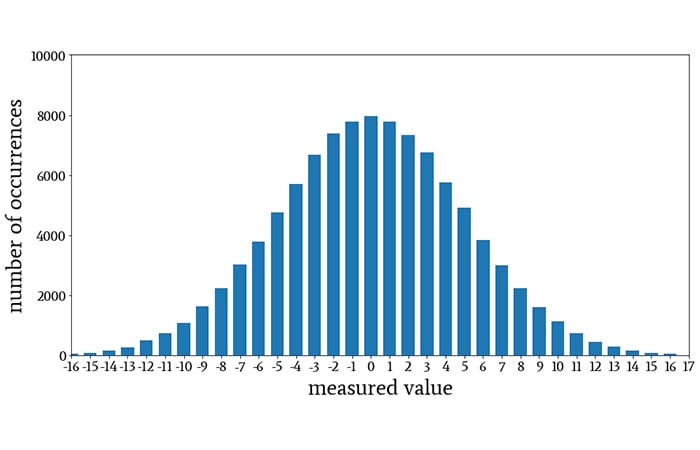
A histogram is one of the most common ways of representing a frequency distribution. Histograms are used specifically for displaying continuous data that has been organised into groups called classes.
Key differences between histograms and bar charts
While histograms look similar to bar charts, understanding their differences is essential for success in your exams.
Critical Differences You Must Remember:
- No gaps between bars - The bars in a histogram touch each other
- Used for continuous data - Unlike bar charts which show discrete data
- Data is always grouped - The groups are called classes or class intervals
- Area represents frequency - The area of each bar shows how often values occur in that class
Understanding class intervals
For your Leaving Cert course, you will work with histograms that have equal class intervals. This means each group covers the same range of values (e.g., 0-10, 10-20, 20-30).
When class intervals are equal, drawing a histogram becomes very similar to drawing a bar chart, making the process much more straightforward and manageable for exam conditions.
How to draw a histogram
Follow these essential steps when constructing a histogram:
- Draw two axes at right angles to each other
- Label the horizontal axis with your variable (e.g., time, age, distance)
- Label the vertical axis with frequency
- Plot the class intervals along the horizontal axis
- Draw bars with heights matching the frequencies
- Ensure bars touch each other with no gaps
Exam Tip: Always remember to label both axes clearly - marks are often lost for unlabelled axes.
Worked example: Drawing and interpreting histograms
Let's examine this frequency table showing times taken by 32 students to solve a problem:
| Time (in secs) | 0-10 | 10-20 | 20-30 | 30-40 | 40-50 | 50-60 |
|---|---|---|---|---|---|---|
| No. of students | 1 | 2 | 8 | 12 | 6 | 3 |
Worked Example: Constructing the Histogram
The histogram for this data would show bars of heights 1, 2, 8, 12, 6, and 3 respectively, with each bar covering a 10-second interval.
The bars touch each other because we're dealing with continuous time data, and the height of each bar directly represents the frequency for that class interval.
Finding the modal class
The modal class is the class interval with the highest frequency. It represents where the most values occur in your data set.
Method for Finding Modal Class:
- Look at your frequency table or histogram
- Identify which class has the highest frequency
- State the modal class as the interval
Worked Example: Modal Class
In our example above, the modal class is (30-40) seconds because this interval has the highest frequency of 12 students.
Finding the median class
The median is the middle value when all data is arranged in order. For grouped data in histograms, we find which class interval contains the median.
Method for Finding Median Class:
- Find the total number of values (n)
- Calculate the median position:
- Add up frequencies from the lowest class until you reach or pass the median position
- The class containing the median position is your answer
Worked Example: Median Class
With 32 students, the median position is between the 16th and 17th values.
Adding frequencies from the start:
- First three classes: 1 + 2 + 8 = 11 students
- The 16th and 17th students fall in the next class interval (30-40)
- Therefore, the median lies in the (30-40) second interval
Reading histograms for analysis
When interpreting histograms, you can extract valuable information about your dataset:
Information You Can Determine:
- Total frequency - Add up all the bar heights
- Most common class - Look for the tallest bar (modal class)
- Distribution shape - Whether data is evenly spread or clustered
- Comparisons - Which classes have more or fewer values
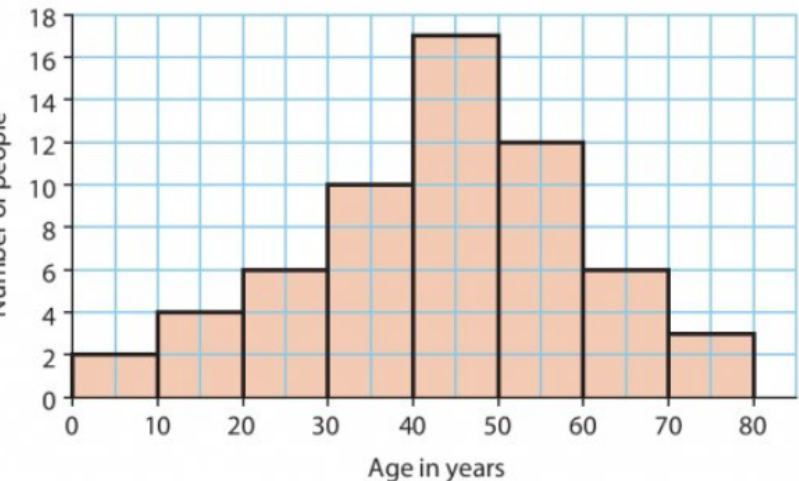
This histogram shows an age distribution that peaks around 50 years, demonstrating how histograms reveal the shape and pattern of your data.
Common exam applications
Understanding how to apply histogram concepts to different types of data is crucial for exam success.
Distance Data Example:
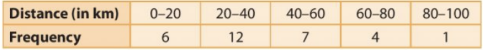
This table shows how 30 motorists travelled different distances. You would need to:
- Draw the histogram with distance ranges on x-axis and frequency on y-axis
- Identify the modal class (20-40 km with frequency 12)
- Calculate totals and percentages as required
Exam tips and common mistakes
Being aware of common pitfalls will help you avoid losing marks in examinations.
Do Remember:
- Label both axes clearly
- Use equal-width bars that touch each other
- Check your frequencies add up to the total given
- State class intervals as ranges (e.g., 30-40), not single numbers
Don't Forget:
- The modal class is an interval, not just the frequency number
- For median class, you need to find which interval contains the middle position
- Areas of bars represent frequencies, not just heights
Exam Trap: Students often confuse the mode (exact value) with modal class (interval). In grouped data, we can only find the modal class.
Remember!
Key Points to Remember:
- Histograms show continuous data organised into class intervals with no gaps between bars
- Modal class is the interval with the highest frequency - always write it as a range
- Median class contains the middle value(s) - calculate position first, then find which interval
- Always label axes in your histogram drawings to avoid losing marks
- Equal class intervals make histogram construction similar to bar chart drawing