Bivariate Data (HSC SSCE Mathematics Advanced): Revision Notes
Bivariate Data
Introduction to bivariate data
When we collect data about two related variables, we call this bivariate data. This type of data consists of ordered pairs of measurements, where we measure two things about each item in our sample.
For example, we might measure both the height and weight of a group of people. Each person gives us one ordered pair: (height, weight).
In bivariate data analysis, we need to identify:
- The independent variable (): the variable we think might influence the other
- The dependent variable (): the variable that might be influenced
The independent variable is typically the one you control or the variable that comes first in time, while the dependent variable is the outcome you're measuring or the response you observe.
These pairs of measurements can be displayed on a scatterplot, which is a graph showing all the data points on a coordinate plane with on the horizontal axis and on the vertical axis.
The two key tools for analysing bivariate data are:
- Correlation: measures how closely the variables are related
- Line of best fit: a line that best represents the trend in the data
Understanding correlation vs functional relationships
In most of mathematics, we work with functions where is completely determined by . For example, if an electrician charges $100 for a visit plus $40 per power point, the total fee for installing power points is exactly:
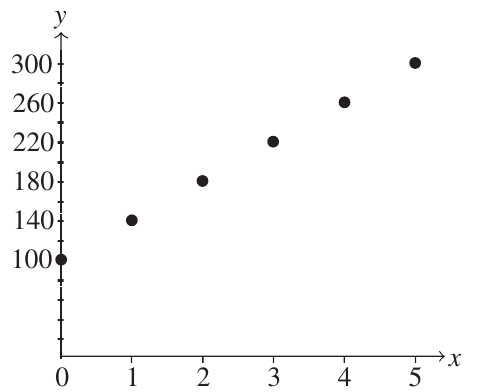
This is a perfect functional relationship with positive gradient. Every point lies exactly on the line.
Similarly, if 100 old cars are being removed from a park at 7 per day, the number remaining after days is exactly:
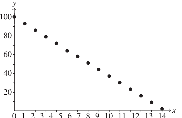
This is a perfect functional relationship with negative gradient.
However, many real-world relationships are not perfect functions. Consider height and weight in people. While taller people tend to be heavier, people of the same height don't all weigh the same amount. The relationship exists, but it's not exact.
The Key Difference
In a functional relationship, knowing tells you exactly what is. In a correlation, knowing gives you information about what tends to be, but doesn't determine it precisely. This is where correlation comes in—it describes statistical relationships where variables tend to move together, but one doesn't completely determine the other.
Pearson's correlation coefficient
The strength and direction of linear correlation is measured by Pearson's correlation coefficient, denoted by .
Key Properties of :
- is always between and :
- means perfect positive correlation (all points lie on a line with positive gradient)
- means perfect negative correlation (all points lie on a line with negative gradient)
- means no linear correlation
- Values between these extremes indicate varying degrees of correlation
The scale looks like this:
Correlations of and are called perfect correlations because every point lies exactly on a straight line.
Positive correlation: heights and weights
Let's look at a real example. When we plot the heights ( in cm) against weights ( in kg) of 50 people, we get a scatterplot like this:
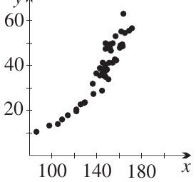
Real-World Example: Height vs Weight
Notice how the dots cluster in an upward-sloping pattern. This shows positive correlation because:
- As height increases, weight tends to increase
- The cluster has a positive slope
- Taller people tend to be heavier (though not always)
This particular dataset has a correlation coefficient of approximately , which is considered very strong positive correlation.
The dots are spread out because people of the same height can have different weights, but there's still a clear overall trend.
Understanding correlation strength
Correlation can be classified as strong, moderate, weak, or none. Here are visual guides:
Positive correlations
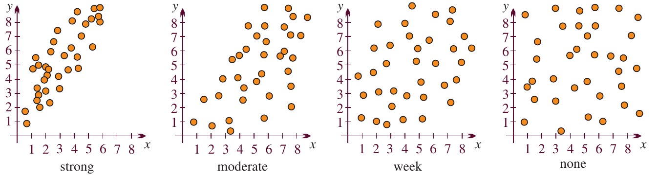
- Strong positive: Points cluster tightly around an upward-sloping line
- Moderate positive: Points show an upward trend but with more scatter
- Weak positive: Points are loosely scattered with slight upward tendency
- None: Points are randomly scattered with no pattern
Negative correlations
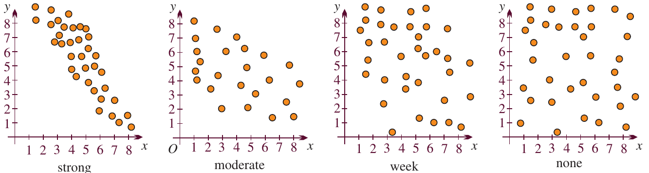
- Strong negative: Points cluster tightly around a downward-sloping line
- Moderate negative: Points show a downward trend but with more scatter
- Weak negative: Points are loosely scattered with slight downward tendency
- None: Points are randomly scattered with no pattern
The strength of correlation is determined by how tightly the points cluster around an imaginary line through the data. Tighter clustering means stronger correlation, while more scattered points indicate weaker correlation.
Types of correlation
Positive correlation
When , we have positive correlation:
- The cluster slopes upwards from left to right
- As increases, tends to increase
- Example: height and weight (taller people tend to be heavier)
Negative correlation
When , we have negative correlation:
- The cluster slopes downwards from left to right
- As increases, tends to decrease
- Example: waiting time and customer satisfaction (longer waits lead to lower satisfaction)
Zero correlation
When :
- There is no linear relationship between the variables
- The points are scattered randomly
- Knowing tells us nothing about
Example: no correlation
Real Data: Sydney's Annual Rainfall (1860-2007)
The Bureau of Meteorology has recorded Sydney's annual rainfall from 1860 to 2007. When we plot year () against annual rainfall ( in mm), the scatterplot shows no linear pattern.
The correlation coefficient is , which is virtually zero. This tells us that:
- Knowing what year it is doesn't help predict rainfall
- Rainfall varies randomly from year to year
- There's no long-term trend (at least not a linear one)
However, we can still see interesting features like drought years (low rainfall) and flood years (high rainfall) as individual points.
Example: negative correlation
Worked Example: Customer Satisfaction vs Waiting Time
A technology company tracked customer waiting times and satisfaction ratings. They measured:
- = waiting time in minutes
- = satisfaction rating from 1 (very dissatisfied) to 5 (very satisfied)
Here's their data:
| 7 | 15 | 22 | 11 | 20 | 15 | 7 | 28 | 6 | 16 | 26 | 19 | |
|---|---|---|---|---|---|---|---|---|---|---|---|---|
| 5 | 2 | 2 | 4 | 4 | 3 | 3 | 1 | 1 | 5 | 3 | 3 |
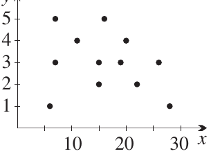
This shows weak negative correlation (approximately ) because:
- The cluster slopes backwards slightly
- Longer waiting times tend to result in lower satisfaction
- The relationship is weak because points are quite scattered
The Impact of Outliers
The point is an outlier (very low satisfaction despite short wait). If we remove this single point, the correlation becomes moderate (). This demonstrates that correlation is very sensitive to outliers, especially with small datasets.
When dealing with outliers, always investigate the context before deciding whether to include or exclude them from your analysis.
The line of best fit
When we see correlation in our data, we can draw a line of best fit (also called the regression line) through the points. This line:
- Best represents the overall trend in the data
- Can be used to make predictions
- Shows the average relationship between the variables
The most common method for calculating this line is called the least squares regression line. This line minimises the sum of the squared vertical distances from all points to the line.
Drawing the line by eye
For now, we can estimate the line of best fit by eye. Here's the heights and weights example with a line of best fit:
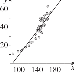
By estimating visually:
- The gradient is approximately
- The -intercept is approximately
This gives us the equation:
This means: for every extra centimetre of height, we expect weight to increase by about kg.
Lines of best fit for weak correlation
When correlation is weak, it's harder to draw the line by eye. Here are the customer service examples:
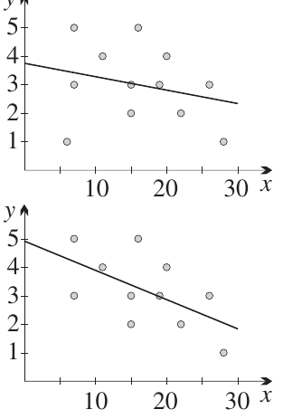
The top graph shows all data points (weak negative correlation). The bottom graph has the outlier removed (moderate negative correlation). Notice how:
- The line is clearer when correlation is stronger
- Removing the outlier changes both the correlation strength and the line of best fit
- Decisions about outliers should be based on understanding the context, not just mathematics
Repeated data points
Sometimes the same ordered pair appears more than once in your data. These are called multiple points. For example, two different people might both be 170 cm tall and weigh 68 kg.
Recognizing Multiple Points
When judging correlation by eye, it's crucial to recognise multiple points because:
- They carry more weight than single points
- Ignoring them can lead to incorrect judgements about correlation strength
- They can be shown using larger circles, numbers, or different symbols
Making predictions: interpolation and extrapolation
Once we have a line of best fit, we can use it to make predictions. However, we need to distinguish between two types of prediction:
Interpolation
Interpolation means predicting values within the range of our data. For example:
- If we have height data from 150 cm to 190 cm
- We can reasonably predict the weight of someone who is 170 cm tall
- This is relatively safe because we're working within our observed range
Interpolation is justified provided our sample is not biased and represents the population well.
Extrapolation
Extrapolation means predicting values outside the range of our data. For example:
- Using our height-weight data to predict the weight of someone 85 cm tall
- Or someone 220 cm tall
Caution: The Dangers of Extrapolation
Extrapolation can be very misleading because:
- The relationship might change outside our observed range
- Using our heights-weights line, someone 85 cm tall would be predicted to have zero weight (clearly wrong!)
- A baby of 40 cm height would have negative weight (impossible!)
Even with very high correlation, extrapolation is dangerous. The relationship that holds in your data range might not hold elsewhere.
Understanding causation
When two variables are correlated, students often ask: "Does one cause the other?" This is a complex question with several possibilities.
If events and are correlated, four scenarios are possible:
- causes
- causes
- Both and are caused by some third factor
- The correlation is coincidental (a fluke)
Additionally, many real phenomena have multiple causes, particularly in:
- Medicine (health outcomes have many contributing factors)
- Weather (many variables interact)
- Human behaviour (complex motivations)
Correlation Does Not Imply Causation
Questions of causation are best left to scientists who understand the specific context. As mathematicians, we can identify and measure correlation, but determining causation requires subject-matter expertise.
Some phenomena are chaotic (like weather patterns), making both prediction and causation extremely complicated, even with strong historical correlations.
Non-linear correlation
Not all relationships follow a straight line. Sometimes data cluster around a curve rather than a line. This is called non-linear correlation.
For example, the heights-weights scatterplot actually has a slight curve to it. Perhaps the relationship should be tested against:
- A quadratic curve
- An exponential curve
- A cubic curve (since volume is proportional to the cube of height)
For this course, we focus on linear correlation, but it's important to recognise that real-world relationships are often more complex.
Key points to remember
About Correlation:
- Bivariate data consists of ordered pairs of measurements
- Correlation measures how closely two variables are statistically related
- Pearson's correlation coefficient ranges from to
- Positive correlation () means variables increase together
- Negative correlation () means one increases as the other decreases
- means no linear correlation
About the Line of Best Fit:
- The line of best fit represents the overall trend in correlated data
- It can be estimated by eye or calculated using formulas
- The least squares regression line minimises squared vertical distances
- Outliers can significantly affect both correlation and the line of best fit
About Predictions:
- Interpolation (within data range) is relatively safe
- Extrapolation (outside data range) requires extreme caution
- Strong correlation doesn't necessarily mean causation
- Understanding the context is crucial for interpreting results
Remember!
Essential Concepts:
- Bivariate data involves measuring two variables for each item, creating ordered pairs that can be displayed on a scatterplot
- Pearson's correlation coefficient () measures linear correlation strength and direction, ranging from (perfect negative) through (none) to (perfect positive)
- Visual assessment of scatterplots helps classify correlation as strong, moderate, weak, or none, for both positive and negative relationships
- Line of best fit represents the overall trend and can be used for interpolation (safe within data range) but extrapolation (outside data range) requires caution
- Outliers can dramatically affect correlation measures and should be investigated for their cause rather than automatically removed