Displaying Data (HSC SSCE Mathematics Advanced): Revision Notes
Displaying Data
Introduction to data analysis
When you collect data, whether small amounts or huge datasets, you usually end up with unsorted lists of numbers or categories. Just scanning through this raw data rarely gives you useful insights. The field of statistics provides tools to help analyse and make sense of this information.
There are three main stages to analysing raw data:
- Display the data using various tables and graphs (or charts) to gain an overview and initial insights into what's happening
- Calculate summary statistics to measure key features. For single variable data, you'll use measures of location (like mean and median) and measures of spread (like variance, standard deviation and interquartile range). For two variable data, you'll also use correlation and lines of best fit
- Investigate patterns and make predictions by using probability theory to calculate theoretical probability distributions, then test how well your data fits these distributions
After this analysis, you might suggest further experiments to collect more data and test your findings.
Review of random variables
Before working with data displays, let's review some fundamental concepts about random variables and experiments.
Experiments and random variables
An experiment in statistics can be either deterministic or random:
- A deterministic experiment has only one possible outcome
- A random experiment has more than one possible outcome
A random variable is the outcome when you run a random experiment. We usually denote it with an uppercase letter like . The various possible outcomes of the experiment are called the values of the random variable.
Scores and frequency
When you run an experiment many times, the outcomes are called scores. The complete (finite) list of all the scores is called a sample.
The frequency of an outcome or value is the number of times it occurs in your sample.
Types of random variables
Random variables can be classified in different ways:
- A random variable may be numeric (if its values are numbers) or categorical (if its values are categories or labels)
- A numeric random variable is called discrete if its values can be listed in a sequence like
- A numeric random variable is called continuous if its values cannot be listed (like measuring height as a real number rather than a rounded measurement)
Examples of Random Variables:
- Recording a person's country of birth is a categorical variable
- Recording the number of overseas countries a person has visited is a numeric discrete variable (values can be listed)
- Recording a person's exact height is a numeric continuous variable (we cannot list all possible real number values)
Frequency tables and cumulative frequency tables
What is a frequency table?
The most basic tool for organising raw data is a frequency table. You can create one using a spreadsheet or database, or by hand using tally marks.
When working with numeric data, you can extend this to a cumulative frequency table, which shows the number of scores less than or equal to each given value.
Worked Example: Spelling Test Data
At the start of Year , Cedar Heights High School gave students a spelling test marked out of . Here are the raw results:
We can organise this data using tallies and frequencies:
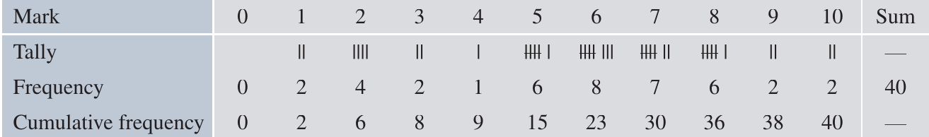
The frequency row shows how many students achieved each mark. For example, 6 students scored 5 marks, and 8 students scored 6 marks.
The cumulative frequency row shows the running total. For example, the cumulative frequency at mark is , meaning 23 students scored 6 marks or less.
Insight: Looking at the cumulative frequencies, we can see that - students appear to have poor spelling, or perhaps they had limited experience with tests in earlier years.
Cumulative frequency for categorical data
If the values in a categorical dataset have been sorted into a meaningful order, you can also create a cumulative frequency table for them (this is particularly useful for Pareto charts, which we'll discuss later).
Understanding cumulative frequency
For numeric data, the cumulative frequency tells you the number of scores that are less than or equal to a given score.
You can extend a frequency distribution table to a cumulative frequency distribution table by taking the accumulating sums of the frequencies.
Finding the median from cumulative frequencies
When analysing single variable data, two main questions guide our investigation:
- Measures of location: Where is the centre of the distribution?
- Measures of spread: How spread out are the data?
The median is an important measure of location.
What is the median?
The median (symbol , meaning second quartile) is the middle score when you arrange all scores in ascending order. More specifically:
- For an odd number of scores, the median is the single middle score
- For an even number of scores, the median is the average of the two middle scores
A cumulative frequency table makes it easy to identify the median.
Example with odd number of scores:
( scores)
The median is the th score (the middle one), which is 10.
Example with even number of scores:
( scores)
There are two middle scores: the th score is and the th score is .
The median is their average: .
Using cumulative frequency to find the median
Let's use the spelling test data from earlier to find the median.
There are scores, so the median is the average of the 20th and 21st scores.
From the cumulative frequency table:
- The th score is
- All scores from the th up to the rd are
Therefore, both the th and st scores are , so the median is 6.
This tells us that a student with a score of is in the middle of the class.
Displaying categorical data
There are many different ways to display data using tables and graphs. Good displays should be easy to read, even for people who aren't statistics experts. They should help you gain insights and communicate findings clearly.
You need to be careful when reading tables and graphs. They can sometimes distort information, either intentionally or unintentionally. Always examine displays critically to spot potential misleading features.
Pareto charts
A Pareto chart is a powerful tool for displaying categorical or discrete data. While it can be used for any categorical dataset, its main purpose is to identify which problems in a business are most urgent and need attention first. It's classified as one of the 'seven basic tools of quality' in business management.
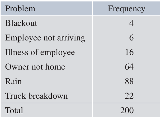
Example: Business Problems at Secure Roofs
Secure Roofs is a company that arranges roof repairs. Sometimes scheduled repairs don't take place on the expected day, causing loss of income while expenses continue. The manager analysed the last such failures and organised them into six categories:
Constructing a Pareto chart
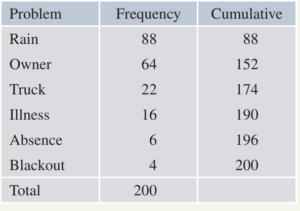
To create a Pareto chart, follow these steps:
Step 1: Arrange the categories in descending order of frequency (highest first)
Step 2: Calculate the cumulative frequency for this new order
Step 3: Draw two graphs together:
- A frequency histogram with columns in descending order
- A cumulative frequency polygon (line graph)
The chart typically has two vertical axes:
- Left axis: actual frequencies
- Right axis: percentage frequencies
Here's the reorganised table and the Pareto chart:
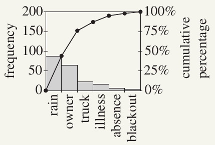
Interpreting the Pareto chart
With this chart, the manager can work through issues from left to right, tackling the most serious problems first:
- Rain ( occurrences): The manager might decide to only schedule external roof repairs three days ahead when weather forecasts are more reliable
- Owner not home ( occurrences): The manager could personally ring each owner two days ahead with a friendly reminder, followed by an SMS the evening before
- Truck breakdown ( occurrences): Perhaps a new truck has been budgeted for next year
- Other issues (illness, absence, blackout): The manager may have little control over these
Key feature of Pareto charts:
The cumulative frequency polygon in a Pareto chart is always concave down (curves downward) because the categories are arranged in descending order of frequency. This means each chord connecting two points on the curve lies below or on the curve.
Conventions for Pareto charts
There are no universal standards for drawing Pareto charts, but common features include:
- The histogram rectangles join up with each other
- The cumulative frequency polygon starts at the left-hand bottom corner (because the initial sum is zero)
- Each point is plotted at the right-hand top corner of its corresponding rectangle
Two-way tables (contingency tables)
A two-way table (also called a contingency table) combines two or more related frequency tables. It allows you to investigate whether two variables are related.
Even in its simplest form with just four numbers, a two-way table can be surprisingly complex to interpret. This topic connects to bivariate data analysis and conditional probability.
Example: Phone Cover Preferences
A survey asked adults what colour phone cover they preferred. Responses were recorded as either Dark (black-brown) or Colour (coloured), and the gender of each person was also recorded:
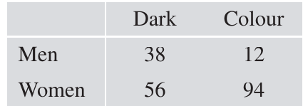
At first glance, looking at the numbers and under 'Dark', you might think women prefer dark colours more than men. However, this would be misleading.
The importance of marginal frequencies
To analyse this properly, we need to add row and column totals (called marginal frequencies):
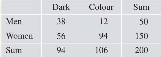
Now we can see that the survey included women but only men. The sample was heavily biased towards women, which we must account for in our analysis.
Analysing proportions
To answer the question "Do men prefer dark colours more than women do?", we need to calculate proportions:
For men:
- Proportion preferring dark covers:
- Proportion preferring coloured covers:
For women:
- Proportion preferring dark covers:
- Proportion preferring coloured covers:
The analysis clearly shows that men prefer dark covers much more than women do ( versus ).
The overall proportion preferring dark covers is , which is NOT the average of and because the sample was biased towards women.
Understanding the table structure
Each row and each column in the extended table is actually a frequency table:
- The last row and last column are called marginal distributions
- The inner rows and columns are called conditional distributions
This terminology relates to conditional probability concepts.
Conditional probability in two-way tables
The proportions we calculated are actually probabilities. If we choose a person from the survey at random:
We can also calculate conditional probabilities. These tell us the probability of one event given that another event has occurred.
To find the probability that a person prefers dark covers given that they are a man (or woman), we use a reduced sample space:
We can also work in the opposite direction:
These conditional probabilities give us deeper insights into the relationships between variables.
The mode and the range
Besides the median, there are two other simple but useful statistics: the mode and the range.
The mode
The mode is the most popular score in a dataset. It's the score with the greatest frequency.
The word 'mode' comes from 'fashion', referring to what's most popular. The mode is the simplest measure of location to identify because it's immediately obvious from a frequency table. It's even easier to spot from a histogram.
Examples of the Mode:
- In the Secure Roofs frequency table, the mode is 'Rain' with a frequency of
- In the spelling test scores, the mode is 6 (which happens to equal the median, though this isn't always the case)
Multiple modes
Some frequency tables have two or more scores with the same maximum frequency. These are called:
- Bimodal: two scores with equal highest frequency
- Trimodal: three scores with equal highest frequency
- Multimodal: several scores with equal highest frequency
The range
The range is only defined for numeric data. It measures how spread out the data are.
Definition: The range is the difference between the minimum and maximum scores.
Example: Range of Spelling Test Scores
For the spelling test scores:
- Minimum =
- Maximum =
- Range =
The range is the simplest measure of spread for a dataset.
This statistical meaning of 'range' is different from its use in function notation, where it means the set of all output values of a function.
Summary: measures of location and spread
- The mode is a measure of location (tells you where the centre or most common value is)
- The range is a measure of spread (tells you how dispersed the data are)
Key Points to Remember:
-
Three stages of data analysis: Display data using tables and graphs, calculate summary statistics, then investigate patterns and make predictions
-
Frequency tables organise raw data by counting how many times each value occurs. Cumulative frequency tables show running totals of frequencies
-
The median is the middle score when data are arranged in order. Use cumulative frequency tables to find it quickly: for scores, find the average of the th and th scores
-
Pareto charts display categorical data in descending order of frequency, combining a histogram and cumulative frequency polygon. They help identify the most important issues to address first
-
Two-way tables (contingency tables) show relationships between two variables. Always calculate proportions within rows or columns, not just raw frequencies, to avoid being misled by unequal sample sizes
-
The mode is the most frequent score (measure of location) and the range is the difference between maximum and minimum scores (measure of spread)