Quartiles and Interquartile Range (HSC SSCE Mathematics Advanced): Revision Notes
Quartiles and Interquartile Range
Introduction
When analyzing numerical data, we need ways to describe both the centre and the spread of the distribution. Quartiles and the interquartile range provide valuable measures for understanding how data is distributed around the median.
Quartiles are particularly useful when dealing with skewed data or datasets containing outliers, as they provide a more complete picture of the distribution than measures of central tendency alone.
Understanding quartiles
Quartiles divide an ordered dataset into four approximately equal parts. There are three quartile values that create these divisions:
- Lower quartile (Q₁): Also called the first quartile, this is the value that separates the lowest 25% of the data from the rest.
- Median (Q₂): The second quartile, which divides the data into two equal halves.
- Upper quartile (Q₃): Also called the third quartile, this is the value that separates the highest 25% of the data from the rest.
To find quartiles, you must first arrange your data in increasing (ascending) order. This is a crucial first step that cannot be skipped.
Finding quartiles with an odd number of scores
When you have an odd number of data values, follow these steps:
- Arrange the scores in increasing order.
- Find the median (Q₂) - this is the middle value.
- Omit the median to create two sublists of equal size.
- Q₁ is the median of the lower (left) sublist.
- Q₃ is the median of the upper (right) sublist.
Worked Example: Finding Quartiles with 15 Data Points
A shop recorded toaster sales over 15 weeks:
Raw data: 19, 16, 18, 15, 16, 19, 17, 21, 16, 16, 20, 18, 30, 19, 21
Step 1: Arrange in order: 15, 16, 16, 16, 16, 17, 18, 18, 19, 19, 19, 20, 21, 21, 30
Step 2: Find the median (Q₂): Since there are 15 scores, the median is the 8th value = 18
Step 3: Split the data (excluding the median):
- Lower half: 15, 16, 16, 16, 16, 17, 18
- Upper half: 19, 19, 19, 20, 21, 21, 30
Step 4: Find Q₁ and Q₃:
- Q₁ = median of lower half = 16
- Q₃ = median of upper half = 20
Result: Q₁ = 16, Q₂ = 18, Q₃ = 20
Finding quartiles with an even number of scores
When you have an even number of data values:
- Arrange the scores in increasing order.
- Divide the list into two equal sublists.
- Q₂ is the average of the two middle values.
- Q₁ is the median of the lower sublist.
- Q₃ is the median of the upper sublist.
Worked Example: Finding Quartiles with 16 Data Points
The shop sold 21 toasters in week 16, giving 16 scores total:
15, 16, 16, 16, 16, 17, 18, 18 | 19, 19, 19, 20, 21, 21, 21, 30
Step 1: Calculate Q₂: Q₂ = (18 + 19) ÷ 2 = 18.5
Step 2: Find Q₁ and Q₃:
- Q₁ = median of first 8 scores = 16
- Q₃ = median of last 8 scores = 20.5
Result: Q₁ = 16, Q₂ = 18.5, Q₃ = 20.5
Interquartile range (IQR)
The interquartile range measures the spread of the middle 50% of the data. It is calculated as:
The IQR tells us the range within which the central half of our data lies. It is a measure of spread that is not affected by extreme values (outliers).
The IQR is considered a "robust" measure of spread because it focuses only on the middle 50% of the data, making it resistant to outliers at either extreme.
For our examples:
- 15 scores: IQR = 20 - 16 = 4
- 16 scores: IQR = 20.5 - 16 = 4.5
The five-number summary
A complete picture of a dataset can be captured using five key values:
- Minimum (sometimes written as Q₀): the smallest value
- Q₁: the lower quartile
- Q₂: the median
- Q₃: the upper quartile
- Maximum (sometimes written as Q₄): the largest value
For the toaster sales examples:
- 15 weeks: 15, 16, 18, 20, 30
- 16 weeks: 15, 16, 18.5, 20.5, 30
Notice that:
- The range is the difference between maximum and minimum
- The IQR is the difference between Q₃ and Q₁
Box-and-whisker plots (box plots)
A box-and-whisker plot (or box plot) is a visual representation of the five-number summary. Here's how to interpret one:
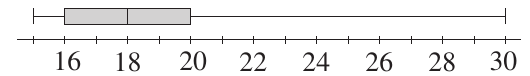
Understanding Box Plot Components:
- The box: Extends from Q₁ to Q₃. The length of the box equals the IQR and contains the middle 50% of the data.
- The line inside the box: Marks the median (Q₂).
- The whiskers: Lines extending from the box to the minimum and maximum values, showing the full range of the data.
Parallel box plots
When comparing two datasets, we can draw parallel box plots - one above the other on the same scale. This allows for quick visual comparison of the distributions.
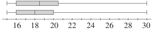
The diagram above shows two box plots comparing the 15-week and 16-week toaster sales data. We can immediately see that adding the extra data point increased both the median and upper quartile slightly.
Identifying outliers
An outlier is a data value that lies unusually far from the other observations. Outliers may result from:
- Measurement errors
- Recording mistakes
- Unusual but genuine occurrences
- Natural variation in the data
There is no universally accepted definition of an outlier, but a common criterion uses the IQR:
IQR Criterion for Outliers:
A score is classified as an outlier if it is:
or
Important considerations:
- The gap between the suspected outlier and the next closest value is also important.
- In very large datasets, we might expect some values to be many IQRs from the quartiles due to natural variation.
- Nothing replaces careful examination of the actual data values.
- In most cases, outliers should remain in the dataset but be displayed differently and discussed.
Outliers in box plots
Box plots can be modified to show outliers separately:
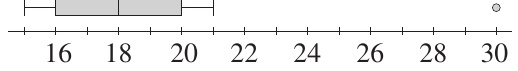
Identifying Outliers in Toaster Sales Data
In the toaster sales example with 15 weeks:
- The value 30 is well separated from other scores
- 30 is 10 above Q₃ = 20, which is 2.5 times the IQR of 4
- By the IQR criterion: 1.5 × 4 = 6, so any value above 20 + 6 = 26 is an outlier
In the modified box plot:
- The whisker stops at the highest non-outlier value (21)
- The outlier (30) is shown as a separate point (often a circle or dot)
This visual distinction helps identify and discuss unusual values. In this case, the score of 30 toasters sold could be explained by a special sale that week.
Worked example: die-rolling simulation
This example demonstrates how to calculate quartiles from both experimental and theoretical data.
Worked Example: Die-Rolling Experiment
Scenario: A die is rolled repeatedly until a six appears. The number of rolls needed is recorded. This is repeated 50 times.
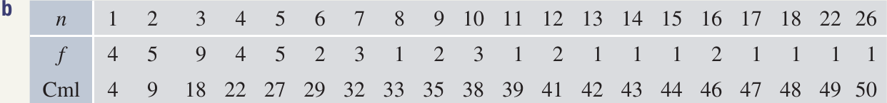
Part a: Finding the quartiles from experimental data
The median Q₂ is the average of the 25th and 26th scores = 5
The lower quartile Q₁ is the 13th score = 3
The upper quartile Q₃ is the 38th score = 10
Part b: Identifying outliers
IQR = 10 - 3 = 7
Upper limit = Q₃ + 1.5 × IQR = 10 + 10.5 = 20.5
The scores 22 and 26 both exceed 20.5, so they are classified as outliers. This makes sense as they are also well separated from the other scores.
Part c: Theoretical probability
Let X be the number of tosses required to get a six.
This forms a geometric progression with first term and ratio .
The sum to infinity:
This confirms that the probabilities sum to 1, as they should.
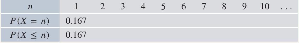
Part d: Finding quartiles from cumulative probabilities
From the cumulative probability table:
- Q₂ = 4 (first score with cumulative probability ≥ 0.5)
- Q₁ = 2 (first score with cumulative probability ≥ 0.25)
- Q₃ = 8 (first score with cumulative probability ≥ 0.75)
IQR = 8 - 2 = 6
Outlier threshold: Q₃ + 1.5 × IQR = 8 + 9 = 17
Any score greater than 17 is classified as an outlier.
Part e: Why are the distributions unsymmetric?
Both the experimental and theoretical distributions are skewed to the right. The frequencies are bunched up on the left (low values are more common) and spread out toward the right (high values are less common but possible). This reflects the nature of the experiment - you're more likely to roll a six quickly than to take many rolls.
Median and quartiles vs mean and standard deviation
We now have two families of summary statistics:
Family 1:
- Mean
- Variance
- Standard deviation
Family 2:
- Median
- Quartiles (Q₁, Q₃)
- Interquartile range
Sensitivity to Outliers:
For the 15 weeks of toaster sales:
- Quartile-based: Q₁ = 16, Q₂ = 18, Q₃ = 20, IQR = 4
- Mean-based: mean = 18.73, standard deviation = 3.53
If we replace the outlier 30 with 21 (the next highest value):
- Quartile-based: No change in median, quartiles, or IQR
- Mean-based: mean changes to 18.13, standard deviation drops dramatically to 2.00
The standard deviation is very sensitive to outliers, while median and quartiles are robust (resistant to outliers).
When to use each approach:
- Use mean and standard deviation when analyzing total quantities (like cash flow, total profits).
- Use median and quartiles when outliers might distort the picture (like studying typical purchasing patterns, or when data is skewed).
Real-World Application: House Prices
House prices are typically skewed to the right due to very expensive properties. In this case:
- The median better represents the price of a typical home than the mean
- The IQR is less affected by million-dollar mansions than the standard deviation
This is why real estate reports typically quote median house prices rather than mean prices.
Summary of key concepts
Summary statistics we've covered:
Measures of location:
- Mode
- Median
- Mean
Measures of spread:
- Range
- Interquartile range
- Variance
- Standard deviation
The five-number summary:
- Minimum
- First quartile (Q₁)
- Median (Q₂)
- Third quartile (Q₃)
- Maximum
A box-and-whisker plot is constructed from the five-number summary and provides a visual representation of the data distribution.
Understanding Skewness:
- Skewed to the right (positively skewed): The tail extends further to the right (higher values)
- Skewed to the left (negatively skewed): The tail extends further to the left (lower values)
Data are described as skewed in the direction of the longer tail, not the peak.
Key Points to Remember:
- Quartiles divide ordered data into four parts: Q₁ (25th percentile), Q₂ (median, 50th percentile), Q₃ (75th percentile).
- IQR = Q₃ - Q₁: The interquartile range measures the spread of the middle 50% of data and is calculated as the difference between the upper and lower quartiles.
- The 1.5×IQR rule for outliers: A value is typically considered an outlier if it falls more than 1.5 times the IQR below Q₁ or above Q₃.
- Box plots display the five-number summary: minimum, Q₁, median, Q₃, and maximum in a clear visual format.
- Quartile-based statistics are robust: Unlike mean and standard deviation, median and IQR are not heavily influenced by outliers, making them useful for skewed distributions.