Using Technology with Bivariate Data (HSC SSCE Mathematics Advanced): Revision Notes
Using Technology with Bivariate Data
Why use technology for bivariate data analysis?
Calculating correlation coefficients and regression lines by hand is extremely time-consuming and prone to errors. For any serious statistical work with bivariate data, you need appropriate technological tools.
Technology provides both efficiency and accuracy when working with bivariate data. Whether you're analyzing 12 or 12,000 data pairs, the statistical methods remain the same - technology simply makes larger datasets manageable.
Common technological tools include:
- Statistics calculators for small datasets
- Spreadsheets (like Excel) for medium to large datasets
- Statistical software packages for complex analyses
- Online tools for quick calculations and visualizations
This section focuses on using technology effectively to analyze bivariate data, create visualizations, and interpret results.
Types of datasets and appropriate tools
Small datasets: A statistics calculator can quickly find the correlation coefficient and the equation of the line of best fit. If your calculator has these functions, familiarize yourself with the specific steps required for your model.
Larger datasets: Spreadsheets are the most practical tool. They allow you to:
- Store and organize data efficiently
- Perform multiple calculations simultaneously
- Create visual representations
- Easily modify data and see updated results
Using spreadsheets for correlation and regression
Spreadsheets like Excel provide built-in functions for statistical calculations. While Excel versions vary, the core approach remains consistent. Here's how to analyze bivariate data using a spreadsheet.
Setting up your data
Start by entering your data in a clear, organized format:
- Type column headers in the first row (e.g., 'Time x' in cell A1, 'Rank y' in cell B1)
- Enter your data pairs in the columns below the headers
- Each row represents one observation with paired x and y values
Calculating the mean
The mean (average) is a fundamental statistic for bivariate analysis.
Steps:
- Create labels for your calculations (e.g., 'Mean x' in D1, 'Mean y' in E1)
- Click on the cell where you want the result (e.g., D2)
- Type
=to indicate you're entering a function - Search for and select the AVERAGE function
- Specify the range of cells containing your x-values (e.g., A2:A13)
- The function will calculate
Excel shortcut: After calculating the mean for x-values, select both cells and use Ctrl+R to "Fill right" and automatically calculate the y-mean.
Calculating standard deviation
Standard deviation measures how spread out your data values are.
Steps:
- Label your cells (e.g., 'SD x' in D4, 'SD y' in E4)
- Search for 'standard deviation' in Excel functions
- Select STDEV.P for population standard deviation
- Specify your data range
For sample data (rather than a complete population), STDEV.S may be more appropriate as it uses in the denominator instead of .
Finding the correlation coefficient
Pearson's correlation coefficient measures the strength and direction of the linear relationship between two variables.
Steps:
- Label a cell 'Correlation' (e.g., in D7)
- In the cell below (e.g., D8), search for and select the PEARSON function
- Enter the x-values in the first box
- Enter the y-values in the second box
- The result is , which ranges from to
Interpretation:
- close to : strong positive correlation
- close to : strong negative correlation
- close to : weak or no linear correlation
Finding the regression line
The regression line (line of best fit) has the equation , where is the gradient and is the y-intercept.
For the gradient:
- Label your cell 'Gradient' (e.g., in D11)
- Search for and select the SLOPE function
- Important: Enter y-values first, then x-values (reversed order!)
- This calculates the gradient
For the y-intercept:
- Label your cell 'Intercept' (e.g., in E11)
- Search for and select the INTERCEPT function
- Again, enter y-values first, then x-values
- This calculates the y-intercept
Critical detail: Both SLOPE and INTERCEPT functions require y-values first, then x-values - this is the opposite order from how you might naturally think about them! Double-check your cell ranges to avoid errors.
The complete regression line equation is then using your calculated values.
Example spreadsheet output
Here's what a completed statistical analysis looks like in Excel. Notice how all the key statistics are clearly labeled and organized for easy reference.
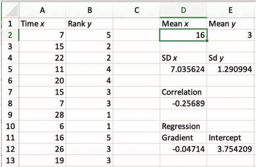
This spreadsheet shows:
- Raw data in columns A and B
- Mean values: ,
- Standard deviations: ,
- Correlation coefficient: (weak negative correlation)
- Regression line: gradient , intercept
So the regression equation is approximately .
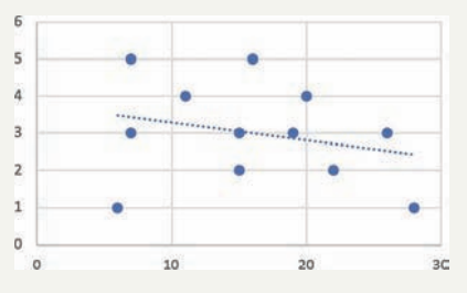
Creating scatterplots and adding regression lines
Visualizing your data helps you understand the relationship between variables and verify that a linear model is appropriate.
Creating a scatterplot
- Select all your data cells (both x and y columns, including all data pairs)
- Click the 'Insert' tab at the top of Excel
- Find the 'Charts' group and click 'Recommended charts'
- Select the 'All charts' tab
- Choose 'X Y Scatter'
- Select the option showing just dots (no connecting lines)
- Double-click to insert the chart
You can then move and resize the scatterplot as needed.
Adding the regression line
- Click on your scatterplot to select it
- A 'Design' tab should appear at the top of Excel
- Click 'Design', then find 'Chart layouts'
- Select 'Add chart element'
- Choose 'Trendline', then select 'Linear'
- The regression line will appear on your scatterplot
This visual representation shows how well the regression line fits your data points. If the points don't cluster reasonably close to the line, a linear model may not be appropriate for your data.
Saving your chart
To use your chart in reports or presentations:
- Click on the chart
- Right-click on the chart border
- Select 'Copy'
- Paste into your word processor or other software
Working with internet data
Real-world data from the internet offers excellent opportunities for investigation and projects. However, internet data requires careful handling.
Common issues with internet data:
- Missing values: Some entries may have blank fields
- Corrupted data: Occasional entries may contain obvious errors
- Inconsistent formatting: Data may need cleaning before analysis
- Outliers: Always investigate unusual values - are they errors or genuine extreme observations?
Best practices:
- Carefully review all data before analysis
- Check for and document any missing values
- Investigate outliers (but only remove them if you have good justification)
- Keep a record of any data cleaning you perform
Whether you're working with 12 or 12,000 data pairs, the statistical methods remain the same. Technology simply makes larger datasets manageable.
Worked example: removing an outlier
Worked Example: Impact of Outlier Removal
When you remove an outlier from your dataset, all statistical measures will change. Here's an example using the call waiting times data with one outlier removed:
Results after removing outlier:
- Mean values: ,
- Standard deviations: ,
- Correlation coefficient: (stronger negative correlation than before)
- Regression line:
Comparison with original data:
- The correlation became significantly stronger (from to )
- The gradient became steeper (from to )
- This demonstrates how much influence a single outlier can have on your analysis
Key lesson: Always investigate outliers carefully - they can dramatically affect your statistical results.
Exam tips
Essential exam strategies:
- Always check your function inputs: Some Excel functions require y-values first, then x-values (like SLOPE and INTERCEPT)
- Label everything clearly: Use descriptive headers for your data and calculations
- Verify your results: Does the scatterplot match what the correlation coefficient suggests?
- Round appropriately: Keep sufficient decimal places during calculations, but round final answers sensibly
- Document your process: If using technology in an exam, ensure you can explain what you calculated
Remember!
Key Points to Remember:
- Technology is essential for efficient bivariate data analysis - manual calculations are too time-consuming
- Statistics calculators work well for small datasets; spreadsheets are better for larger datasets
- Excel's key functions for bivariate data are: AVERAGE, STDEV.P, PEARSON, SLOPE, and INTERCEPT
- The regression line equation is where is the gradient and is the y-intercept
- Always visualize your data with a scatterplot to check if a linear relationship is appropriate
- Internet data requires careful checking for missing values, errors, and outliers before analysis
- Remember: SLOPE and INTERCEPT require y-values first, then x-values (reversed order!)